Now that New York City has finally flipped the switch on congestion pricing, the big question is: Will it work? And if so, how well?
To find out, all eyes turned to an unassuming new web tool called the Congestion Pricing Tracker. The brainchild of two college-age brothers, the tracker uses real-time traffic data from Google Maps to calculate traffic times for chosen routes and days. The data is presented as a line graph of traffic times before and after congestion pricing went into effect on January 5th. Compare one line to the other to see whether traffic times have increased or decreased.
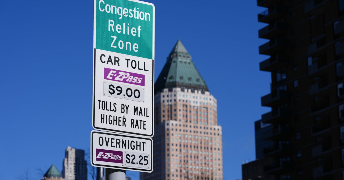
Unsurprisingly, depending on the route and time of day, the new tolling scheme seems to be working — perhaps even better than expected. Since January 5th, most drivers entering Manhattan below 60th Street during peak hours will pay $9 — or $2.25 for late nights and weekends. And that fee appears to be doing what it set out to do, which is to change the behavior of the people behind the wheel and funnel millions of dollars into needed transit improvements.
That was what initially drew brothers Benjamin and Joshua Moshes to the project. Benjamin, a senior studying math and economics at Brown University, was initially working on a project about taxis when his adviser, professor Emily Oster, made a suggestion about switching topics.
“She recommended that I also look at this new congestion surcharge that was going to happen in the summer, and collect data and kind of track how things go,” Benjamin told The Verge.
Benjamin liked the idea, especially as it related to the concept of price elasticity and demand. In other words, the more expensive something is, the less people will want to do it. Historically, driving has come with very few costs for the driver — in fact, most of it, from road infrastructure to free parking, is actively subsidized by the government. So, if you make it pricier to drive a private vehicle into one of the most congested, transit-rich areas in the country, perhaps you can convince some of them to stop doing it.
“How much does it take for people to really switch their behavior?” Benjamin asked. “A lot of the theories went, you know, $9, people need to get to work, people still need to get into the zone, public transportation isn’t going to cut it, people aren’t going to change their behavior. Others said, people are going to really change their behavior, there’s going to be a lot less traffic.”
“How much does it take for people to really switch their behavior?”
He roped in his brother Joshua, who was about to start his freshman year at Northeastern University. Together, they got started outlining the tool.
The data project was delayed when New York Governor Kathy Hochul surprised many by abruptly putting congestion pricing on hold, citing concerns about the affordability of the new fee and the risk to New York’s post-pandemic economy. But the pause would only prove to be temporary, with Hochul reinstating the toll after President-elect Donald Trump’s victory in the November election. The toll was lowered to $9 from $15, and a few weeks later, the tolling cameras were turned on.
Photo by Selcuk Acar / Anadolu via Getty Images
At the same time, the tracker launched — and almost immediately, you could find it linked in social media posts from transportation advocates who were thrilled to watch in real time as fewer cars seemed to be entering the congestion zone. The Metropolitan Transportation Authority (MTA), which was overseeing congestion pricing, wasn’t scheduled to release its own preliminary traffic figures for a couple of weeks. Many people wanted data now, and the brother’s tracker helped meet the demand.
In devising the tool, the brothers used Google Maps’ API to collect real-time traffic data from 19 routes, using the shortest time to drive from point A to point B for every route. Every 15 minutes, the tracker refreshes the times for every route, resulting in 1,824 data points each day. Most of the data was from the 13 routes directly affected by congestion pricing, with additional routes from outside the zone to measure the effect on those commutes. And they even included a handful of routes in Chicago and Boston as controls in case there were national or historical trends they weren’t capturing.
In the run-up to congestion pricing, one of the methods experts were using to measure the effectiveness of the new toll was to cite average speeds within the congestion zone. Slower speeds meant more traffic, and faster meant less. But Benjamin and Joshua settled on commute times as the better metric.
“Oh, now it’s taking me four minutes to cross Lincoln Tunnel when it used to be 10.”
“What’s great about commute times is that it’s easier to sort of internalize saying, ‘Oh, now it’s taking me four minutes to cross Lincoln Tunnel when it used to be 10,’” Benjamin said. “If the average speed used to be 19 miles per hour, and now I’m going 21 miles per hour, I think I can also internalize that it’s a little bit different.”
The brothers were surprised by how quickly the tracker took off, earning citations in major media stories from The New York Times, The Economist, and Bloomberg. Their tool became a definitive source for gauging whether congestion pricing was effective.
“The number of social media posts, Twitter posts, the amount of people that went on the website, people who donated to us, which we’re really grateful for, has really surprised us in a positive way,” Benjamin said.
The brothers say they hope to keep the tracker live — though there are costs associated with web hosting and collecting the data. (You can donate to their project here, or just buy them a cup of coffee.) They plan to make enhancements, improve their data collection methods, and design a better map. Obviously, this is the type of project that would benefit from a lot more data and a much longer lifespan.
“We’re trying to keep the website running, the data collection running, so that we can actually see if the averages go up, go down, if any changes happen from what we’ve been seeing in the last few days,” Joshua said.
But one thing seems certain: Benjamin is likely going to receive a very good grade on his thesis.
“I think the project was an enormous success in the sense of getting information about traffic patterns immediately,” said Oster, the Brown economics professor and Benjamin’s adviser, in an email. “Ultimately, the MTA and others will have this information, but the value of the tracker is in delivering this immediately. I was so proud that they were able to put this together.”











+ There are no comments
Add yours