
I knew there would be an argument. The room had gone eerily quiet. “Isn’t it about time,” my partner began, “that we freshened this place up a little?”
There was a long pause as she glanced around the white walls of our kitchen – which, I’ll admit, do have a little bit of paint chipping off them. Then she dropped a glossy magazine on the table – World of Interiors, I think. I was trying not to look.
My partner is passionate about colours and knows the names of all the different shades. I don’t – but I am a psychologist, and that gives me some skin in this colour game too.
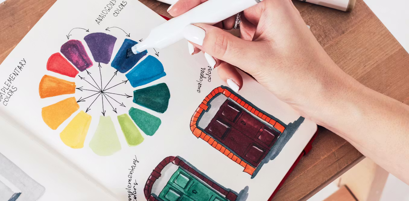
Let’s start with those myriad names. Clay pink, muted teal, warm taupe … psychologists have long argued that the extent of your colour vocabulary affects how good you are at colour recognition. My partner spots subtle differences that I never notice. Recently, it’s been all about katsuobushi smoke, halva sesame and black garlic amber.
Colours exert their influence through a combination of evolutionary predispositions, physiological responses, learned associations and broader cultural meanings. Because of this, I’d argue that choosing a new colour scheme is a psychological issue, not just an aesthetic one.
Indeed, a growing body of neuroscientific, behavioural and psychological research shows that colour is not merely a matter of taste. The hues that surround us influence our emotional states, cognitive performance, social interactions, sleep – and even our long-term psychological wellbeing.
In other words, the colours of our walls might be shaping our lives in ways we rarely consider.
Strong or subtle?
Let’s start with a fundamental question: what does psychology say about whether to go strong or subtle in your paint choices?
Neutral colours (whites, greys, beiges) are low in visual stimulation, which helps reduce sensory overload and stress. They enhance perceived spaciousness, and can have positive effects on cognitive performance in both children and adults. But their psychological impact hinges on shade and context. Cold greys or stark whites may evoke sterility or sadness, particularly in poorly lit spaces.
Recently, there has been a general trend away from white towards using brighter colours in our homes. The hot colours for 2026 apparently include chocolate brown and burgundy – while Ikea’s colour of the year is Rebel Pink: “A vibrant, playful shade chosen to inspire joy, energy and self-expression.”

Shutterstock
However, the psychological evidence says choose low- to mid-saturation shades rather than hyper-bright colours for your long-term comfort. Blue and muted green are associated with enhanced creativity and improved problem-solving. A muted green home office or study may make you more innovative without you really noticing why.
Green, with its obvious nature connection, is also linked to restoration and reduced mental fatigue, supporting the broader findings of environmental psychology on biophilic design.
You should probably reserve warm, energising colours for social or active areas in the house. Soft yellow feels cheerful, presumably due to its association with sunlight – but high-saturation yellows may increase agitation.
And then there’s red. In evolutionary terms, bright red wavelengths tend to increase physiological arousal, raising heart rate and galvanic skin response. It can also affect desire – one study found men perceived women as “more attractive” and “more sexually desirable” when their photos were presented on a red rather than white background.
But red is also associated with danger and warning. Children did less well in problem-solving tasks when their exam number was written in red rather than green or black, or if the cover of the test booklet was red. Even just seeing the word “red” can negatively affect intellectual performance.
So think carefully before using red in your home office. A red-accented study might feel “dynamic” initially, but it could backfire when you start on tasks requiring calm focus and clear thinking. In contrast, painting an office blue seems to have a calming effect. It is associated with sky and water, and seems to be connected to improved concentration.

August Snow/Alamy
The 60-30-10 rule
In truth, my partner didn’t seem all that keen to take the advice of a psychologist – well, this one, anyway – about the house’s impending makeover. “Haven’t you heard of the 60-30-10 rule?” she sniffed.
The experts of interior design suggest 60% of a room should be devoted to the dominant colour (the majority of the walls plus a key piece of furniture like a sofa, say), 30% for the secondary colour to add visual interest (perhaps including curtains or carpet), and 10% to an “accent colour”. The roots of these proportions have been said to lie in visual psychology and mathematics’ “golden ratio” – although some recent studies suggest the association of this precise mathematical formula with our perceptions of beauty is something of a myth.
Nonetheless, I propose this scheme for our living room: soft sage green (dominant), warm cream (secondary), plus brushed gold as the accent colour (maybe as cushions).
My reasoning? Sage green reduces stress, improves relaxation and mimics the cognitive benefits of being in nature. Cream warms the palette, encouraging a cosy rather than “forest hermit” vibe. Finally, accent colours draw attention, and gold can have a powerful symbolic and emotional impact because of its cultural associations with wealth, success and achievement. It subconsciously signals confidence and positivity (in moderation, of course – Donald Trump famously loves excessive gold decoration).
Now I’m just waiting to see which colour paints my partner returns with.