


Last month we released Orion, a small app that turns your iPad into an HDMI monitor. This was certainly a big departure from our usual practice of making camera apps, so I wanted to take a moment to show the ‘why’ — and, after that, the ‘how’: our process of making it from thought to launch.
This is a dive into the conception, design, and development of Orion, a showcase of the fun one can have while making an app, and a look at the way a simple utility can be infused with funky retro charm.
The Pitch and the Product
This summer, Apple announced iPadOS 17 would support UVC, or USB Video Class devices (basically:”webcams”). This could be compelling to us, so we researched adding support to Halide. After all, how cool would it be to have Halide’s interface for your digital camera?
After some quick research, we found it didn’t really work quite like we had hoped. However, our experiments uncovered that those inexpensive USB-C “capture cards” you find on Amazon work like webcams. With one of those, you could plug any HDMI device into your iPad and its output would show up on your screen. It was a “Woah” moment.
What if we built an app that helped you use your iPad as a monitor?
Evaluating An Idea
It’s one thing to have an awesome idea, and another to come up with product. We love doing things for the sake of art, but when you run your own business, you have to avoid new and shiny distractions. Otherwise, you’ll end up neglecting the work your customers rely on you for.
Ben and I pride ourselves on reviewing each other’s weird, left-field ideas whenever they come up — making sure we don’t jeopardize our entire business to, say, build an app that launches a game in the dynamic island when you press the action button (it was a promising idea, Ben). So before jumping on a new project, it helps to be skeptical. We asked ourselves a few questions.
❓ How many people want this? Our gut said, “A lot.” We’ve lost count of the times we wished we had a portable monitor within reach, whether it’s plugging it into our video and still cameras for better monitoring, connecting it to a Mac-Minis we have sitting in a closet, or just hooking up to a Nintendo Switch while traveling. At the same time, there’s a huge barrier asking someone to spend even $15 on a separate adapter in addition to the cost of our app.
❓ What makes our version special? We expected a glut of free “iPad monitor” apps in the App Store, like the Flashlight App gold rush of 2010. What could we bring to the table?
Design, in and of itself, is a feature. If this was going to be a possible use of the iPad, we might as well make it delightful.
We also had technical tricks up our sleeve. Our research found that those capture dongles only supported 1080P resolution, and this presented an opportunity. Thanks to our background in image processing, we could build a resolution enhancer that would intelligently upscale to 4K resolution.
❓ Could it make some income to recoup our time? Assuming there’d be a lot of free utilities to enable this, we felt it was ideal for this app to be ‘freemium’. We’d make the core experience and most important part — using your iPad as a monitor — free. Advanced features, like our 4K upscaling, could be a one-time purchase. A big plus here was that we saw it as a fun exercise to build something new, and didn’t have the pressure to turn it into a business.
📝 A side note on fun: we never intended Halide to be a business, either. We just built it out of passion, and had a lot of fun doing it. That ended up becoming a huge success, and a ton of fun to work on. To this day, I think the best products are often built out of passion, not in an effort to chase huge payouts.
Okay, we had a plan, maybe. On paper, this all sounded like a good plan at that, but one with uncertainty. We know we’re obsessed with details. Unchecked, we could find ourselves spending a year on this, and if it flopped, we’d be kicking ourselves that we hadn’t made that dynamic island action button game instead (it could be a massive multiplayer game, Ben!).
But we held ourselves to a short schedule, we could risk it. If it made a few bucks, great! If not, we could treat it as the quirky art project it was.
It was August 4th, just around the corner from New iPhone Season. This is our busiest time of year. That makes it sound kind of casual, but we are talking nights-and-weekends-crazy-busy-busy — when new iPhones come out, we don’t get advance hardware or a heads-up on what’s coming. We have to run to the store, buy the phones, and fix what is broken first and then work long nights to support what’s new.
We had to get Orion out before then. If we didn’t ship Orion in time, we had no choice but to shift focus to Halide and Spectre updates and abandon it. So we set the new iPhone launch as our deadline— either ship this app in 45 days, or abandon it and move on.
Buckle up.
The Design Process
While Ben worked on the technical functionality, in parallel, I explored Orion’s potential visual design. I wanted it to be very fun and even a little campy — I got a lot of inspiration from in the 80s which had a very futuristic, yet tacky look.
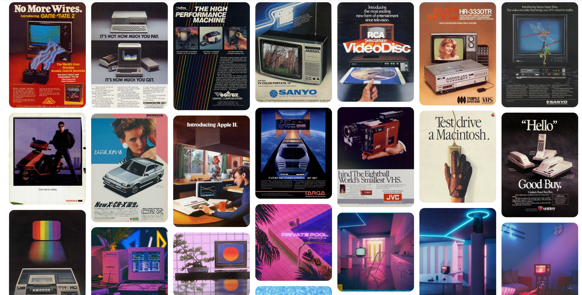
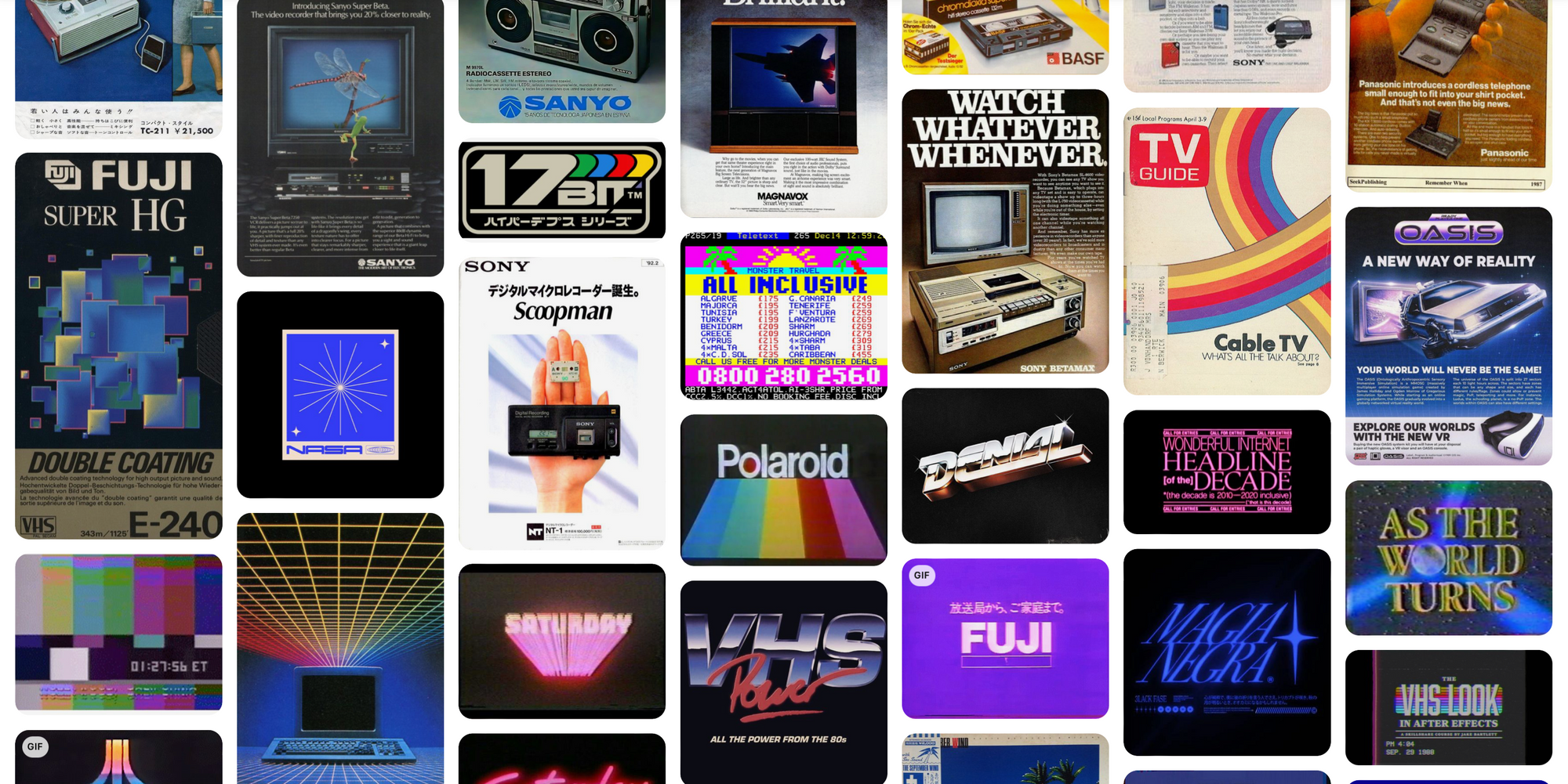
I loved the optimism and almost science-fiction like reverence for technology back then. There was a lot of color and whimsy involved.
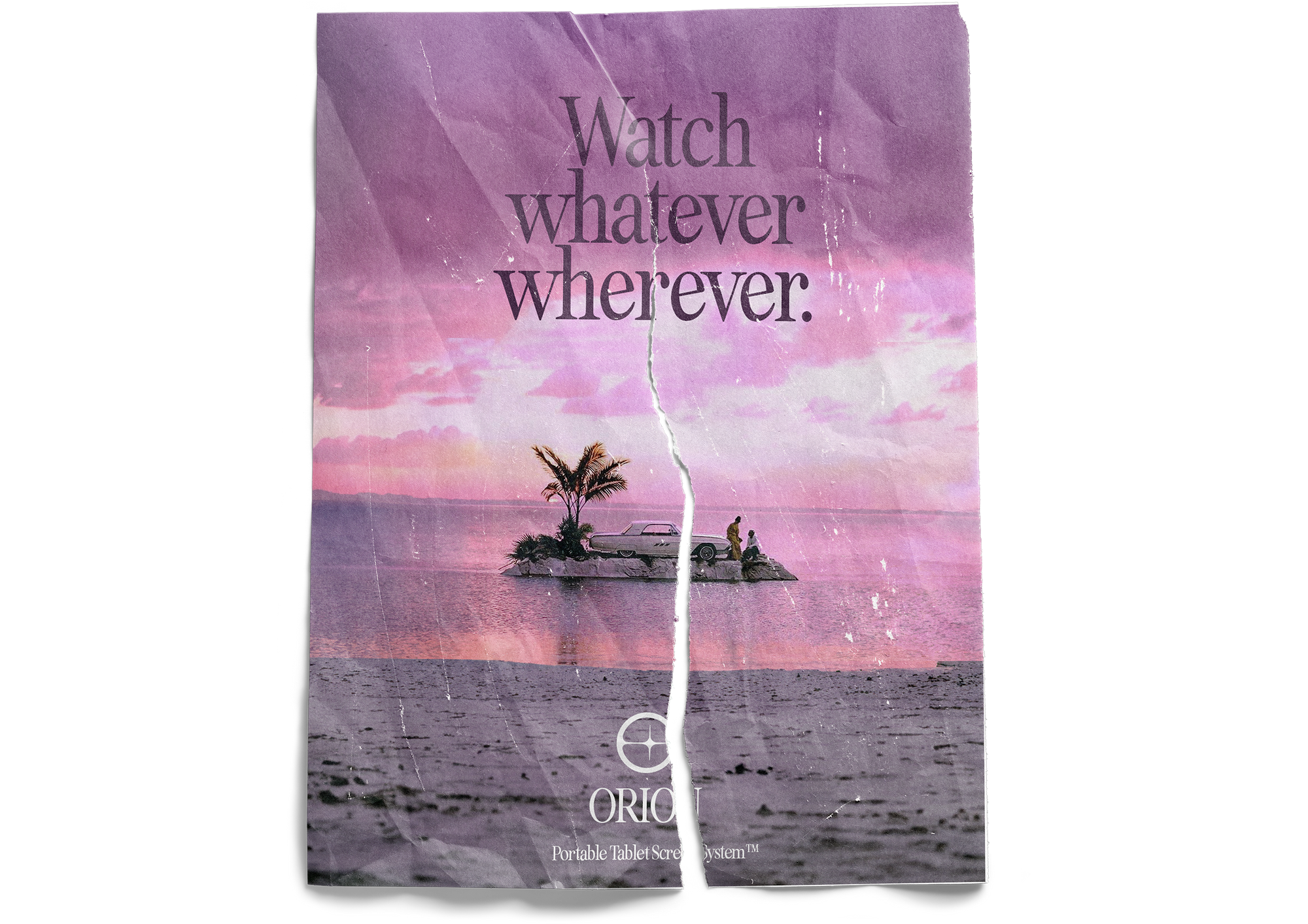
In my first explorations, I just jammed on silly, hypothetical promotional materials for Orion. I pretended flat screen displays didn’t yet exist, and imagined ads like, ‘finally, a screen you can take anywhere!’, ‘watch whatever, wherever!’, showing a couple on an abandoned sand bank with their car during a pink sunset.
Noodling around, I was suddenly inspired to make the first screen of the app: A… box?
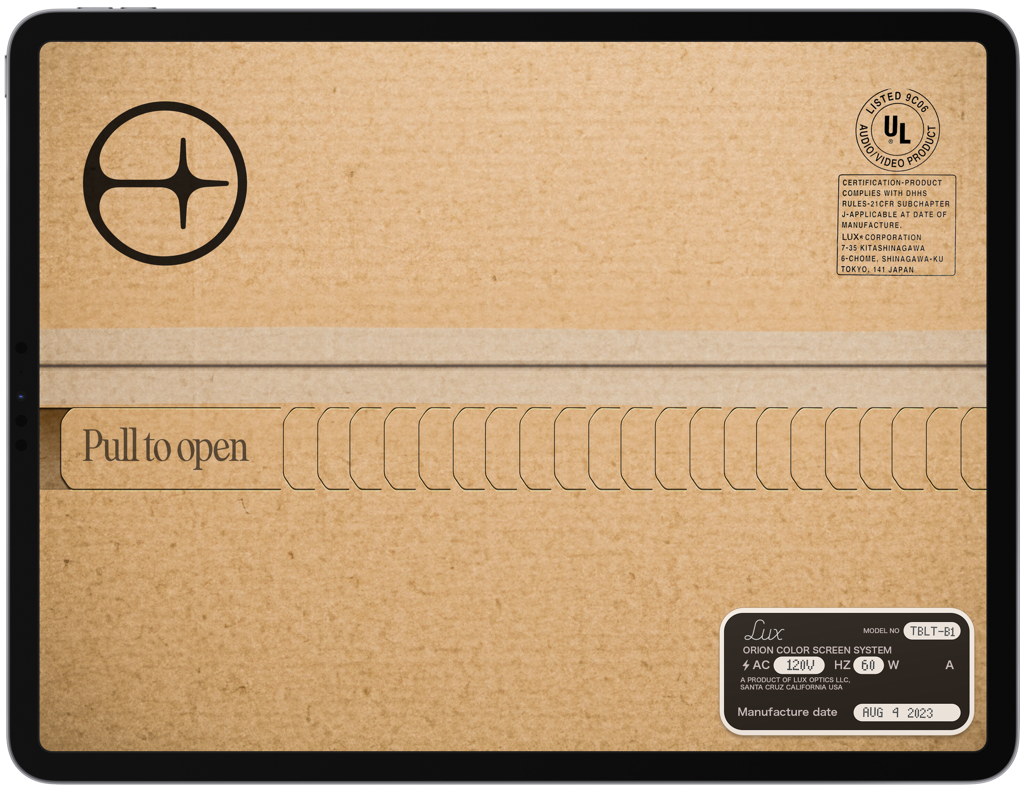
I didn’t know what the app would look like, but I wanted it to be a physical experience. Maybe a user could unbox it, as if it really was a TV from the 80s? The most satisfying possible experience unboxing is a tearaway strip; that could translate well to a swipe.
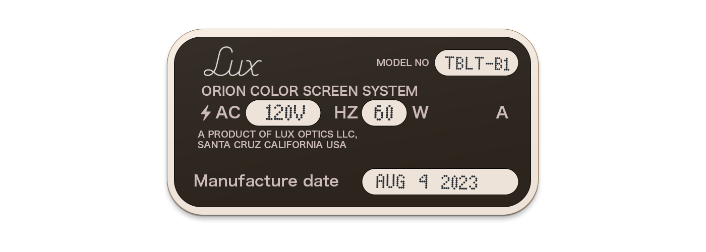
I threw together some bits and made the box less bare: I labeled the box with an address and electronics certification sticker, using Sony corp’s old Tokyo address, along with a sticker typical of the electronics of the era, listing its voltage and Hz. The dot-matrix type on that sticker is ever so slightly misaligned, as if it wasn’t quite printed perfectly in that semi-analog world.
Funny enough, this was the first screen I designed and the last thing we actually built. In the final days, we even managed to get a few more finishing touches into it. More on that later — but suffice to say this would become both a figurative and literal shipping label.
Orion was the kind of project that is pure fun to me, and it gave me an excuse to reach out to people whose work I loved and admired. The first person I reached out to was a longtime friend and collaborator: Jelmar Geertsma.
Jelmar is an exceptional designer. He’s a master of type design, for one, but also a spectacular graphic designer. I have worked with many designers in my time, but Jelmar is the kind you only meet once and file mentally in a dramatically lit cerebral hall of fame. Most designers can pull off doing a layout or product page, but type design requires the kind of obsessive nature to keep perfecting a single letter for weeks, if not months. It requires you to have an ever-burning fire and love for the craft inside you that motivates you to do what you do. Jelmar has that fire, and it’s very bright in him indeed.
I am also lucky to call him one of my best friends, whom I met at art school days about 18 years ago. With our shared appreciation for niche design humor, typeface particularities, beautifully made things and Pulp Fiction, we got along very well in school. It led to many long sessions just designing things for fun and jamming on typefaces along with a few clashes with teachers whom we often out-witted with our computer design chops.
In August, my grandfather passed away peacefully of old age. I flew to the Netherlands to attend the service, speak at his funeral and grieve with my family. While I was there, I took the opportunity to visit Jelmar for a few days — or nights, rather — bringing with me some fine American whiskey, a cigar or two, and a lot of ideas.
For Orion, our brainstorming sessions blended nostalgia and excitement.
We both love retro-80s vibes (Jelmar often wears a highly tech-forward Casio watch), and one of our most successful collaborations became my favorite detail and one of our most praised aspects of Spectre and Halide: our custom typefaces.
We’d certainly showcase our love of type in Orion, but that is not where we started.
My first sketch of the app (post-box design) had me imagining a sort of retro VCR / TV screen aesthetic. I saw two crucial parts we had to design: the ‘screen’ experience, and the on-boarding experience.
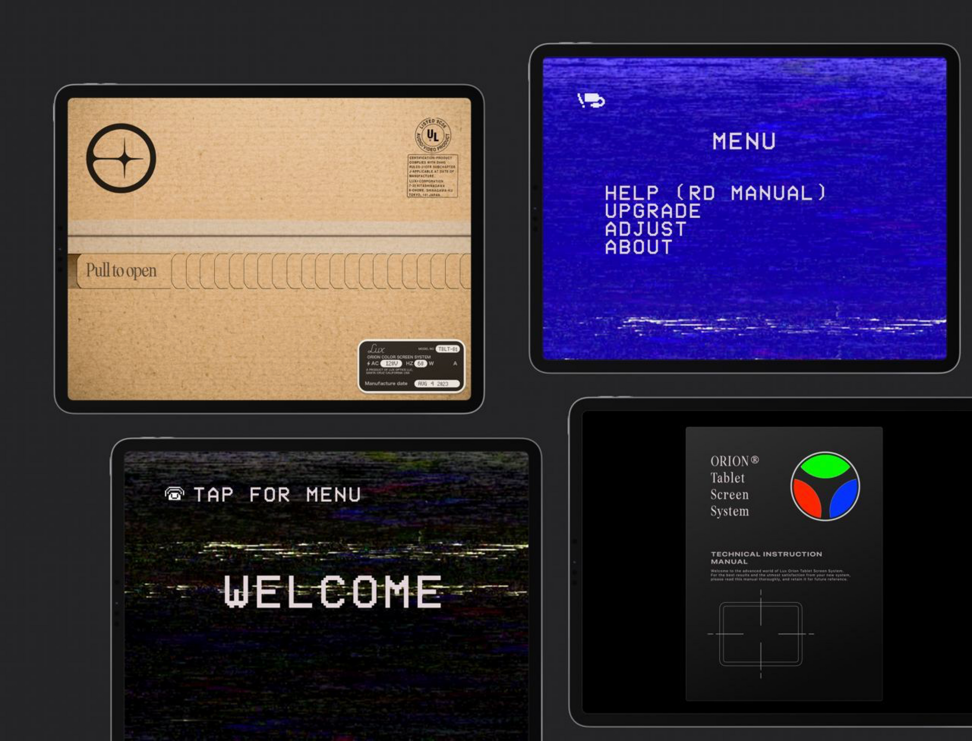
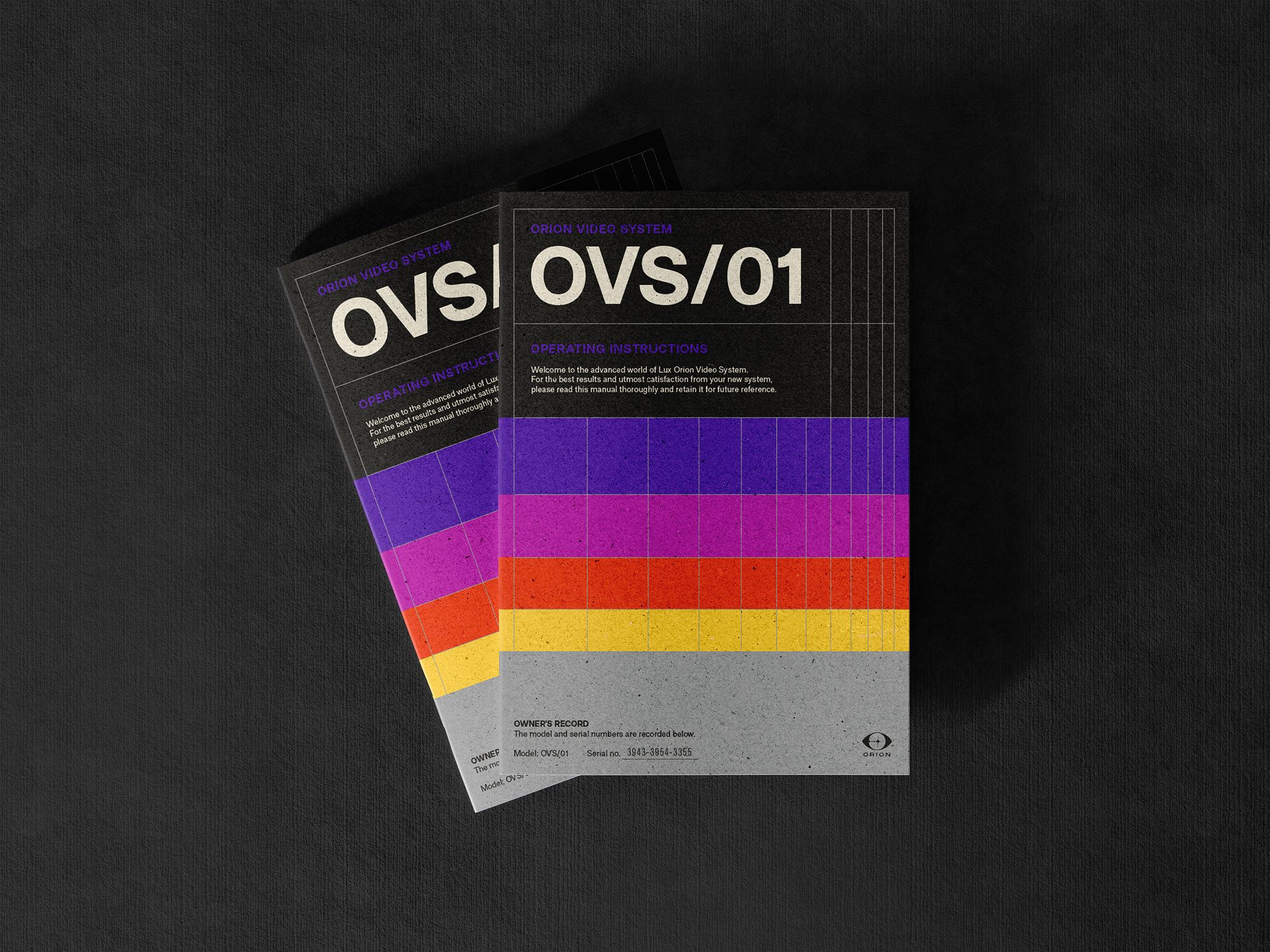
The manual was a pretty key experience. We’ve always had ‘physical’ manuals in Halide as a tactile and visually fun way to get acquainted with the app, and we notably switch their design up for major releases.
For Orion, we wanted it to be far more rooted in the period’s graphic style. That required experimenting a lot more with visual style, the Orion logo and typography. Jelmar did an insane job and put together a massive variety of designs:
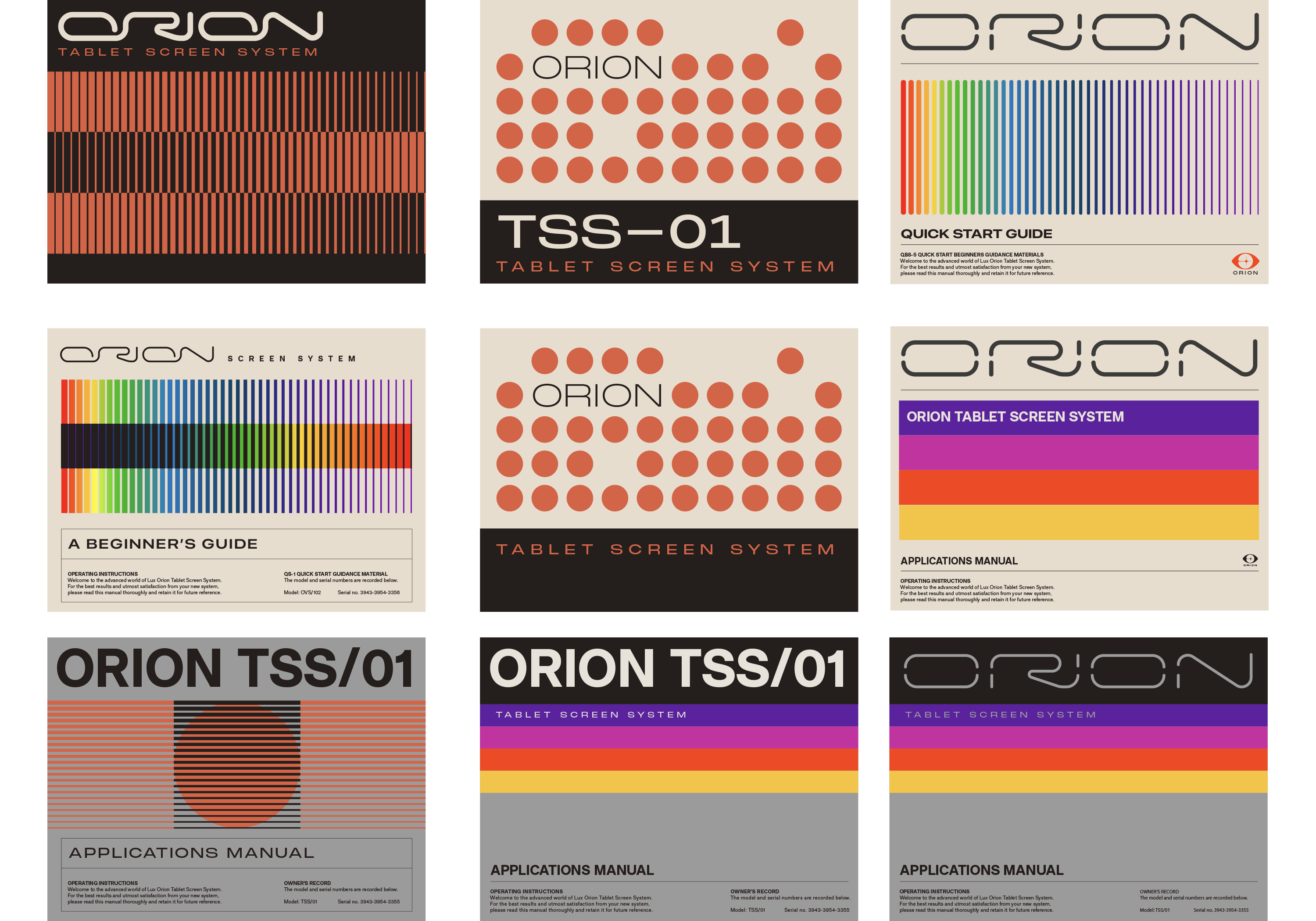
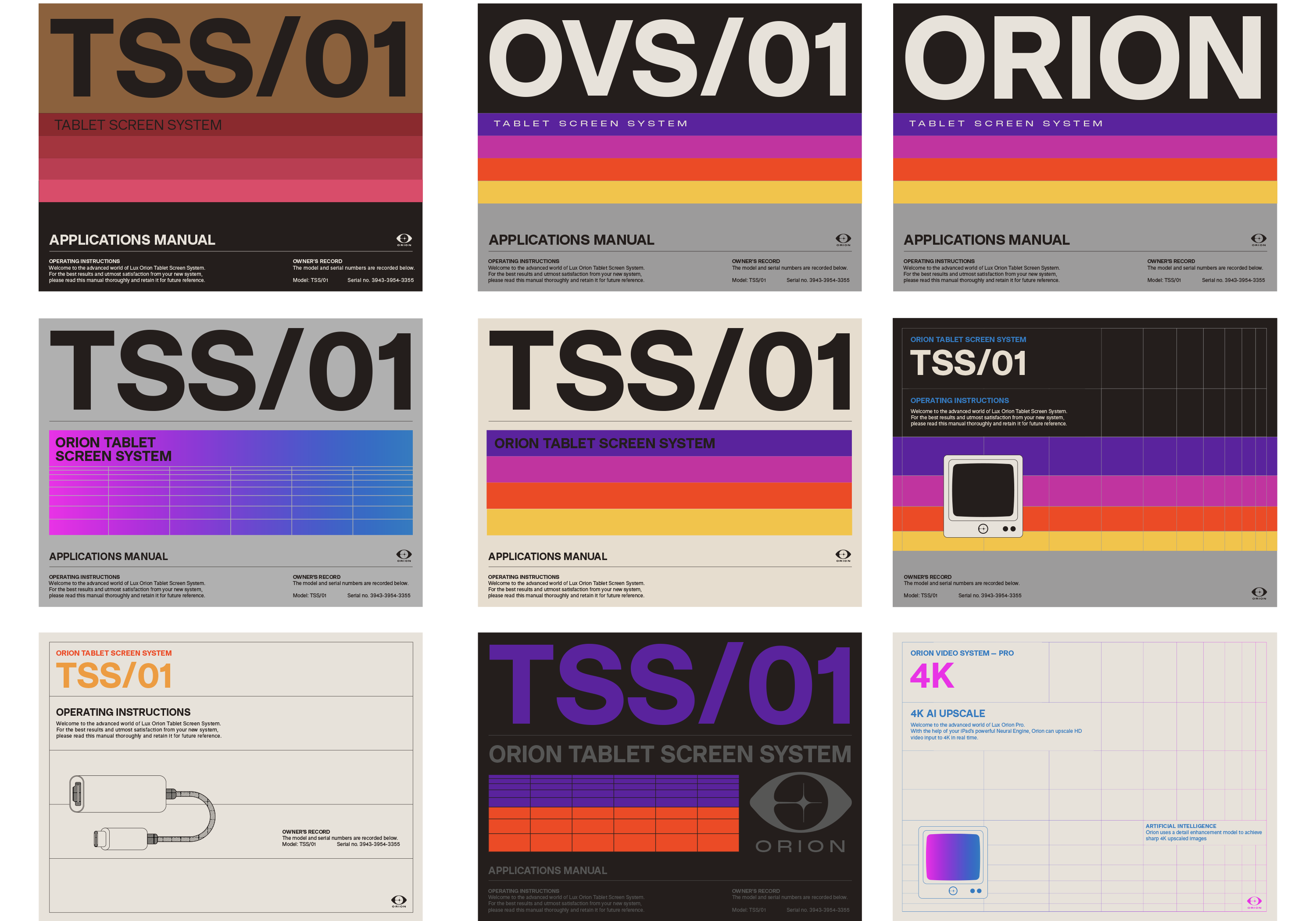
I debated changing these up depending on device type, but we narrowed it down and started improving just one, in a more traditional manual aspect, which would greet the user after unboxing. I also added some paper texture and mild wear and tear. We really wanted you to feel an uncanny old-yet-modern vibe from it:
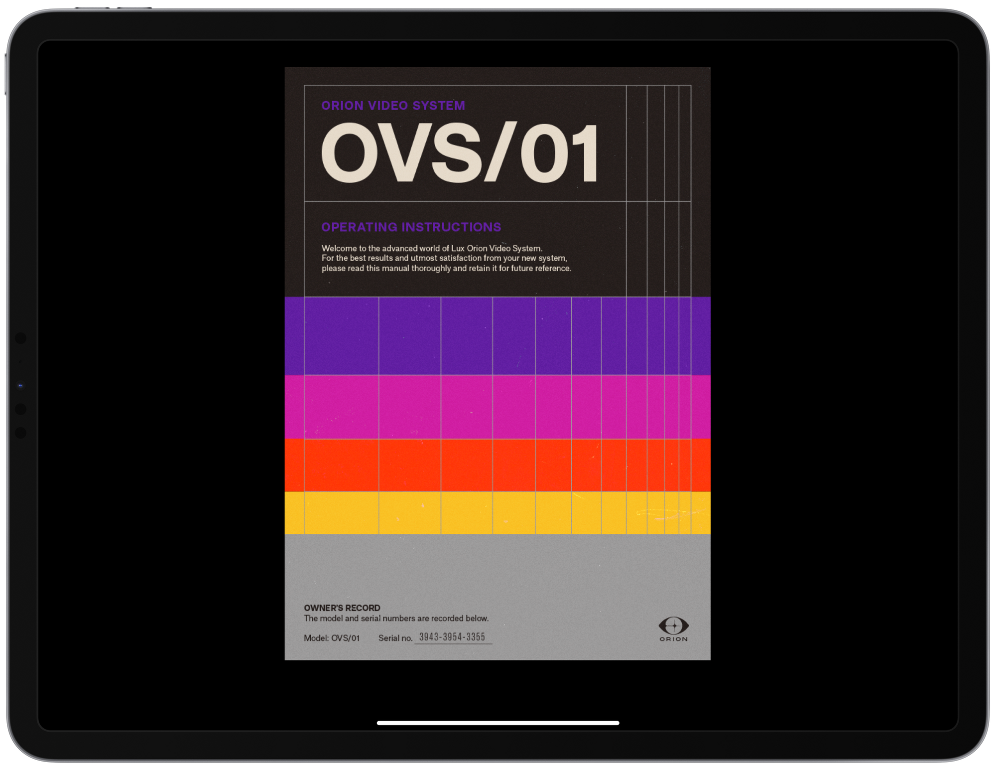
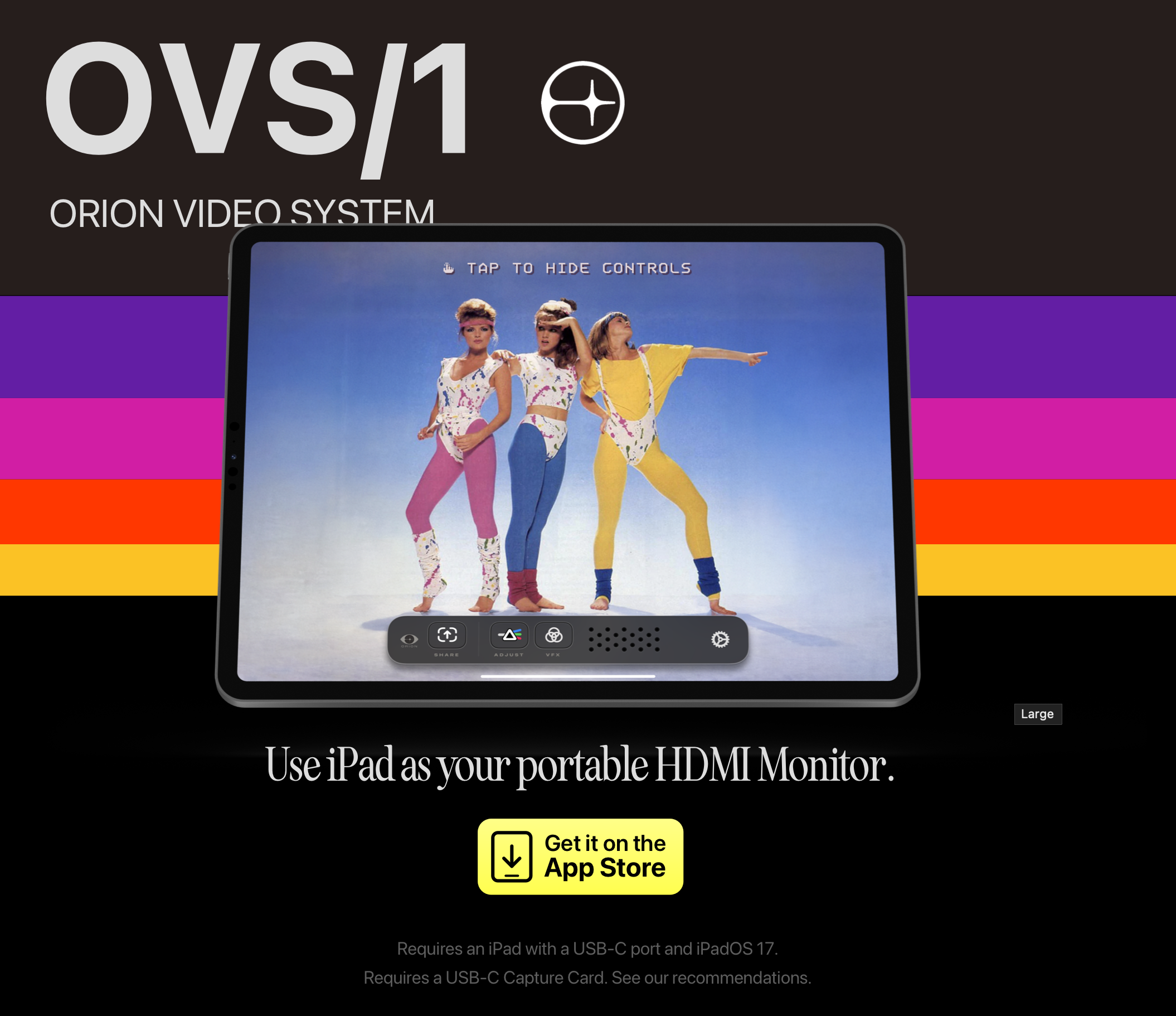
If you wonder about the phrase ‘Video System’ in Orion, that’s more than a casual label. It’s a tribute to the VCR and CRT TV era, a time when on-screen type and iconography was new, pixel-y and clumsy.
True to my first sketch, we were now down the second step in a basic flow: users open the app to a very tech-tastic, VHS tape-like manual cover design and 80s-style internal illustrations, then transition to pixely menus.
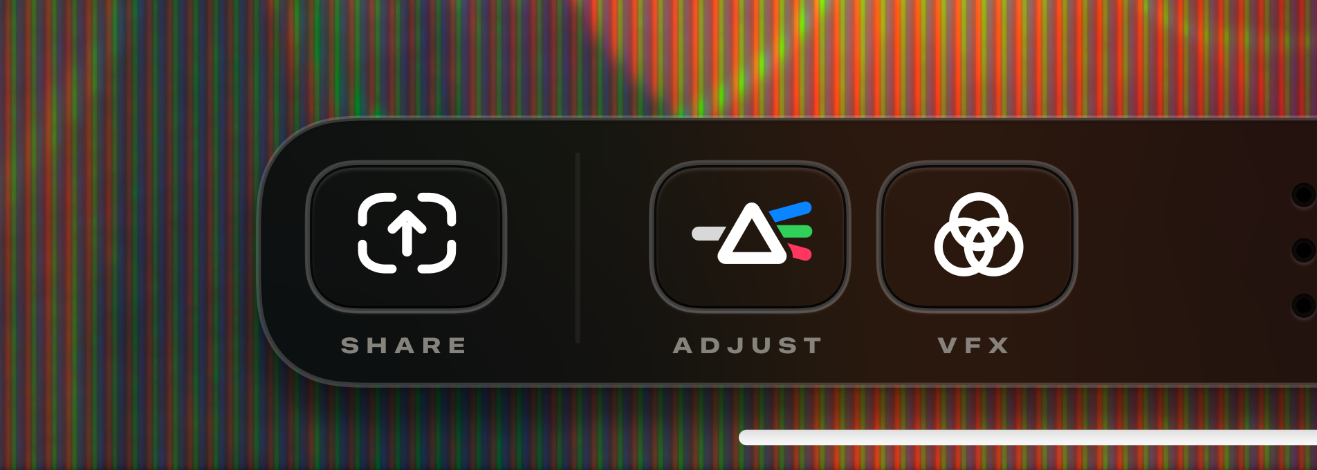
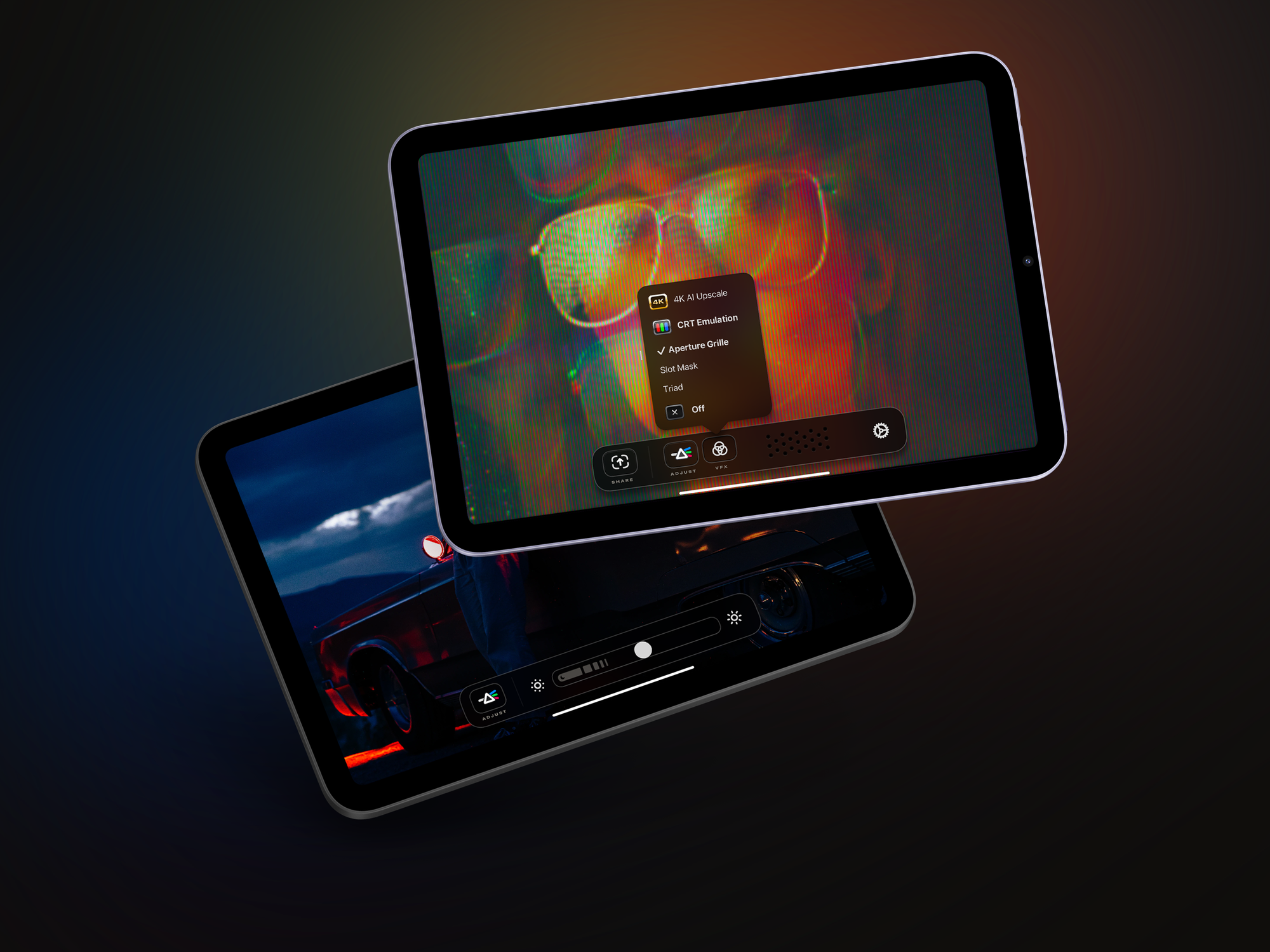
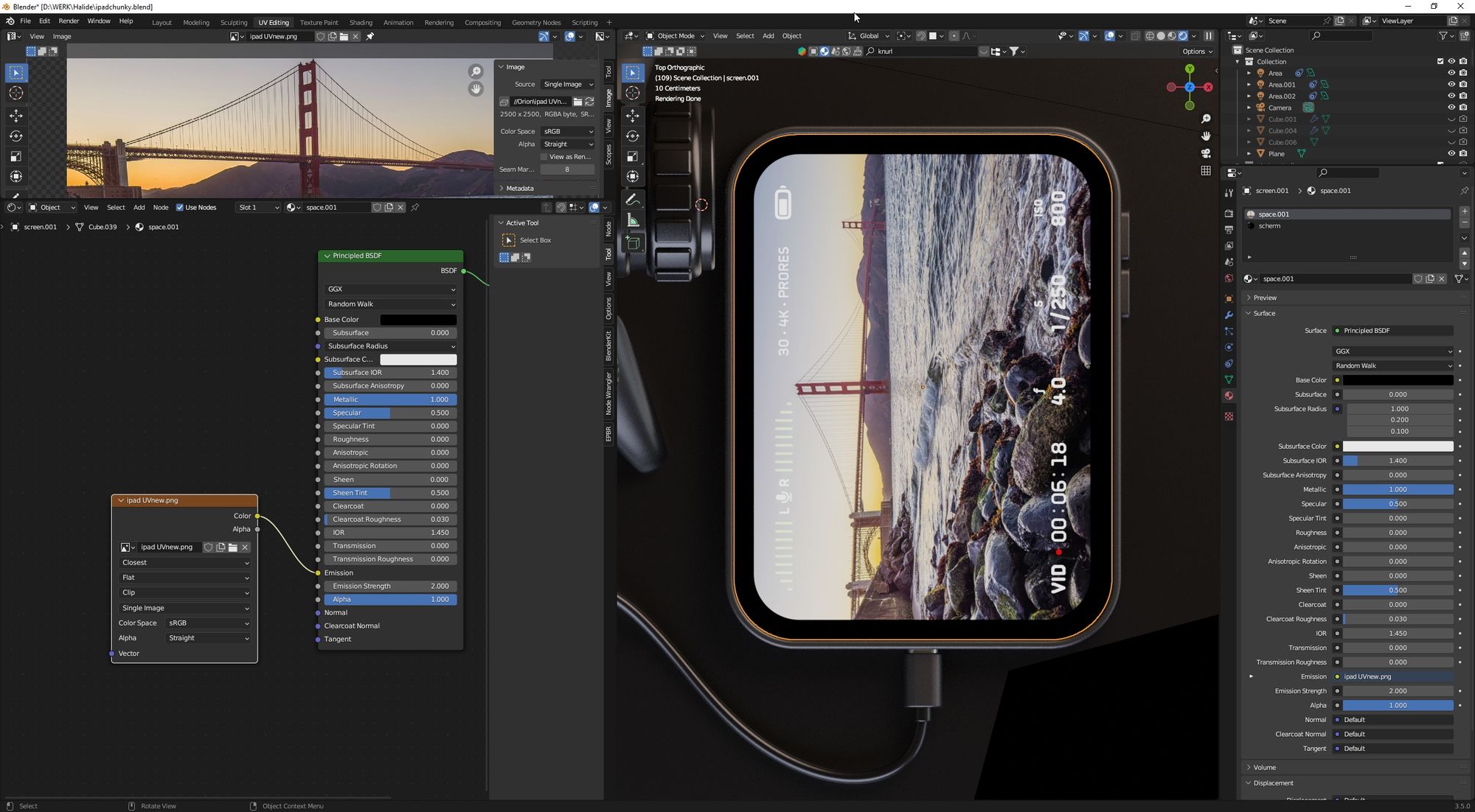
We ended up crafting display curvature, slight chromatic aberration and interference noise, and a quasi-analog feel to the digital interface of Orion.
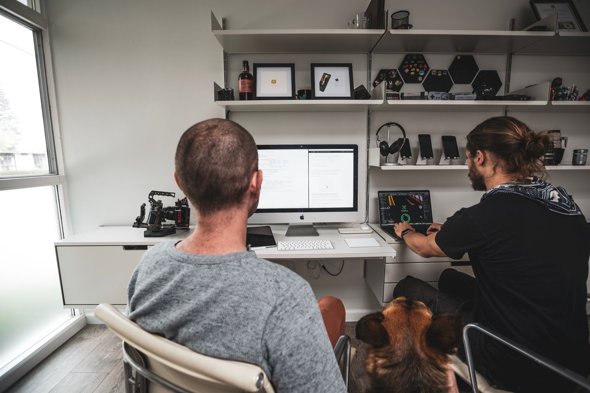
This effect would have been difficult to implement in years past. By limiting the app to iPadOS 17, we could take advantage of custom shaders, those tiny programs that run on your GPU, responsible for the most complex effects in video games. However, Ben was focused on the app as a whole, so it was risky sending him off on days-long explorations of cool but superfluous effects (or MMORPGs that run in the Dynamic Island). We needed help, and enlisted Anton Heestand.
Keep in mind, it’s a VERY bad idea to add more developers to a project thinking things will just go faster; more people means more time spent managing everyone’s time. You run the risk of teammates duplicating work, or making changes that interfere with each other. Luckily, Anton’s shader effects didn’t really touch the rest of the app, and he was a delight to work with. The same went for his help on the initial unboxing experience (which we’ll talk about later).
Based on designs I built in Sketch, Anton built out these cool effects, independent of the rest of our work. Despite his challenging time offset with us — Anton is in Japan — he pulled in his changes at night, and we provided feedback. This delegation was critical given our short timeline, and a big win.
While Anton worked on the CRT effects in the interface, Ben built the CRT effect applied to the video. Why two? The UI effect was pure “flair,” while the video effect strived for physical accuracy. Ben performed rigorous QA testing…
We won’t dig too deep into how analog TVs work, partly because this isn’t meant to be a technical post, and partly because there’s no topping this outstanding YouTube series by Technology Connections.
However, a detail we wanted to get right was the arrangement of color phosphors. These arrangements defined the three “looks” of the analog era. The triadic, where the different colors were arranged in a triangular layout:
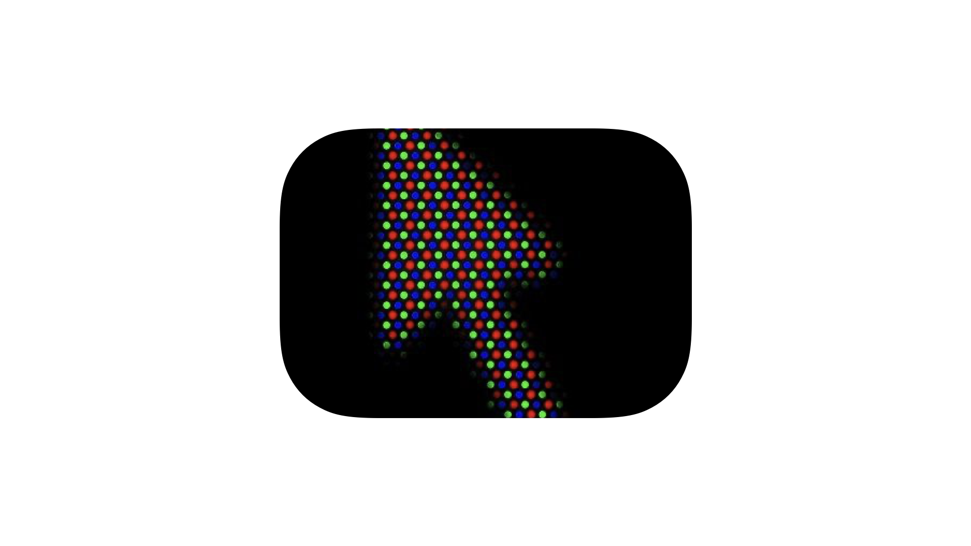
Then, there’s slot masks:
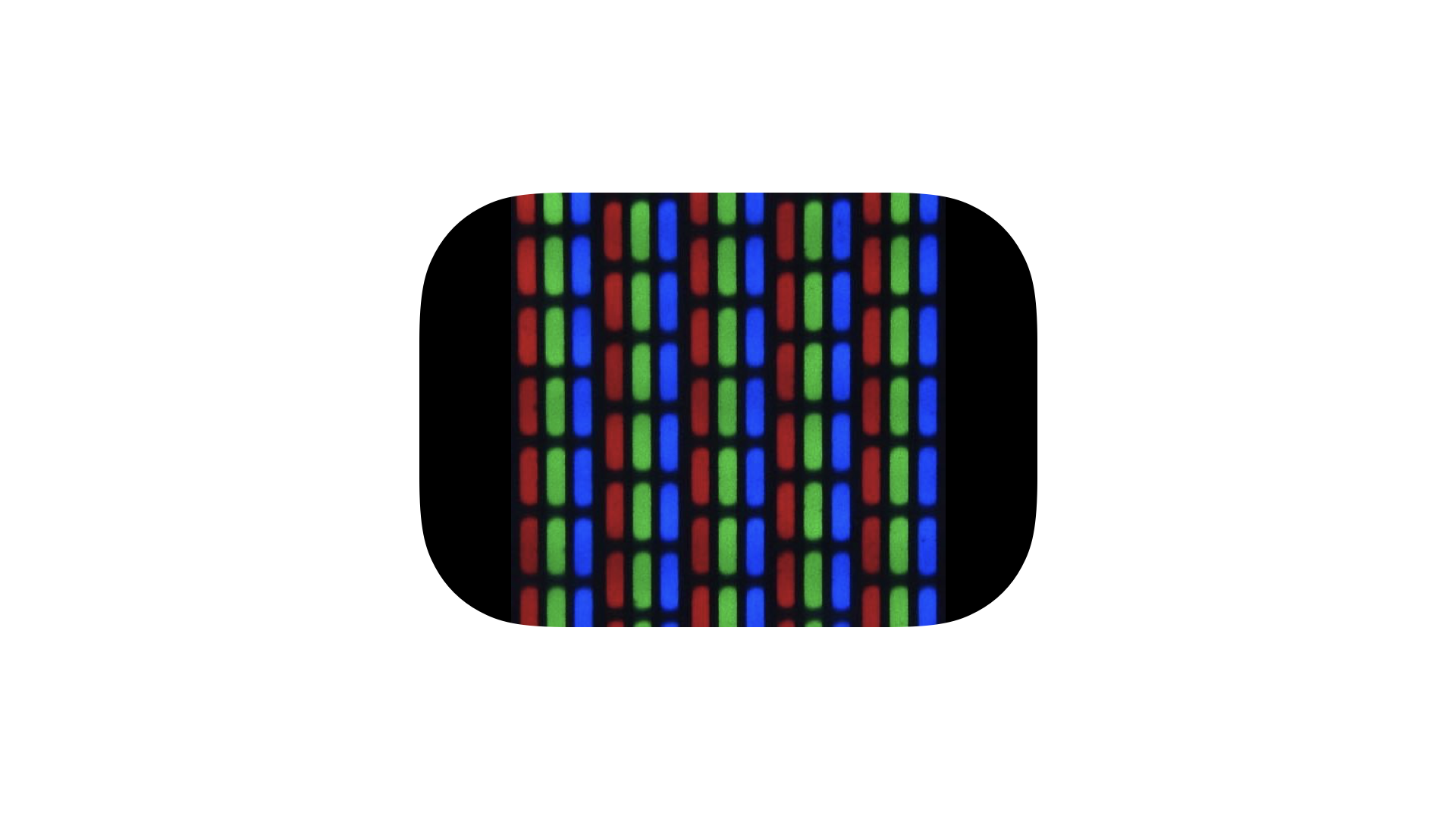
Finally, there was the pinnacle of television, Sony’s Trinitron. It provided the brightest, most vibrant colors. That was thanks to its unique makeup:
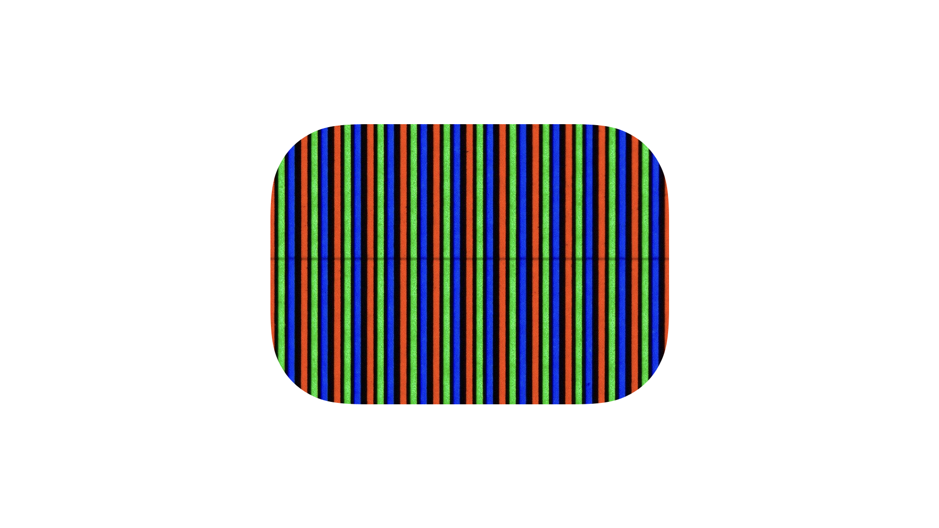
The technical name for this is “Aperture Grille.” While that sounds like a delightful diner that is catered specifically to photographers, it is a real technical term. We avoid saying Trinitron, since it’s a trademarked name.
For our authentic CRT effect, each pixel in the shader passes through a “virtual phosphor,” and then gets slightly diffused to simulate halation — the process where every phosphor kind of ‘bleeds’ into the adjacent one.
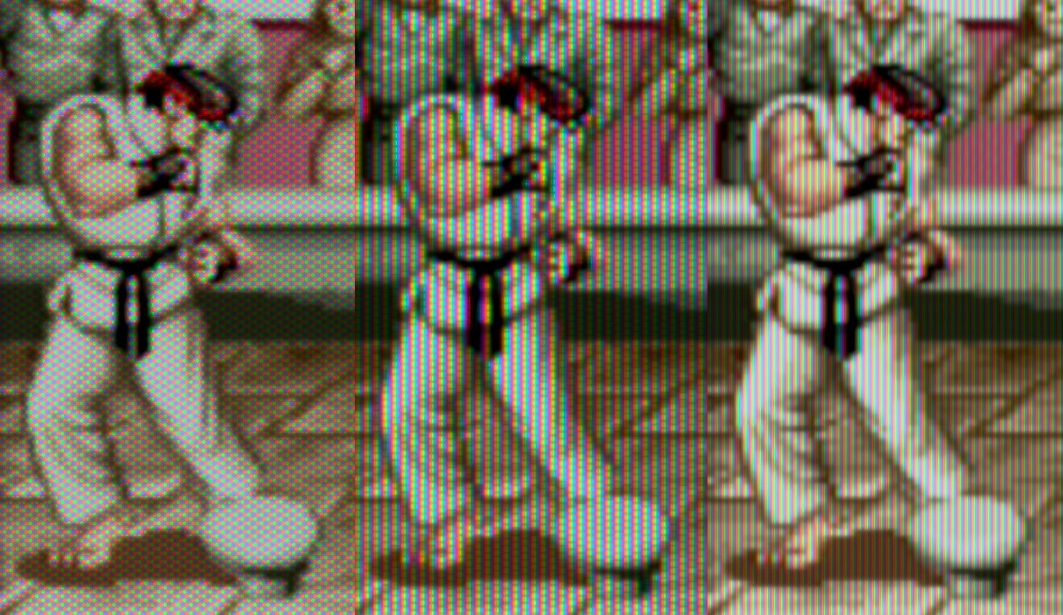
These shaders took about four days to build, which included some experiments with scan lines. We even tried drawing the whole image in two alternating phases, like a real TV would. We ultimately stopped at phosphor emulation as we found it hit a sweet spot in recapturing the feel of pixel art as originally shown. Virtual phosphors act as low-pass filter, whereas scan lines just hide pixels.
So Orion emulates a “perfect” television, one where there are zero gaps between runs of the cathode ray gun.
Or maybe we’re just telling ourselves this until we decide we like scan lines.
Typography
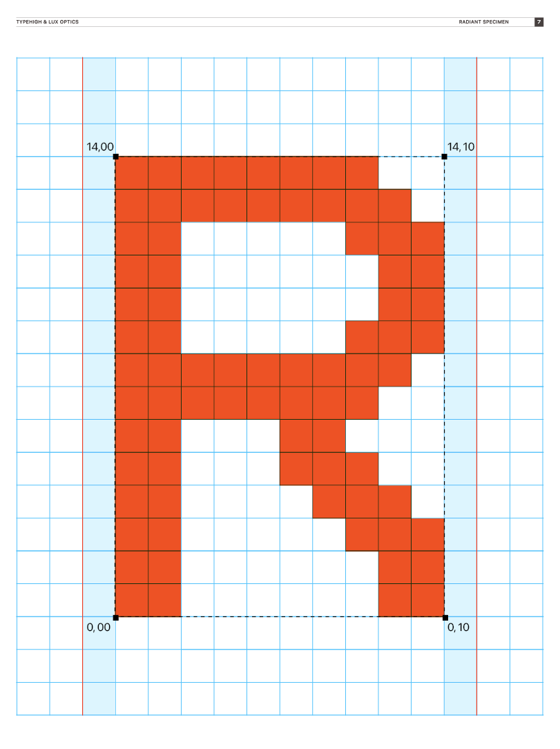
In the type department, Orion would meet the bar set by our previous apps. The manual uses an unique cut of a Dutch sans-serif by Jelmar called Azimut, and in the menus you can spot Orion’s custom pixel font, Radiant.
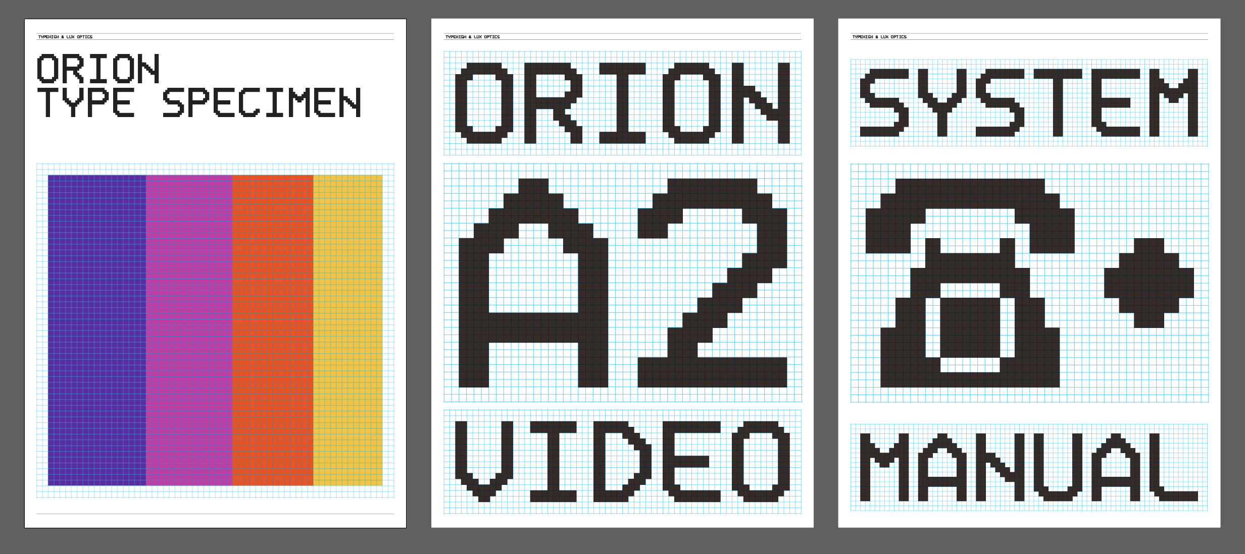
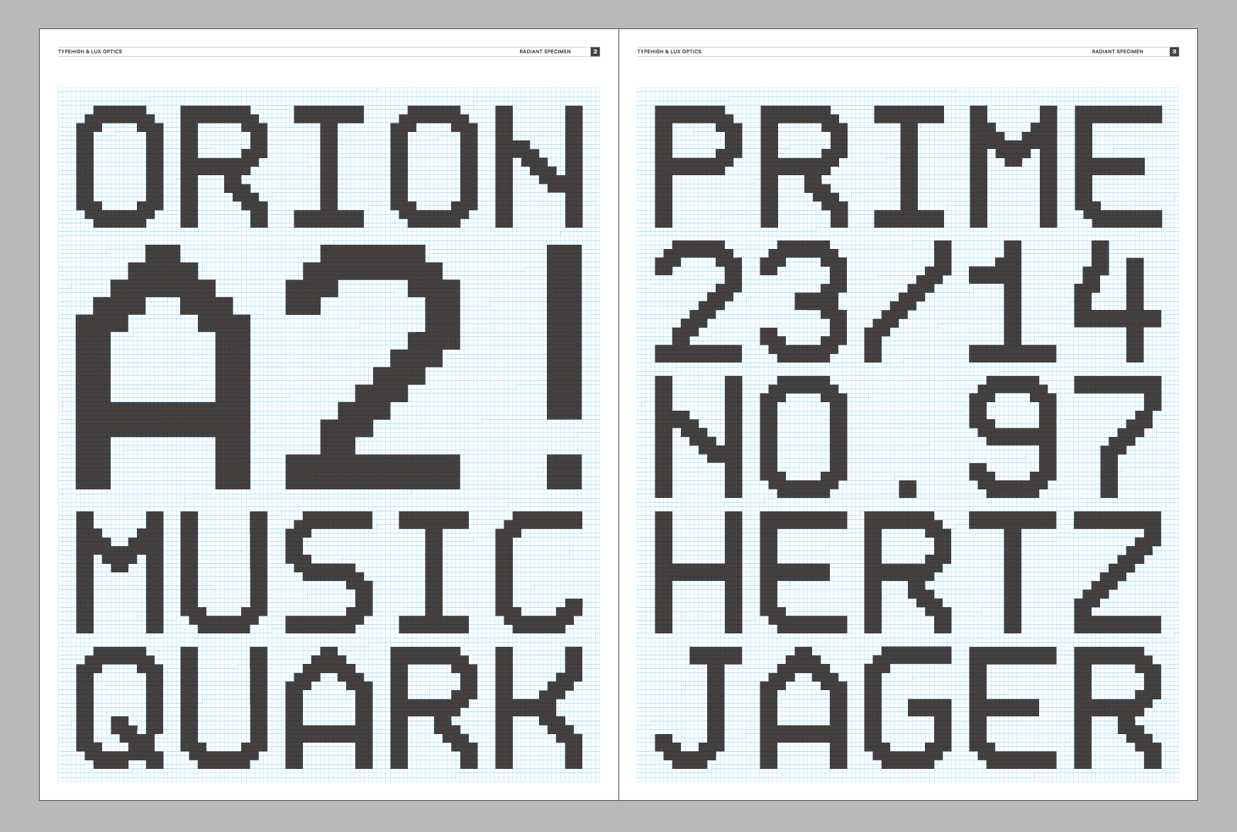
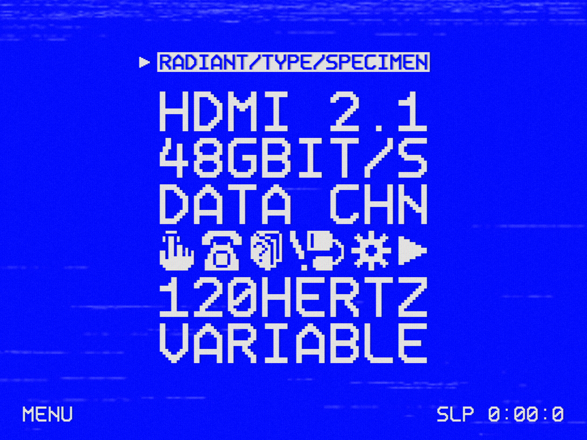
We noticed most mid-eighties VCR type followed a similar grid. Radiant is based on that raster, but mixes those proportions with the style of Ambrotype, the typefaces in Halide. It also features my delightfully clumsy pixel art icons!
We call it Radiant because we designed it together while Foundation Season 2 aired its last, excellent episodes— we loved watching the show together on long nights in between jamming on the app.
Controls
Honestly, I almost went overboard with control design. It was easy to envision a wood-paneled remote with funny plastic buttons. Perhaps the plastic would be textured, like it typically was back in the day. Gritty and dark grey. I caught myself somewhat early, because a critical part of building a fun app is finding fun that doesn’t completely harm usability.
I remember the fantastic animation in iOS 6 that shredded a pass in the Passbook (now Wallet) app with a long, amazing animation. It was super whimsical, fun, and gorgeous – but deleting more than 1 pass was a real slow slog.
The happy medium is a set of controls that feels and looks very tactile, yet not completely out of place on a modern iPadOS interface.
We probably said ‘no’ to hundreds of unhinged but fun ideas, and threw away so much delicious eye candy, just to keep things practical and grounded. In the end, it’s still plenty fun.
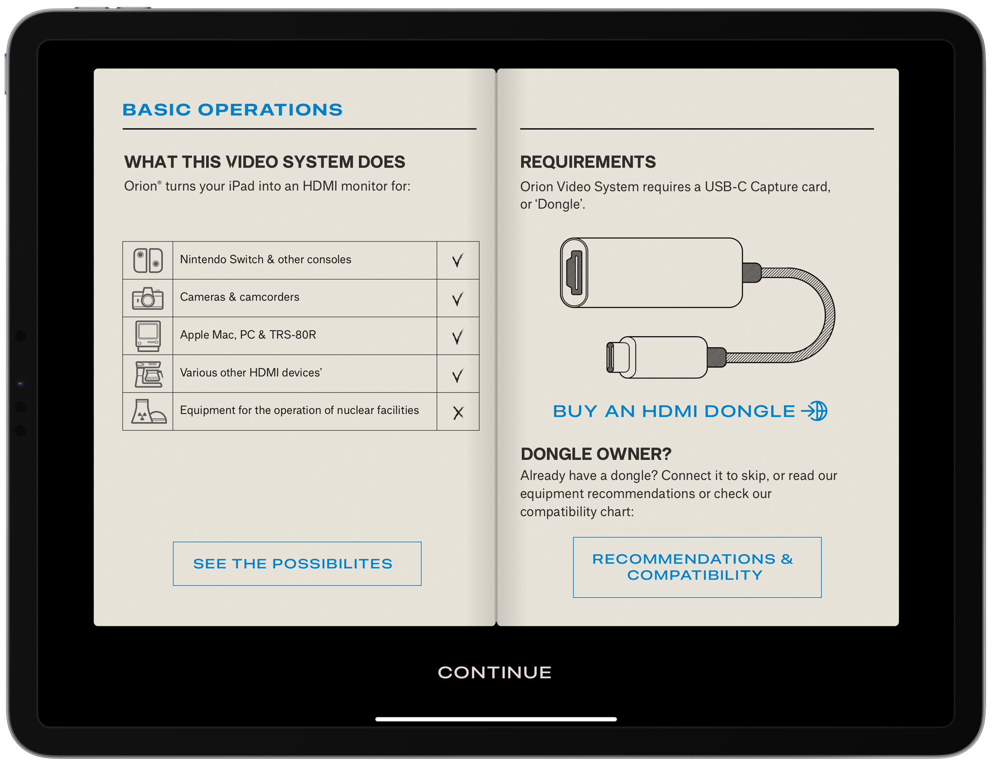
At the same time, fun helps keep things during the boring jobs, like explaining hardware requirements to the user. That made us grateful for the detailed manual that opens on first launch — it’s putting the ‘fun’ in ‘functional’, because it helps show how new users how cool the app could be, even without the dongle.
On the inside of the manual, we detail what you can use Orion for, and we explain the hardware you need.
We made sure to not take ourselves too seriously here: I used Jelmar’s tiny, vintage 2-cup Douwe Egberts coffee maker as an icon for ‘Various Other HDMI devices’, for instance, and switched up the heading on the second page from ‘Already have a USB-C Capture Card?’ to the far more catchy ‘Dongle Owner?’:
I felt pretty done here. We had the manual. You could plug in at that point and use the app. Ben and Jelmar didn’t see it that way: they saw another big challenge. After the manual, how do you convince someone using Orion is worth spending $15 on a dongle?
Ben had a great idea: adding a full featured demo mode with a sample video helps anyone get a great feel for it, and we could make it a particularly campy old 80s video to really make it fit the mood.
One possible snag: bundling a long video inside the app would add to Orion’s download time, and take up needless space on your iPad. No problem: we download the demo video on-demand and discard it after viewing.
The Icon
I whipped up an Orion glyph on day 1 of the project before seeing much else. I figured it had to feel a bit retro-TV like, with a hint of space age.
This was nice enough, but my friend Louie Mantia wrangled with the curves a bit to arrive at this version:
Extremely eagle eyed longtime Lux fans might understand the visual pun in the icon here: Halide launched as our first app, and had an app icon shape hidden in the aperture of the camera:
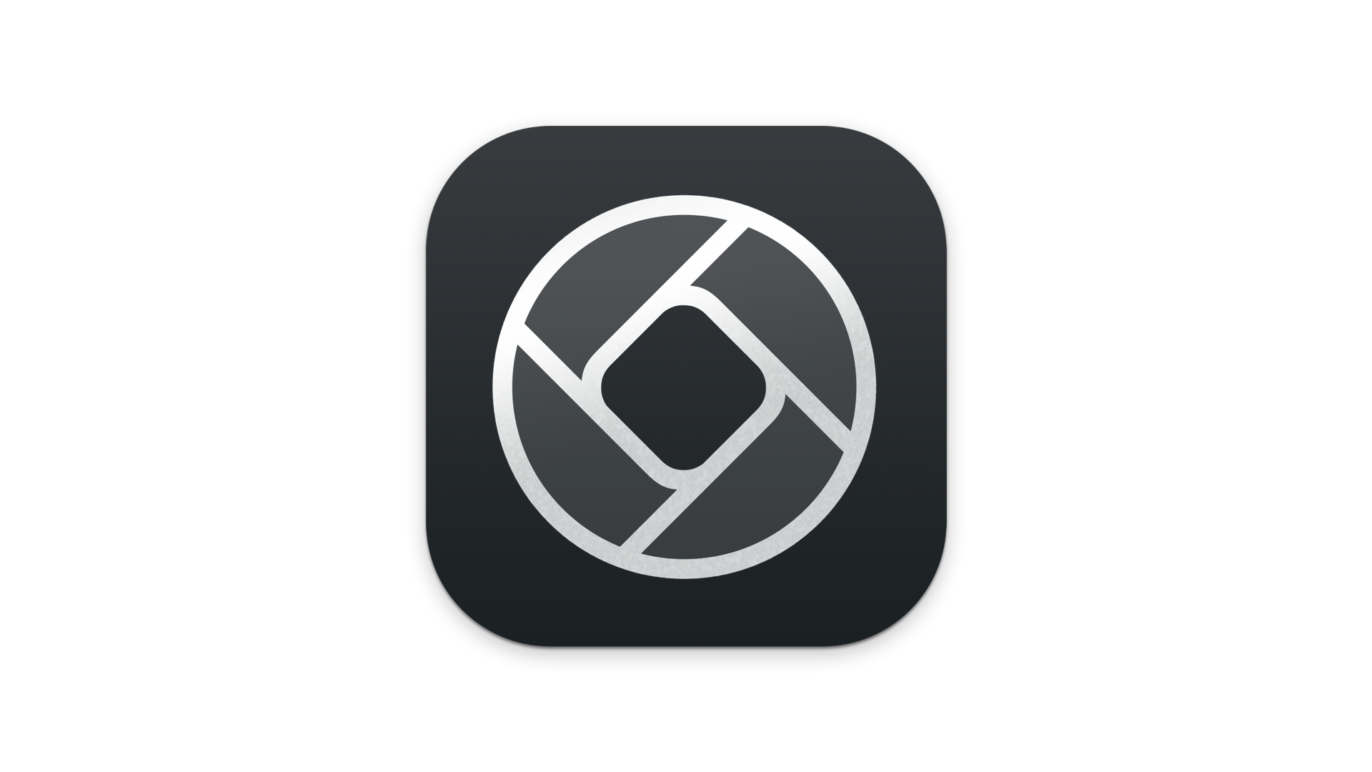
With Orion, our fourth app, it hides a similar visual joke but with a bit more layering. Perhaps our development icon can reveal it to you:
App four — four icons. Get it?
Now it was just a matter of choosing the final app icon.
Honestly, I simply chose the one that was the most fun to make: the test-image TV tube. It matched our last minute domain name choice of Orion dot tube. We still use the Orion logo throughout, though — on our website and all over the app.
The Upgrade Screen
The final challenge in the last week or so was designing an attractive upgrade screen for the Pro features. We decided to reuse some of our unused manual graphics — they were just too good — so we could pack more retro-80s graphic design into the app and inform people of the kind of cool features that we had in Orion Pro.
I really wanted to do something fun with the price label, so I made a rather too detailed, half-peeled and slightly damaged discount tag.
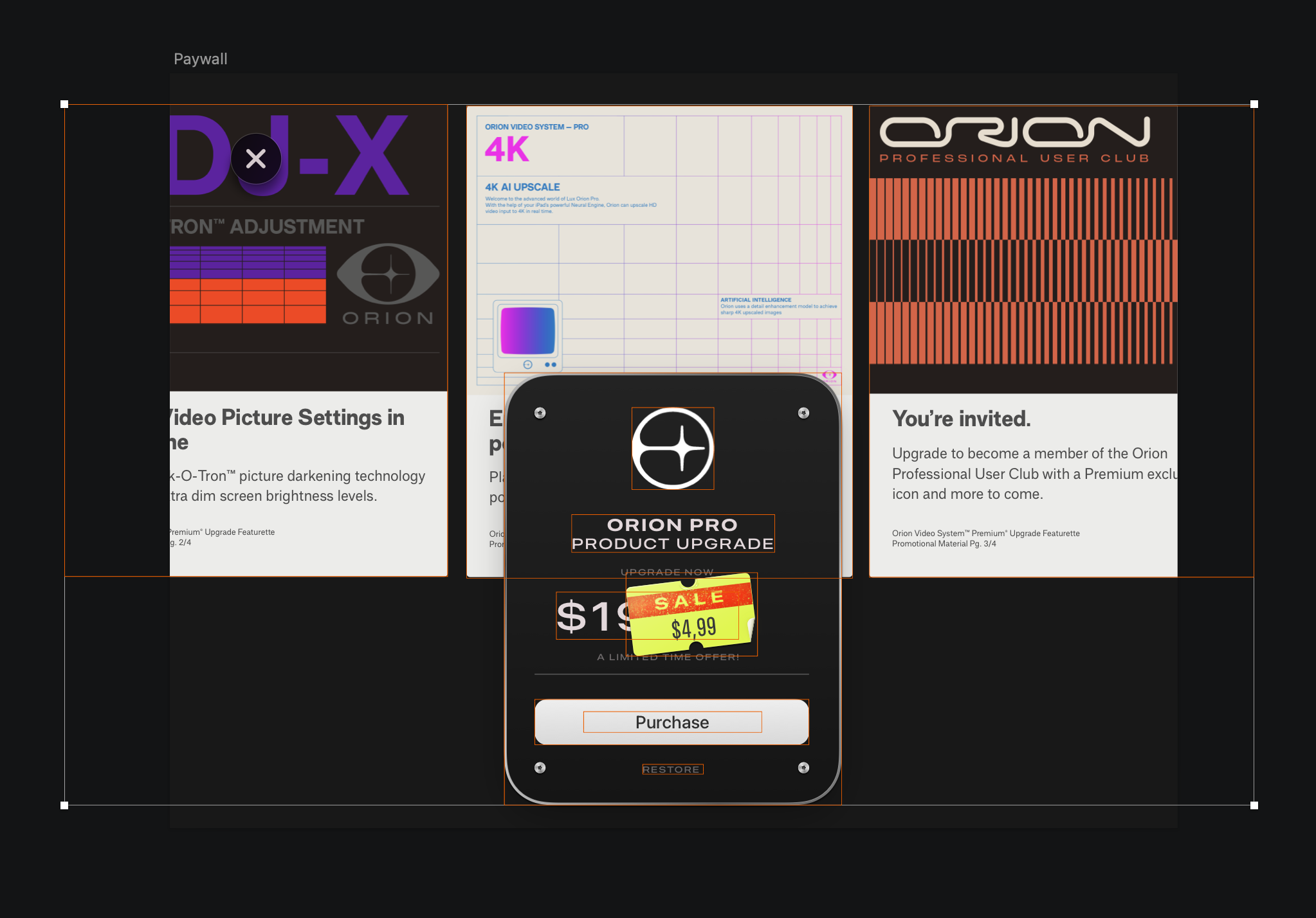
While investigating typical typefaces, I discovered Apple’s San Francisco Compressed typeface style matched great:
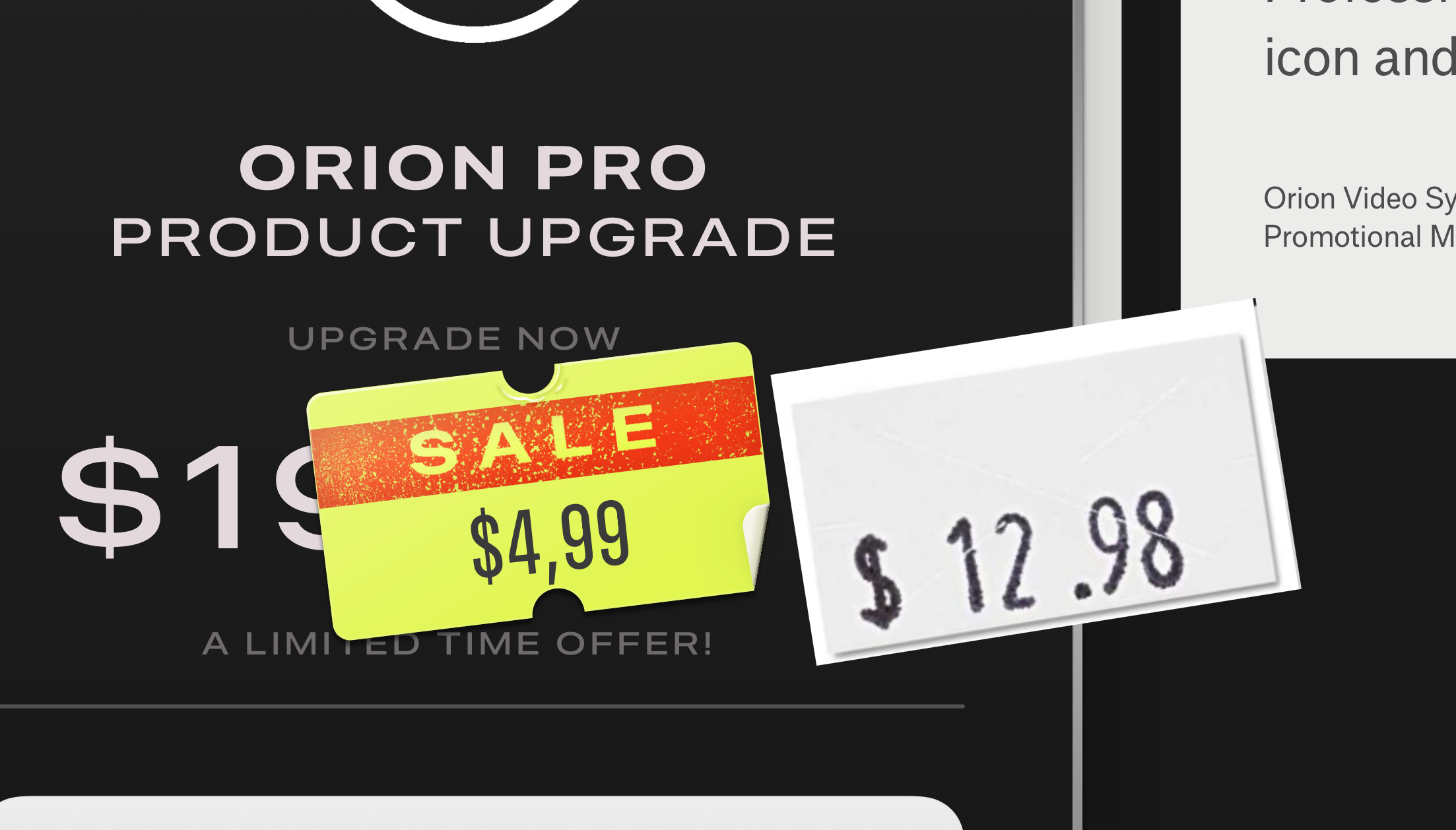
To accomplish the worn sticker effects, I used a combination of textures and brushes in Photoshop to get the material right, then created vector shapes in Sketch of the label and its small paper ‘folds’.
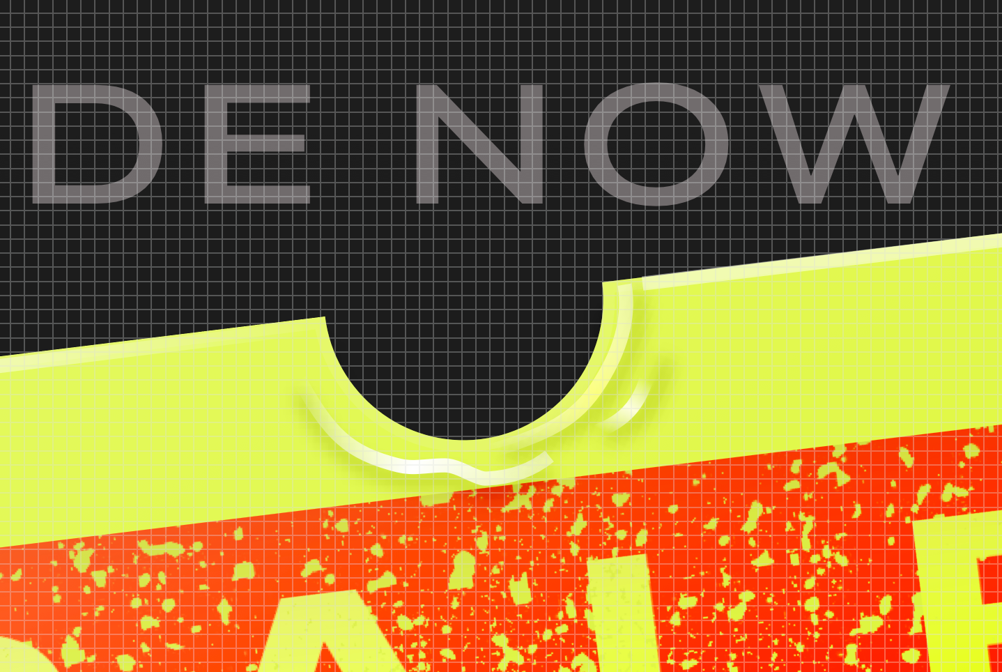
Final details and the little curl were all rendered in Sketch. We exported a blank ‘tag’ bitmap so we could dynamically render the price for localization.
Chunky Friends
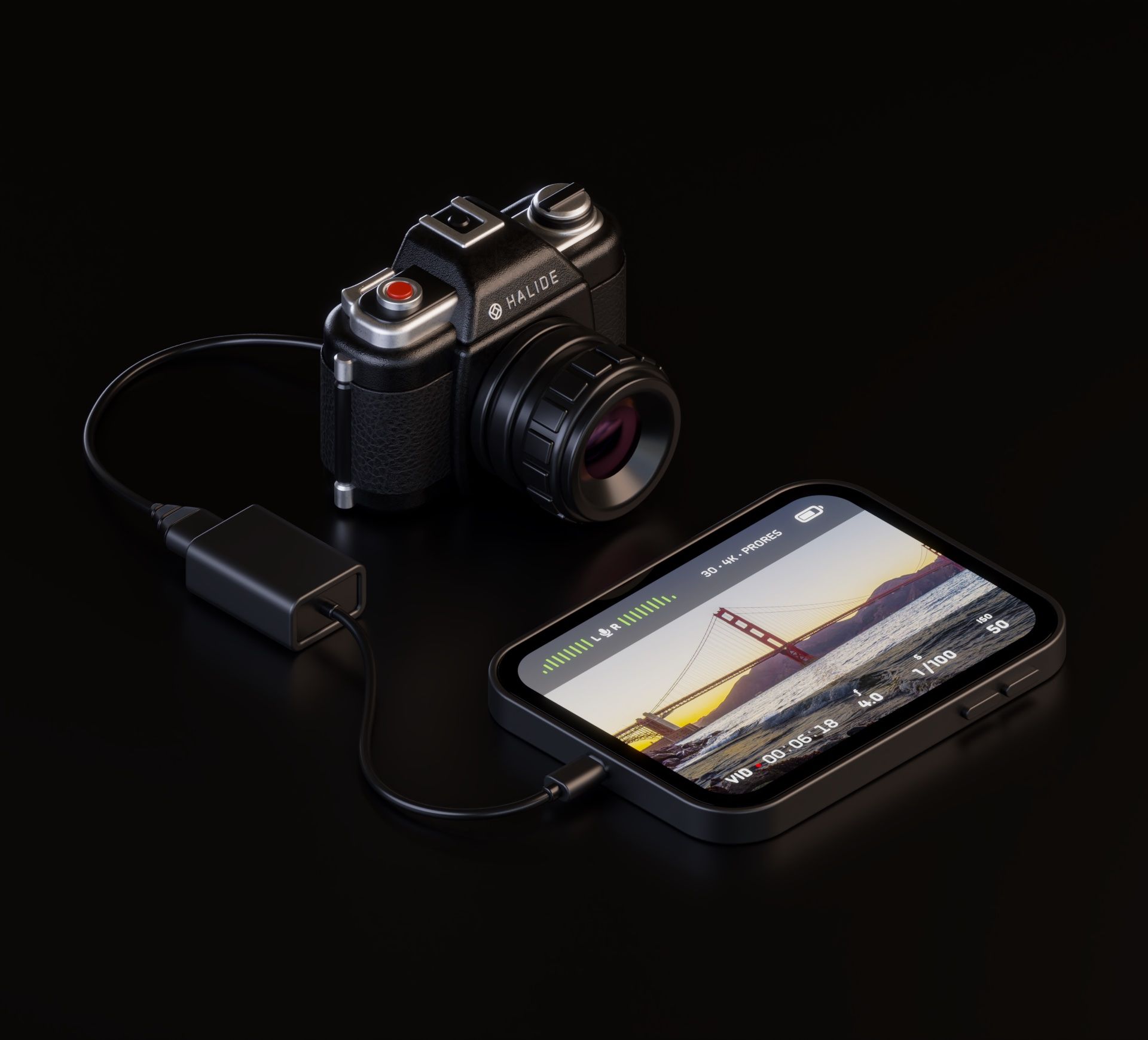
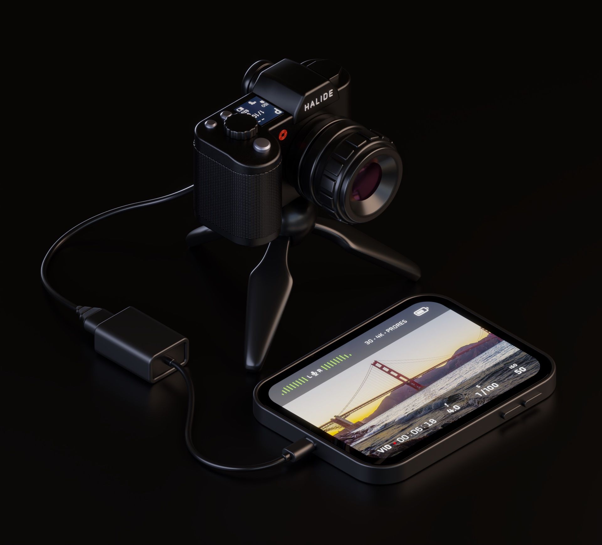
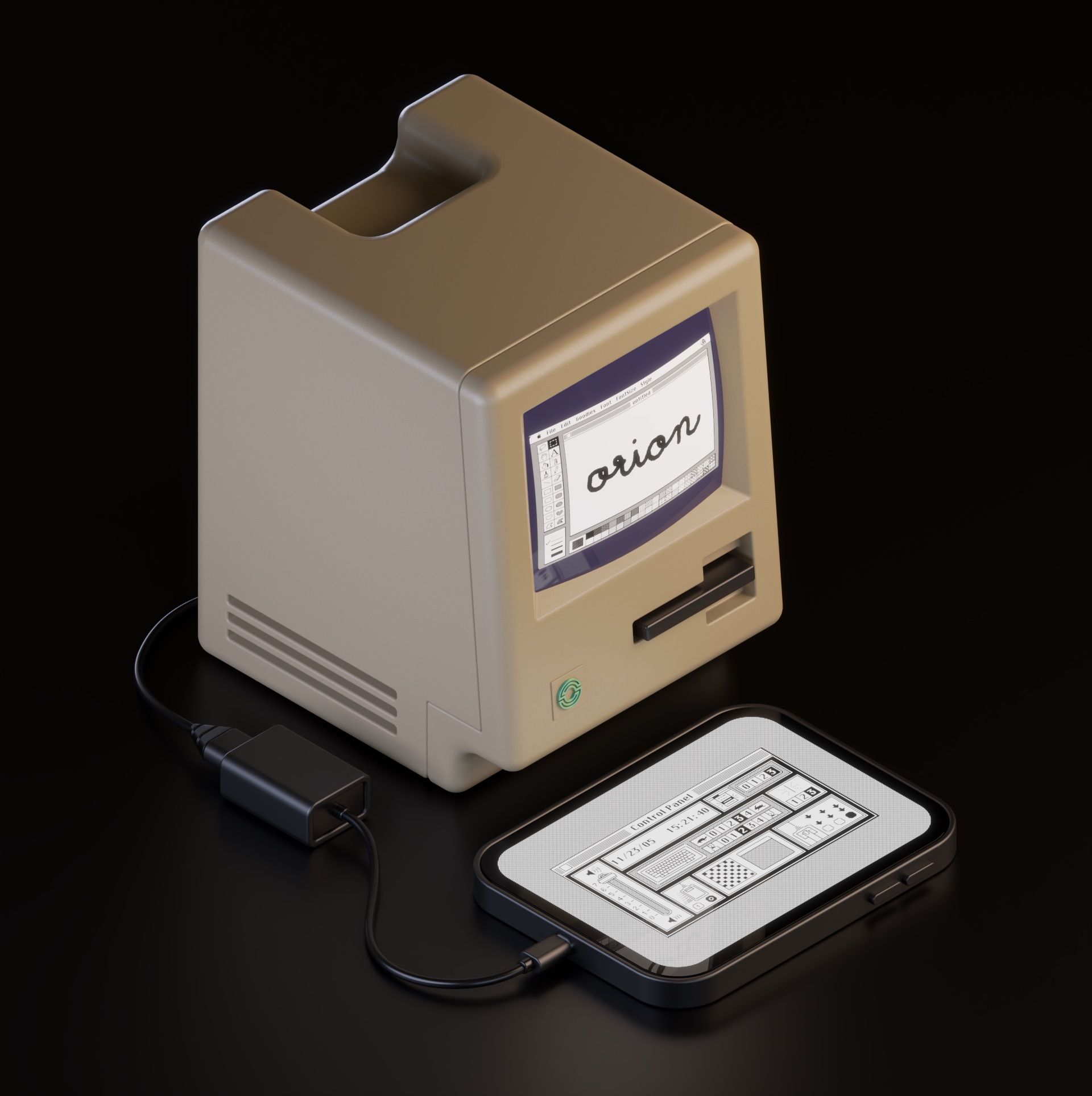
Recall Ben’s solution to users not being sold with just the manual? As we put final touches on these screens, Jelmar worked on designs outside of the app. He had already worked on a fun series of chunky renders of various movie props:
So, we figured, rather than just tell you what the app does with dry text, he jammed on these extremely cool, chunky renders showing the app in use.
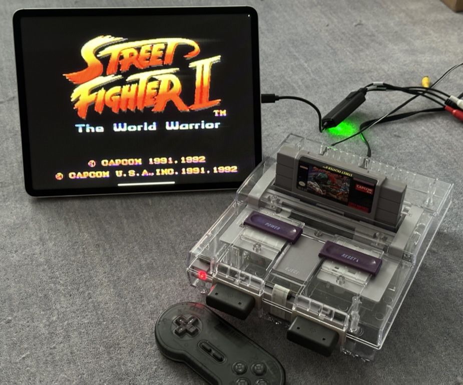
See it connected to a camera:
Or a computer:
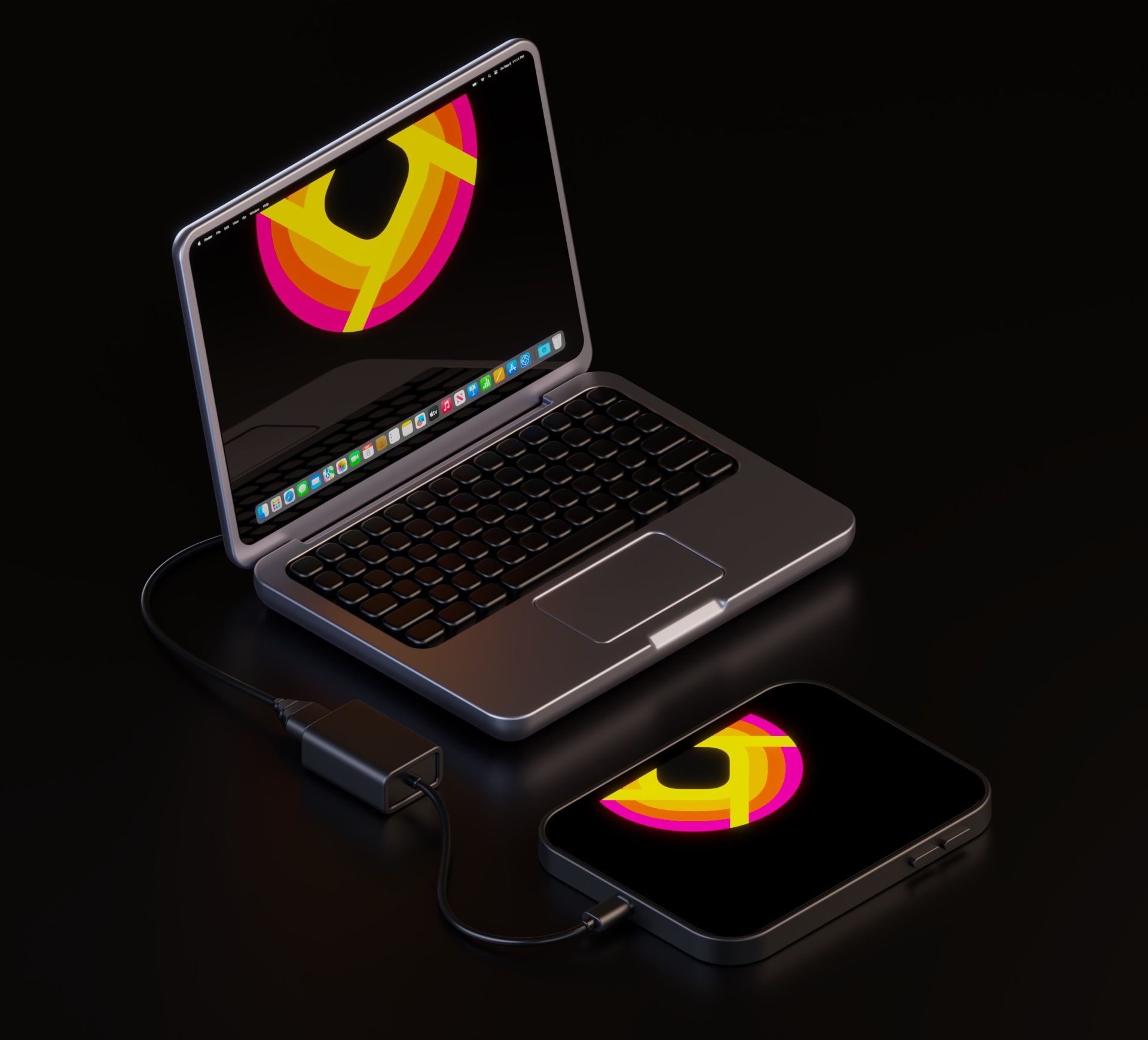
Or consoles:
We mixed things up with modern and old versions. Going fully retro with all our materials might confuse people. “Orion only supports ancient, 1982 era hardware?”
If you look closely, you might spot a few fun easter eggs in there too. Let’s just say it’s all in the Halide cinematic universe – and we’re very grateful that our friends at Panic and Campo Santo let us use imagery here from some of our favorite games in action: Untitled Goose Game and Firewatch.
What Didn’t Make It
With our deadline fast approaching, it was time to cut stuff. While it’s tempting to add features up until the last minute, at a certain point you need the discipline to say “pencils down.” The final stretch of any release should be about pixel peeping and bug hunting.
One feature that hit the cutting room floor were alternate icons — imagine a NES icon, an Xbox icon, a beige Macintosh screen, and more. I’d love suggestions if you have any, because we still want to get this into an update, and I genuinely love working on app icons.
On the marketing side, we didn’t have time to shoot a launch video. I even visited a thrift store to buy 80s clothes and enlisted some friends — one of which was committed to cutting their hair to leave only a mullet. Next time, perhaps?
What shouldn’t get lost in lamenting that which we couldn’t, is relief in what we somehow could.
I was tremendously glad that we managed to include our unboxing experience— our very last feature to get implemented. Remember me writing about it? I wanted to get a last few changes in: notably, I wanted the edges to be somewhat irregularly ‘torn off’, so I had to dust off my old Photoshop dual brush skills to create nice, ragged fibrous edges on the bitmap mask.
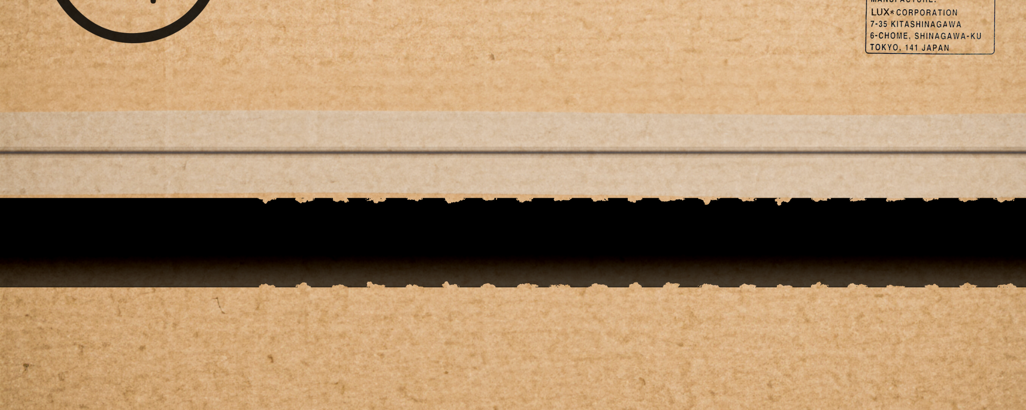
This detail in the app is my personal favorite, and I was beyond honored that Cabel Sasser was willing to write a bit of beautiful intro music to set the tone perfectly once you finish pulling that cardboard strip.
It’s a playful nod to tech unboxing videos, and I secretly still hope someone makes a dedicated unboxing video for our quirky app — though some videos already show it off beautifully, like this great one from Jackson Hayes.
Another nice ‘unboxing’ clip is from Bytereview’s Orion review.
Launching Orion
As Ben focused on last minute scrubbing for bugs and prepping for submission, I spent the night before launch assembling our Orion site.
That was, fortunately, easy even for this self-admitted web-challenged designer. I managed to create a pretty decent page in Framer in just one very long night in a very uncomfortable wooden chair in a farmhouse. And with that, we were all set for a launch.
On Wednesday — two days after iPadOS 17 came out, and just two days before new iPhone 15s would hit stores and arrive at people’s doorsteps, we sent out notice to press and flipped the switch.
Introducing Orion: A display that can go with you anywhere.
Turn your iPad into an HDMI monitor for cameras, consoles and more.
Available now — for free. https://t.co/ND9AS2aiqz pic.twitter.com/PByx5vq2zl
— Halide (@halidecamera) September 20, 2023
Much like Halide’s first version, before we launched, barely anyone tried it besides ourselves. You really never know with a project like this if it will be well received or not. We wondered if we struck the right balance between inside joke and functional product.
And… people actually got it. Financially, it exceeded our (admittedly very low) expectations, but most importantly, it seems to have put a smile on many people’s faces.
Money was never and has never been our metric of success. When you get hundreds to thousands of messages from people geeking out on our weird, quirky details, those late nights fretting over little details instantly became even more worth it.
We’re so glad you love Orion. It really was our pleasure.


+ There are no comments
Add yours