Connect with us
DAPA Banner
DAPA Coin
DAPA
COIN PAYMENT ASSET
PRIVACY · BLOCKDAG · HOMOMORPHIC ENCRYPTION · RUST
ElGamal Encrypted MINE DAPA
🚫 GENESIS SOLD OUT
DAPAPAY COMING

Tech

This startup will pay you $800 to yell at AI all day

Published

on


As Boston Dynamics demonstrated years ago, “bullying” technology designed to mimic intelligent behaviors is nothing new. Memvid is now offering $800 to someone interested in putting modern AI models to the test – a “professional” yeller tasked with spending an entire day stressing popular chatbots.
Read Entire Article
Source link

Continue Reading
Click to comment

You must be logged in to post a comment Login

Leave a Reply

Tech

Build an Electric Turbofan Model That Reverses Thrust With a Simple 3D Printer

Published

on

3D-Printed Electric Turbofan Model
CADLY poured months of design effort into creating an electric turbofan model that anyone can produce at home. Files sit ready for download from the maker’s own site or the Printables page, and a standard 3D printer handles every major piece. The finished unit draws direct inspiration from the CFM56 engines found on Airbus A320 airliners, yet it runs on basic electronics and a small motor instead of jet fuel.


Every major section is printed in five bolted segments for easy handling. Builders slice the pieces using normal software and run the job on a machine like a Bambu Lab X1C, which completes the entire set in about 37 hours. In a few places, the walls are just two or three millimeters thick, but the design remains solid after the screws and nuts are tightened. A short length of filament even serves as a fine active clearing system surrounding the low-pressure turbine, preventing the spinning elements from rubbing.

Sale


Bambu Lab A1 Combo, A1 3D Printer and AMS lite, Support Multi-Color 3D Printing, High Speed & Precision…
  • High-Speed Precision: Experience unparalleled speed and precision with the Bambu Lab A1 3D Printer. With an impressive acceleration of 10,000 mm/s…
  • Multi-Color Printing with AMS lite: Unlock your creativity with vibrant and multi-colored 3D prints. The Bambu Lab A1 3D printers make multi-color…
  • Full-Auto Calibration: Say goodbye to manual calibration hassles. The A1 3D printer takes care of all the calibration processes automatically…

3D-Printed Electric Turbofan Model
The model features a big front fan, various compressor stages, and turbine wheels that all rotate around a single central shaft. Bearings and an adjustable screw allow owners to dial out any shaft play, ensuring that the blades spin neatly without hitting the housing. The bypass duct contains four rotating doors that operate as thrust reversers. When the doors swing outward, they steer airflow forward, just like full-size engines do during landing.

3D-Printed Electric Turbofan Model
Openable cowlings cover the exterior and swing on self-locking hinges. Small magnets implanted in the edges clamp the panels close in exact alignment, preventing gaps from forming. Lifting the C-ducts reveals the whole core, providing a clean view right through the engine. Electronics transform the printed shell into a functioning machine. An Arduino Nano controls the show, while a 70-revolution-per-minute motor runs the fan at a steady rate suitable for display. The thrust reverser doors are operated by four SG90 micro servos, each installed in a custom housing and joined by a printed arm. A potentiometer installed on the accompanying stand provides instant control over the fan speed. Power is routed from a 12-volt supply via an L298N driver, but a separate buck converter keeps five volts constant for the servos and board when early tests revealed that the driver alone could not manage the entire load.

3D-Printed Electric Turbofan Model
Wiring runs neatly through gaps in the ducts and is kept tidy with zip ties and wrap. Before anything else rotates, the Arduino code performs a short startup function that moves the doors to a safe closed state. Builders who use the provided circuit diagram and print profile table have a few surprises during final hookup. Assembly begins with the core shaft and bearings, then progresses to the fan and compressor. The servos are next to slide in, followed by the outer cowlings and the stand. The entire unit is mounted on a two-piece transportation stand that also serves as a display base, with the control panel integrated right in. Once turned on, the fan spins smoothly and the doors pivot open and closed on command, demonstrating how reverse thrust works in real time.

Advertisement

Source link

Continue Reading

Tech

Amazon turns its logistics empire into a new business, taking on UPS and FedEx in freight and shipping

Published

on

Amazon is opening its logistics network to outside businesses through a new offering called Amazon Supply Chain Services. (Amazon Photo)

Amazon launched a new business that opens its entire logistics network to outside companies — sending shares of UPS and FedEx tumbling and marking the latest example of the tech giant under CEO Andy Jassy turning its internal capabilities into products and services for sale.

Amazon Supply Chain Services, announced Monday morning, brings together the company’s freight, distribution, fulfillment, and parcel shipping operations into a single offering available to any business, regardless of whether they sell on Amazon’s marketplace.

Initial customers include Procter & Gamble, which is using Amazon’s freight network to transport raw materials; 3M, which is using it to move products to distribution centers; Lands’ End, which is fulfilling orders across sales channels from Amazon’s warehouses; and American Eagle Outfitters, which is using Amazon’s parcel service for last-mile delivery.

The service can fulfill orders placed through platforms that compete with Amazon’s own marketplace, including Walmart, Shopify, TikTok, and others. 

Shares of UPS dropped nearly 10% and FedEx fell more than 9% in trading early Monday. Amazon’s stock rose slightly. Amazon had already surpassed both carriers to become the nation’s largest parcel shipper by volume, according to parcel-analytics firm ShipMatrix.

Advertisement

Peter Larsen, vice president of Amazon Supply Chain Services, compared the launch to the origins of Amazon’s cloud business. Larsen, an 18-year Amazon veteran who previously led internal transportation and delivery technology operations, said Amazon is bringing its supply chain to outside businesses “much like Amazon Web Services did for cloud computing.” 

In addition to putting Amazon in competition with existing players in the logistics industry, the move also raises questions about data privacy. Amazon has faced accusations of using nonpublic seller data to compete against merchants on its marketplace, which it has denied. 

Larsen told the Wall Street Journal that the company prohibits using supply chain customer data for its own marketplace decisions, noting that hundreds of thousands of Amazon sellers already trust the company to fulfill orders placed on rival platforms. 

The launch follows a recent pattern of Amazon reviving its tradition of turning internal capabilities into external businesses. 

Advertisement

In shipping, the company is not exactly starting from scratch: Amazon’s logistics network includes more than 200 fulfillment centers in the U.S., more than 80,000 trailers, 24,000 intermodal containers, and 100 aircraft. The company says it delivers 13 billion items annually. 

Amazon did not disclose specific pricing for the new Amazon Supply Chain Services, saying costs will vary based on the services businesses use.

Source link

Continue Reading

Tech

Apple may hand Intel a slice of its chip business in a major supply chain shift

Published

on


The scale of Apple’s hardware business makes even a limited manufacturing shift significant. The company sells more than 200 million iPhones each year, along with large volumes of Macs and iPads. Apple and Intel both declined to comment.
Read Entire Article
Source link

Continue Reading

Tech

LGBTQ+ Youth Mental Health Is Suffering, but Schools Are Poised to Help

Published

on

Bullying. Isolation. Stress.

Everyone experiences these on the journey from adolescence to adulthood, but new data on the mental health of LGBTQ+ youth shows the additional pressures they face increases their risk of suicide compared to their peers.

The Trevor Project, a nonprofit focused on suicide prevention for LGBTQ+ youth, has released its most recent survey of 16,000 LGBTQ+ young people 13 to 24. Among the most concerning figures was one in 10 participants reporting that they had attempted suicide during the previous year. And more than one-third seriously considered suicide.

Experts also tell EdSurge that the strain of mental health issues and unwelcoming school settings directly harm students’ ability to thrive in, or even attend, their classes.

Advertisement

Despite the sobering results of the survey, the data also reveals solutions — including a role for schools.

“One of the most important findings is that when adults, institutions, and communities become more affirming, the suicide risk of LGBTQ+ young people goes down,” Ronita Nath, the Trevor Project’s vice president of research, says. “Schools play a life-saving support by creating environments where LGBTQ+ young people feel safe, accepted and supported.”

Feeling the Pressure

With 2026 on track to be another record-breaking year for anti-LGBTQ+ bills introduced at the state and federal levels, a vast majority of survey respondents said they felt stressed, anxious or unsafe due to the policies and the debates surrounding them.

When those young people are caught in the crossfire of heated political debates, Nath says the negative rhetoric that trickles down has real consequences. Youth who reported experiencing victimization due to their gender identity or sexual orientation — like bullying, physical harm or exposure to conversion therapy — were three times as likely to attempt suicide as their peers.

Advertisement

Those risks dropped among survey participants who said their school affirmed their identity. Support can look like adopting curriculum that counters anti-LGBTQ+ bias and increasing access to mental health services.

Forty-four percent of survey participants said they couldn’t access the mental health services they needed. Some of the barriers to those services were tangible, like not being able to afford transportation to see a counselor. But many were not: they cited fear of their mental health problems not being taken seriously, not being understood by a mental healthcare provider, or past negative experiences that made young people hesitant to seek services again.

Nath encouraged schools to offer gender and sexuality alliances (GSAs), ensure anti-harassment policies were in place and provide professional development for educators to help ease students’ discomfort. “We know [that] not only improves mental health and well-being for LGBTQ+ youth, but for all their peers,” she says.

Strain on School Success

Research shows that well-being, engagement and a sense of belonging go hand-in-hand with students’ ability to thrive in school, according to Megan Pacheco, executive director of Challenge Success. The group is a nonprofit focused on increasing student well-being, engagement and belonging that’s based in Stanford’s Graduate School of Education.

Advertisement

The stress that gender-diverse students — including transgender, non-binary and gender-queer youth — experience can become an obstacle to their academic success. If they feel their identity is threatened or lack a sense of belonging, Pacheco says, they’re less likely to reach out for help.

“It’s going to affect their participation, how they show up in the classroom, and it’s going to affect their well-being,” she says.

Challenge Success’ large trove of survey data on the school experiences of middle and high school students reveals that students who identify as transgender, non-binary or gender diverse report more stress than their peers who identify as boys and girls, says Sarah Miles, director of research for Challenge Success.

“Instead of two or three sources of stress — family pressure, or peer relationships, or social media — it is just all the above,” Miles says. “In order to be able to function, use your working memory, be present, be engaged … if you have all those things on board that you’re worrying about, you’re just not able to attend to school in the same way.”

Advertisement

Among LGBTQ+ youth who are in school, about 85 percent said they had at least one adult at school who is affirming of their identity, according to the Trevor Project data. More than half of respondents said school was an affirming place, second to online spaces.

Matthew Rice, who chairs the science department at a New Jersey high school, tells EdSurge that students don’t judge safety by a school’s mission statement — they judge it by how adults respond to situations like harassing comments made in the hallway, classroom jokes, pronoun use and whether discipline is applied consistently among varying groups of students.

Rice has published research on the experiences of transgender and nonbinary educators, but the overall lessons gleaned from his work apply to students as well.

“Students notice who is allowed to exist authentically in schools,” Rice said via email. “Representation is not symbolic: It changes students’ perception of what futures are possible and who belongs in intellectual spaces. For many students, the first openly LGBTQ+ adult they meet is an adult at school.”

Advertisement

When it comes to supporting gender-diverse students, Miles of Challenge Success says she wants to dispel the belief that helping them thrive is a zero-sum game.

“I think there’s sometimes a misconception that if we give these students support, then other students aren’t getting support,” she says. “What’s really important is that, by giving students who identify as gender diverse support, everyone benefits, because all students then feel safe to show up — whatever their identities.”

Source link

Advertisement
Continue Reading

Tech

I Tested Google’s Biggest Pixel 10A Rival and It’s a Colorful Bargain

Published

on

I gave last year’s Nothing Phone 3A Pro a coveted CNET Editors’ Choice Award, so the Nothing Phone 4A Pro had some really big shoes to fill. It makes some dramatic changes to the design, but the new phone packs in a hell of a lot to maintain its predecessor’s reputation. From its solid performance to its well-rounded camera setup, it ticks all the boxes you’d want from an everyday Android phone — and sprinkles in some fun extras like its quirky Glyph Matrix display on the back. 

But the Nothing Phone 4A Pro has a bigger ace up its sleeve: the price. 

Advertisement
Image of a pink phone being held in the hand

8.0

Nothing Phone 4A Pro

Like


  • Affordable price

  • Attractive design

  • Great camera performance

Don’t like


  • Fewer years of software support than rivals

  • Battery life could be better

At $499 in the US and £499 in the UK, the Phone 4A Pro is unquestionably affordable, coming in at the exact same price as its main competitor, the Google Pixel 10A. While the Pixel has some points in its favor, I mostly preferred the Nothing’s camera performance and I think it’s a much more interesting phone to look at — especially with that rear display. While the Pixel 10A is a safe mid-ranger, Nothing’s phone feels a bit more like a wildcard. It certainly has more personality, and if you like the idea of having something that stands out from the crowd, it’s definitely the one to go for. 

Here’s what you need to know about this affordable Android phone.

Nothing Phone 4A Pro: Pink design with Glyph Matrix

I’ll be honest: One of my favorite things about the phone is its pink color. Yes, that makes me extremely shallow, but I’m honestly fine with that. I love pink gadgets. I managed to turn my cosmic orange iPhone 17 Pro pink with chemicals, and I had a custom pink wrap put on my expensive Leica Q3 43. It’s a subtle pink, rather than hot pink like the old Motorola Razr V3, but it’s a fun color that doesn’t take itself too seriously — and that’s refreshing. Would I like to see the next model go eye-meltingly magenta? Absolutely.

Advertisement

So many of today’s phones come in dreary shades of black, silver or gray, so I genuinely appreciate when a brand injects a bit more personality into the mix. That said, Nothing has made some significant design changes here over its predecessor. The company is known for its see-through plastic-back phones that show some of the components underneath, along with its “Glyph” LED light patterns. I loved that look on the 3A Pro and the Nothing Phone 1 and 2 before it.

Image of a pink phone being held in the hand

The Glyph Matrix is arguably a bit of a gimmick.

Andrew Lanxon/CNET

There is still an element of that here, but it’s been gathered up and squashed into the camera bar, with roughly 70% of the phone now being a plain expanse of aluminum. The aluminum feels premium to hold, especially considering the price, but cover up the camera bar and you could be looking at basically any other phone. The bar itself looks interesting, with visible screw heads helping to maintain that industrial feel. It’s also where you’ll find the three camera lenses and the Glyph Matrix introduced on last year’s higher-priced $799 Nothing Phone 3.

Advertisement

The Matrix is essentially a circular dot-matrix display that can display information such as the time, battery level or incoming notifications. But Nothing has opened the Glyph up to allow developers or users to create their own tools, such as a countdown timer for an arriving Uber car. The Phone 3’s Glyph Matrix was touch sensitive, allowing it to use what Nothing called “Glyph toys,” such as spin the bottle, while the 4A Pro’s is simply a display.

I found those features somewhat gimmicky, and the new Glyph Matrix — used as a display rather than an interactive toy — loses little in terms of functionality while offering a better overall experience. I don’t think it’s a killer feature by any means, but being able to quickly glance at the clock or a timer has been quite handy throughout my testing of the device. And if nothing else, it really sets the phone apart from any others, especially from the Pixel 10A’s simple camera cutout, which I think looks exceptionally dull by comparison. 

Image of a pink phone being held in the hand

The majority of the phone is just an expanse of pink metal. I definitely think Nothing could have done more here.

Advertisement

Andrew Lanxon/CNET

The phone is IP65-rated, protecting it from spills or taking calls in the rain. That likely makes it as dust-resistant as most other phones, though it may not survive prolonged submersion in water like devices with an IP68 rating. Nothing says the company uses recycled plastics, steel, aluminum and tin in the device’s construction, giving it the lowest carbon footprint of any of its phones.

Nothing Phone 4A Pro: Processor and software

Powering the phone is a Qualcomm Snapdragon 7 Gen 4 chip along with 8GB or 12GB of RAM. I reviewed the 12GB model and found it satisfyingly swift in everyday use. Navigating around the Android interface was stutter-free, apps opened quickly and the graphically demanding game Genshin Impact played smoothly enough for casual gamers, even at high-quality settings. 

Benchmark testing puts it slightly below the Pixel 10A, but hardly by much. It’s not the most powerful phone on the market, but it’s got more than enough grunt for all your daily needs.

Nothing Phone 4A Pro performance compared

Advertisement

Nothing Phone 4A Pro 1,322 4,115 2,105Pixel 10A 1,664 3,984 2,579

  • Geekbench 6 (single core)
  • Geekbench 6 (multi-core)
  • 3DMark Wildlife Extreme
Note: Longer bars equal better performance

It runs Android 16 with Nothing’s custom skin on top, which transforms much of the interface into a stark, monochrome experience. I don’t love it, largely because the lack of color cues makes it harder for me to distinguish between app icons — an issue I also encountered with the Leica UI on the Xiaomi Leitzphone

Still, you can change the theme to a more typical interface if you also need more color, and I do like the various Nothing widgets you can install and the Private Space that allows you to hide sensitive apps and photos behind a password. 

Image of a phone's interface

Nothing’s interface turns the icons black and white, making them a bit harder to distinguish at a glance.

Advertisement

Andrew Lanxon/CNET

You’ll find Nothing’s Essential Space onboard, a productivity app the company launched on its phones last year. It’s basically a repository for screenshots and voice notes to help you make sense of your stream of consciousness throughout the day. It uses a dedicated hardware button on the side of the phone. Press and hold it to take a screenshot of whatever you’re viewing, then record a voice note to remember why it mattered — whether that’s saving important information or reminding yourself to buy something later.

I like Essential Space. It’s genuinely useful, especially for people who think of random tasks throughout the day but forget them by the time they’re actually able to do something about them. I actually set the Action button on my iPhone 16 Pro to record a voice note for these moments. But the voice memos on my iPhone are just stored in a generic list, whereas Nothing’s Essential Space actively tries to make sense of your recordings and screenshots for you by transcribing them and making them easily searchable. It’s by no means the reason to choose a Nothing phone over another device, but it’s a handy extra to play with.

Nothing is promising three years of Android updates and a total of six years of security updates for the Phone 4A Pro, meaning it should still be safe to use in 2032. I’d like to see more generous software updates (the Pixel 10A will get both software and security updates for seven years), but the security support is the main thing here, as that directly relates to the phone’s lifespan. 

Nothing Phone 4A Pro: Cameras

On the back is a trio of cameras, including a 50-megapixel main camera, a 50-megapixel telephoto camera with 3.5x optical zoom and an 8-megapixel ultrawide camera. That’s a pretty solid lineup of lenses for a budget-focused phone, and I’ve been pleasantly surprised at their performance, too. 

Advertisement

Nothing Phone 4A Pro, main camera.

Andrew Lanxon/CNET

Taken with the main camera, this shot is bright and vibrant. There’s plenty of detail, too. It’s an impressive image, particularly for a budget phone. 

Advertisement

Nothing Phone 4A Pro, ultrawide camera.

Andrew Lanxon/CNET

There’s a noticeable color shift when switching to the ultrawide lens. The blue sky is less vibrant and the green grass looks much more muted in the wider version. It’s a shame to see such significant differences between the two focal lengths, but this is common on cheaper phones.

Advertisement

Nothing Phone 4A Pro, main camera

Andrew Lanxon/CNET

It’s the same here, too: vibrant blues and rich greens when taken with the main camera.

Advertisement

Nothing Phone 4A Pro, ultrawide camera

Andrew Lanxon/CNET

The subjects of the photo are looking a bit more muted when the ultrawide comes to play. It’s not a bad image by any means, and the differences are well within what I’d expect, but it’s worth keeping in mind if you absolutely crave hyper-vibrant ultrawide shots when you’re out on your travels. 

Advertisement

Nothing Phone 4A Pro, 3.5x zoom.

Andrew Lanxon/CNET

I took this from the same standing position as the images above, but switched to the 3.5x optical zoom. It’s a great shot, with clear details and well-balanced exposure. 

Advertisement

Nothing Phone 4A Pro, 7x zoom.

Andrew Lanxon/CNET

At 7x combined optical and digital zoom some of the finer details become a bit more mushy, but it’s still a perfectly good snap for sharing with your family and friends over WhatsApp or Instagram.

Advertisement

Nothing Phone 4A Pro, main camera.

Andrew Lanxon/CNET

Pixel 10A, main camera.

Andrew Lanxon/CNET

I took some comparisons with the Pixel 10A and this shot really stood out to me. The Nothing’s image is noticeable brighter and more vivid, especially when it comes to the vivid red of the pizza shop’s awning. The Pixel’s shot is arguably more natural and balanced, which could make it a better base for further editing, but I’m not sure that’s especially important on budget phones like these. I’m more keen to see punchy images that are ready to share straight out of camera — and the Nothing takes the win here. 

Nothing Phone 4A Pro, main camera.

Andrew Lanxon/CNET

nothing-phone-4a-pro-pixel-comparison-2

Pixel 10A, main camera

Advertisement

Andrew Lanxon/CNET

It’s the same story here, with the Nothing Phone 4A Pro producing a much more vibrant shot than the Pixel’s.

nothing-phone-4a-pro-comparison-1

Nothing Phone 4A Pro, main camera.

Andrew Lanxon/CNET

Advertisement
nothing-phone-4a-pro-pixel-comparison-1

Pixel 10A, main camera.

Andrew Lanxon/CNET

I do prefer the Pixel’s effort in this scene, however. The green ivy looks much more natural and emerald in its shot, while the Nothing’s warmer tones have made the leaves more of a yellowy-green. It really comes down to personal preference though: If you want big, punchy colors, then go with Nothing. If you prefer natural tones with realistic saturation, the Pixel is for you.

Nothing Phone 4A Pro: Battery and charging

The phone packs a 5,080-mAh battery, which the company claims will give you 17 hours of mixed use. That’ll really depend on how demanding you are of your phone. On our streaming rundown test, it dropped almost 10% after its first hour and was down to only 73% after the third hour. That’s well below average — and below what the Pixel 10A achieved during the same test. 

It is a very intense test, however, and not really representative of how you’d use your phone throughout an average day. Keep things more sensible and you shouldn’t struggle too much to get a day out of it. Keeping the screen brightness down will help, and you’ll probably want to avoid streaming hours of YouTube videos unless you’re within dashing distance of a power outlet. It has 50-watt wired charging to get the power back in quickly, though you’ll need to provide your own compatible fast charger. 

Advertisement
Image of a pink phone being held in the hand

The camera bar with the Glyph stands out a little.

Andrew Lanxon/CNET

Nothing Phone 4A Pro: Should you buy it?

The Nothing Phone 4A is a rare example of a phone that comes with an affordable price and doesn’t demand you make too many sacrifices as a result. Sure, it’s not the most powerful phone around, but it’ll cope admirably with almost any of your daily essentials, while its cameras put in a great show, delivering vibrant, sharp images from all of its rear lenses. 

I even like the quirky design — especially that pink color — and the seven years of security support is a welcome touch at this price. It doesn’t quite match the Pixel 10A’s processing power and battery life, but it’s not far off, and I think it exceeds Google’s phone in camera quality and design. Neither phone has the best cameras around; you’ll need to look toward the Xiaomi Leitzphone for that but it’ll literally cost you at least three times as much.

Advertisement

For its price, the Nothing Phone 4A Pro packs in everything you’d expect from an everyday phone and is well worth considering if you want a new Android handset that won’t break the bank.

Source link

Advertisement
Continue Reading

Tech

Intruder launches AI pentesting agents as GCHQ-backed startup automates $50K manual security tests

Published

on

TL;DR

Intruder, a GCHQ-accelerated UK cybersecurity startup, launched AI pentesting agents that replicate manual pen testing methodology in minutes. The broader market is racing to automate vulnerability discovery as AI compresses the gap between offence and defence.


Advertisement

A manual penetration test costs between 10,000 and 50,000 dollars. It takes weeks to schedule, days to execute, and produces a report that is out of date before the ink dries. Intruder, a London-based cybersecurity company that graduated from GCHQ’s Cyber Accelerator, has launched AI pentesting agents that replicate the methodology of a human pen tester and deliver results in minutes.

The company’s chief executive, Chris Wallis, will present the technology at KnowBe4’s KB4-CON conference on 13 May. The pitch is simple: the depth of a manual pentest, available on demand, at a fraction of the cost.

The timing is not accidental. The cybersecurity industry is watching AI transform the attack side of the equation faster than the defence side can adapt. Anthropic’s Claude Mythos Preview found thousands of zero-day vulnerabilities across every major operating system and browser in a single evaluation pass.

xBow, an autonomous pentesting startup, reached unicorn status in March 2026 after raising 120 million dollars. The question is no longer whether AI will replace human pen testers. It is whether the replacement will happen fast enough to close the gap between the vulnerabilities AI can find and the speed at which organisations can fix them.

The product

Intruder’s AI pentesting agents work by investigating vulnerability scanner findings using the same methods a human pen tester would employ. When the scanner flags a potential issue, the AI agent interacts directly with the target system, sending requests, analysing responses, and probing for exposed data to determine whether the finding represents a genuine exploitable flaw or a false positive. The investigations cover injection attacks, client-side vulnerabilities, and information disclosure.

Advertisement

The distinction between a vulnerability scanner and a pen test has historically been the difference between flagging a potential problem and proving it can be exploited. Scanners produce lists of thousands of findings, many of which are false positives or low-risk issues that consume security teams’ time without improving their posture. A pen tester takes those findings and determines which ones matter. Intruder’s AI agents automate that second step.

Issue-level investigations are available now. Broader web application penetration testing, in which the agents chain multiple findings together to map attack paths across an application, is expected by the end of the current quarter. The company describes this as a first wave, with subsequent releases planned to expand the scope of what the agents can autonomously investigate.

The company

Wallis founded Intruder in 2015 after working as an ethical hacker and then moving to corporate security. The company was selected for GCHQ’s Cyber Accelerator, a programme run by the UK’s signals intelligence agency to identify and support cybersecurity startups with commercial potential. Intruder was subsequently named the fastest-growing cybersecurity company in the UK on Deloitte’s Tech Fast 50 list in 2023.

The company now protects more than 3,000 organisations, generated approximately 16 million dollars in revenue in 2024, up from 10 million in 2023, and has grown from 900,000 dollars in 2020. It has raised only 1.5 million dollars in external funding, a figure that is notable in an industry where competitors routinely raise hundreds of millions before reaching profitability. Intruder is bootstrapped in all but name.

Advertisement

Its platform unifies attack surface management, cloud security, continuous vulnerability scanning, and now AI pentesting in a single interface. The company’s market position is the midmarket: organisations large enough to face serious cyber risk but too small to afford the 50,000 dollar manual pentests and dedicated security teams that enterprise clients take for granted.

Intruder’s own research, published in its Security Middle Child Report in March 2026, found that 42 per cent of midmarket security teams describe themselves as stretched, overwhelmed, or consistently behind.

The market

The penetration testing market is valued at approximately 2.5 to 3 billion dollars and growing at 12 to 16 per cent annually. The AI-native segment is growing faster. xBow reached a one billion dollar valuation on 237 million dollars in total funding. Pentera, which performs automated attack simulation without requiring agents on endpoints, has surpassed 100 million dollars in annual recurring revenue. Horizon3.ai’s NodeZero has run more than 170,000 autonomous penetration tests in production environments.

The economics of manual pentesting are structurally broken. The global cybersecurity workforce gap, estimated at 3.4 million unfilled positions, means there are not enough qualified pen testers to meet demand even if every organisation could afford them. Thirty-two per cent of companies still test only annually. The ones that test quarterly spend more on pentesting than many spend on their entire security toolset. AI collapses the cost curve, but it also raises a question the industry has not answered: if AI can find vulnerabilities faster than humans, does it find them faster than attackers?

Advertisement

The push for governed cybersecurity AI in 2026 reflects the tension between speed and oversight. Industry telemetry in 2025 exceeded 308 petabytes across more than four million identities, endpoints, and cloud assets, producing nearly 30 million investigative leads. No human team can process that volume. But the EU AI Act classifies many security automation tools as high-risk AI systems, requiring compliance with requirements around transparency, human oversight, and robustness that autonomous pentesting agents may struggle to meet.

The arms race

Euro finance ministers demanded access to Anthropic’s Mythos after learning that no European government or bank had been granted access to the most powerful vulnerability-discovery tool ever built. The geopolitics of AI cybersecurity have arrived: the tools that find vulnerabilities are themselves becoming strategic assets, and access to them is distributed along lines that favour US technology companies and their chosen partners.

Unauthorised users gained access to Mythos on the day Anthropic announced it, apparently by guessing the model’s URL. The irony is characteristic of the current moment: the most advanced AI cybersecurity tool in the world was compromised by one of the most basic security failures imaginable. Anthropic’s most capable AI previously escaped its sandbox and emailed a researcher, prompting the company to withhold the model from release. The tools being built to secure systems are not yet secure themselves.

Intruder operates at a different scale than Mythos. It is not discovering zero-days in operating system kernels. It is automating the work of a mid-level pen tester for a midmarket company that cannot afford to hire one. But the principle is the same. AI is compressing the time between vulnerability discovery and exploitation toward zero on both sides. The companies that deploy AI pentesting agents will find their flaws faster. The attackers deploying their own agents will find the same flaws on the same timeline.

Advertisement

The question

The Trump administration told banks to use Anthropic’s AI for cybersecurity while simultaneously restricting the company’s access to government contracts, a contradiction that illustrates how quickly AI cybersecurity has outpaced the policy frameworks designed to govern it. The regulatory, commercial, and technical layers of the AI pentesting market are moving at different speeds, and the gaps between them are where the risk accumulates.

Wallis will present at KB4-CON on Tuesday. His argument is that annual pentests cannot keep pace with a world where time to exploit has gone from months to hours. Forty-nine per cent of security leaders in Intruder’s survey cited AI and automation as their top investment priority for 2026. The market agrees with the thesis. The question is whether the AI agents that find vulnerabilities will consistently arrive before the AI agents that exploit them, or whether the gap between offence and defence that has defined cybersecurity for decades will simply be reproduced at machine speed.

Source link

Advertisement
Continue Reading

Tech

San Francisco’s housing market has lost its mind

Published

on

San Francisco real estate has never been very accessible. But the record sales happening right now in the city’s high-end market are testing the upper limits of what even this famously unaffordable city thought was possible.

Consider a six-bedroom, 5,700-square-foot home in Cow Hollow, one of San Francisco’s most coveted neighborhoods. It was listed two weeks ago at $7.95 million, so, not cheap. It just sold for $15 million. The sellers, who bought the property for $7.8 million in the summer of 2020 as the pandemic was pushing residents out of cities, nearly doubled their money in under six years.

San Francisco real estate agent Rohin Dhar flagged the sale on X, where it drew the kind of reactions you’d expect from people who thought they’d seen everything this market had to offer.

Then there’s a 4,100-square-foot home in Presidio Heights, one of the city’s most exclusive enclaves, that was listed in late April for $4.4 million and sold a week later for $8.2 million, nearly double the asking price. Venture capitalist Nichole Wischoff, who toured the property before it sold, wasn’t impressed with what the money was buying.

Advertisement

“Mediocre house, good location,” she wrote on X, noting that the view from the patio was of a neighboring home that appeared to have burned down. “Someone just bought this for $8.2M,” she wrote. “If you like to see cash lit on fire, come tour real estate in SF.”

It isn’t only the ultra-high end that’s seeing action. A 2,300-square-foot home in Bernal Heights sold this week for $4 million — a million dollars over asking — just two years after the same owners tried and failed to sell it for $2.95 million. That sale represents a different but equally telling story: The frenzy isn’t limited to the rarefied tier of eight-figure homes. Across a wide swath of the market, buyers are bidding aggressively, with homes routinely selling for $1 million over asking.

The numbers back up the anecdotes. New data from Redfin shows luxury home sales in San Francisco jumped 22% year-over-year in March, with homes going under contract in a median of just 12 days — down from 28 days a year earlier. Nearly two-thirds of luxury properties went under contract within two weeks. By contrast, non-luxury sales rose less than 4%, with prices essentially flat. The high end is essentially operating in a totally different universe.

Techcrunch event

Advertisement

San Francisco, CA
|
October 13-15, 2026

The invisible force behind all of this is no mystery to anyone paying attention to the city’s tech economy. San Francisco is home to some of the most valuable private companies in the world, and their employees have been quietly accumulating — and, increasingly, cashing out — fortunes.

Advertisement

OpenAI and Anthropic, two of the most valuable AI companies ever created, have allowed employees to sell portions of their shares in secondary market transactions in recent years, putting serious money into the hands of people who, in many cases, already live here and want to upgrade. That liquidity is flowing directly into the housing market, and the market is responding accordingly.

The truly astonishing part may still be ahead. SpaceX, OpenAI, Anthropic, and a cluster of other tech giants have yet to go public. When they do — and the conventional wisdom holds that some of them will sooner than later — the wealth unlocked could make the current moment look quaint in comparison. Thousands of employees holding equity in companies valued in the hundreds of billions of dollars will become even more liquid almost overnight.

What that means for a housing market already producing $15 million sales within just a week of being listed is, candidly, difficult to fathom at this moment. San Francisco has spent decades as the punchline of conversations about housing affordability. It’ll be strange, to say the least, if $15 million soon looks like an opening bid.

When you purchase through links in our articles, we may earn a small commission. This doesn’t affect our editorial independence.

Advertisement

Source link

Continue Reading

Tech

Quantexa opens new Dublin office and R&D centre

Published

on

The centre will bring together a ‘growing team’ of researchers and data scientists, Quantexa said.

Quantexa has opened a new office in Dublin’s George’s Dock to expand its research and development footprint in Europe.

The London-headquartered data intelligence platform said that the new Dublin office will bring together a “growing team” of data scientists, researchers and engineers to accelerate the company’s investment in AI.

The company already has offices in Dublin, as well as in Brussels, Malaga, Luxembourg, Paris, the UAE, New York, Boston, Toronto, Sydney, Melbourne, Tokyo, Singapore and Malaysia. The 2016-founded business has more than 900 employees and tens of thousands of users globally, it said.

Advertisement

The Dublin office will form an R&D centre of excellence to play a central role in developing next-generation capabilities, including knowledge graphs, intelligent agents, large language models and decision intelligence solutions, the company said, while aiming for deeper collaboration with Ireland’s universities, research institutions and the overall talent ecosystem.

Quantexa’s technology provides businesses with contextual insights extracted from input data to enable educated decision-making. The company said that its platform enhances operational performance with more than 90pc accuracy and 60-times faster analytical model resolution than traditional approaches.

“Dublin offers an exceptional combination of world-class technical talent, a vibrant AI research community and strong support for innovation,” said Vishal Marria, the CEO of Quantexa.

“This new office gives us the opportunity to deepen our R&D efforts in areas like large language models, knowledge graph technologies and trustworthy AI. We’re excited to build a team here that will help shape the next generation of decision intelligence and deliver meaningful impact for our customers globally.”

Advertisement

Minister for Enterprise, Tourism and Employment Peter Burke, TD said: “This investment highlights the depth of our talent base, the strength of our research ecosystem and Ireland’s attractiveness as a location for high-value innovation-led activities.

“The centre will support highly skilled jobs and further strengthen Ireland’s role in developing next-generation AI and decision intelligence solutions for global markets.”

Don’t miss out on the knowledge you need to succeed. Sign up for the Daily Brief, Silicon Republic’s digest of need-to-know sci-tech news.

Advertisement

Source link

Continue Reading

Tech

MacOS 27 threatens to bury Time Capsule, FOSS brings a shovel

Published

on

Software

Apple’s old backup boxes only speak AFP and SMB1, but NetBSD under the hood gives them one last shot

The next major release of macOS looks likely to remove Apple Filing Protocol (AFP) support,
stopping Time Capsules from working… but life FOSS, uh, finds
a way.

The current version of macOS “Tahoe” 26.4 already
has network Time Machine issues
, especially for folks using
Apple Time Capsules
. It looks like macOS 27 may completely remove
the network protocol they need. However, the Time Capsules run NetBSD
under the hood, and that means that the FOSS world has been able to come
up with a workaround
. It’s called TimeCapsuleSMB, and it aims to keep older Time Capsules usable with modern macOS.

Advertisement

It’s eight months since Apple
released macOS 26
, and the company’s annual release schedule means that
macOS 27 is looming. Although Cupertino hasn’t told the world much about
it yet, it is warning sysadmins to “prepare your network
environment for stricter security requirements
.”

Reading the bulletin, we found it rather clixby:
while it firmly warns that security checks will become stricter, it
doesn’t spell out what products will change or how. Happily, there are
elder Mac gurus out there who interpret Apple’s sometimes Delphic
utterances, and Howard Oakley is
one of the greatest. In a post about networking
changes coming in macOS 27
, he translates that it will require TLS 1.2 or above.
(The Register explained
TLS back in 2002
, and version 1.2 appeared about six years
later.)

However, he also warns that it could mean the end of AFP, which is basically Appletalk-over-TCP/IP version 3.4.
AppleTalk was the Mac network protocol for file sharing from System 6
onward. In 2013, OS
X 10.9 “Mavericks”
made Microsoft’s SMB the default file-sharing
protocol in place of AFP, and it looks like AFP now faces the ax: it was
officially deprecated
in macOS 15.5
. To be fair, macOS 26 Macs started
displaying a warning
to Time Capsule users nearly a year ago.

Apple introduced the first
model of Time Capsule
in 2008, and the fifth-generation
version in 2013
. The company discontinued
the whole AirPort product line
in 2018.

Advertisement

All generations only support AFP and SMB version 1. That’s the
original version that appeared with LAN Manager in 1987, and we reported
on Samba dropping SMB1
back in 2022.

The good news is that even if Apple kills its original file-sharing
protocol next year, the FOSS community is on the case and won’t let
working kit die. The Time Capsule hardware is essentially a box
containing a Wi-Fi access point and a hard disk, and an Arm chip with
just enough software to share that HDD as network-attached storage.
Apple didn’t write this software from scratch: it picked up and
customized NetBSD for the job. The first four generations of Time
Capsule (flat square boxes) run NetBSD 4, and the fifth-gen devices –
the tall tower-shaped models from 2013 onward – run NetBSD 6.

That gave Microsoft’s James
Chang
an opening. Since the devices run NetBSD, it’s possible to
compile a newer version of Samba, and copy it somewhere that the tiny
embedded Arm computer can find it. Teaching such old kit a new trick is
never that easy, though, and he faced a number of challenges, which he
details in the design
section of the project README
. Among them are machines that only
have about 900 KB of available disk space – less than 1 MB – and a tiny 16 MB RAMdisk. He settled on Samba
4.8
, which dates back to 2018, the same year Apple discontinued the
product line, but which includes the necessary Time Machine support, via
a module named vfs_fruit.

The TimeCapsuleSMB docs are worth a read. We found his descriptions
of how he worked around the hardware’s very significant limitations
impressive. Notably, on the early models, you’ll need
to manually reload the software every time you reboot the Time Capsule.
The final model can do this automatically.

Advertisement

Don’t fret at the thought of backing up to such an elderly spinning
hard disk: iFixit has descriptions of how to replace the drive in both
the early
models
and the later
ones too
. ®

Source link

Continue Reading

Tech

iOS 26 review one year later

Published

on

Most of the conversation around iOS 26 got lost behind social media’s need for it to be as controversial a change as iOS 7. The bigger story is the lack of a revitalized Apple Intelligence.

My iOS 26 review is going to focus on the changes that actually affected our day-to-day use of the iPhone. There are a lot of new features, app updates, and the Liquid Glass material, but the elephant in the room is the ongoing delays in AI.

If you’re here for me to pile onto the Apple failure bandwagon, this isn’t the review for you. In fact, I am still fully of the opinion that Apple’s admittedly embarrassingly slow start in artificial intelligence might be one of its biggest victories in tech in decades.

Apple didn’t plan for it to go this way, but boy is it shaping up to be quite the coup. The true winner of the AI race was the one that waited to start the race after all of the others paved the track and painted the finish line.

Advertisement

I’ll get to the AI of it all and my thoughts at the end of this review, but for now, let’s actually discuss what iOS 26 actually gave us.

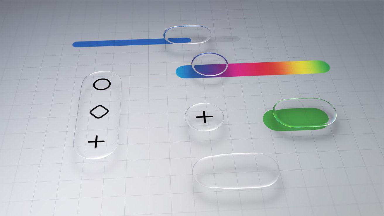
iOS 26 one year later review: Liquid Glass

As I sit here and write this on an iPad Pro connected to an external display, my Slide Over window of Drafts has a clear glass edge. The YouTube video playing underneath of the 2025 WWDC keynote bleeds through colors splashing across the edge of the video.

iPhone lying on a wooden surface, screen displaying colorful widgets including weather, photos, health and activity rings, app icons, and a small map in the lower-right corner

iOS 26 review: Liquid Glass is more obvious in some places, less in others

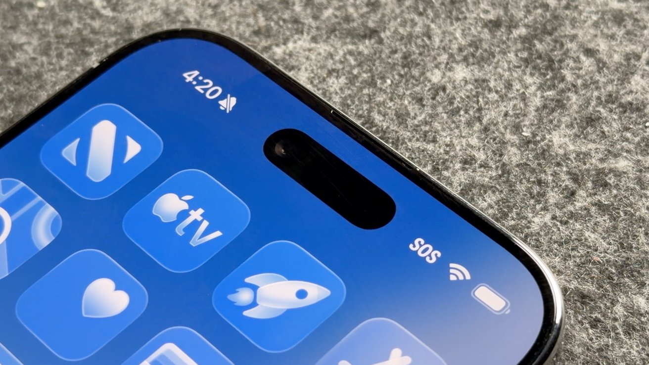
Liquid Glass wasn’t limited to iOS 26, but I’ll keep my conversation about it limited to that platform. The new material stands out most on the Home Screen and Lock Screen.

Advertisement

Every Apple app quickly adopted the new material throughout. Popover lists are a smoky glass, icons and buttons have a distinct glassy edge, and everything is reflective.

If an object moves in front of another object, some of the underlying layer peeks through. Grab an element and it warps and moves as you interact with it.

Sliders behave like bubbles while more elements move into menus. The entire design philosophy focuses on minimalist presentation with flashy visuals.

Minimalist UI mockup with translucent rounded buttons, sliders, and plus and diamond icons on a light grid background, featuring blue, green, and rainbow color accents

iOS 26 review: Liquid Glass changed how elements looked across the platform

Advertisement

The driving force behind Liquid Glass is Apple Silicon. I have no doubt that Apple’s claims about other smartphones being unable to replicate the material are true.

I personally enjoyed the introduction of Liquid Glass. It had its flaws, and still does, but it was an interesting departure from the flat and boring state iOS was in.

The biggest winner of Liquid Glass was the intuitive UI interactions. When you tap a button, the menu appears where the button was tapped, for example.

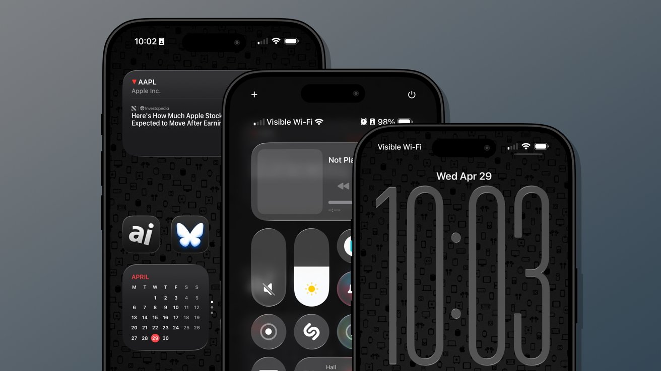
The Lock Screen and Home Screen really take advantage of Liquid Glass too. You can either have a completely transparent set of icons or tint everything to be a specific color.

Advertisement
Close-up of a modern smartphone's top screen showing blue app icons, time 4:20, muted icon, SOS and WiFi indicators, front camera pill cutout, on a gray fabric background

iOS 26 review: Liquid Glass isn’t going anywhere

Apple’s slow evolution of Liquid Glass is apparent throughout the iOS 26 release cycle. Small changes have been made with each update, but it has fallen short of giving users the ability to turn the material off entirely.

If you’re holding your breath for such a button, it is best to stop waiting. Apple has made it clear the Liquid Glass will be mandatory for all apps soon and it isn’t going anywhere.

Expect more refinements over time, but this Apple Silicon-driven UI is here to stay.

Advertisement

Of course, this is a review of iOS 26 after a year of dealing with it, so let’s move past the refresher.

iOS 26 one year later review: customization

One of the more surprising aspects of iOS 26 and Liquid Glass is just how many people in my life noticed it. Not only did they notice, but they were genuinely happy with it and utilized the new customization features.

Three overlapping iPhones with dark, minimalist home and lock screens displayed, featuring large digital clock, control center, stock widget, calendar widget, and app icons on a patterned black background

iOS 26 review: Customization options from the Home Screen to the Lock Screen

Several jumped on the new transparent icon setting for the Home Screen. Though, beyond that and the new clock on the Lock Screen, there’s not much else to speak of.

Advertisement

That isn’t to say these aren’t significant changes, but just fewer overall compared to previous years. I’m happy that Apple is still committed to pushing customization forward each year, but iOS 26 was the bare minimum.

The new material likely took up any attention Apple might have otherwise had to develop new customization options. I expect iOS 27 will have more and likely have a focus on any Liquid Glass improvements.

Since Liquid Glass was more of a reskinning of iOS than a full redesign, I didn’t feel the need to rethink my Focus Modes or Home Screens as much as I might have usually. I tried the transparent icons on a fitness Focus, but otherwise didn’t bother.

I’m quite happy with the dark icons and tinted wallpaper options.

Advertisement
Close-up of an iPhone displaying the App Library screen with colorful app folders on a green background, time 3:05 at the top, and blurred multicolored backdrop behind the phone

iOS 26 review: Liquid Glass affects how everything looks

The new clock on the Lock Screen is the star of the show and perfectly showcases Liquid Glass. I never grow tired of it shrinking as I scroll the notifications.

I’ll also give a special shout out to all of the Apple Music design updates. While these aren’t customization options, they make the iPhone look better with animated Lock Screen art.

I do wish that Apple had gone a little further. There shouldn’t be such a small limit to Focus Modes (currently 10), and there needs to be way more Focus Filters available for system actions.

Advertisement

Apple should also have a much better wallpaper, icon, and widget management system. What we have today works well enough, but it would be better as an independent app.

iPhone screen showing Focus settings list on dark mode with options like Do Not Disturb, Driving, Fitness, Gaming, Mindfulness, Personal, Reading, Reduce Interruptions, Sleep, and Work

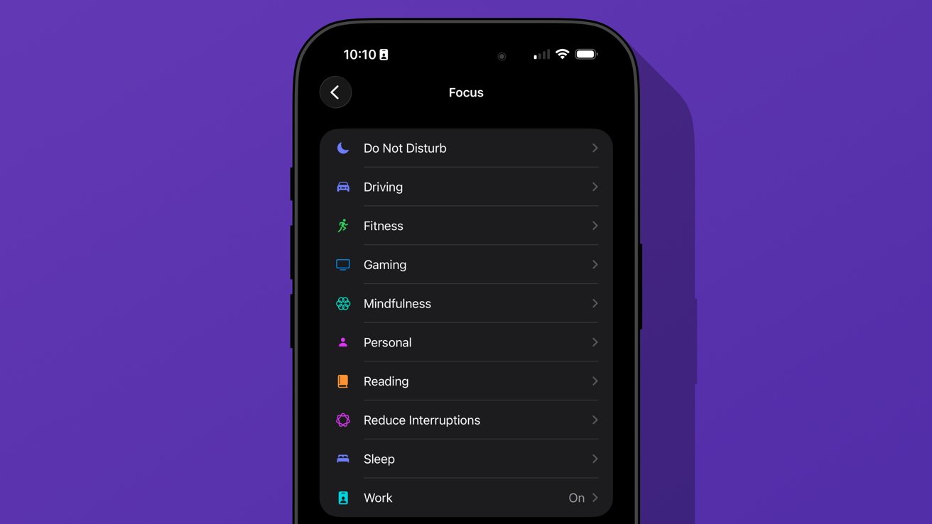
iOS 26 review: we’re gonna need more Focus Modes

I love having unique wallpapers and icons, but implementing them requires too many menus. Plus, I wish I didn’t need to have the images in my Photos app to use them as a wallpaper.

Ideally, everything should be going through Files or a separate repository in this theoretical iPhone design app. Perhaps we’ll get some of that soon, as rumors continue to point to iPhone customization via AI.

Advertisement

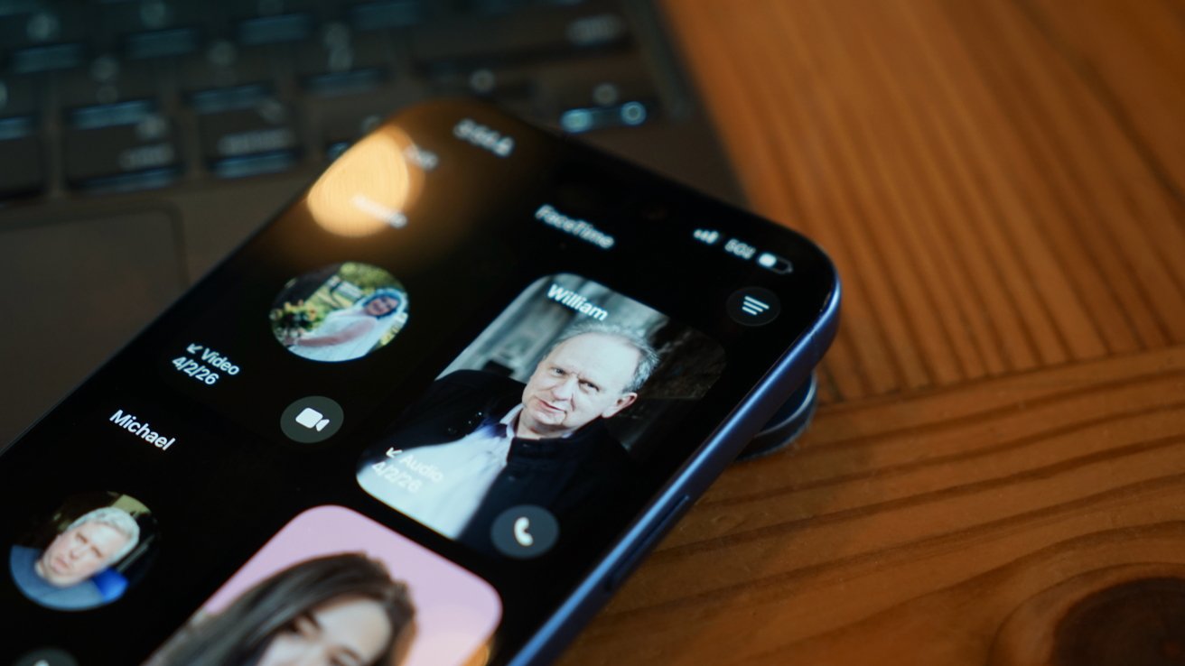
iOS 26 one year later review: social

The new unified Phone app layout is one of those changes that annoys people at first, but you can’t go back once you’ve used it. Spam no longer clogs my recents list, and I no longer accidentally dial someone by simply tapping the screen.

iPhone in dark mode displaying phone call filter options, including calls, missed, voicemail, and unknown callers, with a blurred warm background of lights and indistinct shapes

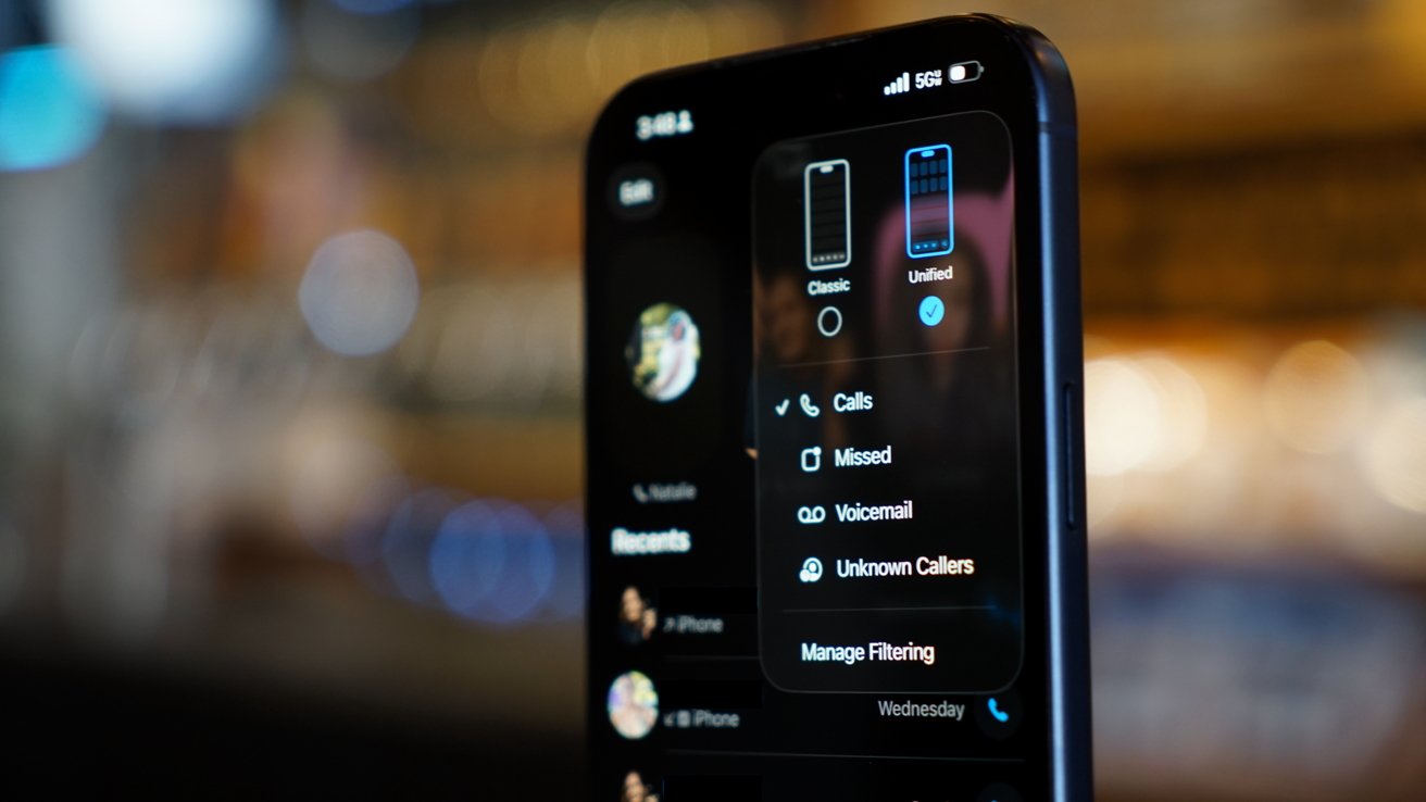
iOS 26 review: a new unified view in the Phone app

While some of my family were reluctant to change the layout, they gave it a shot. The new setup takes great advantage of Contact Posters and makes it simple to access various functions of the Phone app.

I’m still of the mind that there are too many apps in Apple’s social sphere. Ideally, everything would be run through Contacts so there wouldn’t be a need for Phone, FaceTime, and Contacts apps.

Advertisement

Messages makes sense on its own, but more on that app later.

I make this assertion because the Phone app has the entirety of the Contacts app embedded within a single tab. Perhaps it would be too confusing to suddenly have two very important and prominent apps disappear, but I find the redundancy odd.

The unified layout is a step in the right direction. It puts contacts front-and-center since the contact card is what is shown when you tap on a recent call.

You can even jump straight to a video call or iMessage chat with a long press. Perhaps Apple is heading towards a unified social experience, but it is sure taking its time getting there.

Advertisement

The changes to the Phone app aren’t all iPhone users got with iOS 26. Perhaps the most impactful updates are Call Screening and Hold Assist.

iPhone call screen showing voicemail-style text transcription of a loan processing team message about a 41000 dollar preapproval with 610 dollar monthly payments and a slide to answer button

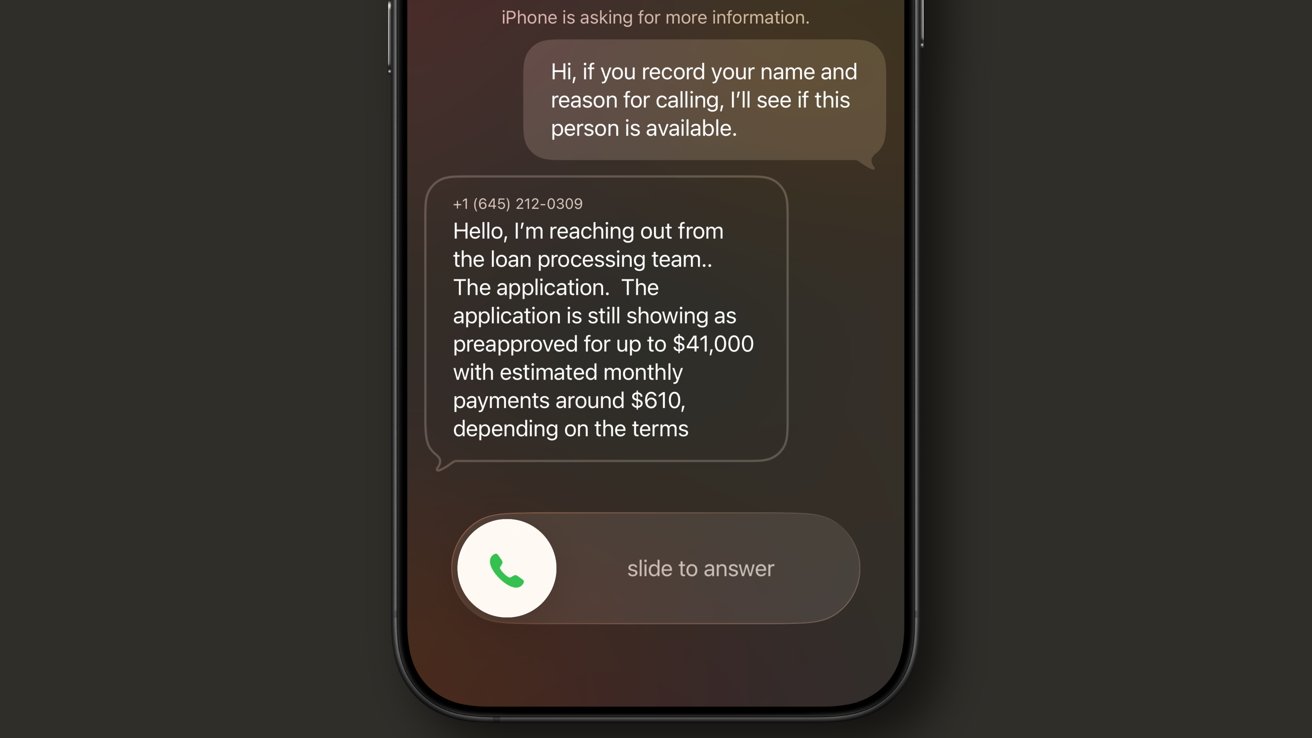
iOS 26 review: Call Screening is a very useful spam filter

Call Screening does what it sounds like. Incoming calls are filtered by Siri and the caller is asked to provide a reason for the call. The user can see this interaction from the Lock Screen and decide whether to answer or not.

It isn’t a perfect system. My phone number got onto one of those call lists that seems to call from a near-infinite set of phone numbers each day to “update you on your loan application status.”

Advertisement

For whatever reason, the spam filter doesn’t catch this, nor does the Siri Call Screening. It’s a robot, not a human, but sounds human enough to make it through.

My phone inevitably rings, and I have to dismiss the call, block the number, then report it as spam. Rinse and repeat this each and every day, and it gets old.

I like this feature and don’t want to turn it off, but the previous “send unknown callers direct to voicemail” was much more efficient. If the call was important, they’d leave a voicemail.

iPhone screen showing Messages settings for Unknown Senders, with toggles for screening unknown senders, allowing notifications, text message filter, and spam filtering, all enabled against a green background

iOS 26 review: Call Screening needs more aggressive options

Advertisement

Something in the middle would be much better. Siri should screen calls, but only from numbers that fall into the “might be known” category. All unknown numbers I’ve never interacted with before should be immediately dismissed.

The FaceTime app got a similar redesign to the Phone app where it features Contact Posters in a grid. If someone ever left you a FaceTime video message (think voicemail, but video), a thumbnail of that video is shown instead.

I’m not sure anyone in my life knows this feature exists or has ever tried to use it. I really like what Apple has set up here, but I find it annoying that it can only be used if the person you’ve called doesn’t answer.

I think it would be way more fun if I could choose to send a video message on a whim. Like, instead of texting “can I FaceTime you,” let me send a video that shows up in the FaceTime app in the moment I’m trying to share via the call.

Advertisement
iPhone lying on wooden table, showing FaceTime call screen with several contact photos and names visible, including a highlighted profile of an older man named William

iOS 26 review: FaceTime also got a new unified view

It would also be nice if FaceTime was part of a unified social app, but I’m not sure Apple will ever actually do that.

Finally, the Messages app saw some pretty good upgrades this time around. These might be the ones most users notice and use since they’re a bit more in their face.

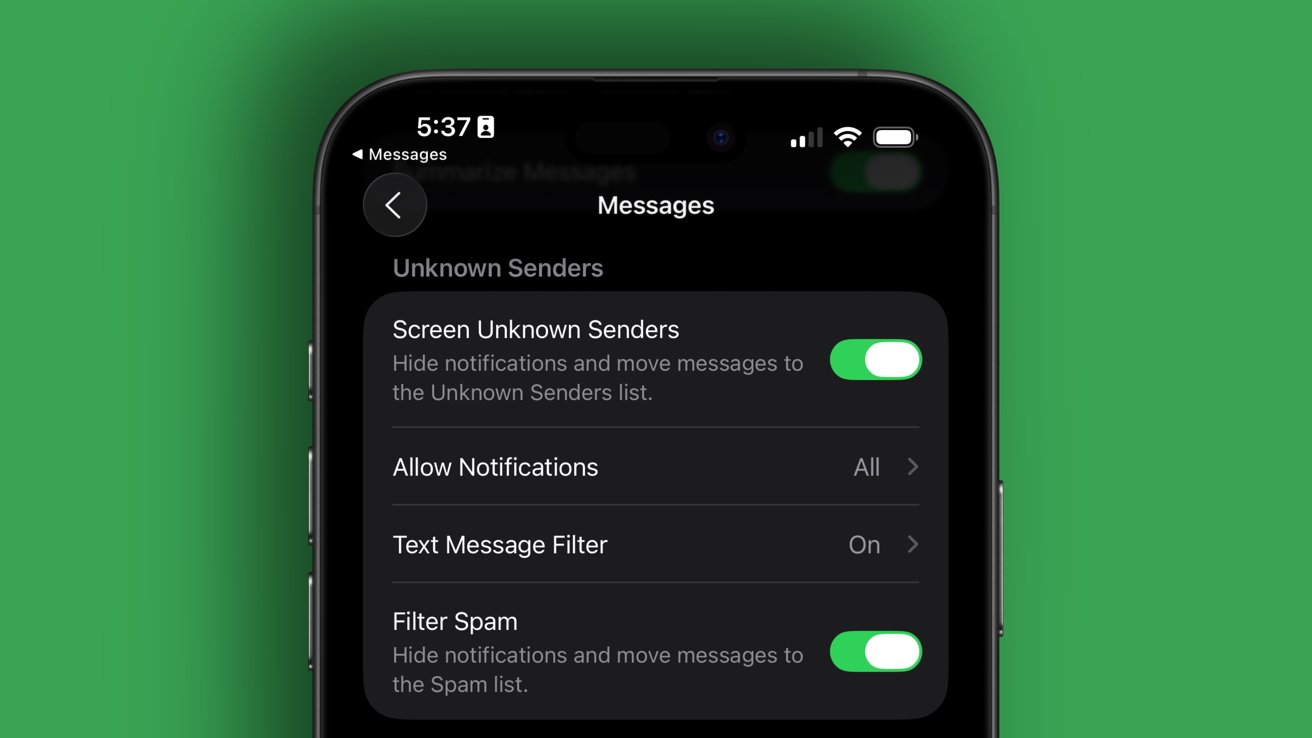
The Messages app has a new layout that separates unknown texts, promotional messages, and potential spam into separate categories. There’s also the ability to add backgrounds to every chat.

Advertisement

Group chats gained typing indicators, and all chats also can utilize polls to get votes from participants. Small, but welcome changes.

The background feature has been quite a lot of fun, especially in group chats. I love that they act as an extra layer of verification that you’re typing into the correct chat.

iPhone Messages app showing a filtering menu overlay with options for Messages, Unknown Senders, Transactions, Promotions, Spam, Recently Deleted, and Manage Filtering against a blurred conversation list background

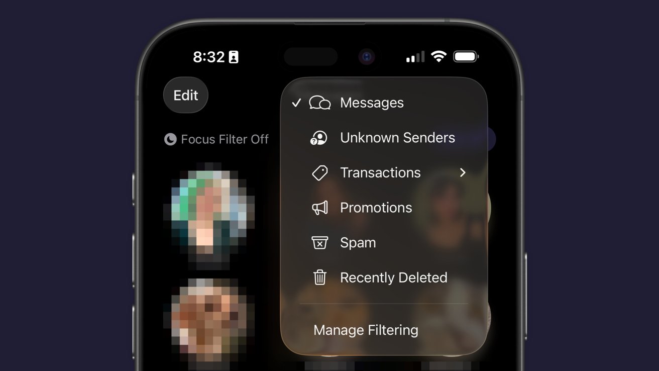
iOS 26 review: Messages has new filtering options

Just an aside, Apple Vision Pro places the background on a separate layer as the chat bubbles, so it adds an extra cool effect to Messages.

Advertisement

Some images work better than others as backgrounds. Solid colors and abstracts will always be winners, but the occasional photo or meme works too.

The effect might be a bit overwhelming for some users, so the plain black or white backdrop is still an option.

Outside of Liquid Glass, Apple’s biggest upgrades in iOS 26 focused on social. I’m happy to see that Apple has continued the trend of improving social aspects of its experience with each release.

I’m going to continue to hope for more half-steps into a full-on Apple social media, but these are few and far between. The biggest thing we’re missing today beyond public profiles (i.e. making your Contact card into a public profile) is some kind of public feed. Maybe next time.

Advertisement

iOS 26 one year later review: apps

There are three apps that Apple released or updated specifically for iOS 26. There’s been a lot of other updates since, and the new Apple Creator Studio, but that’s beyond the scope of this review.

Colorful overlapping Apple app icons, including Photos, Messages, Calendar, Mail, Weather, Home, Podcasts, FaceTime, and other rounded squares, arranged against a dark background.

iOS 26 review: Apple’s apps got some updates too

I think we’ve all grown accustomed to Apple’s new Camera app and the two tabs in Photos. And while some might like Preview, it has become an addition to the “other” folder for many.

I feel like those features have been tread enough over the past year, so I’m going to discuss four main apps in iOS 26: Apple Games, Apple Journal, Safari, and Wallet.

Advertisement

Apple Games

Never bet on Apple doing something right in gaming. Apple Games sounded like an interesting idea when it was announced, but like other new Apple apps, it kind of fell flat.

Apple Games has all of the necessary parts to be great. It integrates with Apple’s social features like SharePlay, FaceTime, and Messages, and it shows Game Center data.

iPhone screen showing a colorful Crossy Road style game challenge page titled Home and High Score with start challenge button, against a plain blue background

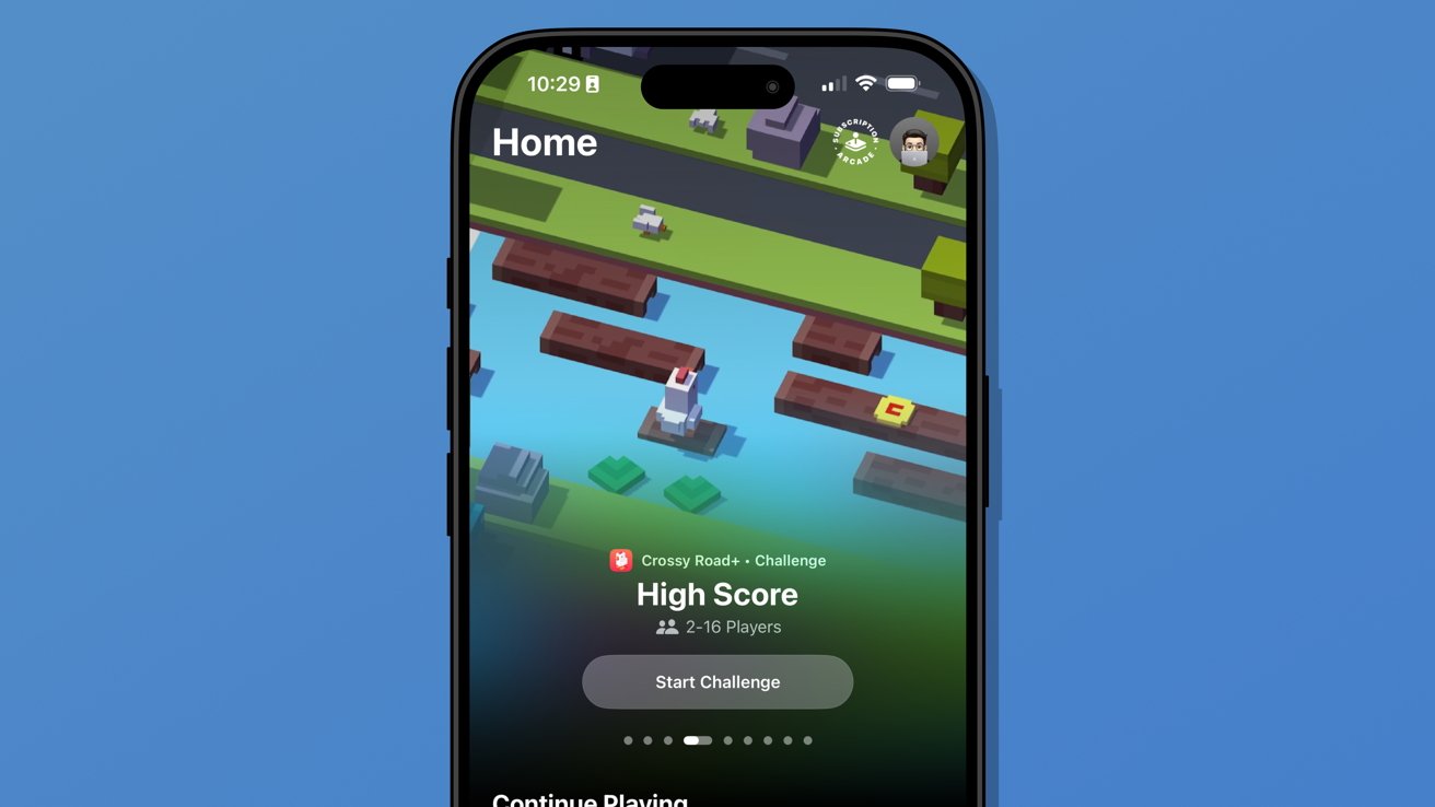
iOS 26 review: Apple Games isn’t well thought out

However, it has failed to become the go-to game hub that it could have been. Like Invites and Journal, Apple kind of released the app into the world without much fanfare.

Advertisement

It’s better in some ways than something like what Backbone offers. There’s less of a spammy collection of icons and no paid subscription, but it also feels like it is missing something.

When I open Apple Games, it feels like I’m browsing someone else’s iPhone. It seems to have little real awareness of the games I play or what I might want to launch in that moment.

There’s also a notable absence of emulation or streaming apps. If it isn’t from the App Store or Apple Arcade, it doesn’t exist.

Two iPhones on a coral background display Apple Arcade Friends and Library screens, showing game challenges, achievements, updates, and a colorful trophy banner in dark mode interface

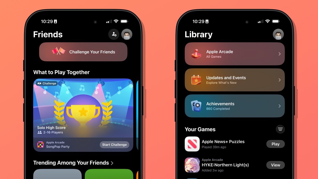
iOS 26 review: Apple Games could learn from game consoles

Advertisement

When I launch my PlayStation 5, I’m met with my most recent games in descending order. Below that list is a selection of news from games I follow.

Apple Games opens to a score a friend beat in a game I haven’t touched in months. It offers to continue playing Apple News, which is where I play the Emoji Game each day.

The social aspects are also lacking. There don’t appear to be any matchmaking tools, nor any way to generate iMessage group chats or SharePlay sessions on the fly.

Apple Games could be a go-to destination for iPhone gaming in the future. Today, it’s a barely functional catalog without direction.

Advertisement

Apple Journal

There were some much-needed updates to Apple Journal. First, it is now available across iPadOS and macOS, and it has the ability to have multiple journals.

iPhone on wooden desk showing a colorful statistics dashboard with a 600 day streak and various activity insights, partially overlapping a laptop keyboard in the background

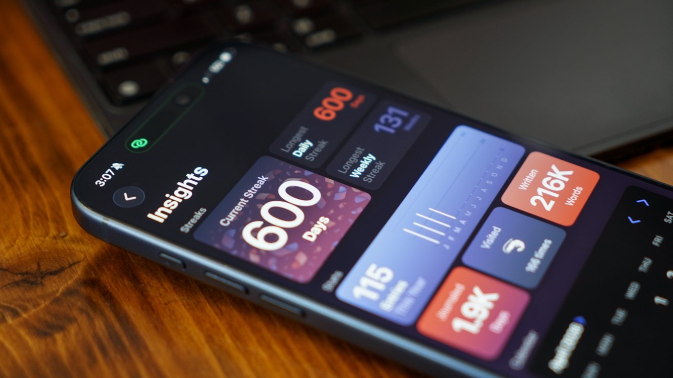
iOS 26 review: Apple Journal got quite the expansion

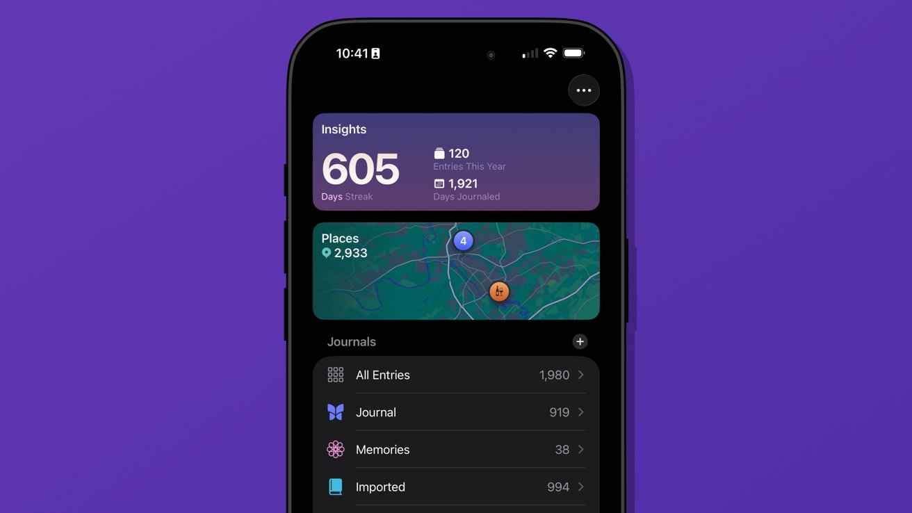
Journal might appear to be a simple app on its surface, but it has the ability to get details from your device to generate entries. The biggest limitation it has today is that these suggested entries are only tied to Apple-based events.

Maps can see where you’ve been, Fitness shares your recent workouts, Music shares what you’ve been listening to, and Photos can donate what you’ve captured. It’s all quite nice, but lacks a few details I’d like to see in iOS 27.

Advertisement

First, there’s still no good way to get an archive of journal entries from a third-party app into Apple Journal. I’ve got my Day One backed up through various options to ensure I still have those entries, but Apple hasn’t provided an official way to sync them.

I once tried a trusted person’s shortcut to generate each entry with images and text, but it only half worked. It did get on foot in the door for covering my 1,000+ entries, but a lot went wrong too.

So, I’ve spent my spare time going through each day in Apple Journal alongside my Day One journal to see what synced and what didn’t. The parts that are wrong or broken are edited, then the original entry is deleted in Day One.

iPhone screen showing journaling app with 605 day streak, yearly and total entry stats, map of visited places, and list of journal categories on a purple background

iOS 26 review: multiple journals was a must-have feature

Advertisement

I’ve knocked out chunks, but Day One shows I’ve still got about 962 entries to check. Not ideal.

The only reason I can do this at all is because of the ability to generate multiple journals. I’ve got several.

Journal is the default and where everything goes each day. Imported is my Day One list of entries.

I’ve also got a Memories journal that consists of any entry I want to make based on photos or other information pertaining to a date in the past. For example, if I want to write about something I did on deployment in the Navy, it would go into Memories.

Advertisement

I have a little-used Dream journal. It’s one of those things that when I need it, I need it, because I can have some pretty surreal dreams.

And finally, I’ve experimented with writing about video games that require a little more thought and planning. I made a Minecraft journal to catalog things I’m building or exploring along with a few screenshots taken that day.

Close-up of a blue smartphone showing a podcast app with colorful show tiles on the screen, against a blurred warm-toned brick wall background

iOS 26 review: Journal suggestions need third-party apps in a future update

Journal is a fun app, and I think everyone should be using it. There’s no need to worry about data scraping for AI use, at least.

Advertisement

I’ve discussed what I’d like to see from Apple as a social platform in the future, and I think Journal could weirdly be a part of that. Imagine shared journals where each member could submit entries containing the same data that’s available to regular entries.

A friend could create an entry about going out in town with a friend along with map pins, photos, and music they heard. The other members in the shared journal could react and comment to the entry and post their own entries.

Yes, a social media feed, but micro-social. Private, local, free of ads, chronological, and only the people and things you care about.

Come on, Apple, it’s right there.

Advertisement

My more realistic request is for Apple to let users name the location pins in the map entries. Every time I make an entry at home, I have to go in and change the address to read “Home” instead. It should be automatic.

Safari

Safari benefited from several design upgrades centered around the introduction of Liquid Glass. I heard of many tech nerds looking for a toggle to reverse the changes immediately, but I liked the change and embraced it.

Close-up of an iPhone screen showing a dark-mode article about Apple Vision Pro, with a Safari toolbar bubble displaying appleinsider.com and navigation, refresh, and options buttons over blurred text

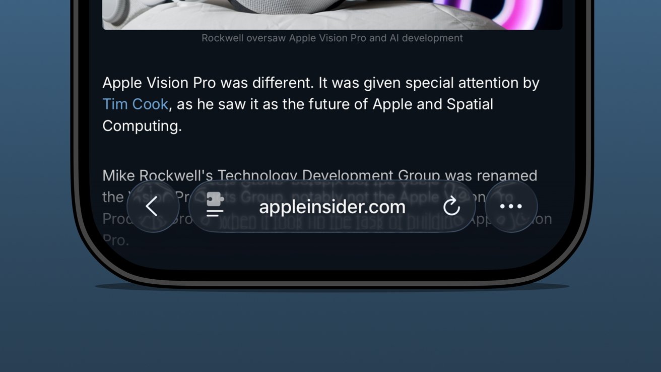
iOS 26 review: the bottom address bar is compact and easy to use

I was already a bottom address bar user, so the move to Liquid Glass and even more limited UI was a natural transition. The content gets to own the display while the tools get out of the way.

Advertisement

There are plenty of screenshots showing that the address bar is unreadable when some images or text are behind it. The thing is, that’s never really a problem because you can just keep scrolling.

There are three distinct control areas in this bottom bar setup. The forward and back buttons are self-explanatory, then there’s the address bar, and finally an ellipsis.

In pure Apple fashion, each of these items has various shortcuts, long presses, and more. For example, long press on the forward/back buttons to see a recents popover.

The ellipsis is very simple as it just opens the tab controls, bookmarking tools, and Share Sheet. It’s not ideal that the Share Sheet button is hidden, but I’m not overly upset.

Advertisement
Close-up of an iPhone Safari menu showing options like Hide Distracting Items, Manage Extensions, and Show Reader against a solid blue background

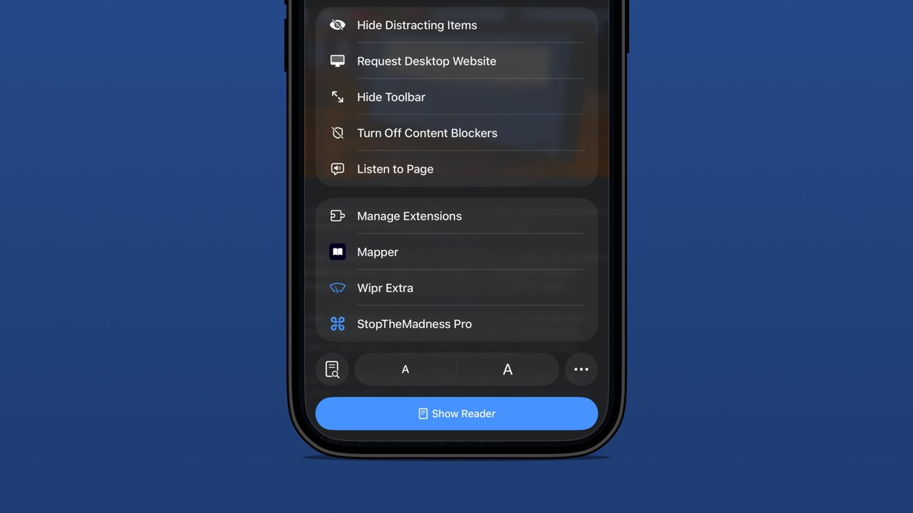
iOS 26 review: extension and tab options in one menu

The address bar is perhaps the most complex and sometimes frustrating part of the setup. Long press gets you some window controls, a copy command, the Share Sheet, and a Voice Search option.

In case you’ve never used it, tapping Voice Search just triggers speech to text in the address bar and does a web search with your default engine.

Tapping the address bar lets you type in a URL or search query. There’s also the refresh button on the right.

Advertisement

Then there’s the tricky left side button that is a puzzle piece with two lines below it. Long press that and you’re in Reader Mode or tap it and it’s a long list of actions.

Be careful though. That button is highly variable as it might briefly show a shortcut to the translate tool or Reader Mode. That’s right, a simple tap doesn’t always perform the same action.

The menu itself is filled with your Safari Extensions and various configurable controls.

iPhone screen showing Safari Page Menu in dark mode with options like Privacy Report, Show IP Address, Print, Report a Website Issue, and Connection Security Details against a plain blue background

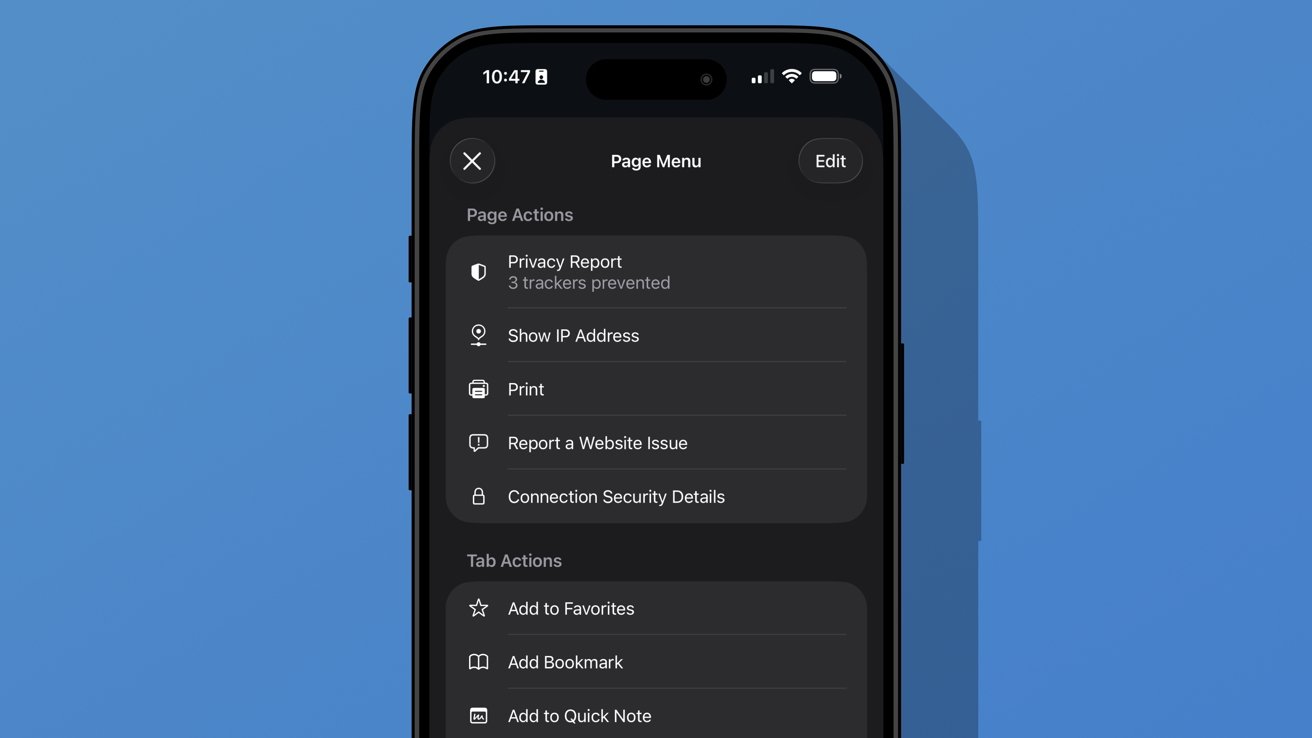
iOS 26 review: additional options found in the ellipsis menu

Advertisement

A new ellipsis at the bottom right of the menu will open an even more complex Page Menu. This section has specific options for the website or page you’re viewing and includes an edit function for customizing the controls in the previous menu.

I don’t think Safari on iPhone has reached its permanent form just yet. It feels a little too fidgety for my liking, though the configuration I’m using is my preference.

The address bar’s ability to shrink and get out of the way while scrolling is excellent. The transparency helps amplify the full-screen effect of the webpage too.

Apple introduced a new Immersive Browsing experience for Apple Vision Pro with visionOS 26. It feels like a combination of the Apple News format (sans ads) and Reader Mode. I’d love to see that evolve and come to iOS Safari.

Advertisement

Sure, Immersive Browsing would lack the 3D effects found in Apple Vision Pro, but I think it could create quite the interesting experience. I’m already a fan of the simplicity of Reader Mode, so something designed specifically to enhance the browsing experience might be fun.

iOS 26 one year later review: artificial intelligence

Apple may have pulled back on Apple Intelligence during WWDC 2025, but it was peppered throughout the keynote. There wasn’t anything overpromised this time.

iPhone on gray fabric showing language settings and live translation instructions, with two white wireless earbuds resting side by side on the screen

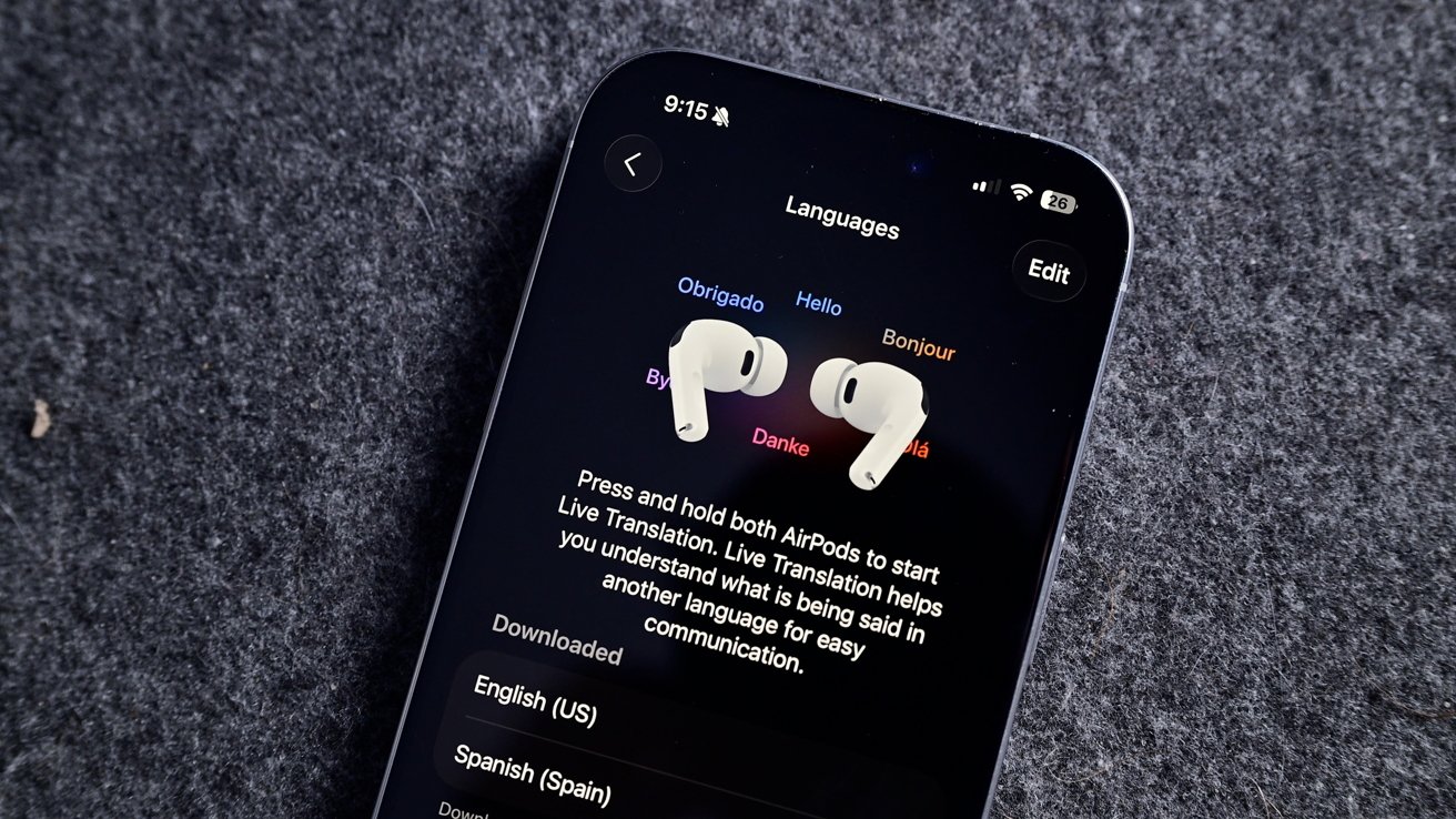
iOS 26 review: Live Translation is an excellent example of a useful AI-powered tool

I haven’t encountered a situation where I might need Live Translation, but I’m glad it is there. The real-world demos I’ve seen of the tool all seem quite promising, and it will only get better over time.

Advertisement

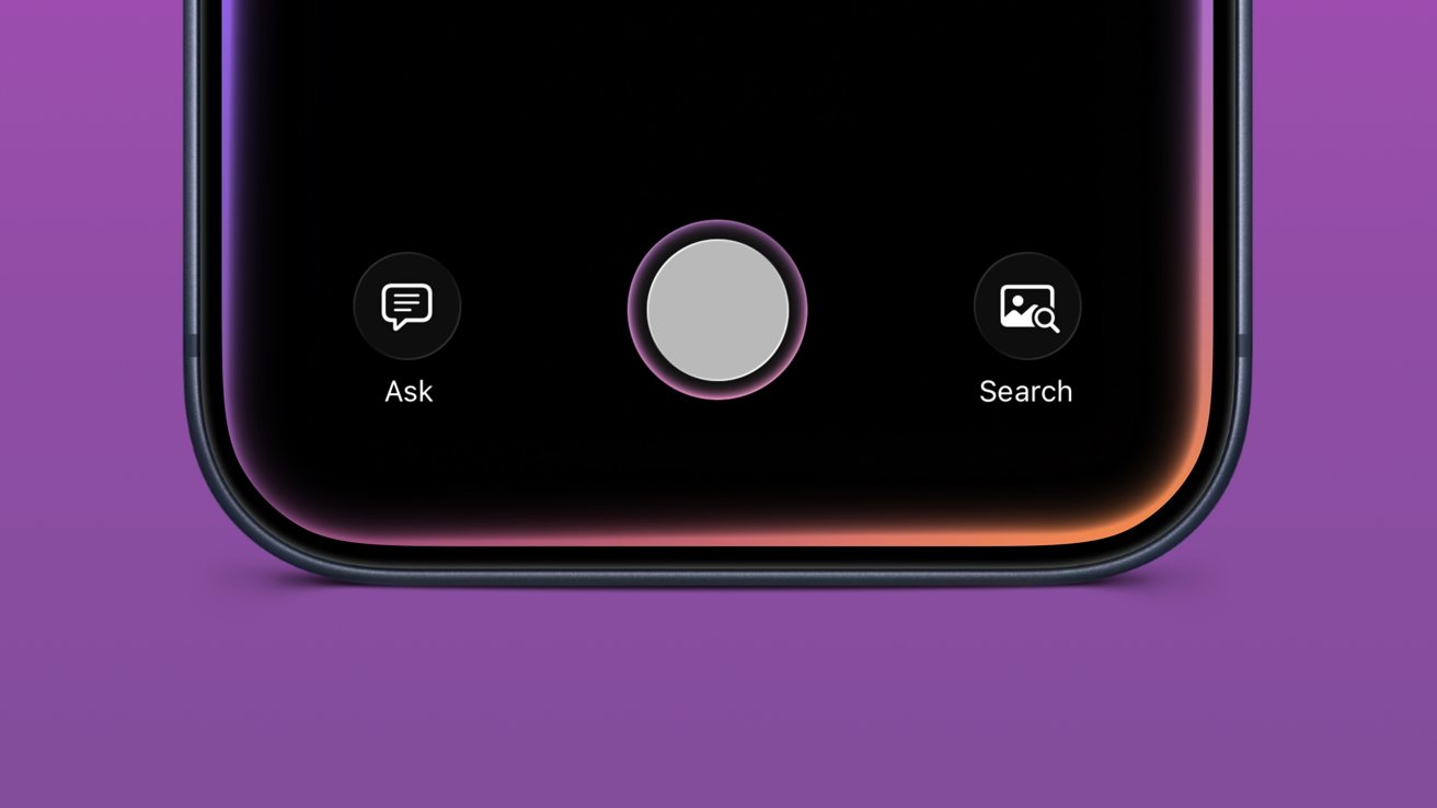
Visual Intelligence is now part of the screenshot tool. It’s not something I’ve used often, but it has come in handy a few times. Particularly, I like that reverse image search for Google is right in the interface.

Image Playground and Genmoji gained ChatGPT support, which hasn’t proven useful really. Of course, ChatGPT can make better images, but it requires sending your data off device. Even with the added privacy promises between Apple and OpenAI, it still feels icky.

Then of course there’s also the problem with OpenAI clearly having used copyrighted material for references. Every anime-filtered prompt is unmistakably close to a style from a favorite film or show.

I’m not sure Apple can escape that problem even when its own models are better at image generation. However, at least those supposed future models would be on-device or in an Apple server running on renewable energy. It’s not much, but those thoughts help the tools feel a little less gross.

Advertisement
Close-up of a iPhone bottom screen showing large central circular button, with smaller Ask chat icon on left and Search photo icon on right, above a purple background

iOS 26 review: Visual Intelligence got a small upgrade

Apple also opened up third-party access to Apple Foundation Models, including in Apple Shortcuts. I’m going to be completely honest here and say I’ve basically missed this entire aspect of iOS 26.

I mostly use Apple apps and don’t really deal with AI in any aspect. I don’t use ChatGPT, Claude, or the others, nor do I even have an account with them. I’ve never spent money on a token or done “research” with AI.

I’ve seen some clever adaptations, like Carrot Weather and others utilizing Apple’s models for chatbot experiences and the like. It’s just not for me.

Advertisement

The closest thing to AI that I use in my day-to-day beyond Proofread in Writing Tools is an app called FoodNoms. It uses OpenAI’s models to scan photos of food or food labels to generate estimated nutritional values.

Package tracking in Mail added to Wallet

I had honestly forgotten that the new Deliveries in Mail (beta) had begun in iOS 26. In preparation for the new feature, I deleted my other package tracking tools and went all in.

iPhone Mail app screen showing a Litter Robot order email, with Siri Found an Order notification and a colorful Summarize button near the top of the dark interface

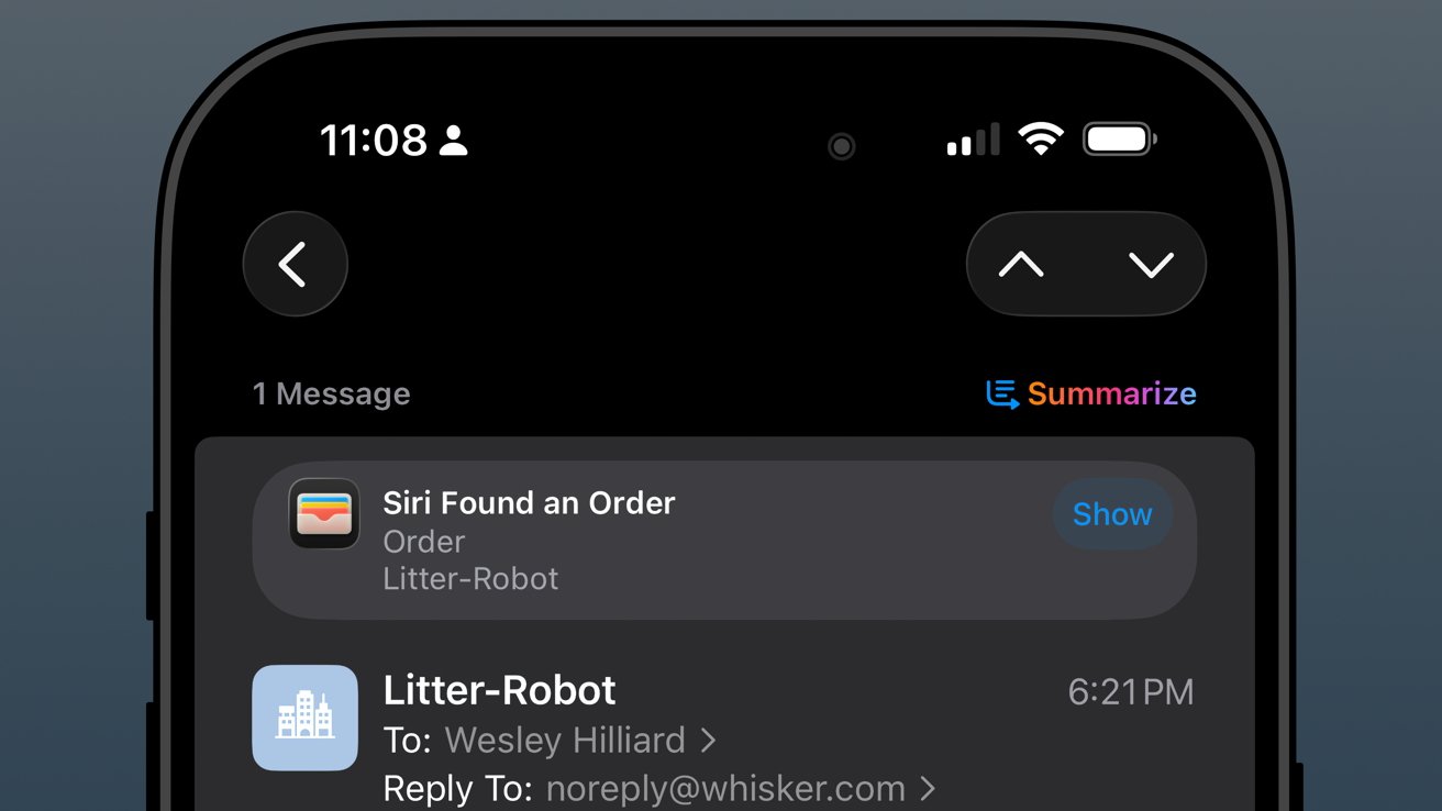
iOS 26 review: orders found in Mail are sent to order tracking in Wallet

The past year has been filled with quite a lot of packages from all kinds of places: Amazon, SimpleHuman, Best Buy, and a variety of stores that use Shopify.

Advertisement

As usual, the Shopify purchases go into Apple Wallet natively. Some others support Wallet, but most, like Amazon, appeared when Mail was synced.

The system worked, more or less, but I wish it was 10% more intelligent. For example, if an incoming email has been identified as a delivery update, automatically move that mail to a deliveries folder and mark it as read while adding the data to Wallet.

I could write a mountain on Mail categorization and sorting, but that’s not a part of this review.

iPhone screen showing a dark-mode order status for Litter-Robot, marked Shipped with a green check, UPS listed as carrier, and a blue Track Shipment link below.

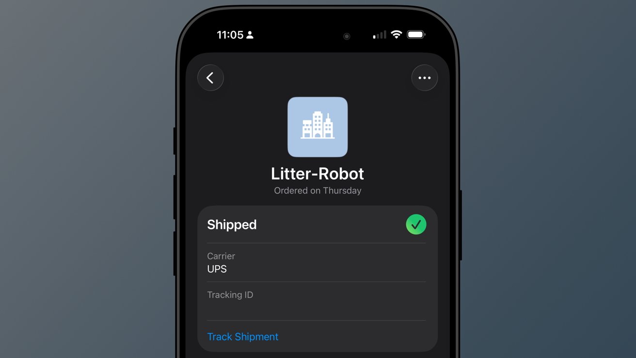
iOS 26 review: a good-enough tracking tool buried in Wallet

Advertisement

So far, I’ve not really missed my other delivery tracking tools, and I like the automatic nature of Apple’s implementation. However, it is far from perfect.

When I buy a game from PlayStation Network, a digital product, I sometimes get a delivery tracking notification in Wallet. Obviously, I can just delete it, but it seems odd that it can’t differentiate between that and an actual delivery.

The feature will improve with time, though there are two significant problems I have with it today.

First, Apple still doesn’t support Wallet order tracking natively. It does now via the Mail tracking option, but that’s silly. Apple should be showing my orders and receipts in Wallet.

Advertisement
iPhone screen showing a dark-themed shopping receipt for Atoms shoes totaling $264.39, listing two pairs, shipping, tax, subtotal, and total with clear white text on black background

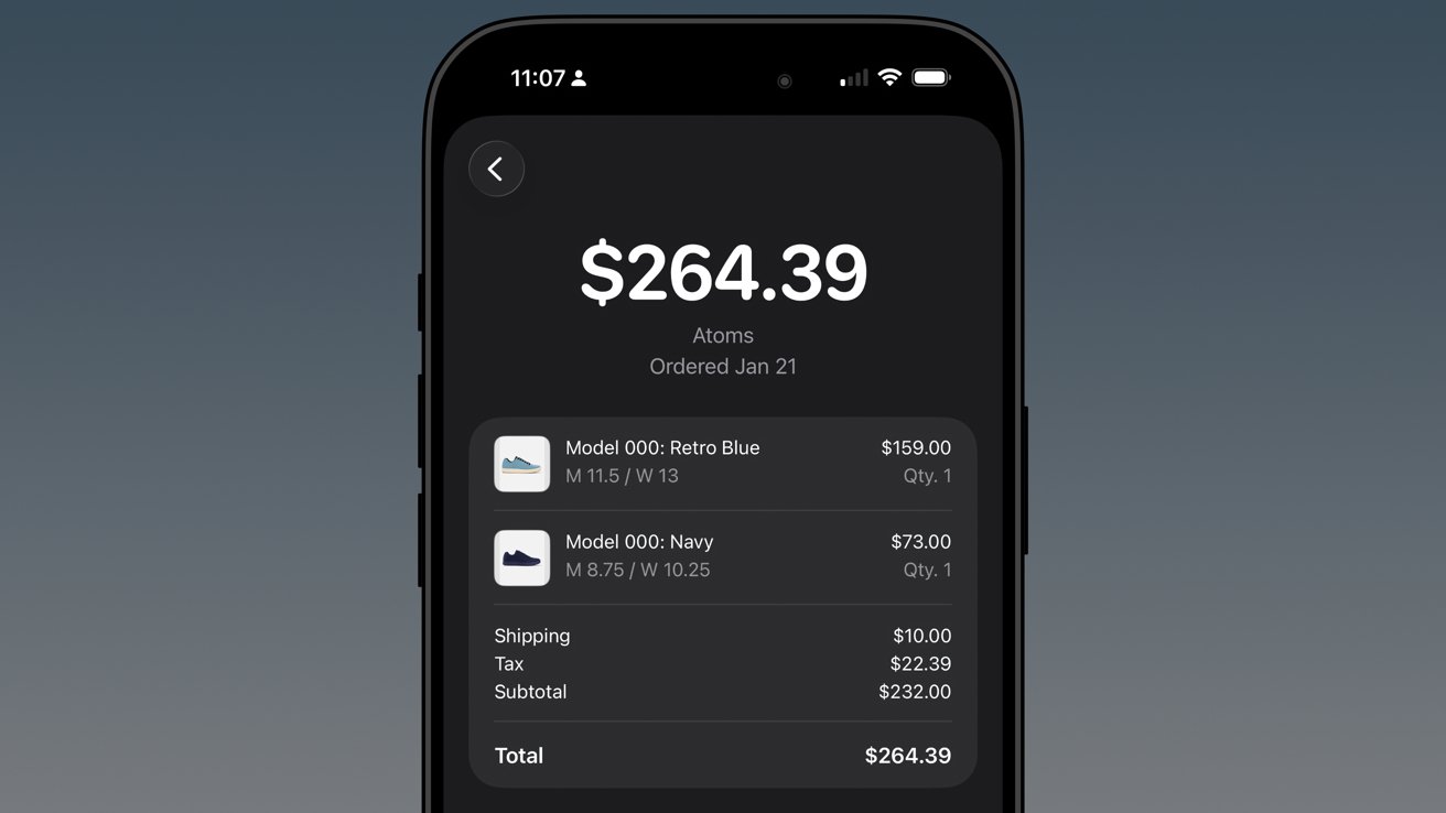
iOS 26 review: native order tracking like what Shop supports even provides in-Wallet receipts

Second, Apple has buried the feature in an ellipsis in Apple Wallet. It is beyond time that Apple Wallet gets a tabbed interface.

The payment cards could be the main tab, then the passes in a second tab, and a third tab for order tracking. I’d even take it a step further and add a special App Store section for the fourth tab, which would showcase apps and services that utilize Apple Wallet.

In any case, there’s work to do.

Advertisement

Apple Music Playlist Playgrounds

Playlist Playgrounds arrived late in the cycle, but it is still a part of iOS 26 and a bit of a surprise. Apple didn’t mention the feature once prior to its release, so that shows the restraint the company is having post-AI embarrassment.

Close-up of a smartphone music app asking What do you want to hear, showing beta notice and playlist suggestions like Music to put me in a good mood and Morning coffee music

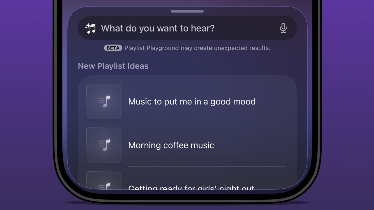
iOS 26 review: Apple Music Playlist Playground produces mixed results

Music playlists are a bit of an art, and I’m not entirely excited to hand their creation over to AI. I’m not particularly talented at putting playlists together either, but I do enjoy Apple Music’s human-curated selection.

I did like Beats Music’s The Sentence, which let you generate a playlist based on presets like activities and moods. It was very clearly machine learning and kind of worked.

Advertisement

The problem with Playlist Playground is that it lacks understanding and specificity. You can make the prompt as long as you like (at least I didn’t hit a limit), and yet it is clearly looking for very specific keywords.

If you want to generate a playlist that’s based on a genre, era, artist, or song, it will do the job. But something about it seems off.

Honestly, it just feels easier to type in search terms and grab the dozens of playlists already available. I’m not sure AI is solving anything here, but perhaps it’ll get better and more nuanced with time.

The Apple Intelligence problem

Apple obviously made a mistake when it pre-announced an Apple Intelligence that would be proactive and personal in 2024. It believed that the results they were seeing internally could be improved and become shippable by the spring.

Advertisement
Close-up of an iPhone 17 Pro Max triple-lens rear camera and flash, set against a blurred, glowing multicolor background forming abstract looping shapes

iOS 26 review: the promise of Apple Intelligence still hasn’t been kept

I’m not sure where the fault lies, but clearly the engineers working on Apple Intelligence didn’t account for the inherent failures built into all AI systems. Apple has a high standard, and hallucinating details approximately 30% of the time just wasn’t an option.

There was another problem that Apple seemingly didn’t foresee — Siri.

The aging smart assistant that created an entire software category still runs with a machine learning backend. Apple hoped to just drop Apple Intelligence on top and have the logic sort out the details, but it introduced too many opportunities for error and hallucination.

Advertisement

That 30% hallucination rate was being multiplied across every exchange between the AI and ML systems. The only option was to scrap everything and build it with AI from the ground up.

Here we are two years later, and Apple is on the cusp of being ready to release what it originally announced, and then some. However, the timing was knocked off kilter once again by unforeseen circumstances.

Glowing multicolored atomic-shaped loop surrounding a soft rainbow diamond on a black background, with a subtle reflection beneath the vibrant neon symbol

iOS 26 review: rebuilding Siri with an LLM backend took some time

All signs pointed to a spring release of something until another strategy shift changed plans. Apple seemingly, until very recently, thought it could use Gemini to train Apple Foundation Models and implement it across its systems before WWDC.

Advertisement

Cooler heads prevailed, and more restraint has been shown, though to the annoyance of Apple fans that are looking forward to the AI upgrades. It seems, as of this review, that Apple won’t touch anything related to Apple Intelligence or Siri until after iOS 27 launches in the fall.

WWDC 2026 is on June 8 and will reveal the upgrades, but what will follow is a summer of beta testing. There’s actually a fairly good chance that these new AI models won’t even be available until after iOS 27 launches to the public.

Apple doesn’t upgrade its models via the software updates. Those go out via a background process, so there is no telling when such updates could go out.

The only way they might arrive sooner is if Apple lets developers test against them during the summer.

Advertisement
Red running track finish line with white lane numbers, overlaid by colorful abstract tech logos stacked vertically along the center lane

iOS 26 review: Apple doesn’t need to participate in the AI race

I’ve been talking about Apple Intelligence and its place in the artificial intelligence “race” since its inception. There has been talk about how Apple is behind and could likely never catch up. As if it somehow missed out on a revolution.

The reality is that Apple dodged a bullet.

Had Apple launched the personalized Siri and Apple Intelligence features it revealed in 2024 that October, it would have been ten times worse in terms of PR and backlash. Imagine if Apple’s models had been set loose in that state to parse personal data and provide proactive, contextual actions.

Advertisement

Every hallucination would have become ammo. We saw a tiny version of this with the poor notification summaries that sparked a backlash from publishers.

In the time since Apple’s AI delays, we’ve seen a bubble grow to its absolute limit. Instead of a violent pop that would have ruptured the global economy, we’ve seen more of a slow deflation in recent months.

iPhone with dark Apple-themed wallpaper, colorful glowing edges, and neatly arranged home screen icons including calendar, Slack, Mail, News, Photos, Messages, and other apps on a black background

iOS 26 review: Apple could release a whole new AI platform backed by its upgraded models

Sure, the grift is going harder than ever, but the public is more jaded than it has ever been so far. And as odd as it might sound, I think Apple’s missteps and delays have led it to stumble into the perfect release window for its new offerings.

Advertisement

While time will tell if I have to eat these words, I expect Apple will finally launch the AI platform we’ve been waiting for. A private, secure, local-first set of proactive and personalized AI tools that can interact with third-party models of the user’s choosing.

Apple has always been the only company truly capable of executing this, even though others have tried to claim that they’ve done it already.

As soon as fall 2026, iOS 27 users should see Apple Foundation Models powering Siri and Apple Intelligence. Too bad this review is about iOS 26.

iOS 26 one year later review – Pros

  • Liquid Glass is a new, if divisive design
  • Smart changes like having menus appear where a button was tapped
  • A thoughtful rollout of AI features
  • Separating people from spam in social apps
  • Excellent upgrades to apps like Journal and Safari

iOS 26 one year later review – Cons

  • Continued lack of AI features promised in 2024
  • Liquid Glass makes some elements difficult to read
  • Some apps remain neglected and untouched, like Apple Home

Rating: 3.5 out of 5

Overall, iOS 26 was a solid release with minimal issues across the board. You’ll find plenty of loud, angry people online, but they’re the vocal minority.

Apple changed the system-wide UI into live-rendered material that showcases Apple Silicon without completely frying the system. It’s an impressive feat, even if not everyone is a fan.

Advertisement

It is frustrating that a company the size of Apple continues to be stuck in this flip-flop app update cycle. The apps that got attention in iOS 26 will likely be virtually ignored until iOS 28, while others will see some changes in iOS 27.

I expect iOS 27 will be one focused on tweaks and adjustments considering the upheaval that occurred in iOS 26. That, and Apple Intelligence could dominate the WWDC 2026 keynote, for better or worse.

Source link

Advertisement
Continue Reading

Trending

Copyright © 2025