Politics
How The Ifs And Buts Rule Simplifies Decluttering

Our clutter doesn’t necessarily reflect messy habits. In many cases, it stems from the stories we tell ourselves.
Think about the items you hold on to not because you truly want or need them, but because of hypothetical or future-focused narratives. “I’d use that if I had more time.” Or “I’d want to wear that because it looks great, but it’s not as comfortable as I’d like.”
That mindset is at the heart of what organisers call the “ifs and buts” rule of decluttering. And by recognising this kind of thinking, people can make meaningful progress when it comes to tidying and organising their homes.
What is the “ifs and buts” rule of decluttering?
“The ‘ifs and buts’ approach focuses on noticing the conditional language people use when they hold on to items – such as ‘if I lose weight,’ ‘but I might need it someday,’ or ‘if we ever have guests,’” said professional organiser Regina Lark. “These phrases often signal that clutter is being kept for a future version of life rather than the one currently being lived.”
Think about that episode of Friends when Monica buys extremely uncomfortable boots, but she feels the need to justify keeping them because they were so expensive.
Ask yourself if the reason you’re holding on to something is because of an “if” or “but” condition. That fancy pizza oven you’ve never even used? Maybe you know you should get rid of it, “but it was expensive”. That “but” is probably not a great justification for letting it take up so much room in your kitchen.
“When you hear yourself making statements like ‘I’d like this sweater if it was a different colour’ or ‘I like the sweater but it doesn’t fit me,’ you know we are leaning more towards letting it go,” said Julie Naylon of No Wire Hangers Professional Organizing.
She added that these statements are usually accompanied by a “yucky” face that indicates how they really feel about the item. Maybe you love those cool accent pillows in your closet – but they don’t actually work with your home’s decor. Instead, they’re just gathering dust and taking up valuable storage space.
“When I work with clients and they start creating ‘if and but’ excuses while we purge, I know that’s fear talking, and deeper down, they know that they’ll never use that item,” echoed Tova Weinstock, the professional organiser behind Tidy Tova. “So if you’re decluttering your space and hear those words come up, acknowledge that that’s fear talking and overcome it. When in doubt, throw it out.”

This framework disrupts the conditional thinking that keeps clutter in your home
“The gist of the ‘ifs and buts’ approach is sound and harks back to one of the earliest recorded organising ‘rules’ – the 19th century quote from William Morris, ‘Have nothing in your house that you do not know to be useful, or believe to be beautiful,’” said Lisa Zaslow, a professional organiser with Gotham Organizers.
“If you’re holding on to something that you’d actually use if it looked or functioned differently, or keeping something that kind of works for you but not entirely, you’re better off letting it go and purchasing something that you truly love and use.”
She believes the “ifs and buts” rule essentially reframes this old guideline: keep the best – let go of the rest. Basically, hold onto the items you don’t need to make excuses for keeping, the ones that don’t require a mental negotiation.
“I remind my clients, if you’re keeping something for ‘some day,’ remember that by definition, ‘some day’ is never today,” Zaslow said. “Ask: What’s the impact on your present life if you’re keeping something for a future that may never arrive?”
With the “ifs and buts” rule, the idea is to simplify the process while also addressing the psychology behind why we hold on to certain items.
“This kind of thinking is closely tied to what I call aspirational clutter, objects connected to who we hope to become rather than who we realistically are right now,” Lark said. “There’s also an element of magical thinking at play, where we unconsciously believe the item itself might help create that future. I find this approach especially insightful because it helps people see that clutter is often carrying emotional meaning – hope, guilt, optimism or unfinished dreams – not just physical belongings.”
Acknowledging the deeper emotions or future dreams behind clutter can help you make more practical decisions.
“Organising works best when we focus on who we are right now, not who we might be someday,” said Katie Hubbard of Turn It Tidy. “The goal isn’t to follow rules perfectly – it’s to create a home that supports your life today.”
There are benefits to the ‘ifs and buts’ rule – but also potential downsides
“The benefit of the ‘ifs and buts’ approach is that it helps people organise around their real, present-day life instead of an imagined future,” Lark said. “It can reduce guilt and create clarity about what truly supports daily routines.”
Increased emotional awareness is another positive effect of following this framework, noted Dina Smith, a professional organiser and founder of Closet Therapy with Dina.
“The ‘ifs and buts’ rule helps people become more aware that they may be holding space for a version of themselves that may no longer fit,” she said.
“Letting go of those items can create a sense of relief, clarity and self-acceptance. This sense of relief can be a form of emotional or mental decluttering.”
This process can also help people overcome their fears around letting go of stuff, which is ultimately empowering.
“Instead of letting fear drive your decluttering session, take a moment to feel proud of yourself for getting rid of an item that felt ‘if or but’-y,” Weinstock said. “It’s kind of liberating, isn’t it?”
On the other hand, the process might also take an emotional toll, so it’s important to be mindful.
“It may bring up grief or disappointment about goals that haven’t materialised,” Lark said. “That’s why this method works best when paired with compassion, reminding people that letting go of an item doesn’t mean giving up on themselves – it simply means making space for what actually fits their life right now.”
For those who struggle to get rid of anything, you might also start by putting your “ifs and buts” items into a “maybe” pile and revisiting later once you’ve tossed things that are easier to purge.
“Those ‘lower-hanging fruit’ will give the client confidence to go back to their ‘maybe’ pile and generally let those things go,” Weinstock said.
If you try the “ifs and buts” rule, try to let go of self-criticism and lead with a sense of curiosity and acceptance.
“This is a gentler approach,” Smith said. “When people understand that their space should support who they are now, not who they think they should be, decluttering becomes less about loss and more about freedom.”
Resist the urge to treat the “ifs and buts” rule like some infallible commandment, however.
“I’ve seen firsthand, after working with thousands of people, how ‘simple’ organising rules can make people feel badly if they can’t follow them,” Zaslow noted. “It reinforces their thoughts that organising is a difficult skill and can exacerbate feelings of shame and inadequacy when they can’t master it.”
She recommended viewing it as an organising “tool”, rather than a rule. “Ifs and buts” can provide helpful guidance or a framework for decluttering decisions, but it’s OK if you’re not vibing with that approach.
“There’s a reason that there’s more than one tool in a toolbox – and countless types and sizes of hammers,” Zaslow emphasised. “Don’t take organising rules too literally, and just use what’s useful to you.”
Politics
USA ups piracy to maintain dollar hegemony: Medhurst


USA has ramped up piracy and sabotage to prop up dollar hegemony, journalist Richard Medhurst’s latest YouTube video explained.
“We are witnessing the transition of the United States from an empire into a pirate state,” Medhurst says, describing what he calls the birth of a new petrogas dollar.
The Syrian-born British journalist lists several of the US’s “criminalities” to illustrate his point.
Medhurst is not the only one trying to popularise the USA as a pirate empire.
The Empire of Piracy better pay attention to Mohsen Rezaee, the top military adviser to Ayatollah Mojtaba Khamenei and a former IRGC commander-in-chief:
“We will by no means give in on our 10 conditions in the negotiations through a naval blockade.”
“This is my personal… pic.twitter.com/wxcafczZPH
— Pepe Escobar (@RealPepeEscobar) April 16, 2026
Cradle’s journalist Pepe Escobar also calls the US “the Empire of Piracy.”
Escobar said that Iran’s top military adviser dismissed any talks of Trump becoming the policeman of the Strait of Hormuz.
The Iranian military says an announced naval blockade on vessels by the US in international waters would be illegal and amount to piracy, warning that no Gulf ports would be safe if its own were threatened https://t.co/cwf2FkAjqL pic.twitter.com/UA99a5j1rR
— Al Jazeera English (@AJEnglish) April 13, 2026
Iran has officially called the US’s move to blockade the Strait of Hormuz “piracy.”
South America and the Caribbean
Medhurst explains that under the guise of an anti-narcotics operation, the United States deployed a naval fleet to the Caribbean.
In South America, the kidnapping of President Maduro was “strategic.”
Medhurst says:
Half of Cuba’s energy grid was dependent on oil from Venezuela. Immediately after kidnapping Maduro and taking control of the oil, the United States cut Cuba off, plunging its power grid into darkness. This shows that capturing Venezuela’s oil wasn’t merely about corporate greed, but for strategic geopolitical purposes as a leverage, as a weapon to use for regime change [in Cuba]
Trump has said he could “do anything I want with it” when talking about Cuba.
Maduro’s capture, eight weeks before Trump declared war on Iran, cleared the way for Shell — and whoever said ‘it’s not about the oil’ … @ditalalmolloy reports.https://t.co/3MSFf8gPTS
— Canary (@TheCanaryUK) March 6, 2026
US oil giants like Chevron and UK oil giants like BP and Shell are crawling over Venezuela since the kidnapping of its head of state, as The Canary reported.
USA vs Russia
Medhurst demonstrates the USA and NATO attacks on the Russian fleet.
He said:
During the last months, the United States and their allies began systematically hunting down Russian oil and gas ships, not just in the North Atlantic, but across the entire planet. Particularly after the war in Iran began, we’ve seen an uptick in Russian tankers and LNG ships being blown up or pirated all the way from the Caribbean to the North Atlantic to the Mediterranean to the Black Sea, Baltic Sea

In a post on X, he said NATO’s hands were full with piracy.
Some people laugh at Europe and NATO for not helping in Hormuz, thinking they are cowards or unconvinced of the war.
Not at all.
They love piracy but have their hands full, attacking ships in the Russian sector of the blockade up North. And I’m not joking in the slightest.
— Richard Medhurst (@richimedhurst) April 13, 2026
The UK has been assisting the USA in its endeavours.
Earlier this year, British armed forces assisted US troops in seizing an oil tanker, which American officials accused of breaking sanctions by carrying oil for Venezuela, Russia and Iran.
The UK’s Ministry of Defence said on January 7:
The UK has provided enabling support to the United States at their request to interdict the vessel Bella 1 today,
This ship, with a nefarious history, is part of a Russian-Iranian axis of sanctions evasion which is fuelling terrorism, conflict, and misery from the Middle East to Ukraine
More recently, in late March, the BBC reported that the UK is now “ready to act” to board and detain Russian shadow fleet ships in its waters under the UK’s Sanctions and Money Laundering Act 2018.
West Asia & Indian Ocean
The US oil company Chevron is one of the main corporate beneficiaries of the Western campaign of destruction in West Asia, Medhurst says.
After the US-backed regime change in Syria, Medhurst said Chevron “wasted no time in moving on to Syria’s oil and gas.”

He says that the Board of Peace was “railroaded” through the United Nations Security Council to provide the legal cover for Washington’s colonial plan, giving Chevron access to Gaza’s resources. To make this point, he cites the gas deal Israel recently signed with Chevron.
Israel’s approval of the $35B Chevron natural gas agreement with Egypt marks a major win for American business and regional cooperation. This deal not only strengthens energy security, but also supports broader efforts to stabilize and rebuild Gaza.
— U.S. State Dept – Near Eastern Affairs (@StateDept_NEA) December 18, 2025
The US State Department welcomed the deal, saying it would support “broader efforts to stabilize and rebuild Gaza.”
USA pressuring China
Medhurst argues that China is the ultimate target of this global energy piracy.
He says the US is crippling Venezuela, Russia and Iran, three of China’s top oil suppliers. The goal is to force Beijing to buy expensive American energy and prevent de-dollarisation.
China has repeatedly asserted Iran’s right to sovereignty as the US is trying to blockade the Strait of Hormuz, even though there is an alleged ceasefire till Monday!
Chinese FM Wang Yi held a phone conversation with Iranian FM Seyed Abbas Araghchi.
The current situation has reached a critical stage between war and peace, and a window for peace is opening. China supports maintaining the momentum of ceasefire and peace talks. Iran’s… pic.twitter.com/J9BPBmL5cz
— Lin Jian 林剑 (@SpoxCHN_LinJian) April 16, 2026
Sovereignty is the antithesis of the Western-led hegemonic order, because with sovereignty, how can you make a country crawl with Chevron and Shell?
Featured image via MiddleEastMonitor
By The Canary
Politics
Mother of Filton 24 activist acquitted of ‘locking on’


Emma Kamio, mother of ‘Filton 24’ anti-genocide activist Ellie Kamio, has been acquitted at her trial for ‘locking on’ in protest at the unlawful imprisonment without trial of her daughter and other Palestine Action members. Earlier this week, Ellie and two fellow protesters defeated attempts to convict them of ‘violent disorder’. However, they and others still face charges of criminal damage. Had they been convicted, they could have faced prison sentences of up to twenty years.
The Defend Our Juries group posted footage of her lock-on protest as it celebrated her acquittal:
BREAKING: Filton Activist’s Mother ACQUITTED after Parliament Lock-on
Emma Kamio, mother of Ellie (Leona) Kamio has today been acquitted in a one-day trial at City of London Magistrates Court.
She locked on to the gates of Parliament while the vote on proscription took place. pic.twitter.com/wqtC5lN64u
— Defend Our Juries (@DefendOurJuries) April 15, 2026
The Palestine Action ‘Filton 24’ defendants had already been acquitted in 2026. However, the Starmer government ordered a retrial in its attempt to brand them as terrorists and justify its unlawful terrorism ban on Palestine Action, which carried out ‘actions’ against Israeli weapons-makers and financial interests in the UK. The trials are underway this week in London.
Featured image via the Canary
By Skwawkbox
Politics
Murdoch’s Times doubles down on anti-Green smear campaign


This article is the first in a series exploring British media’s smear campaign against the Green Party before the May 2026 elections — beginning with the Times.
Britain’s mainstream press is doubling down on a smear campaign against the Green Party in the run up to May’s local elections.
Repeated, targeted attacks against Zack Polanski’s party across legacy media can only be described as coordinated scare-mongering before polling day. Outlets including the Times, Telegraph, MEN and regional news are producing daily anti-Green Party stories pre-election, often mimicking each other’s exact framings.
As Britain’s foremost left-of-Labour party — albeit not exactly a high bar — the Greens are shaking politics up from the progressive left in a way not seen since 2017. Unsurprisingly, given the highly concentrated ownership and well-documented right-leaning biases of British media, they’re not happy about the Greens’ success.
The Greens are set to make record gains across London’s city boroughs, England’s councils, the Welsh Senedd and Scotland’s Holyrood parliament this May. It’s becoming increasingly obvious that the British political and media establishment will do whatever it takes to minimise those gains. (Remember Labour’s polling day misinformation van in Gorton and Denton?)
Given that it’s billed as the UK’s “paper of record,” one of the most ‘serious’ British media organisations, what’s the Rupert Murdoch-owned Times been saying?
Green Party — Sig(h)n of the Times
Well, the Times published this rather dramatic headline, with the snatch-quote attributed to — you guessed it — a Labour MP, party chair Anna Turley:
Greens investigate ‘crackpot’ candidates over social media posts
What were the offending posts? Per the Times:
… posts resurfaced calling non-white ministers “coconuts”, questioning British sovereignty over the Falklands and defending “resistance to occupation” by Hamas.
As a white man, I’m not going to adjudicate on “coconut” — but what I will say is that the Times spinning this word as being “racist” and “divisive” entirely misses the point.
Sensible journalism, in my view, should focus on actual, material racism and division inflicted overwhelmingly on black or brown people first and foremost. This includes ‘hostile environment’ immigration policies of successive right-wing government ministers, from Patel to Braverman to Lammy, and the adjacent rhetoric. Yet rather than take such a meaningful approach, the Times spuriously equates words with actions. Symbolism is foregrounded over material reality.
The word “coconut” is intended to mean this: people of colour who gain positions of political power and authority, but use them to uphold rather than challenge systems of dominance, like racial marginalisation and/or hierarchy.
Again, examples include the racist immigration system or a foreign policy doctrine which enables unchecked war crimes and genocide. (Think: the first black US President Barack “Really Good at Killing People” O-bomber and his knack for unprecedented covert drone strikes on brown people in West Asia.)
Indeed, as is stated in the original (now deleted) post the Times cited, by Lewisham Green councillor Hau-Yu Tam:
It’s reminiscent of Priti Patel admitting her family wouldn’t get in [to the UK] under her own immigration rules, but somehow even more callous. These coconuts.
To criticise this language and paint it as derogatory, rather than critiquing the harmful and degrading policy itself, is both old and misguided.
It’s exactly the same playbook as Zionists shunning people on university campuses for saying “from the river to the sea,” screaming “antisemitism” at them and making unfalsifiable hypotheses about what words could mean — rather than condemning the actual inhumane genocidal crimes committed against Palestinians.
Times and Times again…
Relatedly, the Times also criticised Tam for saying that students at the London School of Economics “were correct to defend the Hamas book.” So much for context!
This followed a coordinated Zionist attempt to shut down a lecture by the author of Understanding Hamas: And Why That Matters, which students physically defended.
This, frankly, is absurd. For one thing, whatever you might think of them, Hamas are a resistance movement against the longest-standing and deadliest illegal military occupation in history, namely the IOF.
Tam included this in the post:
Resistance to occupation is permitted in international law.
Yet the Times frames this without any acknowledgement that it’s actually true! Instead, the Times intends to leave readers with the startling impression that only a Green “crackpot” could believe in such things as resistance to structural violence.
International law?
Furthermore, even if you entirely disagreed with the movement’s legitimacy — which would put you at odds with international law — can anyone really criticise students for wanting to understand the world around them? Should history students be condemned for studying Nazi ideology, too, since most of us disagree with Nazism as a movement?
Clearly not. Even the most Hamas-hating Zionist should surely admit that there’s nothing wrong with anyone — let alone students — wanting to understand political phenomena, especially one of the most significant political movements of our era.
That is, of course, unless learning to understand Hamas exposes students to an independence movement analogous to African National Congress, Algeria’s National Liberation Front, the National Front for the Liberation of Angola, and countless other such movements throughout history.
Lastly, they stuck it to half-Argentinian Green candidate Jo Dowbor — somehow also a “crackpot” — for having a clearly nuanced opinion on the Malvinas (Falkland) Islands.
If that’s the barrel-scraping the Times have to do to score political points, maybe they’re right to be worried after all. Perhaps the Times aims only to mount a resistance to the surging Greens “by any means necessary” — and this is what it takes.
Green Party’s Zack hits back
Reactionary press is nothing new — but the scale and rate of anti-Green sentiment across the British press has become quite pronounced ahead of the local elections on 7 May.
What’s novel, however, is that Zack Polanski has not held off from punching right back at the low-standards journalism spouted by the likes of Murdoch’s Sun and Viscount Rothermere’s Daily Mail (whose wife donated to Reform).
One Green source close to the party leadership told the Canary:
The right-wing press are throwing everything they’ve got at us, but it’s just not working. Our membership is up, poll ratings are up, and we’re on course for a record-breaking set of local election results.
According to Polanski, the scare tactics deployed by Britain’s mainstream media are evidence that they’re scared of what Greens can achieve.
As he wrote in one X post: “The Murdoch empire is terrified.”
Featured image provided via author
Politics
Meet the new Reform UK councillor using your money to fund Israeli occupation
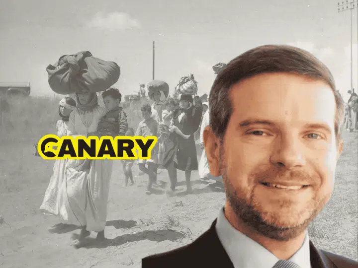

Dr. Alan Mendoza is the new Reform UK candidate for Abbey Road ward in Westminster who is quietly stealing our money to destroy Palestinian villages. The local elections on Thursday 7 May will see Mendoza beg for votes in London, but his primary loyalty seems to lie with Israel. Whilst he presents himself as ‘anti-establishment’, his career reveals a man deeply ingrained in the darkest wings of the British and Israeli establishments. And with him being Chief Advisor on Global Affairs for Reform UK, to which one does his allegiance lie?
Alan Mendoza — His original sin
In April 2011, Mendoza’s Henry Jackson Society (HJS) of which he is executive director, absorbed the Centre for Social Cohesion. The HJS is a Westminster think-tank that promotes “liberal interventionism” and a dark ‘transatlantic’ foreign policy. Basically, it’s a shill for Zionists to break into the heart of our politics. It was originally founded as a group for people from different political parties. Since then, it has been warped into a base for people who push for war. And they use hateful rhetoric against Muslim people in the UK.
The CSC merger was a massive moment for radicalisation. It opened the doors for notorious anti-Muslim wankers such as Douglas Murray to step into the heart of the organisation. This shift was so radical that it tore the society apart. Co-founder Matthew Jamison eventually tore into the HJS, denouncing it as a “far-right, deeply anti-Muslim racist propaganda outfit” that demonised Muslim people and Islam.
Another senior member to resign from the project in 2012 was Marko Attila Hoare. Citing the HJS’s obsession with “anti-Muslim and anti-immigration views” following the takeover as the final straw. This vile takeover ensured the HJS ceased being a foreign policy group and started being a Zionist weapon against Black, Brown and Muslim communities.
Planting trees over a genocidal crime scene
Mendoza’s disgusting reach extends way beyond that racist little think-tank in London. As the President of the Jewish National Fund UK (JNF), he leads a charity that literally erases Palestinians and their history, just to fund illegal occupation. And they’re using our fucking money to do it. One of their most disgusting projects is Britannia Park, a leisure facility in Israel.
This park covers 10,000 acres. And it was built directly over the ruins of seven Palestinian villages, including Ajjur. These communities were ruthlessly ethnically cleansed in 1948 to make way for Israeli expansion. The JNF is planting forests over the bones of innocent Palestinians to make sure displaced people can never return to their homes.
This is a systematic process of erase and deny. It physically blocks the Right of Return for refugees. And why Mendoza preaches about ‘British values’, he heads an organisation that shreds international law and builds on the remains of stolen homes.
And it gets worse.
The stolen land that WE foot the bill for
This isn’t just a devastating issue on the other side of the world. It is our fucking money they are using to commit these disgusting crimes. Through its subsidiary, KKL Charitable Accounts (operating as SmartGiving), Mendoza’s network moved an astounding £9,683,167 in the last financial year. And because it has charitable status, this theft of stolen land is subsidised by us. The British taxpayer is footing the bill through Gift Aid.
This vile little loophole allows wealthy wankers to get a 25% top-up from the government to fund projects that international law deems to be presumptive war crimes. To put it simply, our money is being used to erase Palestinian land and hand it over to settlers in Israel. And that fills me with rage. So whilst Reform UK says it wants to ‘stop the waste’ of public money, it’s own chief advisor is funnelling tax-payer money into illegal settlements behind the scenes.
In 2021, the KKL-JNF board even voted to officially facilitate land purchases in the occupied West Bank. So every quid they reclaim through Gift Aid by Mendoza’s Zionist charities, is a quid that we could use to heal our broken NHS and feed our hungry children. But no, our government is effectively giving it to the ethnic cleansing of Palestinians.
Alan Mendoza — Foreign agents are infiltrating our politics
Mendoza is now the Chief Advisor on Global Affairs for Reform UK. This is the man who is writing Nigel Farage’s foreign policy. A man who is deeply invested in Zionist expansion is definitely not going to be interested in fixing any broken system we have in the UK. The party’s ‘anti-establishment’ bullshit is nothing but a smoke screen designed to support and uphold racist ideologies fed to us by Israel’s far-right.
This corruption of the UK political landscape is a family affair for the Mendozas it seems. Alan is married to Claudia Mendoza, who is the Chief Executive of the Jewish Leadership Council. So whilst her husband appears to be Israel’s infiltrator into our politics, she seems to be reinforcing their control quietly behind the scenes.
As the head of the JLC, Claudia lobbies our government to protect these Zionist entities. Her organisations orchestrate the crack downs on anti-Zionist activism and the pro-Palestine movement.
If we allow Alan Mendoza to be elected to the Abbey Road ward, we are effectively allowing a Zionist takeover of our own democracy. Mendoza doesn’t give a flying fuck about saving the public’s money. While our society is crumbling, our NHS failing and our kids are hungry, Mendoza diverts OUR money away from those issues. He is funnelling our cash into paving over the bones of massacred Palestinians.
Mendoza is a Zionist shill, and we have to do everything we can to stop him getting into power. Time to dig out these parasites that have latched on to Reform UK. We need to do it now before it’s too late.
Featured image provided via author
By Antifabot
Politics
Trump’s 442k ICE deportations not enough for MAGA ghouls


Donald Trump’s racist immigration forces deported over 440,000 people in the US fiscal year for 2025. His jackbooted Immigration and Customs Enforcement (ICE) agents have been terrorising American cities — and even killing US citizens — virtually since he came back to power in 2025.
US outlet Axios reported:
The top U.S. immigration enforcement agency deported 442,637 people between October 2024 and September 2025, according to newly-released statistics.
Adding:
The top-line figure is about 171,000 people more than the fiscal year before, but far short of Trump’s campaign promise to deport one million people a year.
Clearly Trump’s racist immigration regime is not hitting its grotesque targets:
The figure is the first official deportation statistic released under the Trump administration and was included in a congressional budget justification report.
Axios reported:
The Office of Homeland Security Statistics hasn’t updated its data since November of 2024. Homeland Security’s much-hyped “self deportation” figure is not included in the report. The agency has claimed in press releases that more than two million have “self-deported” but hasn’t shared regular data.
MAGA sad about Trump’s mere 400k deportations
Meanwhile Trump’s fascistic Make America Great Again (MAGA) allies have said the president has gone soft on deportations. Nigh-on half a million people ejected not enough for them then…
The grim-sounding Mass Deportation Coalition is chief among the complainers. Its leader, Mike Howell, told Axios:
The truth is the first year was not a year of mass deportation
Adding:
A conscious decision was made to go after the worst first, which was, we’ll call it a deviation from the central campaign promise of mass deportations.
A White House spokesperson told the outlet:
Nobody is changing the Administration’s immigration enforcement agenda and the President’s entire team is on the same page when it comes to implementing his policies.
Budgetary changes
And MAGA’s white supremacist weirdos might have more discomfort in store for them. A new report by Homeland Security, which control ICE, says that it has actually asked for less money for the next financial year:
The ICE report shows that the goal for next year is to deport 1 million people. But the agency has asked for less money in fiscal year 2027 than it did in fiscal year 2026.
ICE recently lost its boss after Trump fired nativist horror Kristi Noem and replaced her with another fascist tool, the preposterously named Markwayne Mullin. As the Canary wrote at the time:
Turns out that using a masked secret police to murder and kidnap people to concentration camps makes you unpopular, even in America.
As such, Noem has made a convenient sacrifice to make Trump look like he’s relenting. Meanwhile, nothing will change under Markwayne Mullin, save maybe that ICE will get a little more cautious, a little more covert in their actions.
There is no number of deportations which will sate American fascism’s thirst for human suffering. Trump may be distracted by his failed war against Iran, but sooner or later his Sauron gaze will turn back to the US and his attention will return to the ignoble task of kicking out immigrants left, right and centre. We hope the American people will continue to fight back, as they have in Minnesota and elsewhere.
Featured image via the Canary
By Joe Glenton
Politics
Palestine participates in the Beach Games in China without a coach and half a team


The Palestinian national beach soccer team has arrived in Sanya, China, to participate in the 2026 Asian Beach Games, but this time their arrival is unlike any previous appearance.
The team’s roster is incomplete. The coaching staff is absent. The international stadium is open to a team exhausted by years of inactivity.
Their progress has been halted by war, reduced to mere survival rather than competition.
Trapped in Gaza
The team enters the tournament with only 11 players. This includes five players from the Gaza Strip currently in Cairo, and six players from the West Bank, who are participating for the first time simply to fill the roster.
This lineup seems more like an attempt to fill space than to build a complete team. In reality, it is all that remains of a team that was once close to the top of the sport.
The most heartbreaking aspect is the absences: the entire coaching staff is not traveling, and key players are trapped by the war in Gaza. They will be absent from the fields, along with the very essence of the game itself.
The long years of inactivity, stretching back to the outbreak of war, have left Palestinian beach soccer with nothing but a dormant memory – a sport barely surviving.
Sports eroded by war
Beach soccer in Palestine didn’t suddenly collapse; rather, it gradually eroded over nearly three years of inactivity.
Training camps ceased, travel opportunities vanished, and international participation dwindled to almost nothing – a stark reflection of the direct impact of war on sports at all levels.
This sport wasn’t alone in its isolation; the beach volleyball team was also unable to travel to the same tournament, completing the picture of Palestinian absence from the competitions. It was as if participation this time wasn’t measured by the number of teams present, but by the number that couldn’t make it.
Despite all this, participation carries a dimension that transcends the result and the tournament itself. It’s an attempt to keep Palestine’s name present on the international stage, even if the presence is incomplete and burdened by circumstances. It’s a determination not to completely sever ties with the world.
The Palestinian national team’s memories harken back to a different time. When he was competing fiercely in Arab and Asian championships, coming close more than once to the World Cup dream, and even reaching the podium to win bronze at the 2012 Asian Beach Games in China.
That win is a distant image that seems today to belong to another life, before war redrew the boundaries of the game, the field, and the opportunity.
By Alaa Shamali
Politics
Disabled pensioner says Farage minders assaulted him over disabled parking spot


Disabled Shetland pensioner Don Whittle has accused Reform UK leader Nigel Farage‘s ‘heavies’ of ‘manhandling’ him – assault, in other words – after Farage’s car took a disabled parking bay.
Incident caught on camera
75-year-old Whittle has rheumatoid arthritis, heart failure, a pacemaker and a spinal condition that weakens his arms and legs. He says that the thugs grabbed him after he tried to take photos of Farage’s car in a disabled spot he needed to drop his wife off. The incident was caught on camera:

‘Lucky’ henchmen
An unfazed Whittle quipped that the henchmen were “lucky – I could have used my martial arts training”. He went on:
I’m disabled and I take offence to people that park in disabled spots who are not disabled. I went down to take photographs of them parked there and so they started to move off and decided to park on a corner on double yellow lines. I photographed them there.
This clown wouldn’t let me through. And I couldn’t go through on the pavement because of the protesters. I just wanted to get through to the front to take pictures of them blocking the street. [After Farage got in the car] I walked past them and went and stood in front of his car, thinking, ‘Well, if you can stand and block me, I can stand and block you.’
So I stood there. And two of his henchmen came out and manhandled me across the road out of the way. They weren’t considerate. They didn’t say, ‘Would you mind moving out of the way?’ They didn’t even ask. They just grabbed me. I said, ‘I’m disabled.’ And they didn’t care.

Shetland Greens intervene
Shetland Greens mounted a protest against Farage’s visit. Party candidate said:
We are here to oppose the toxic Trumpian politics of Nigel Farage. We stand against hate, our politics are guided by kindness, and we support the human rights of all people including migrants, ethnic minorities, and all marginalised people.
The Reform grifter could easily have afforded to pay for a parking space. He has been identified as having the second-biggest non-parliamentary earnings among all UK MPs after spending more than 1,100 hours outside Parliament working for fourteen outside employers. Clacton voters have complained that he is rarely in the constituency.
A sign spotted on a fence alongside one of Shetland’s main roads described Farage as a “frog-faced wanker”.
By Skwawkbox
Politics
Pope calls leaders who spend billions on wars ‘tyrants’


The Pope has criticised world leaders who spend billions on wars. This comes just days after US president and all-around fucking dickhead Donald Trump depicted himself as Jesus on Truth Social.
Trump vs Pope
American-born Pope Leo has been critical of Trump and the genocide he and Israel are committing. He rightly made Trump look like an absolute cock with the most grace by saying:
War divides; hope unites. Arrogance tramples upon others; love lifts up. Idolatry blinds us; the living God enlightens. All it takes is a little faith, a mere “crumb” of faith, in order to face this dramatic hour in history together — as humanity and alongside humanity. #Peace
On 13 April, Trump attacked the Pope in a lengthy post. As Canary reporter Willem Moore said, feel free to read it all if you’ve got a spare 10 minutes and don’t respect your own time.
This will end well.
Some genius in Trumpland decided, “Hey, the best thing we can do now is to go to war with the Holy Father.” pic.twitter.com/zYG3IuNivB
— Rick Wilson (@TheRickWilson) April 13, 2026
The paedophile president followed that up by posting the now-infamous AI image:
Trump is now posting AI images of himself as Jesus Christ healing, what appears to be, a young Jeffrey Epstein. pic.twitter.com/zG2OQKbP9s
— Harry Sisson (@harryjsisson) April 13, 2026
Surreal
The Pope responded to Trump’s latest outburst with:
I don’t think that the message of the Gospel is meant to be abused in the way that some people are doing.
I will continue to speak out loudly against war, looking to promote peace, promoting dialogue and multilateral relationships among the states to look for just solutions to problems.
After much criticism from his own supporters, Trump deleted the post. He then tried to claim he was actually supposed to be a doctor, not Jesus. Because doctors typically place their hands on their patients’ foreheads and heal them with light, don’t they?
He also of course, blamed the ‘fake news’:
Reporter: Did you post that picture of yourself depicted as Jesus Christ?
Trump: It wasn’t a depiction. I did post it and I thought it was me as a doctor. And had to do with red cross as a red cross worker, which we support and only the fake news could come up with that one. pic.twitter.com/7Y1u86GjkP
— Acyn (@Acyn) April 13, 2026
As the Canary also reported, JD Vance also tried it with the Pope, but got heckled in the process. Maybe you should just go pay him a visit, JD, it worked with the last one.
Now, on his tour of Cameroon, Pope Leo is doubling down on calling out genocide.
He criticised leaders who:
turn a blind eye to the fact that billions of dollars are spent on killing and devastation, yet the resources needed for healing, education and restoration are nowhere to be found.
He continued:
The masters of war pretend not to know that it takes only a moment to destroy, yet often a lifetime is not enough to rebuild
Speaking to crowds, he said the world was ‘being ravaged by a handful of tyrants’ and that in Cameroon in particular there was ‘an endless cycle of destabilisation and death’.
Fresh off the back of his speech, the Pope tweeted another message which was blatantly aimed at Trump:
Woe to those who manipulate religion and the very name of God for their own military, economic, and political gain, dragging that which is sacred into darkness and filth
It’s clear that the Pope will not be intimidated by pathetic little men like Trump, now if only other leaders like Keir Starmer could follow in his wake.
Though it will never not be fucking ridiculous that the bloody pope subtweets the president of the United States.
Featured image via the Canary
Politics
Support for Reform slashed following Farage’s crypto controversy


With the local elections fast approaching, Reform would ideally like to see their polling go up. Instead, they just lost a sixth of their supporters in one week according to More in Common:
Reform drops to 25% in this weeks voting intention their lowest since April 2025. They lead the Tories by 3 & Labour by 4
N = 2,011 | 10-13/4 | Change w/ 8/4 pic.twitter.com/DNZVf9Incv
— Luke Tryl (@LukeTryl) April 15, 2026
 REF UK 25% (-5)
 CON 22% (+3)
 LAB 21% (+1)
 GREEN 13% (+1)
 LIB DEM 12% (nc)
 OTH 3% (nc)
 SNP 2% (nc)
This is particularly embarrassing for Reform as the pollster More in Common is linked to their party:
Well of course Miles Jones, Reform UK’s Deputy Leader in Bexley works for pollster More in Common… pic.twitter.com/xMR8nOwyq3
— Reform Party UK Exposed
 (@reformexposed) April 3, 2026
Reform plummet
Of course, we can’t trust polls by themselves. The fact that different pollsters get such wildly different results is testament to that. In the above, More in Common have the Greens at 13%; several other pollsters regularly have them outperforming Labour:
— Seats — Poll: @FindoutnowUK, 15 Apr (+/- vs 8 Apr) pic.twitter.com/5um8xYOZyi
— Stats for Lefties
 POLL | Reform lead by 6pts
 Ref: 26% (+1)
 Grn: 20% (=)
 Con: 17% (=)
 Lab: 16% (=)
 Lib: 11% (=)
 Ref: 323
 Grn: 108
 Lib: 77
 Con: 48
 SNP: 47
 Lab: 12
 Plaid: 8

 (@LeftieStats) April 16, 2026
— Seats — Poll: @YouGov, 12-13 Apr (+/- vs 7 Apr) pic.twitter.com/m0PQxoBh26
— Stats for Lefties
 POLL | Reform lead by 5pts
 Ref: 24% (=)
 Con: 19% (=)
 Grn: 18% (+2)
 Lab: 17% (+1)
 Lib: 13% (=)
 Res: 4% (=)
 YP: 0% (-1)
 Ref: 282
 Grn: 91
 Con: 83
 Lib: 81
 SNP: 47
 Lab: 34

 (@LeftieStats) April 14, 2026
At the same time, a sudden drop with a pollster can indicate that something is amiss for a party (that or something is amiss with the pollster).
Looking at Politico’s Poll of the Polls, we can see that averaged out Reform are down six percentage points from where they were six months ago:

It’s no wonder Reform are losing support. The following are just some of the stories we’ve reported on in the runup to the local elections:
- Reform activist said ‘Hitler was right’.
- Reform candidate wants to ‘tear down’ the NHS.
- Reform candidate exposed as a horny nincompoop.
- Day One Reform activist accuses party of ‘sewer’ politics in explosive resignation letter.
- Farage heckled at Reform’s Jimmy Saville-aping London launch.
A fish rots from the head
On 13 April, Farage announced his partnership with Stack BTC. As part of this, he purchased an unseemly quantity of Bitcoin – i.e. the digital money which you can’t use to buy everyday things but you can use to scam people:
BREAKING: Nigel Farage has purchased £2m of Bitcoin for Stack BTC – becoming the first sitting MP and the first UK political party leader in history to publicly buy Bitcoin.
A landmark moment for Bitcoin in British politics.$STAK @Nigel_Farage @blockchain @kwasi_stackbtc… pic.twitter.com/O614kKe5TN — Stack BTC (@stackbtc_) April 13, 2026
Farage bought the crypto from a company linked to Kwasi Kwarteng – the chancellor who delivered Liz Truss’s disastrous budget (the one which led to rampant inflation we never recovered from).
Journalist Fraser Nelson accused Kwarteng and Farage of working together to generate “hype” for their own benefit:
No, Kwasi: your company gave Farage a sweetheart deal. A bonus he can exercise in just two years. Ordinary shareholders don't have this.
The penny-share nature of your firm means Farage is already ~£200k up (+93%). With crypto, hype creates value. https://t.co/maRks88jMO https://t.co/5v9a9j7m5K
— Fraser Nelson (@FraserNelson) April 13, 2026
Hype is what made crypto what it is.
The value of BitCoin kept going up because people kept buying it. Those who bought early made bank; those who bought late did not.
In other words, there was a pyramid-like shape to the affair.
Because of the nature of triangle-shaped ventures, it became harder and harder to get people to buy in. Resultantly, BitCoin’s value has plummeted in the past six months:

Crypto holders need the value to keep going up – hence the promotional deals like this one with Farage.
Lib Dems are challenging the Farage Crypto dealings with the FCA https://t.co/L8LEGTpV0y
— dave lawrence


 (@dave43law) April 13, 2026
A long way to go
Reform UK have certainly lost support, but we need to make sure they lose more.
Whether it’s jumping into bed with dodgy donors or sucking up to Trump, this party is trouble.
We just don’t want the public to realise too late that Farage and co never had their best interests at heart.
Featured image via Canva
By Willem Moore
Politics
Israel’s Lebanon house demolitions are part of an explicitly genocidal doctrine


The BBC has confirmed Israel is demolishing hundreds of homes in southern Lebanon. Yet the corporation left out some key context: home demolitions are a part of an explicitly genocidal strategy know as the Dahiya doctrine.
BBC Verify used satellite imagery to confirm hundreds of homes had been deliberately destroyed with airstrikes or Israeli occupation force (IOF) demolition teams on the ground.
The BBC report said:
BBC Verify analysis found more than 1,400 buildings had been destroyed since 2 March based on verified visual evidence.
This is just a snapshot of the overall damage caused by Israeli air strikes and demolitions, because of limited access on the ground and available satellite imagery.
The reported acknowledged that the “true scale” is likely to be “much higher”.
The BBC did report some of the context:
Israel’s levelling of these structures comes after Defence Minister Israel Katz’s order on 22 March to “accelerate the destruction of Lebanese homes” near the Israeli border based on the “model in Gaza” as part of its campaign against Hezbollah.
Adding that:
The systematic demolition of these towns and villages may amount to a war crime, international law experts told BBC Verify.
And to their credit (for once) the BBC noted that Israel provided no evidence:
that Hezbollah has embedded military infrastructure within civilian areas in the region.
But there is still a lot missing from their report…
Lebanon: vital context
Here’s a breakdown of how we actually got here – usually missing from legacy media reporting.
Israel violated the US-brokered Lebanon 2024 ‘ceasefire’ over 15,400 times since it was signed. Must be a world record. Yet a short salvo from Hezbollah in early March 2026 was framed as a signal outrage by legacy media. That attack has been cited by the settler-colonial state as a pretext to invade.
Not satisfied with pulling the US and its allies into a runaway war with Iran, Israeli troops have pushed into Lebanon with airstrikes pummelling the capital Beirut.
The Canary reported the early moments of the new war here. You can read about the secretive Israel-US ‘side letter’ pact which gave Israel carte blanche to keep bombing through the ‘ceasefire’ here. And our extensive coverage of Israel’s ceasefire regular breaches here.
But there’s more…
Dayiha scorched earth doctrine
The so-called Dayiha doctrine was born in Lebanon and sharpened over many years. This scorched earth approach to ‘counter-insurgency’ found its fullest expression in Israel’s genocidal assault on Gaza. Now it is back where it began: Lebanon’s combative south.
As the Canary reported on 6 March, just days into the new Israel invasion, peace and conflict expert professor Paul Rogers explained the history and character of the doctrine particularly well in the context of Gaza in December 2023. Surveying the early devastation in the enclave, he said the horror spoke to a:
specific Israeli way of war that has evolved since 1948, through to its current Dahiya doctrine, which is said to have originated in the 2006 war in Lebanon.
Rogers said:
In July of that year [2006], facing salvoes of rockets fired from southern Lebanon by Hezbollah militias, the IDF fought an intense air and ground war.
However:
Neither succeeded, and the ground troops took heavy casualties; but the significance of the war lies in the nature of the air attacks. It was directed at centres of Hezbollah power in the Dahiya area, in the southern suburbs of Beirut, but also on the Lebanese economic infrastructure.
It was there in Dahiya that Israel’s genocidal impulses mutated into a new policy of annihilation.
As Rogers explains:
This was the deliberate application of “disproportionate force”, such as the destruction of an entire village, if deemed to be the source of rocket fire.
One graphic description of the result was that “around a thousand Lebanese civilians were killed, a third of them children. Towns and villages were reduced to rubble; bridges, sewage treatment plants, port facilities and electric power plants were crippled or destroyed.”
This “deliberate application” of massive Israeli violence goes far beyond fighting ‘terrorists’ and aims to destroy the very means of life.
As we always make sure to point out, Israel’s ambitions in Lebanon are not and have never been ‘defensive’. In the Zionist fever-dream of a Greater Israel, Lebanon is already theirs. So are large parts of other neighboring countries. The application of the latest version of the Dahiya doctrine to Lebanon is just the last expression of this Western-backed colonialist yearning.
Featured image via the Canary
By Joe Glenton
-

 Politics6 days ago
US brings back mandatory military draft registration
-

 Sports6 days ago
Man United discover Nico Schlotterbeck transfer fee as defender reaches Dortmund agreement
-

 Fashion6 days ago
Weekend Open Thread: Veronica Beard
-

 Politics7 days ago
Malcolm In The Middle OG Turned Down ‘Buckets Of Money’ To Appear In Reboot
-

 Politics4 days ago
World Cup exit makes Italy enter crisis mode
-

 Business6 days ago
Tesla Model Y Tops China Auto Sales in March 2026 With 39,827 Registrations, Beating Cheaper EVs and Gas Cars
-

 Crypto World3 days ago
The SEC Conditionalises DeFi Platforms to Be Avoided for Broker Registration
-

 Crypto World3 days ago
SEC Signals Exemption for Crypto Interfaces From Broker Registration
-

 News Videos2 days ago
Secure crypto trading starts with an FIU-registered
-
 NewsBeat4 days ago
Pep Guardiola and Gary Neville agree over Arsenal title problem that benefits Man City
-

 Business5 days ago
Ireland Fuel Protests Enter Day 5 as Blockades Spark Shortages and Government Prepares Support Package
-

 Business6 days ago
OpenAI Halts Stargate UK Data Centre Project Over Energy Costs and Copyright Row
-

 Politics7 days ago
LBC Presenter Mocks Trump Over Iran War Failures
-

 Crypto World6 days ago
Federal judge blocks Arizona from bringing criminal charges against Kalshi
-

 NewsBeat3 days ago
Trump and Pope Leo: Behind their disagreement over Iran war
-

 Crypto World3 days ago
SEC Proposes Certain Crypto Interfaces Don’t Need to Register as Brokers
-

 NewsBeat5 days ago
JD Vance announces ‘no agreement’ with Iran over nuclear weapons fear
-

 Tech7 days ago
A version of Windows 10 released a decade ago is now eligible for additional security patches
-

 Business6 days ago
IMF retains floor for precautionary balances at SDR 20 billion
-

 Business6 days ago
Former Liverpool CEO eviscerates FIFA for World Cup ticket pricing


You must be logged in to post a comment Login