


TP-Link Tapo C660 Kit: One-minute review
The TP-Link Tapo C660 Kit is a feature-packed 4K outdoor security camera that delivers many of the perks usually reserved for pricier models, including solar charging, pan-and-tilt coverage, color night vision and local microSD storage.
That last feature means you won’t need to pay for a subscription for video playback and download, but there are still some great (but non-essential) features in the paid Tapocare subscription, especially if you plan to expand your home’s security with more than a single camera.
The Tapo app is also easy to use, and the C660 Kit will slot in alongside other Tapo smart home gear like lights, plugs and more to form its own smart home ecosystem. On the other hand, if you have other smart devices in the mix and would prefer a hub to control them all, Alexa has the strongest support, while Google Home only works with voice commands and video streaming to smart displays and TVs. There’s no native support for Apple HomeKit.
Latest Videos FromTechRadar
While it doesn’t necessarily stand out in a crowded market with its design, the white casing looks sleek and stylish, and the IP65 waterproof rating means the C660 Kit is dust-tight and can withstand low-pressure water jets from any direction (aka rain, splashes or hose spray).

TP-Link Tapo C660 Kit review: Price and availability
- Starts at $169.99 / £179.99 / AU$299 for a single camera unit
- Available in multipacks of 2, 3 and 4-camera bundles
- Optional Tapocare subscription plans start at $3.49 / £2.99 / AU$3.99 per month
The Tapo C660 Kit costs $169.99 / £179.99 / AU$299 for a single camera unit, although multipacks of 2-, 3- and 4-camera kits are available either as set bundles or as part of a build-your-own package option directly from Tapo as well as through third-party retailers like Amazon.
While you may not need a subscription package, especially if you use a single camera unit, Tapocare might well be worthwhile for some users. It offers cloud storage, extended video clip history for up to 30 days and enhanced notifications, with plans starting at $3.49 / £2.99 / AU$3.99 per month for one camera on the Basic Tapocare tier. Prices increase as you add more cameras.
You can also buy the camera on its own without the solar panel under the TP-Link Tapo C560WS name for $99.99 / £109.99 / AU$199.
TP-Link Tapo C660 Kit review: Specs
|
Price |
$169.99 / £179.99 / AU$299 |
|
Megapixels |
8MP |
|
Resolution |
4K / 3840 x 2160 pixels |
|
Field of view |
105º |
|
Pan/tilt |
360º horizontal rotation, 90º vertical |
|
Storage |
microSD up to 512GB (not included) |
|
Smart home |
Alexa, Google Home, Siri Shortcuts; no HomeKit |
|
Battery |
10,000mAh |
|
Connectivity |
2.4GHz / 5GHz Wi-Fi 4 |
|
IP Rating |
IP65 |
TP-Link Tapo C660 Kit review: Design and installation
- Sleek black and white color scheme
- Straightforward installation with easy-to-follow instructions
- Recommended mounting height is between 2.5m and 3m (8-10 feet)
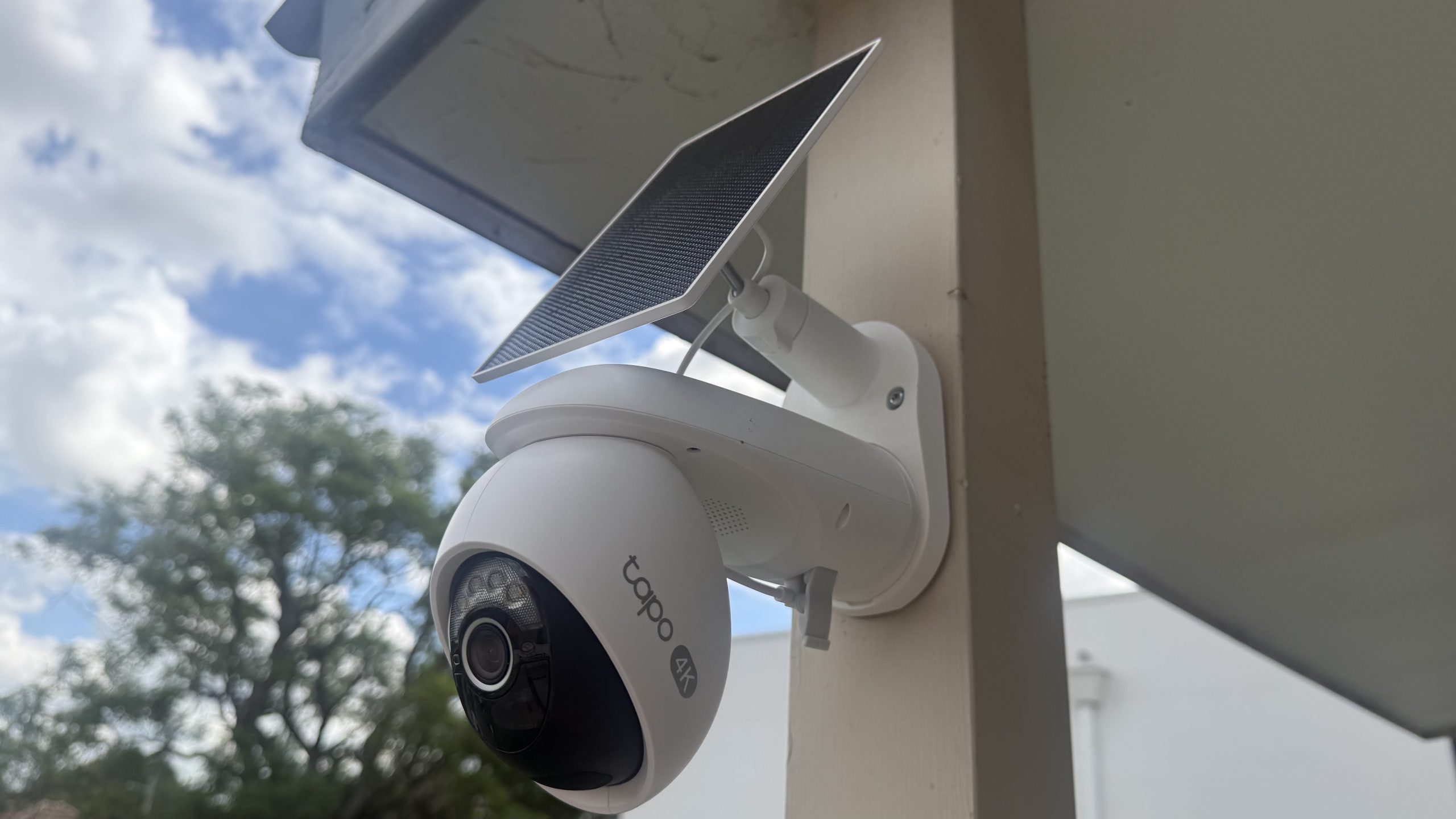
The Tapo C660 Kit has a sleek white plastic body with black accents around the lens, with IP65 rating for dust ingress protection and resistance to low-pressure water jets from any direction. This means water from rain, splashes or hose spray will be fine, but it won’t withstand immersion and pressure washing.
The solar panel is just the right size relative to the camera — it isn’t small and subtle by any means and it’s definitely noticeable once installed, but it isn’t too imposing either. As mentioned above, there is a rubber flap underneath the camera lens concealing the power button, a reset button and a microSD card slot.
Installing the Tapo C660 Kit is straightforward thanks to the easy-to-follow instructions included in the box. You start by drilling holes where you want to mount the base plate, then slot the camera in. The solar panel is screwed on top, then plugged into the camera’s USB-C port located on the bottom.

It’s worth taking some time to think about where you want the camera placed before you install it, though. While the Tapo C660 Kit can pan and tilt the camera, getting the full view of an entire space isn’t guaranteed if it’s mounted too low since it doesn’t tilt upward. TP-Link recommends mounting it between 2.5m and 3m (8-10 feet) and in a location where the solar panel gets the most sunlight throughout the year.
TP-Link also recommends that the camera shouldn’t point at swaying trees and other moving objects like vehicles and pedestrians to prevent an avalanche of notifications, but if it’s unavoidable, the C660 lets you set motion detection zones via the app to reduce or minimize notifications of movement within those zones.

One thing to note about the installation is that the camera has a manual power button tucked away beneath a flap under the lens. Unlike other security cameras that power up automatically when plugged into a power source (like the solar panel or a USB-C cable), this button needs to be switched on before mounting (especially when it’s in a hard-to-reach height) and pairing with the Tapo app.
Pairing the camera to the app is quick and straightforward, with only a few setup options at the beginning, like Wi-Fi connection type (2.4GHz for longer range or 5GHz for better video streaming quality, both using the Wi-Fi 4 standard), assigning the camera’s location and even the icon you want displayed in the Tapo app home screen.
TP-Link Tapo C660 Kit review: Software and smart home support
- Tapo app is intuitive and easy to use
- Alexa has full support, while Google Home is limited
- Motion detection zones move with the camera instead of a fixed area
TP-Link’s Tapo C660 Kit natively integrates with the Tapo smart home app, allowing the camera to slot into any existing Tapo smart home ecosystem that might include lights, plugs, switches, robot vacuums, door locks and more.
If you have devices from other brands and use a smart assistant to consolidate them into one interface, the camera supports Amazon Alexa and Google Home. Alexa supports both live footage playback and voice commands, while Google Home only supports voice controls and video streaming on select devices. Apple HomeKit isn’t supported, but alerts and automations can still be done through Siri via iOS shortcuts enabled through the Tapo app.

The app works well, with an intuitive interface using tiles to show all your Tapo devices, with dedicated tabs for the different gadget categories (like cameras, vacuums and ‘Smart’ for automations). You can play the live feed and adjust settings by tapping on the tile for the camera (or cameras if you have more).
Camera settings include two-way audio, a toggle for the built-in spotlight and adjustments for panning and tilting the camera. There’s also an option to ‘save’ a set camera position via ‘Viewpoints’ and easily access those positions without manually adjusting each time. Those views can be used for automations, too.
To try out the feature, I set the camera to monitor the rear of the house instead of the driveway and front stairs for just a few hours during the day, and it would activate as scheduled each time. Patrol Mode also lets you move the camera between those set positions, but the Tapo app warns that this mode may impact the camera motor’s longevity.

One annoyance I found with the Viewpoints feature was that the motion detection zone that I set also moved with the camera and there’s no option to lock it to a specific spot. Thankfully, I didn’t have to move my camera too often for that to personally impact me, but I can see it being inconvenient for some users.
Adding to the motion tracking is a setting subject detection like person, pet or vehicle, and it can also be set for different motion detection zones as well.
TP-Link Tapo C660 Kit review: Performance
- Crisp 4K image quality from 8MP lens
- Built-in spotlight provides color at night
- Solar panel keeps the unit running 24/7
The Tapo C660 Kit captures videos through its 8MP lens with 4K (3840 x 2160 pixels) resolution, with a frame rate of 15 or 20 frames per second. The recorded video clips were crisp and detailed when viewing live or when playing back previously recorded footage. It was clear enough for me to see details like faces, vehicle license plates and larger text from further away, while the 18x digital zoom provided more detail than lower-resolution cameras.
It managed to retain detail in brighter areas and the video wasn’t washed out, like when direct sunlight was hitting the driveway. There’s built-in wide dynamic range to prevent overexposure in bright sunlight or underexposure in dark shadows.
Motion tracking was responsive, and the C660 Kit could track me moving when I was walking quickly, running or cycling (although I wouldn’t necessarily call myself a fast runner or cyclist to try and avoid the tracking). I also liked that the camera automatically reverts to the original position after detecting movement, so I didn’t have to adjust it manually as some security cameras require you to do.
At night, the f/1.6 aperture takes in enough light to provide a clear image, and the built-in spotlight adds more low-light visibility. There’s also an infrared sensor as an alternative to color night vision. While I found both modes were able to detect movement almost instantly, the image quality isn’t as crisp as daytime mode, but it was still decent enough to be clear and fully visible.
The built-in microphone produced clear audio and was loud enough for a conversation even when I wasn’t at home.

The solar panel kept the battery topped up, with the camera almost always running at 100% apart from some overcast days. It was only when I switched on 24/7 Capture (which frankly most people won’t need) that the solar panel struggled to keep the camera charged, and I eventually had to bring it indoors (it can be removed from its base plate easily) for a top-up via a USB-C cable.
In a different test, I tried running the camera without the solar panel plugged in, and the camera ran uninterrupted for just over 2 weeks before it needed charging.

The Tapo C660 Kit isn’t necessarily the cheapest 4K security camera, but having local storage via a microSD card makes it a great value option compared to others that require a subscription to access cloud storage for recorded footage. It supports up to 512GB, though you’ll need to purchase the microSD card separately as it doesn’t come with one in the box.
TP-Link says that’s enough for around 16 complete days of recording, which is plenty for most people. Local storage means you can also back up those recordings to your home computer or another drive for redundancy. The Tapo app also lets you password-protect the microSD card for an extra layer of security.
Accessing footage from the card is easy through the app, and notifications reliably link to recordings with almost no delay after the camera detects motion. Video playback is also very smooth in the app. If you prefer cloud storage, you can opt for the aforementioned Tapocare subscription and choose a plan based on the number of connected cameras you plan to have.
Other features in Tapocare include 30 days of encrypted video storage for events, rich notifications and video summaries.
Should I buy the TP-Link Tapo C660 Kit?
|
Attribute |
Notes |
Score |
|
Value |
You get some premium features like 4K resolution and 360º views for an affordable price, while on-device storage means you don’t have to pay for a subscription. |
5/5 |
|
Design |
It features a clean, sleek white design that’s relatively sturdy, and the solar panel that helps to extend its battery life is a proportionate fit. |
5/5 |
|
Software |
The Tapo app is clean and intuitive, with plenty of adjustments to fine-tune the settings. Alexa has the strongest support for smart home integrations, with Google Home at a distant second. |
4/5 |
|
Performance |
It captures crisp 4K footage well, and also performs reasonably well in low-light situations thanks to a built-in spotlight. |
4/5 |
Buy it if
Don’t buy it if
How I tested the TP-Link Tapo C660 Kit
I installed the Tapo C660 Kit to a porch post on my property for a few months to get a sense of both its recording capabilities and whether its solar panel would keep the camera’s battery charged.
I tested all the settings, but had the alarm and spotlight mostly turned off to avoid disturbing neighbors, only doing one-off tests to see if they perform as advertized. I would also check captured footage whenever I got a push notification.
The smart home integrations were tested with smart displays (a 2nd-gen Google Nest Hub and an Amazon Echo Show 5) in addition to the Alexa and Google Home mobile apps.
First reviewed July 2026


You must be logged in to post a comment Login