The Camp Snap is a digital pocket camera with the design of a retro-styled film camera. It’s extremely inexpensive and leans into the digicam trend that’s popular among 20-somethings and younger. It doesn’t quite succeed in the same way similar cameras do, like the Flashback.
Image quality is fairly mediocre, even for a budget camera, which, to be fair, might be what some people are looking for with the retro trend. However, spending even a small amount more can get you better images to start with, giving you more options for how the final photos look.
For the price, the Camp Snap isn’t bad. In fact, it’s better than some ultrabudget cameras I’ve tested, but beyond the overall design, the Camp Snap has less to offer, even compared to other cameras with similar vibes and style.
Advertisement
Camp Snap specs
Photo resolution
8 megapixels (3,264×2,448)
Video resolution
N/A
Sensor size
1/3.2-inch
Lens
32mm (35mm equivalent) f/1.8
Image stabilization
None
Screen type
Monochrome LCD with image count only
Storage
MicroSD (4GB card included)
Weight
97grams (0.2 pounds)
App
None
The Camp Snap has fairly unimpressive specs, not too surprising for something that costs $70. The version I bought was V105, which overall looks the same as previous versions but has the ability to install custom filters for the photos and a slight redesign of the flash toggle.
The toggle also turns the camera on and off. Previous versions used the shutter button to do that. I can see why they made that change. It’s far less likely to take 50 photos of the inside of your bag with a physical power switch.
Advertisement
Geoff Morrison/CNET
Surprisingly, the camera actually has a removable microSD card on the bottom under a door that’s secured with a screw. That’s not exactly the most user-friendly design, which I suppose is why Camp Snap recommends connecting the camera via USB and barely mentions the card.
Next to the card slot, hidden by the same door, are the extent of the Camp Snap’s settings: a mode button and two others for up and down. This is to set the date recorded in the photo’s metadata. That’s it. No exposure settings, modes, switchable filters, nada.
This camera was designed to replicate the feeling of using disposable film cameras. If you want more than that, look elsewhere.
Advertisement
Geoff Morrison/CNET
You can install a filter for your photos, though this process also isn’t user-friendly. To switch filters, you need to plug the camera into a computer and download a .flt file from the Camp Snap website, drop it into the camera’s memory and all images taken after that will use that filter’s settings. You can’t change it on the go, and unlike the Flashback, you don’t get unfiltered photos to adjust later.
Geoff Morrison/CNET
You can, however, design your own filter if one of the premade options on the website isn’t to your liking. It’s an easy-to-use interface, complete with a preview of your adjustments.
Most people buying the Camp Snap will probably stick with either the preinstalled “Camp Classic” or “Vintage” filter (it’s called both on different parts of its site) or choose one of the other premade ones that are available, but being able to design your own this easily is a great feature.
However, again, switching filters isn’t as simple as pressing a button or scrolling through menus.
Advertisement
The filter design page on Camp Snap’s website.
Camp Snap/CNET
Not having Bluetooth or Wi-Fi is likely one of the reasons the Camp Snap is so cheap. It’s also why spending a bit more on the Flashback is probably a wise investment. Not having to connect to a computer to do anything is definitely a bonus.
The other problem is that the base image quality isn’t great, limiting the effectiveness of the filters in general. I’ll get to that in the next section.
Usability and photo quality
Advertisement
Enlarge Image
All images in this section are unedited other than cropping and use the preinstalled Camp Classic/Vintage filter unless otherwise noted.
Geoff Morrison/CNET
Using the Camp Snap isn’t quite as satisfying as the Flashback either. First, it feels even more cheaply made. You wouldn’t think there’d be much of a difference between the Camp Snap’s 97 grams and the Flashback’s 147 grams, but it’s noticeable, and the lighter Camp Snap feels even more disposable.
There’s less tactile and audible enjoyment as well, with a cheap-feeling shutter button, extremely unsatisfying electronic shutter sound and none of the ratcheting click-click-click of the Flashback’s “film” advance dial.
Advertisement
Enlarge Image
Geoff Morrison/CNET
That said, with a single button and no settings to adjust, the Camp Snap is obviously very easy to use. It doesn’t even have a screen, unless you count a small monochromatic LCD that shows the picture count. You can line up a shot with an optical viewfinder. These never worked particularly well, but it’s better than nothing.
Enlarge Image
Advertisement
Geoff Morrison/CNET
Going for the retro aesthetic is one thing, but it invites the question: What’s retro? Does that mean the 2000s digital cameras? Or is it 90s disposable film cameras? Black and white?
Digital cameras have long had settings and “filters” that adjust how the final image looks. Some, like many Fujifilm cameras, have built a cult following around their filters (or, as we in the cult call them, recipes).
The Camp Snap’s preinstalled filter is alternately called Camp Classic or Vintage, which they describe as “that classic summer camp vibe.” But again, summer camp from what period?
Geoff Morrison/CNET
The images with the preinstalled filter have an overly warm color temperature that wasn’t typical in-era, but some imagine it was. The images are noisy and oversharpened, looking vaguely like a budget 2000s digital camera or early camera phone. The camera also tends to blow out highlights. They look better than the Kodak Charmera, at least.
Advertisement
Enlarge Image
From left to right: Camp Classic/Vintage, Kodaclone, 101Clone and a custom “neutral” filter made using the website tool’s Standard preset.
Geoff Morrison/CNET
I can see what Camp Snap was trying for with the looks of some of the filters, but because the underlying images are mediocre, the filters end up looking like the kind of filters you’d get on a cheap digital camera that you never use after the first day.
Then again, that’s not entirely different than what Camp Snap says it’s going for with this camera. Such marketing just ends up feeling like “if you can’t fix it, feature it,” though. Or to put it another way, you could do what these filters are doing on a camera that produces better images, and the final result would overall be better.
Advertisement
Maybe I’m overthinking it. If people wanted “better” photos, they wouldn’t be looking to mimic old disposable cameras.
More camp, less snap
Geoff Morrison/CNET
I’ve mentioned it a bunch in this review because I came away from my time with the Flashback rather enamored with it. It’s a nostalgia-induced dopamine hit for those who used disposable cameras and something delightfully retro for many (most?) of its potential customers that likely never experienced such things the first time around. That’s fine — every generation has that about something.
The bones on the Flashback were good, though. It took decent pictures for a $120 camera, and it was easy to use. I didn’t get that same warm feeling after my time with the Camp Snap. This is a very inexpensive camera that feels and performs like a very inexpensive camera, trying to mimic something it isn’t.
The Camp Snap has the added hassle of needing to connect to a computer to view your images. Not ideal. Even if you have a microSD card reader for your phone, you’d need to also carry a tiny screwdriver to get at the card. Also not ideal.
Advertisement
Then there’s the pictures themselves, which are retro but in a bad way. The Flashback presents images that are an idealized aesthetic of what once was. The Camp Snap is what was, specifically, the worst cameras of the era.
Swan boats with the 101Clone filter taken approximately 0.75 miles from the 101 highway.
Geoff Morrison/CNET
Physically, though, it looks great, and is available in a selection of colors I wish more products had in this era of grays on grays on grays. I don’t believe for a second they sell out of specific colors as often as its website says. That manufactured scarcity seems to be a trend in budget camera viral marketing.
Advertisement
For a little more, the Flashback is the better option. Also, for the same price as that camera is a step-up Camp Snap model, the CS-Pro, which has a 16-megapixel resolution and the ability to choose between four filters on the fly. Plus, it upgrades the flash from the base model’s LED to Xenon.
That latter feature should help get that 90s flashbang look when using it. Camp Snap’s marketing says it has better image quality, but it still doesn’t have Bluetooth or Wi-Fi. It also has a silver-on-black design that looks like SLRs from the 70s. To each their own, but I prefer the color options of the base Camp, snappy as they are.
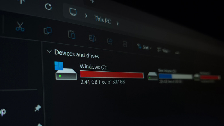
Solid-state drives have completely changed the game for storage on computers and laptops. No moving parts, no RPM (revolutions-per-minute) to worry about, and lightning-fast read and write speeds. Even early SSDs were impressive, but once the M.2 format hit the market, things got even better. While SSDs are currently monstrously expensive, pretty much every modern desktop and laptop uses them, mostly due to the demands of modern software, video games, and operating systems.
Here’s the thing, though. Even though modern SSDs are super fast, and they will last a lot longer than most hard drives due to their lack of moving parts, they can still slow down. As you fill them up with data, which can happen very quickly if it’s a smaller SSD, that advertised speed of several thousand megabytes per second goes down fast.
Fortunately, modern operating systems like Windows support a standard hardware command to help you solve this issue, with a very fitting name: TRIM. TRIM cleans up so-called blocks of data so that the SSD knows which ones to use, making it more efficient and increasing its lifespan.
Advertisement
Why should you use TRIM?
Nwz/Shutterstock
Although it has a much cooler name, TRIM is essentially the modern equivalent of disk defragmentation, which Windows can still do. Defragmenting old hard drives brought all the data closer together in a more accessible spot, allowing the hard drive to cycle through the data more efficiently and make it faster. TRIM doesn’t work on the same principle as defragmentation, as SSDs and HDDs store data in different ways, but TRIM does serve a similar purpose. It increases your SSD’s efficiency and lifespan by clearing up empty blocks of data that are no longer in use.
Recent releases of Windows run this process automatically in the background, and you can check this through the drive’s properties from inside This PC on your computer. If the scheduled optimization (which you can find inside of Properties > Tools > Optimize) is set to On, then Windows runs TRIM for you on a weekly basis.
Advertisement
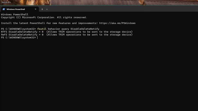
Another way to check if TRIM is on is through PowerShell. Simply run PowerShell with administrator privileges. Next, type “fsutil behavior query DisableDeleteNotify” without the quotes, then hit Enter.
Marko Sokolovski / SlashGear
If both values are zero, then TRIM is on, and you don’t need to worry about it. We would not recommend disabling it, as in this era of highly unpredictable SSD prices and the importance of keeping our data safe and secure, it’s always a good idea to keep your SSD on its best behavior, and TRIM definitely helps out with that.
We’ve all been there at one point or another; you unlock your iPhone with the intention of checking the weather or sending a quick text, only to be greeted by a sea of little red circles.
They’re everywhere, screaming for your attention like a digital toddler until you open the app and clear it. It’s a core part of the iOS experience, sure, but after years of staring at these tiny stress-inducers, I’ve had enough. The problem? I can’t really do much about it.
App badges are my worst enemy
The problem with app badges is that they are designed to be addictive. They’re pitched as helpful reminders, but in reality, they’re designed to draw you into an app to see what’s “new,” even when there’s nothing of substance actually waiting for you.
Every time I unlock my iPhone and see a bunch of badges on my home screen, I’m immediately distracted. Instead of doing what I actually set out to do, I find myself mindlessly scrolling through a feed just to make the number go away.
Advertisement
Image Credit (Trusted Reviews)
Advertisement
It’s even more infuriating when the badges refuse to leave. We’ve all dealt with that one stubborn app – it’s the Oura app for me at the moment, oddly enough – where you’ve cleared every notification, read every message, and checked every update, yet the badge remains.
For a company that prides itself on “clean” design, the home screen often looks like a messy desk covered in red Post-it notes.
No, I’m not going to disable them one by one
Now, I know what the power users among you are going to say, “Just go into Settings and turn them off!” And yes, technically, you can.
But, there’s the catch: Apple forces you to do it on an app-by-app basis. I have hundreds of apps installed on my iPhone, and the idea of diving into the notification settings for every single one of them to toggle off “Badges” leaves me in a cold sweat – and besides, it’d take the better part of an afternoon.
Advertisement
It begs the question: why isn’t there a system-wide toggle? Apple gives us “Silence Unknown Callers” and “Focus” modes to reclaim our digital sanity, yet it won’t give us a single master switch to kill the red dots. It’s a bizarre omission when you really think about it, especially for an operating system that is supposed to be the very pinnacle of user-friendliness.
Advertisement
Android fixed the issue years ago
What makes this even harder to swallow is that our friends over in the Android camp solved this ages ago.
Image Credit (Trusted Reviews)
On most Android skins, app badges (or “dots”) are intrinsically linked to the notification shade. If you swipe away a notification because you’ve seen it and decided it’s not important, the badge on the app icon vanishes too. A system that, in my mind, makes a lot of sense.
On iOS, the badge and the notification centre live in two completely different worlds. You can clear your entire lock screen, but those red circles will stay pinned to your icons until you manually open the app.
Advertisement
At the very least, Apple should give us the option to mirror that Android-style functionality in the Settings menu for those of us who find the current system a little bit archaic.
It probably won’t change any time soon
As much as I’d love to be optimistic, I’m not holding my breath. With the reveal of iOS 27 scheduled for WWDC in early June, the rumour mill is buzzing about the long-awaited reveal of the Gemini-powered Siri and even more powerful AI features, but a badge overhaul is nowhere to be found.
Advertisement
Badges have been a staple of the iPhone since the very beginning, and despite Apple redesigning the notification system multiple times over the last decade, they’ve remained largely untouched. It seems Apple is perfectly happy with the status quo, even if it means our home screens remain a cluttered, distracting mess for the foreseeable future.
Long-time GNOME/OpenOffice.org/LibreOffice contributor Michael Meeks is now general manager of Collabora Productivity. And earlier this month he complained when LibreOffice decided to bring back its LibreOffice Online project, as reported by Neowin, which had been inactive since 2022. After the original project went dormant — to which Collabora was a major contributor — they forked the code and created their own product, Collabora Online.
But this week Meeks blogged about even more changes, writing that the Document Foundation (the nonprofit behind LibreOffice) “has decided to eject from membership all Collabora staff and partners.
That includes over thirty people who have contributed faithfully to LibreOffice for many years.” Meeks argues the ejections were “based on unproven legal concerns and guilt by association.”
This includes seven of the top ten core committers of all time (excluding release engineers) currently working for Collabora Productivity. The move is the culmination of TDF losing a large number of founders from membership over the last few years with: Thorsten Behrens, Jan ‘Kendy’ Holesovsky, Rene Engelhard, Caolan McNamara, Michael Meeks, Cor Nouws and Italo Vignoli no longer members. Of the remaining active founders, three of the last four are paid TDF staff (of whom none are programming on the core code). The blog It’s FOSScalls it “LibreOffice Drama.” They’ve confirmed the removals happened, also noting recently adopted Community Bylaws requiring members to step down if they’re affiliated with a company in an active legal dispute with the Foundation. But The Documentation Foundation “also makes clear that a membership revocation is not a ban from contributing, with the project remaining open to anyone, and expects Collabora to keep contributing ‘when the time comes.’”
Collabora’s Meeks adds in his blog post that there’s “bold and ongoing plans to create an entirely new, cut-down, differentiated Collabora Office for users that is smoother, more user friendly, and less feature dense than our Classic product (which will continue to be supported for years for our partners).
Advertisement
This gives a chance to innovate faster in a separate place on a smaller, more focused code-base with fewer build configurations, much less legacy, no Java, no database, web-based toolkit and more. We are excited to get executing on that.
To make this process easier, and to put to bed complaints about having our distro branches in TDF gerrit [for code review], and to move to self-hosted FOSS tooling we are launching our own gerrit to host our existing branch of core…
We will continue to make contributions to LibreOffice where that makes sense (if we are welcome to), but it clearly no longer makes much sense to continue investing heavily in building what remains of TDF’s community and product for them — while being excluded from its governance. In this regard, we seem to be back where we were fifteen years ago.
It’s about to become more expensive for Claude Code subscribers to use Anthropic’s coding assistant with OpenClaw and other third-party tools.
According to a customer email shared on Hacker News, Anthropic said that starting at noon Pacific on April 4 (today), subscribers will “no longer be able to use your Claude subscription limits for third-party harnesses including OpenClaw.” Instead, they’ll need to pay for extra usage through “a pay-as-you-go option billed separately from your subscription.”
The company said that while it’s starting with OpenClaw today, the policy “applies to all third-party harnesses and will be rolled out to more shortly.”
Anthropic’s head of Claude Code Boris Cherny wrote on X that the company’s “subscriptions weren’t built for the usage patterns of these third-party tools” and that Anthropic is now trying “to be intentional in managing our growth to continue to serve our customers sustainably long-term.”
Advertisement
The announcement comes after OpenClaw creator Peter Steinberger said he was joining Anthropic rival OpenAI, with OpenClaw continuing as an open source project with support from OpenAI.
Steinberger posted that he and OpenClaw board member Dave Morin “tried to talk sense into Anthropic” but were only able to delay the increased pricing by a week.
“Funny how timings match up, first they copy some popular features into their closed harness, then they lock out open source,” Steinberger said.
Techcrunch event
Advertisement
San Francisco, CA | October 13-15, 2026
Cherny, however, insisted that Claude Code team members are “big fans of open source” and that he himself “just put up a few [pull requests] to improve prompt cache efficiency for OpenClaw specifically.”
Advertisement
“This is more about engineering constraints,” he said, adding that Anthropic is still offering full refunds for subscribers. “We know not everyone realized this isn’t something we support, and this is an attempt to make it clear and explicit.”
Meanwhile, OpenAI recently shut down its Sora app and video generation models, reportedly to free up computing resources and as part of a broader effort to refocus on winning over the software engineers and enterprises that are increasingly relying on products like Claude Code.
Todd talks about what it was like fielding calls from distraught users on the night of the announcement. John offers his thoughts on what the shutdown says about the VR hype cycle, and whether everyone betting on the AI boom should take notes.
Plus: Major League Baseball’s new automated ball-strike system is already exposing umpires and creating a whole new kind of showboating — including one player who was so confident the robot would overrule the ump that he just started walking to first base.
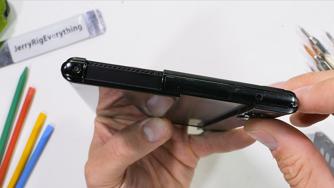
Back in 2021, rumors circulated about a new LG phone with a screen that unfurled like a scroll, similar to a roll-up map rather than a fold. Interestingly, they had planned to release it that year, but LG decided to discontinue its entire mobile division. As a result, the idea fizzled, only to resurface recently with a prototype reaching Zack Nelson (of JerryRigEverything fame).
Zack Nelson began by looking at the exterior elements. In its compressed state, the screen measures around 6.8 inches diagonally. With a simple command, the display expands to 7.4 inches diagonally, thanks to the internal motors. It generates a rather mild buzzing noise, which is thankfully muffled by software that includes some great sound effects. Users can watch the item expand in size in real time and even get dynamic backgrounds that adapt on the fly.
BIGGER, YET SLIMMER THAN EVER: Who would’ve guessed that wider could also be lighter? The design of Galaxy Z Fold7 is refined to feel like a…
BEST CAMERA ON A FOLD YET: You asked for more – now you can have the most. Galaxy Z Fold7 now boasts an ultra-premium 200MP camera with Pro-Visual…
SCREENSHARE FOR STREAMLINED ASSISTANCE: Intrigued by something you see? Go Live with Google Gemini, then screenshare or point your camera at it for…
Nelson removed two Phillips head screws near the roller bit as he began to disassemble it. He applied heat to the back glass, and it popped straight off in one piece. With the glass removed, the side panel came away, and he discovered all these minuscule little hair-like things designed to keep dust from entering the flexy screen area. These tiny hairs are enclosed in a metal cage that protects the part that rolls up.
After that, Nelson proceeded on to check the actual roll component itself, which required him to retract it completely for some extra wiggle room to free it from the frame. He was surprised to see the screen curved around a pretty mild radius, compared to the other folding phones. Behind the screen, there are a series of elevated slats that rise upwards like escalator steps, helping to keep the entire structure flat and stable during expansion.
Other interesting features include little zipper-like linkages along the top and bottom margins of the screen. The sides have metal guides going along them to keep everything neat and tight. It all operates in tandem with two geared motors that communicate via a rack system. There are even three little spring-loaded arms that help keep the entire thing straight and smooth during extension, ensuring that it does not wobble or become stuck. LG stated that the entire system can withstand around 200,000 cycles, which is a significant number given the amount of stress placed on it.
Deeper inside the phone, you’ll find a battery rated a solid 4500 milliamp hours, as well as the usual suspects like a Snapdragon processor, 12 gigs of RAM, and 256 gigs of storage. The rear camera configuration includes a 64-megapixel primary sensor with optical stabilisation and a 12-megapixel ultra-wide lens. On the back, you’ll find a power button that also serves as a fingerprint reader. All of the connection wires are arranged in a fairly straightforward manner that may be simply disassembled.
The screen has a plastic layer that may be scratched with a fingernail, similar to the flexible screens on other phones. When you roll it up, the active portion rests behind the rear glass, allowing you to quickly check alerts and even take selfies (with the main cameras). If anything gets in the way, the software will pause the roll and offer a friendly warning.
Today, fireplaces, their cozy glow once a household staple, are mostly a thing of the past. In fact, a decent amount of old fireplaces are completely blocked up! [David Capper] brings back the atmosphere without the actual flames, with his RP2040-based fireplace glow simulator.
It’s not just a string of LEDs with some PWM brightness control, either. No, [David] goes into detail about the black body radiation that gives these fires their colors. He then uses the theory of black-body radiation to determine the colors that the LEDs glow to simulate the colors of a real fire.
But the colors alone don’t make for a good simulated fire, so [David] adds the heat equation. It starts with a grid wherein each cell has a temperature. Over time, cells are randomly selected to have heat added to them (increasing the cell’s temperature), then he applies the heat equation to diffuse and decay the heat within the grid for a nice simulated crackling fire. Add in a custom PCB and a nice little 3D-printed case and you’re ready for a cozy hacker time.
Nathan Fielder, best known for his Comedy Central show, Nathan For You (and cringe comedy), writes, directs and stars in this new HBO series. In the show, the comedian goes to extraordinary lengths to let people rehearse moments before they happen. In the first episode, Fielder helps a man prepare for a confession to a friend, and builds an exact replica of the bar they’re planning to meet at (the attention to detail is incredible). After planning for any outlandish thing that might happen, we see how the real exchange between the two friends plays out. Bizarre and truly fascinating, The Rehearsal should get some time on your screen.
Glen Anderson has been brokering trades in private company shares since 2010, back when the number of institutional investors focused on the late-stage private market could be counted on two hands. Today, he says, there are thousands.
As president of the investment bank Rainmaker Securities, whose focus includes private securities markets — it facilitates transactions in roughly 1,000 stocks — Anderson has a front-row seat to one of the most nail-biting moments in the history of the secondary market. And right now, he suggests, the narrative has three main characters: Anthropic, OpenAI, and SpaceX.
But the storyline is more complicated than the headlines suggest.
Anderson’s read on Anthropic is consistent with what Bloomberg reported earlier this week: demand for the company’s shares has become almost insatiable. Bloomberg quoted Ken Smythe, founder and CEO of Next Round Capital, saying that buyers had indicated to his outfit that they had $2 billion of cash ready to deploy into Anthropic, even as roughly $600 million in OpenAI shares that investors are trying to sell haven’t found takers.
Advertisement
Anderson sees something similar at Rainmaker. “The hardest stock to source in our marketplace is Anthropic,” he told TechCrunch yesterday afternoon from his Miami home. “There’s just no sellers.”
Part of what turbocharged that demand, Anderson argues, was Anthropic’s very public standoff with the Department of Defense — a turn of events that initially seemed like bad news for the company but has wound up becoming a gift.
“The app got more popular, people rallied around the company as kind of a hero, taking on big government,” he said. “I think it amplified the story and made it even more differentiated from OpenAI.”
Techcrunch event
Advertisement
San Francisco, CA | October 13-15, 2026
That distinction is becoming increasingly meaningful to investors navigating a market where, for years, the prevailing logic was to bet on everyone. Anderson notes that many institutional investors still want exposure to both Anthropic and OpenAI. “The jury’s still out,” he said, on which AI model will ultimately win – but the momentum, at least in the secondary market, has shifted.
Advertisement
That doesn’t mean OpenAI has fallen off a cliff. Anderson pushes back slightly on a binary reading of the situation.
“I wouldn’t say it’s a one-or-the-other conversation,” he said.
But the excitement isn’t there. “It’s not nearly as vibrant a market as Anthropic right now,” he acknowledged.
On valuation, Anderson broadly confirmed Bloomberg’s reporting that OpenAI shares on the secondary market are trading as if the company were valued at $765 billion — an appreciable discount to the company’s newest $852 billion primary-round valuation. He cautioned that he was working from memory, but said the Bloomberg figure was “in the right range.”
Advertisement
OpenAI itself has tried to assert more control over secondary trading. “People should be extremely cautious of any firm that purports to have access to OpenAI equity, including through an SPV,” an OpenAI spokesperson told Bloomberg, noting the company had established authorized channels through banks, with no fees, to counter what it described as a high-fee broker model.
Perhaps tellingly — at least for now — banks including Morgan Stanley and Goldman Sachs have begun offering OpenAI shares to their high-net-worth clients without charging carry fees, according to Bloomberg. Goldman, meanwhile, is charging its customary carry – often 15% to 20% of profits – for clients seeking Anthropic exposure.
What none of this accounts for is SpaceX, which stands apart amid shifting sentiment around these other powerful brands. Anderson describes it as one of the only names in Rainmaker’s universe that never experienced the punishing correction that hit much of the private market between 2022 and 2024, a period when many private companies’ shares fell 60% to 70% from their peaks (after their valuations were run up just as fast).
The rocket and satellite behemoth has “been pretty much consistently up and to the right,” Anderson said.
Advertisement
Anderson, who, naturally, has an economic interest in flattering the company and its earlier backers, credits SpaceX’s management with disciplined pricing and not squeezing every last dollar out of each funding round or tender offer.
“A lot of companies will fall for the temptation to maximize the price of their stock in every round,” he said. “The problem is that that doesn’t leave any room for error.”
SpaceX, by contrast, played it conservatively, by “not getting too greedy,” and the payoff for earlier investors has been enormous. “You can imagine if someone got in in 2015 what kind of gain they’re sitting on right now,” said Anderson.
To put a finer point on that comment: SpaceX was valued at roughly $12 billion in 2015, when Google and Fidelity jointly invested $1 billion in the company. Someone who got in at that price is now sitting on a gain of more than 100x, with the company valued at more than $1 trillion ahead of its planned IPO.
Advertisement
That IPO is now imminent, seemingly. SpaceX filed confidentially this week for an initial public offering, setting the stage for what could be one of the largest market debuts in history, with Elon Musk reportedly aiming to raise between $50 billion and $75 billion, possibly in June. Only Saudi Aramco’s 2019 debut, which valued the energy giant at $1.7 trillion, has come close.
Unsurprisingly, the rumored filing has already changed the dynamics of the secondary market for SpaceX shares, according to Anderson.
“Today, I saw a flood of SpaceX investors coming to me saying, ‘Can you give me SpaceX?’” he noted. “It’s been a very active buy side.” But supply is drying up. The closer a company gets to an IPO, the less incentive existing shareholders have to sell because they can see the liquidity event on the horizon.
That’s where things get a little dicier for OpenAI and Anthropic. Both companies are reportedly exploring public offerings of their own and have signaled they could move this year. But SpaceX, by filing first, is about to test the market’s appetite in a major way, and Anderson suggested that whoever follows will be at a disadvantage.
Advertisement
“SpaceX is going to soak up a lot of liquidity,” he said flatly. “There’s only so much money out there allocated to IPOs.” The first mover gets to the trough first; those who follow face both more scrutiny and, potentially, less capital.
It’s a dynamic that plays out in every so-called vertical and from which the AI companies aren’t completely immune, despite the attention being showered on them right now. Time your IPO too early and you’re the one testing market receptivity. Wait for someone else to go first, and you may find the biggest checks have already been written.
You can hear more of our interview with Anderson in the upcoming episode of the StrictlyVC Download podcast, which drops every Tuesday. In the meantime, check out recent episodes, including those with Whoop CEO Will Ahmed and investor Bill Gurley.
Despite being the default for global e-commerce, digital payments still require a degree of “human touch” when disputes and complaints arise. That friction is becoming a growing cost center as online transactions scale, and Visa argues that shifting to AI-managed dispute handling could streamline the process, cut losses, and turn… Read Entire Article Source link


You must be logged in to post a comment Login