Prove said the roles would be across product, software engineering, research and development, and data science, supporting global product development and growth.
Digital identity verification platform Prove is to create 50 Irish jobs with a $5m investment in its Ireland-based operations.
The company said it sees Ireland as a central hub for the company’s product development, culture and international growth, having set up in the country in 2022 and increased Dublin headcount by 50pc in the past six months.
Prove said the new “high-value” roles would be across product, software engineering, research and development, and data science – with “many” to be available this year – and would support global product development and growth.
Advertisement
It credited its existing Irish operations with playing “a critical role in the rapid acceleration of innovation” over the past year across several product and feature launches.
“The growth of our Ireland team has been an important chapter in Prove’s journey,” said Laura Brittingham, its senior vice-president of people.
“The talent we’ve found there brings deep technical expertise and a collaborative, innovative and dependable spirit that has led to an outsized impact at Prove. There is no version of Prove’s future that doesn’t include Ireland at its centre.”
Prove’s identity verification and authentication tools aim to “streamline onboarding, prevent fraud and deliver seamless customer experiences across channels”, according to the company, by “verifying real people, businesses and agents in real time without friction or guesswork”.
Advertisement
Its customers are in areas such as banking, fintech, crypto, gaming, commerce, insurance and healthcare, and include Visa, Starbucks, Uber and DocuSign.
Prove’s expansion in Ireland is supported by the Irish Government through IDA Ireland.
Its CEO Michael Lohan said: “Prove’s decision to expand its R&D and innovation footprint here highlights Ireland’s strength as a global hub for advanced digital identity, data, and technology development.
“This expansion underscores Ireland’s ability to support companies as they scale internationally, innovate at pace and serve global markets.”
Advertisement
Prove was founded in 2008 as Payfone and rebranded in 2020. It employs more than 400 people globally – across hubs in the US, UK, Ireland and Brazil – and claims to verify 30bn transactions annually and own more than 200 patents in areas around identity and authentication.
Minister for Enterprise, Tourism and Employment Peter Burke, TD said: “This significant investment and the creation of 50 new high-value roles reflect great confidence in Ireland’s talented workforce and in our strong environment for RD&I.
“Ireland is well-positioned to support companies like Prove at the forefront of digital transformation.”
Early images of the Artemis II launch showed an iPhone floating inside the spacecraft. Here’s how Apple’s smartphone got approved for spaceflight.
iPhone 17 Pro Max is now in space following NASA’s approval process
NASA is very strict when it comes to what items are flown into space with astronauts. With the Artemis II trip around the Moon, it’s marking the first time the agency is allowing the crew to carry iPhones in space. This is a big deal, as NASA has strict rules about what actually goes into space, and thorough testing to match. On Friday, the New York Timesreported on what the iPhone 17 Pro Max had to go through to be allowed in the cabin. Continue Reading on AppleInsider | Discuss on our Forums
Standing desks have gone from being niche ergonomic upgrades to mainstream workspace essentials, driven by growing awareness of the risks associated with long, uninterrupted hours of sitting.
Alternating between sitting and standing throughout the day can help reduce back strain, improve posture, and encourage better circulation, while also helping users stay more alert during extended work sessions. For many people working from home, the standing desk has become a central part of creating a healthier, more flexible workspace.
Designing a reliable standing desk, however, is far more complex than simply attaching a motor to a frame. A well-built desk must balance strength, durability, smooth movement, and visual appeal, all while fitting naturally into living spaces that now double as offices.
Advertisement
Article continues below
Designers have to consider everything from materials and structural integrity to long-term reliability and ease of use. Even small decisions — such as desktop thickness, frame construction, or component tolerances — can impact on how stable, quiet, and durable a desk feels over years of daily adjustments.
Advertisement
Ergonomics, durability, sustainability
Vernal focuses heavily on this intersection of ergonomics, durability, and home-friendly design. With more than a decade of experience in the home furnishing industry, its team approaches desk development with a strong emphasis on quality control across every stage, from research and design through testing and manufacturing.
The company also places a welcome importance on sustainability, using FSC-certified materials, recyclable packaging, and responsibly sourced desktop materials such as bamboo and recycled wood.
Its goal is to create ergonomic products that not only support healthier working habits but also blend seamlessly into modern home environments.
Sign up to the TechRadar Pro newsletter to get all the top news, opinion, features and guidance your business needs to succeed!
Advertisement
Having tested some of the best standing desks around, I wanted to better understand what actually goes into designing a modern standing desk — and the engineering decisions that shape performance, usability, and long-term reliability.
So, I spoke with Colin Han, CEO and product team lead at Vernal, about the company’s approach to building desks for today’s evolving home office.
When Vernal begins designing a new desk from scratch, what’s the absolute first technical hurdle your engineering team tackles? Do you immediately attack the industry’s ultimate curse – the ‘wobble’ at maximum height? And when solving that sway, how much of the solution comes down to frame geometry versus the raw manufacturing tolerances of the telescopic legs?
Stability is indeed the design starting point for Vernal. How stable a desk remains at its maximum height is the first challenge our engineering team set out to conquer.
Through modeling and analysis, we broke down the key factors affecting stability into the following three parts: the columns themselves account for approximately 50% of the impact, the structural stability of the feet-to-column connection accounts for approximately 30%, and the structural stability of the frame-to-column connection accounts for approximately 20%.
Advertisement
We focus on systemic optimization in both materials and structure. For material reinforcement, we increased the steel tube thickness of the crossbeams and longitudinal beams, and increased the thickness of the die-cast feet to reduce the risk of structural deformation at the source.
For structural optimization, we introduced reinforcing ribs at key joints and adopted a “grid-style” frame with integrated welding to enhance overall rigidity.
We also rigorously test our products. For instance, we perform a 100% maximum height wobble test on our column modules — a standard stricter than the industry average — to ensure every column meets our stability requirements.
Vernal fully complies with BIFMA X5.5:2021 standards and has fully benchmarked its static stiffness against the industry leader, Uplift V3 (a brand we highly respect).
Advertisement
In the future, we will continue to optimize for even lower wobble levels. Technologically, we aim to further utilize one-piece molded frames to reduce the number of manually assembled parts, thereby increasing structural strength. After all, wherever there is a joint, there are tiny gaps that can affect the perception of stability.
Beyond stability, design aesthetics is our other starting point. We are currently researching new alloy materials to achieve more elegant designs while maintaining the same stability experience. Vernal focuses on home office scenarios, and we look forward to bringing users more “warm” designs that blend seamlessly into the home.
Our bedrooms and living rooms are becoming home offices. How has the ‘resimercial’ shift influenced Vernal’s design decisions? How do you design a standing desk that’s robust enough to survive a corporate environment, but aesthetic enough that someone actually wants it in their home?
Thank you for this question; it is the “soul” of the Vernal brand. When setting up a workspace at home, many people’s first instinct is: “How do I make this desk as rugged and multi-functional as a corporate cubicle?”
In Vernal’s view, this is a dangerous misunderstanding. The home is a spiritual sanctuary; we cannot allow a cold “efficiency machine” to rudely invade our bedrooms and living rooms. Our design North Star is simple: In the home, the identity of “furniture” must always precede the identity of “tool.”
We do not claim to have invented some flawless “black tech.” Instead, we are practicing what I call a difficult “exercise in restraint.” We are working hard to strip away the jarring, industrial, and anxiety-inducing elements of traditional office gear.
Advertisement
This includes rounded-corner designs for safety and comfort, and semi-recessed hand-controllers that are intuitive yet anti-collision. Improving cable management to hide clutter is also vital. It is essential that people feel a sense of well-being; otherwise, one might as well go back to a corporate office.
To be honest, merging “tool efficiency” with “home aesthetics” is a challenging journey, and Vernal is still evolving.
We are no longer spending all our energy on a “one-size-fits-all” desk. Instead, we have split our team into specialized exploration groups: some focus on blending desks with popular styles like Mid-Century Modern (MCM); others obsess over the precision of desktop organization; and others explore new alloys that are easier to shape while balancing cost.
Most importantly, we maintain deep, ongoing dialogues with home-office users to ensure we perceive their true pain points and aspirations. This deep connection with real individuals is Vernal’s core secret.
Advertisement
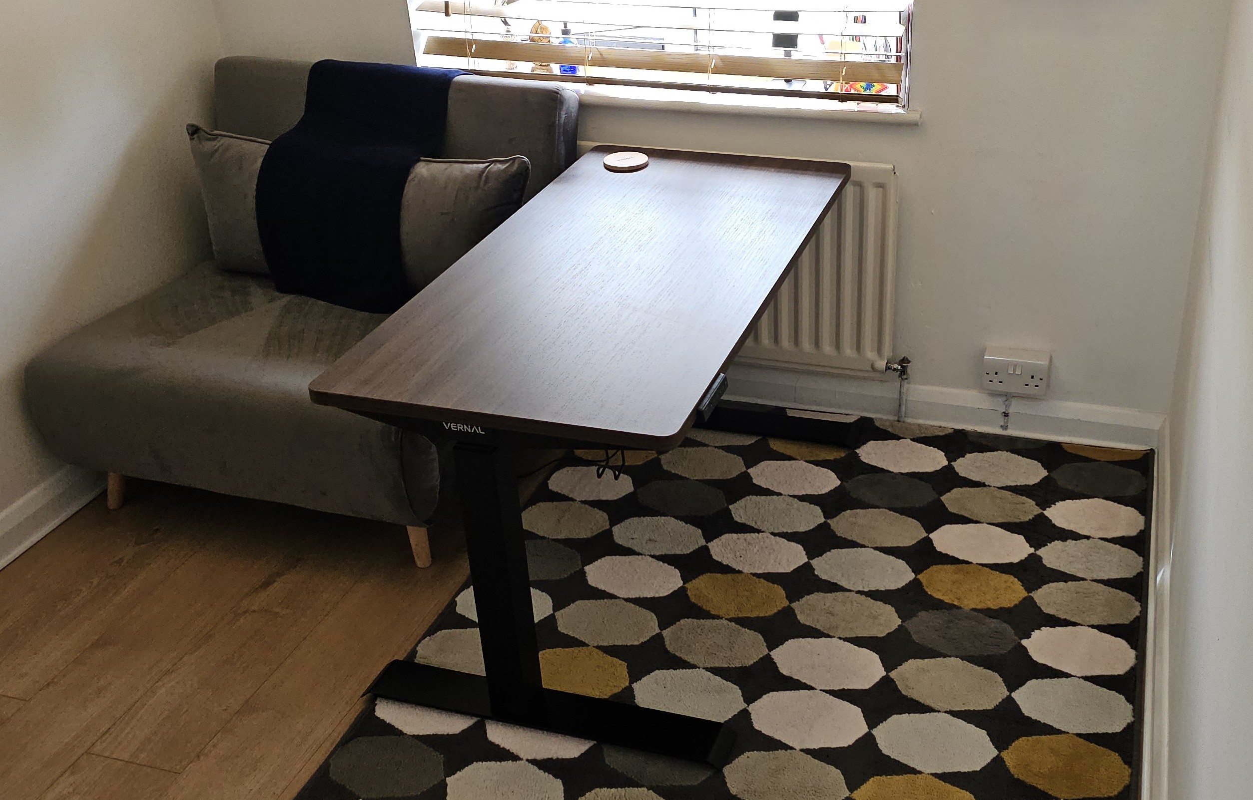
Vernal’s standing desk in a home office during our review (Image credit: Future)
People often assume a standing desk is a magic cure for back pain, but the reality is we often slump, slouch, and lean against the edge. How does Vernal design its desks to encourage healthier habits, and how do you approach ‘micro-ergonomics’ to accommodate how people actually behave versus how they ‘should’ stand?
We are currently focusing on two areas. The first is desktop depth. A standing desk solves the problem of sedentary lumbar fatigue. However, other micro-experiences are often ignored. For example, while 21-27 inch monitors are common, a 24-inch deep desk is only reasonable for a 21-inch screen.
For a 27-inch monitor, a distance of about 26 inches is required. We found that many users use 24-inch depths, which fails to meet the need for a healthy distance between the eyes and the screen to reduce ocular fatigue.
This is a crucial issue that Vernal has specifically addressed in our blog post, How Deep Should Your Desk Be?. We do not sacrifice desk size to reduce packaging or shipping costs; our L-shaped desks remain consistently large to ensure a great experience even with large monitors.
The second area is Computer Vision for posture alerts, which is currently under research. Most people lose track of their posture when deeply focused, and by the time you feel pain, it is often too late.
We are exploring the use of Computer Vision (CV) to monitor and record user posture via their home-office webcams. Based on professional ergonomic advice and user feedback, the system provides proactive alerts and guidance to help users form healthier working habits.
Advertisement
Choosing the right material for a standing desk is a brutal compromise between weight, durability, aesthetic appeal, and cost. How does Vernal navigate the technical decision-making process when selecting materials – from the grade of steel in the legs to the core density of the desktop – to make sure it can survive a decade of coffee spills, monitor mounts, and constant movement?
Vernal does not blindly pursue exaggerated specs. We focus on real-world usage. For example, a 200kg weight capacity costs more than 160kg, but we found that most users’ equipment does not exceed 100kg.
Therefore, we choose a 160kg capacity and invest the saved costs into craftsmanship or the R&D of accessories that actually improve the home-office experience. This makes our accessory system streamlined yet highly effective.
Similarly, with the desk sizes mentioned earlier: larger boards mean heavier packages and higher shipping costs. However, because the experience provided by the correct size is so critical, we refuse to cut costs there.
Our decision-making is simple: Invest money where it creates a real, positive experience for the user.
Your line-up includes the Core3 and Executive models. How does the team decide which features are fundamental for a standing desk and which justify a ‘premium’ jump?
We do not segment products by “Basic, Mid, or Advanced” functions. Every series includes what we consider essential performance: stability, durability, and load capacity. Instead, we plan our series based on user preferences and needs. We make the “tool” attributes the best they can be within our capability, then distinguish series by scenario and aesthetics.
For example, Core3 is designed for those who prefer minimalist and modern styles, while the Executive Series is intended for users who want to maintain a professional “business image” while working from home.
Advertisement
That said, certain professions — like designers, creators, and those who demand high levels of spatial order — have higher functional requirements. For them, standard specs like “stability and noise” are just the baseline.
They need products that eliminate cold industrial design, use “breathing” materials like solid wood or fabric, and provide extreme cable management. These products are our “Flagships” because these users need more than just a desk — they need “fuel for inspiration.” Developing such products is far more difficult than refining a design style.
Our logic is not “low performance to high performance,” but rather: “What environment are we trying to curate for this specific individual?”
In our review of your desk, our managing editor actually sat his entire 100kg body on the desktop and rode it upwards to test your 160kg weight limit. When Vernal is testing motors and frame stability behind closed doors, what is the most extreme or ridiculous real-world stress test your engineers put these desks through before signing off?
It is always fun to see reviewers challenge the limits in the real world! At Vernal, we also perform extreme tests to understand the “redundancy” of our designs. We have established a comprehensive testing system covering mechanical structure, electronics, environment, packaging, and user experience, with over 130 cumulative test items.
Typical tests include lifting life of 10,000+ cycles under a 160kg load, desktop deflection strictly kept under 15mm under a 75kg load and returning to <5mm once released, button life of 100,000+ cycles (exceeding the 73,000 needed for 10 years of use), and control box testing with a failure rate of <0.1%, significantly better than the industry standard of 0.2%–0.5%.
Advertisement
With the launch of the new Core3 this year, we have released our comprehensive testing report. We want to be transparent and show the world exactly what a standing desk must endure — the engineering rigor it goes through—before it is deemed ready to leave our factory.
The desk our Managing Editor rode upwards to test its weight limit (Image credit: Future)
Apple has released the first public beta for iOS 26.5, just a few days after the beta for developers came out. One of the biggest changes the new operating system brings is the “Suggested Places” feature in Apple Maps. It will show you trending places to visit, such as restaurants and other establishments, near your location or based on your search history. You can see Suggested Places when you tap on the search bar in the Maps app.
iOS 26.5 beta also will also come with notifications that the company will be putting ads inside Maps. Apple confirmed in March that it was going to expand its ads outside of the App Store and Apple News apps. The ads you see will be based on your location, the search terms you’ve used and what you’re looking up on Maps. They will show up at the top of your search results and in Apple’s Suggested Places list. Apple said the ads will be clearly marked and won’t be a danger to your privacy. Your current location and the ads you interact with will not be associated with your Apple Account, and your personal data will stay on your iPhone and won’t be collected.
In addition, Apple is testing end-to-end encryption for RCS messages on iOS 26.5 beta yet again. However, the company has yet to reveal whether the feature will roll out with the operating system’s stable release. To be able to get Apple’s public beta releases, go to the Apple Beta Software Program website and sign up using your Apple credentials.
The Acer Chromebook Spin 311 (2026) is a decent small-form-factor Chromebook with solid endurance, okay power for basic tasks and a comfortable keyboard to boot. The screen here feels a little low-res in 2026, while its port selection also isn’t as strong as rivals.
Excellent battery life
Solid performance for basic tasks
Functional port selection
1366×768 resolution feels dated
Thick bezels around the screen
Squirrel Widget
Advertisement
Key Features
11.6-inch HD IPS touchscreen:
The Chromebook Spin 311 (2026) has one of the smallest touchscreens you’ll find on a laptop this affordable, making it a solid choice for the classroom.
Advertisement
MediaTek Kompanio 540 processor inside:
It also has an eight core MediaTek processor inside for reasonable performance for basic tasks.
Advertisement
1.30kg weight:
This smaller Chromebook is quite light too, making it an easy one to carry around on the go.
Advertisement
Introduction
The Acer Chromebook Spin 311 (2026) marks the latest iteration of the brand’s dinkiest ChromeOS-powered laptop.
This new model is designed strictly with efficiency and usability in mind, promising up to 15 hours of battery life and a boost in power with its new MediaTek Kompanio 540 processor, plus it has replaceable USB-C ports and a keyboard that needs two screws to remove it.
Alongside this, the 11.6-inch touch-enabled 1366×768 IPS screen is back, plus a decent port selection, snappy keyboard and more to like out of such an affordable laptop. For reference, it costs £369/$579.99, which makes it one of the cheaper Chromebooks of its kind, alongside the Acer Chromebook Spin 312 and HP Chromebook x2 11, even if US pricing pushes it up somewhat.
Advertisement
Advertisement
To see whether this little Acer laptop is one of the best Chromebooks we’ve tested, I’ve been putting it through its paces for the last week or so.
Design and Keyboard
Compact plastic frame
Meagre port selection
Snappy keyboard, but a small trackpad
Owing to its small form factor, the Chromebook Spin 311 (2026) is a very compact customer indeed, which makes it one of the most portable laptops you’ll find out there. Its all-black finish is pleasant, and the textured black plastic feel provides a semblance of durability, too. I’m not a big fan of the large bezels around the screen, though, which give this Chromebook a bit of a dated look.
There is a bit of flex at the corners when pressed, and on the keyboard deck, too, although as this is a cheaper laptop, I don’t mind too much. It tips the scales at 1.3kg, which is on the heavier side for such a small laptop. With this in mind, the 11-inch screen size and its associated form factor make this easily portable in a rucksack or bag.
Image Credit (Trusted Reviews)
Advertisement
The port selection on the Chromebook Spin 311 (2026) doesn’t set the world alight, but for such a small laptop, it’s reasonable. Each side is home to a USB-C port and a USB-A each, plus the right side has a headphone jack, too. The larger Chromebook Spin 312 model I tested last year supplements this with an HDMI and SD card reader.
The keyboard deck of this laptop is a smaller form factor, complete with arrow keys and a function row. The keys themselves have decent tactility to them, and it’s reasonably easy to get up to speed with them. There isn’t any form of backlighting for after-dark working, though.
Advertisement
Image Credit (Trusted Reviews)
I’m less enthusiastic about the trackpad, though, with its distinct lack of vertical space feeling quite restrictive. It’s reasonably accurate, although quite stiff in use.
For the benefit of repairability and because this is a device designed for harsh educational environments, the USB-C ports here are serviceable (a feature borrowed from business laptops that are a lot more expensive than this one, such as the Dell Pro Max 16 Plus), while the keyboard deck is easily replaceable, too.
Image Credit (Trusted Reviews)
Advertisement
The laptop also comes in plastic-free packaging and is somewhat assembled with PCR plastics to give it some sustainability cred.
Display and Sound
1366×768 resolution isn’t too brilliant
Reasonable brightness and colours
Okay speakers
The display here is a touch-enabled 11-6-inch IPS screen with a 1366×768 resolution and a classic 16:9 aspect ratio that feels very dated against this Chromebook’s rivals, not least with huge bezels surrounding the panel.
The problem I have is the resolution, which feels subpar in 2026. Even the Chromebook Spin 312 and other more compact choices have a Full HD screen, rather than an ‘HD Ready’ one as it were. This leaves it lacking detail, and it can feel a little fuzzy at times. Considering this is a touch-screen designed for budding creatives, it leaves a bit of a sour taste.
Image Credit (Trusted Reviews)
There isn’t a quoted brightness figure for the Chromebook Spin 311 (2026)’s display, although it feels a little dimmer than our usual 300 nit target to my eye when put at full blast. For indoor working, I think you’d be okay, although taking it outside probably isn’t the best idea. Colours look reasonable to my eye, but owing to the lower brightness, there is an element of the panel that feels a smidgen washed out.
Advertisement
Advertisement
To its credit, this Chromebook has a Corning Gorilla Glass coating for added durability, which is important considering the target audience of children, and the touchscreen nature felt surprisingly responsive.
Image Credit (Trusted Reviews)
The Chromebook Spin 311 (2026)’s speakers are downwards-firing and are mostly mids, as you’d expect from a cheaper laptop. They’re okay for casual viewing, but little beyond that. For more extended listening, utilise the headphone jack on the right hand side.
Performance
Okay performance for casual tasks
4GB of RAM is low in 2025
eMMC storage is a shame
The press release for the Chromebook Spin 311 (2026) made a lot about it being one of the first Acer Chromebook devices to ship with the MediaTek Kompanio 540 processor. This is one of MediaTek’s latest low-power mobile chips that features eight cores, including two Arm Cortex-A78 ‘big cores’ and six Arm Cortex-A55 cores, plus a dual-core GPU.
It’s not a chip that’s necessarily designed for outright grunt, and is more for zippy performance for basic tasks where it’s needed. Think of it as a competitor to Intel’s N-series of chips – quiet, but efficient.
Advertisement
Image Credit (Trusted Reviews)
In running it through the Geekbench 6 benchmark test, the Chromebook Spin 311 (2026) provided scores that were very similar to an Intel N100 in the same test. The multi-core result is a bit lower than I expected, owing to the quantity of cores this MediaTek chip has over the N100.
With this in mind, though, outright speed and performance aren’t the name of the game for the Chromebook Spin 311 (2026). Its purpose is to be a portable and efficient laptop for light productivity loads, which it performs decently well. I didn’t experience too much of a slowdown while using multiple Chrome tabs for Docs, Slack and Spotify.
Advertisement
Image Credit (Trusted Reviews)
This particular configuration also nets 4GB of RAM and 64GB of eMMC storage. For the price, I’m not too bothered about this, although it would have been nice to see solid-state storage in 2026 on a more affordable device. The RAM headroom is just enough for basic tasks, although for any extended multi-tasking, going for a model with more RAM is advisable.
Software
Lightweight and clean ChromeOS install
No Chromebook Plus features
Advertisement
The first thing to note with the Chromebook Spin 311 (2026) is that it runs ChromeOS, meaning it’s got a clean and lightweight UI with no real bloatware pre-installed, that’s easy to get your way around and jump into apps such as Google’s G-Suite of productivity apps.
This specific Chromebook Spin 311 (2026) model also doesn’t meet the Chromebook Plus minimum spec requirements, although even with those models that do, they’ve made the decision not to designate this laptop as one. This also means we aren’t getting new features such as Help Me Read, the Quick Insert key or Magic Eraser, for instance.
Image Credit (Trusted Reviews)
There is one benefit to this being a newer model, as it comes with Google’s new Quick Insert key, where the Caps Lock is, which opens a Spotlight Search-style menu which can be used for everything from inserting a link to looking up files.
Battery Life
Lasted for 13 hours 47 minutes in the battery test
Capable of lasting for between one and two working days
The Chromebook Spin 311 (2026) comes with a modest 45Whr battery, which isn’t the biggest it must be said. Owing to the increase in efficiency that MediaTek has touted from the processor inside this laptop, Acer is quoting up to 15 hours of runtime from this laptop before it’ll conk out.
Advertisement
In running a Full HD video loop test at around 50 percent brightness, this small Chromebook lasted for 13 hours and 47 minutes. That’s pretty good and isn’t too far off from Acer’s original estimates. It means you’ll be able to get through two working days with this Chromebook before needing to plug it back into the mains.
Advertisement
Image Credit (Trusted Reviews)
The Chromebook Spin 311 (2026) also comes with a dinky 45W USB-C charger that’s one of the smallest I’ve seen, and was reasonably brisk at putting charge back into the laptop’s battery. A 50 percent charge took 38 minutes, while a full charge took 86 minutes.
Squirrel Widget
Should you buy it?
You want a very small touchscreen Chromebook:
The Chromebook Spin 311 (2026) is one of the smallest touchscreen Chromebooks out there, and if you want the flexibility in a dinky chassis, this is a decent choice.
Advertisement
This Chromebook is quite limited in power with its MediaTek chip and especially with just 4GB of RAM. If you can forgive a touchscreen, the asking price goes a long way in more standard Chromebooks.
Advertisement
Final Thoughts
The Acer Chromebook Spin 311 (2026) is a decent small-form-factor Chromebook with solid endurance, okay power for basic tasks and a comfortable keyboard to boot. The screen here feels a little low-res in 2026, while its port selection also isn’t as strong as rivals.
For instance, the Acer Chromebook Spin 312 model ups the screen size a smidgen, but also brings the resolution to Full HD. It also has a much further-reaching set of ports, and matches this smaller choice in battery life. It’s also around the same price in terms of RRP, making it a bit of a no-brainer in my eyes. For more choices, check out our list of the best Chromebooks we’ve tested.
Advertisement
Advertisement
How We Test
This Acer laptop has been put through a series of uniform checks designed to gauge key factors, including build quality, performance, screen quality and battery life. These include formal synthetic benchmarks and scripted tests, plus a series of real-world checks, such as how well it runs popular apps.
FAQs
What processor does the Acer Chromebook Spin 311 (2026) have?
This sample of the Acer Chromebook Spin 311 (2026) has a new MediaTek processor inside for efficiency over outright power.
Looking for the most recent Strands answer? Click here for our daily Strands hints, as well as our daily answers and hints for The New York Times Mini Crossword, Wordle, Connections and Connections: Sports Edition puzzles.
Today’s NYT Strands puzzle could be tough. Hope you know your animals! One of them is an animal I had never heard of before. Some of the answers are difficult to unscramble, so if you need hints and answers, read on.
If that doesn’t help you, here’s a clue: Helps to be Australian.
Clue words to unlock in-game hints
Your goal is to find hidden words that fit the puzzle’s theme. If you’re stuck, find any words you can. Every time you find three words of four letters or more, Strands will reveal one of the theme words. These are the words I used to get those hints but any words of four or more letters that you find will work:
POUR, BALL, LAYS, PAIL, TAIL, RUSK, BAIL
Answers for today’s Strands puzzle
These are the answers that tie into the theme. The goal of the puzzle is to find them all, including the spangram, a theme word that reaches from one side of the puzzle to the other. When you have all of them (I originally thought there were always eight but learned that the number can vary), every letter on the board will be used. Here are the nonspangram answers:
BILBY, KANGAROO, WALLABY, WOMBAT, KOALA, OPOSSUM
Today’s Strands spangram
The completed NYT Strands puzzle for April 5, 2026.
NYT/Screenshot by CNET
Today’s Strands spangram is MARSUPIALS. To find it, start with the M that’s five letters down on the far-left vertical row, and wind up and over.
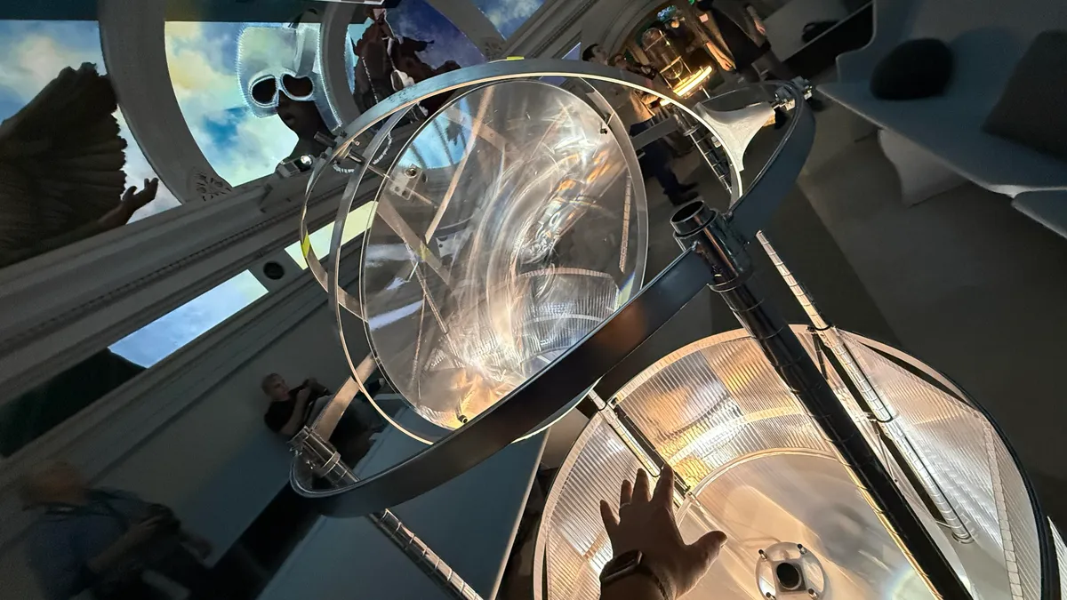
Climbing up flights of stairs in a bank building full of rooms draped in surrealist art, tunnels with lurking beasts called “skin horses” and exhibits of keepsakes imaginary and real, I find myself looking at an art mural across a domed ceiling that I can explore with instruments next to me. Speaking into a microphone, I see my words scroll across the edges. My hands, thrust into a small chamber, are projected across the ceiling, highlighting parts of the mural. Suddenly, AI-generated descriptions emerge where I’d put my hands.
This is the Ministry of Awe, a new installation experience in Philadelphia that I was lucky enough to visit ahead of its opening, and it’s a welcome East Coast dose of strangeness. Created by Meg Saligman and over 100 other artists, it’s a six-story space that makes me think of Meow Wolf or long-time LA oddity the Museum of Jurassic Technology — or even London’s very real Sir John Soane’s Museum.
Advertisement
This “skin horse” lurks in the basement, if you look hard enough.
Scott Stein/CNET
The former bank building’s now an immersive art gallery full of hands-on experiences to unravel and a storyline too: messages in drawers, phones that can be dialed or answered, bathrooms that record your “deposits” with audio messages. Everything at the Ministry is an exploration of the meaning of banks and their associated power. But what drew me here just as much was the idea of how tech would fold into a space like this.
Watch this: I Saw the Future of Tech Art in Philly
Much like Meow Wolf’s explorations of layers of tech into artist installations, something I talked about at SXSW recently, Ministry of Awe is playing with tiny doses of AI — nothing that generates or replaces the work of artists but rather in a way that highlights and possibly enhances. The Ministry of Awe’s signature fifth-floor artwork, The Heavens, is a giant mural work by Saligman that’s projected across the segments of the ceiling. Angled seats let visitors hang around and gaze up, but several “instruments” in the room let you play with the space, too, created by the tech company Spatial Pixel.
Advertisement
A full look at the projector-filled room where the Heavens mural exists, along with interaction instruments. This is just one room of many in the Ministry.
Scott Stein/CNET
Spatial Pixel is focused on “spatial computing for spaces, not faces,” and was founded by Violet Whitney, former director of product and associate director of design at Google Sidewalk Labs, and William Martin, an architect and designer. Both also teach a course in spatial AI at Columbia University.
Exploring AI through art
The Heavens’ interaction tools and how they’re designed to feel integrated and somewhat invisible are part of Whitney and Martin’s explorations of where AI could work in subtler space-aware ways. This fascinates me because AI, smart glasses in particular, are already trying to solve for this with very mixed success. What I’ve found is that art and entertainment can often be better places to explore ideas of AI in contained ways, with rules deliberately made to respect the work and art.
Advertisement
Spatial Pixel’s team in the room they helped design.
Scott Stein/CNET
Whitney and Martin met Saligman in the same Philadelphia neighborhood, which is how they ended up collaborating on the Ministry of Awe’s exhibits. The Heavens experience is run using Spatial Pixel’s open-source platform, called Procession, that blends multiple AI models into a system that works in physical spaces. Whitney and Martin already have an interactive lab space for it at the School of Visual Arts in New York City, but the Ministry of Awe is a public test-bed, working off art that they want to keep sacred.
“A lot of what we’ve been doing is finding ways of changing the mural, or the way that you see the mural through light. A core way we’ve been trying to allow visitors to interact with it is to pick up on the things that they’re saying in the space,” said Whitney. “We want to take the things they’re saying and change the mural based on their words and what they point at.”
Advertisement
The Ministry of Awe’s multilevel former bank building has many rooms inside, many of them interactive, and they were designed differently by different artists.
Scott Stein/CNET
Right now, a lot of the mural interactions are simple and ephemeral: My words disappear, my highlights fade. But the Ministry of Awe’s toying with the theme of banking in personal data, too. And the software being used to run the installation is programmable, so Spatial Pixel aims to keep evolving what happens over time.
“Our goal is eventually to record what the people are contributing, with the right consent. But then maybe those ideas become like this bank. It is a bank, after all, to store these ideas, and then Meg can use them and review them and use it to evolve the painting and physical space. And so it becomes this sort of perpetual dialogue with the muralist,” said Martin.
Advertisement
It’s part of the thinking that Spatial Pixel wants artists to play with, as opposed to tech companies.
Words overlay with art, depending on how you interact. The work changes slightly over time.
Scott Stein/CNET
“What if you could actually talk to a painting? What if you could actually interact with a work of art and then explore it in new ways? We realized,” said Martin, “that accessing these tangible computing techniques, like being able to recognize gesture, move objects around — there’s certainly a lot of academic groups that are discussing this, but it’s still really inaccessible to the actual designers that want to make experiences in that way.”
Advertisement
The idea echoes experimental AI art I saw in Austin at SXSW just days after my Ministry of Awe visit — questions about agency and ownership, where boundaries between AI and personal work get drawn. And as I toured the Ministry space with Meta’s smart glasses on my face, it made me think about how smart glasses — and most AI tools — right now have almost no consideration for this delicate line.
But they’ll need to. And maybe art spaces are the places to begin to think it out, with no glasses or personal wearable tech needed at all.
Before it’s publicly available later this year, the Irish government is trialing its Government Digital Wallet, which includes a way to verify a user’s age to access social media platforms. In its press release, the government’s Department of Public Expediture, Infrastructure, Public Service Reform and Digitalisation said people can store digital versions of their birth certificates, driving licenses, European health cards and more.
Frank Feighan, the department’s minister, said that this testing phase would help inform the development of the digital wallet and ensure it was user friendly. The government hasn’t laid out when the Government Digital Wallet graduates beyond the testing phase, but Ireland is required to create a digital wallet by the end of 2026 as part of a European Union regulation.
“It will be able to facilitate secure age verification capability as set out in Digital Ireland and the implementation of the Online Safety Code, under which designated platforms must have age verification measures in place to help protect, in particular, children and young people from online harm,” Feighan said of Ireland’s digital wallet.
The pilot phase will be done on an opt-in basis and the government has a short survey available for comments and concerns. Along with Ireland, many other European Union member states are working on their own age verification methods. Earlier this year, Spain’s prime minister Pedro Sanchez announced a law to ban social media for anyone under 16.
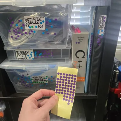
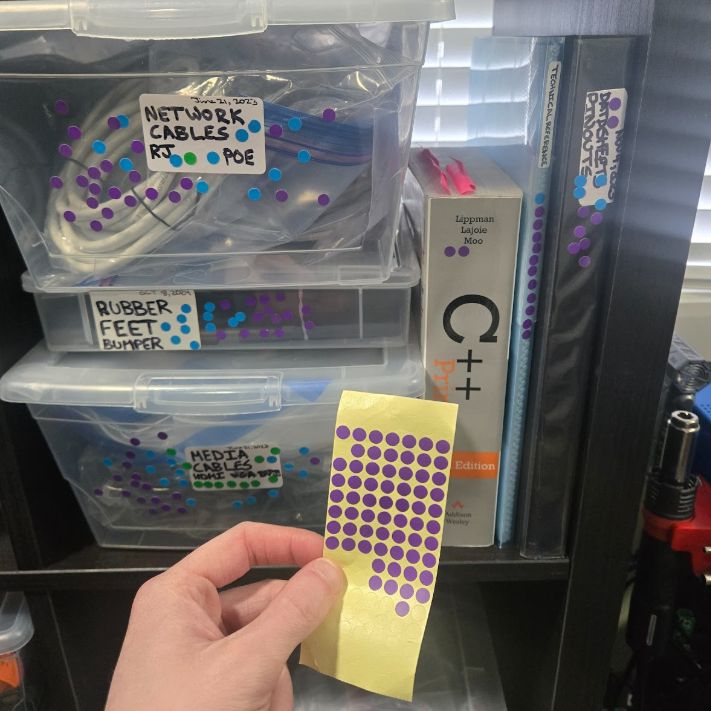
Many of us are guilty of toeing the line between having a ready supply of components at hand and simply hoarding for fear of throwing anything out. In a first admission of this problem, [Scott Lawson] decided to implement a couple of changes to assess his own position on this sliding scale.
The first change was to only put parts, components, and supplies in transparent boxes. Next was to add a sticker on each box noting the contents and box creation date. This was extended to plastic bags inside the boxes when further subdivision was warranted.
Next, the question was about usage patterns, as you may think that you know how often you use something from a specific box, or how important its contents are, but it helps to add some objectivity to this. For this, [Scott] used sheets of dot stickers, with a sticker added each time he opened a box and used something from it.
By persistently doing this for a few years at his home lab, [Scott] was able to assess which boxes fell into any of three categories: hot, warm, and cold. Cold boxes are very rarely — if ever — accessed, and can thus be readily moved to the attic, shed, or even sold off if they have spent a year or longer in cold storage. Hot boxes should obviously be kept near the work areas. This way, one can make objective decisions of what boxes should go where for optimal access, and what things in your home lab are basically just there to look pretty and gather dust.
Advertisement
This is an effective low-tech way to get organized. Or you can go the opposite direction.
KPop Demon Hunters fans, get to McDonald’s fast. For a limited time, you can nab a meal that might seem like an April Fool’s Day joke, but isn’t. Participating McDonald’s restaurants are offering both the HUNTR/X meal, named for the girl group from Netflix’s Oscar-winning animated film, KPop Demon Hunters, and the Saja Boys Breakfast Meal, named for the movie’s boy band.
I beat a path to McDonald’s on Tuesday, the first day the new meals were out, so I could try everything.
Advertisement
I mean, yay, holographic photo cards, but I think I would have preferred a KPop Demon Hunters figurine. Or patterned socks, like those that were given out with the Grinch meal.
NYT/Screenshot by CNET
And the KPop Demon Hunters items are surprisingly pretty good! Be warned: Once word gets around, they might be hard to get. The McDonald’s holiday Grinch Meal sold out quickly at some locations (too bad if you wanted a pair of the adorable Grinch-themed socks that came with it), so don’t wait on this limited-edition menu.
Shake up the fries, skip the Demon sauce
The HUNTR/X Meal, named for the K-pop girl group in KPop Demon Hunters, is a 10-piece chicken McNuggets meal that includes a medium drink and three special menu items.
Advertisement
The top fry is one I shook up with the Ramyeon seasoning, while the other one is just a regular McDonald’s fry. I was surprised by how much I liked the seasoning!
Gael Fashingbauer Cooper/CNET
Ramyeon McShaker fries come with a small bag of soy, garlic, sesame and spice seasoning, along with regular McDonald’s fries. You sprinkle the seasoning into the provided bag, dump in the fries, shake it all up and eat.
McDonald’s does not skimp on the amount of fry seasoning they give you.
Advertisement
NYT/Screenshot by CNET
My take: McDonald’s fries are legendary, and honestly, I didn’t want to season them and risk wrecking the taste. Here’s the shocker: I loved it. They give you a ton of seasoning, and the fries become thickly coated, which I thought would be a nightmare. But they were a salty, tasty delight. There’s no meat in the seasoning, but it reminded me of a fried-chicken coating — tasty and rich.
The meal includes two new sauces for the fries and nuggets. Hunter sauce is a sweet chili sauce mixing notes of chili, garlic and pepper. If you’re familiar with McDonald’s longtime sweet-and-sour sauce, this reminded me of that, with just a touch of heat.
You can order one of each of the two KPop Demon Hunters sauces. Hunter sauce is better than the shockingly purple Demon sauce, in my humble opinion.
Advertisement
Gael Fashingbauer Cooper/CNET
The other new sauce is Demon sauce, a mustard sauce with some heat and a bold purple color. There’s just not enough dark purple food out there. But while the color was cool, I ended up scraping the Hunter sauce cup almost empty, leaving most of the purple Demon sauce behind. I appreciated the almost-but-not-quite wasabi flavor of the mustard, but I wouldn’t order this sauce again.
Look! My McNugget is wearing a purple wig! The best thing about the Demon sauce was the bold purple color, not the kind-of-meh hot-mustard sauce itself.
NYT/Screenshot by CNET
You can try both sauces without an extra charge. I ordered via the app and just selected one of each of the two new sauces.
Advertisement
Ramyeon McShaker fries come with a small bag of a soy, garlic, sesame and spice seasoning that customers sprinkle into a bag with the fries and shake up before eating.
McDonald’s
There’s also a new dessert, the Derpy McFlurry, which blends creamy vanilla soft serve with berry-flavored popping boba pearls and a swirl of wild berry sauce. McDonald’s named it for the supernatural feline, Derpy Tiger, from the KPop Demon Hunters movie.
You know all the jokes about how McDonald’s ice-cream machine is always broken? I tried to order the Derpy McFlurry at my local McDonald’s, but the app said it wasn’t available. I don’t know if that location’s ice cream machine was actually broken or if they didn’t get their shipment of popping pearls, but this is America: There was another McDonald’s less than a mile away that had the dessert.
Advertisement
My McFlurry had kind of melted by the time I got home because the McDonald’s closest to my house didn’t have it. Insert your favorite “McDonald’s eternal broken ice-cream machine” joke here.
NYT/Screenshot by CNET
And I’m glad they did! Although I’m not a berries-in-ice-cream fan, the thick soft-serve and wildberry sauce (blueberry? raspberry? both? I couldn’t tell) were a smooth, sweet mash-up. The boba pearls were fun to pop inside my mouth, too, though beware, they kind of leave behind a little… boba skin?
Advertisement
The Derpy McFlurry blends creamy vanilla soft serve with berry popping pearls.
McDonald’s
If breakfast is your bag, the new morning meal is the Saja Boys Breakfast Meal.
It includes a Spicy Saja McMuffin sandwich, which is a sausage McMuffin with egg and a spicy Saja sauce, hash browns and a small drink. I hadn’t had the chance to tell my husband what was in the sandwich when he swooped through the kitchen while talking on a work call and nabbed a bite. He widened his eyes and waved at his mouth in the universal signal for “HOT!”
At first, I thought he was exaggerating, but then I had a second bite, and the orangish, peppery sauce is hot. It’s also too sweet for my taste, and I wouldn’t reorder this. Without the sauce, the breakfast is just an Egg McMuffin.
Advertisement
The Spicy Saja McMuffin is a sausage McMuffin with egg, topped with a peppery sauce.
NYT/Screenshot by CNET
Both meals come with a photocard for one of the bands and a Derpy card. My breakfast meal included a photo card of Jinu, and my lunch meal featured one of Zoey. Each meal also had a Derpy card with a picture of Derpy Tiger and a QR code that, for some reason, I found incredibly difficult to scan. When I finally did, it took me to the McDonald’s app on my phone and asked for the code on the card. Then it didn’t really do anything.
A McDonald’s rep told me that’s by design: Entering the code means I will unlock content that won’t appear until April 26 and will reveal “the winner of McDonald’s ultimate battle for the fans.” So, I got that goin’ for me.
Advertisement
Demon sauce is a bold mustard sauce with heat and tang — and best of all, it’s bright purple.
McDonald’s
The full KPop Demon Hunters menu should be available at participating McDonald’s locations now, and while I nudged McDonald’s reps for an exact ending date, it’s just “while supplies last.”
Advertisement
Hunter sauce is a sweet chili sauce mixing notes of chili, garlic and pepper.
McDonald’s
My final take: KPop Demon Hunters fans will get a kick out of the meals, though if they are kids, they may wish for a smaller Happy Meal-style option. Ten McNuggets and fries are a lot, and a spicy Egg McMuffin probably isn’t for everybody. I tried to order a mini version of the Derpy McFlurry, but it was grayed out in my app, and the regular one was enormous.
If you do want to try the meals, I highly recommend the fries with the Ramyeon seasoning, the Hunter sauce and the Derpy McFlurry with its satisfying popping boba (share it with a friend if you have a small appetite or if, like me, you’re slogging through the full KPop Demon Hunter menu). I’d give a pass to the Demon sauce and the Spicy Saja McMuffin.
It’s also a bit of a bummer that the only extras in the meals (besides the colorful themed Happy Meal-style boxes) were glittery holographic photo cards and a code for online content that’s still a month away. No collectible figurines or even patterned socks a la the Grinch? That hit a bit of a sour note in this musical munch-fest.
Apple has signed a driver for AMD or Nvidia eGPUs connected to Apple Silicon but there are some big caveats, and it won’t improve your graphics. Here’s what they’re for.
An earlier time when you could use eGPUs with Macs
When Apple announced the use of eGPUs with AMD Radeon cards in 2016, we were pretty excited. Full support shipped in early 2017 and for a few short years, Thunderbolt provided an excellent graphics-accelerating one-cable dock to our MacBook Pros. But even then, Apple has stubbornly prevented modern Nvidia GPUs from working with Macs. And, with the change to Apple Silicon, Apple effectively killed off any real use of an externally usable Nvidia GPU with its Mac lineup. Continue Reading on AppleInsider | Discuss on our Forums


You must be logged in to post a comment Login