Tech
ROKU Keeps Pushing for a Better Streaming Experience with New Home Screen Design

What do you do when you’re one of the world’s top Smart TV and Connected TV platforms? You double down on what people love about your system while making the whole user experience even more streamlined and personalized for each individual viewer.
While Android TV/Google TV may lead the global streaming TV platforms in overall market share, Roku is #1 in North America, with more than a third of all streaming viewers. With a combination of streaming sticks which can turn any TV into a Smart TV, Roku branded Smart TVs and partnerships with TV makers such as Hisense, Philips, and ONN, Roku has established itself as the go-to streaming platform for over 100 million TV viewers and movie lovers.
While alternative Smart TV platforms like Amazon’s Fire TV and Google TV tend to push certain streaming services or shopping services over others, Roku has earned high marks from its users for providing a more service-agnostic user experience. And the company seems to be leaning into this philosophy with significant updates to its user interface.


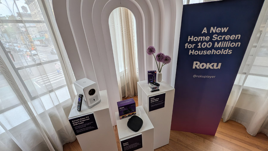
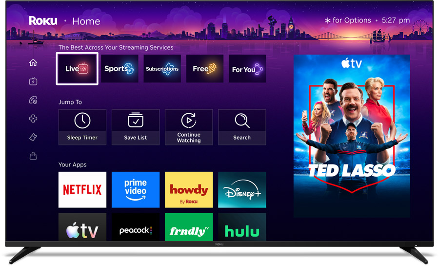
At an event in New York City this morning, Roku unveiled a new version of their Home Screen which promises a more dynamic, smarter experience. Featuring more relevant recommendations and faster pathways to content, the new Roku Home Screen is designed to reduce friction, maintain Roku’s signature simplicity, and help viewers find their next favorite movie or TV show with ease.
While Roku typically makes running tweaks to their user interface and home screen to improve the overall user experience, today’s update to the Home Screen is the most substantial and significant update we’ve seen to the platform in the past ten years.

Company reps told us that the change wasn’t made just for the sake of change, but was informed by direct customer feedback as well as detailed analysis of viewer behavior, with the end goal of streamlining and optimizing the user experience. The new personalized Home Screen tackles the biggest challenges in streaming, while offering a tailored, content-forward way to start watching.
Roku executives at the event stressed that they wanted to make sure they maintained the snappy, responsive feel that Roku users love while improving every element of the user experience. The company has done extensive testing with employees, and actual customers over its development, even allowing customers to opt in early to explore the new features and provide feedback. to the development team along the way.

“When we set out to rethink the Home Screen, we knew we should listen to the people who use it every day,” said Anthony Wood, Roku’s Founder and CEO. “So we talked to the viewers, we tested extensively, and we pushed until the design and the data lined up for a meaningful update. Now, our new Home Screen puts entertainment at the center of everything, while staying true to Roku’s simple, intuitive roots. More than 100 million households will feel the difference the moment they turn on their TV—and it opens up a better, more powerful experience for our partners as well.”
To take things from abstract to actual, one specific data point was critical in inspiring this set of changes: A majority of Roku customers (82%) said they would love it if they turned on their TV and the show they wanted to watch was right on their Home Screen. The new Roku Home Screen does just that, recommending content based on the viewer’s past activity and interests, helping the viewer get up and watching the content they crave quicker. Out of the billions of potential Home Screen layouts, the new system is designed to offer just what you want to see, when you want to see it, for each individual viewer.
Preston Smalley, Roku’s Vice President of Viewer Product, told event attendees that the net effect of the change has been moving from a static Home Screen to a fluid experience that is more dynamic and personalized around each individual user and which changes based on evolving tastes and needs. In Preston’s words, “We want the UI to recede into the background. We want the content to really shine.”
Highlights of the New Home Screen Include:
- Quick Access for your most used apps, continuously adapting to your routine
- An intelligence-driven and expanded content-first “Top Picks for You” section
- New genre-based destinations such as:
- “For You,” built on your interests and filled with fresh personalized picks
- “Subscriptions,” allowing for a convenient way to browse and discover from across all your subscriptions in one place
- Search in key destinations with relevant suggestions and results
- A streamlined collapsible menu
- Elevated shortcuts for everyday actions including Save List, Continued Watching, and more
- “Your Daily Scoop,” a dynamic row that brings you a curated digest of breakout shows and cultural trends
- A “Roku City” tile, taking you to an interactive version of your favorite screensaver

The new Roku Home Screen begins rolling out today (May 27, 2026) across all Roku TVs and streaming devices in the United States. Expansion to additional countries will follow in the coming months.
The Bottom Line
Any time we hear about a major user interface redesign rolling out to all devices, we wonder whether it will be a home run, which users of the platform embrace, or it will lead to the disaster that plagued Sonos just a few years ago. From what we saw at the event, we believe the new Home Screen redesign builds on the simple service-agnostic user interface that has built up Roku’s loyal fan base over the years. If the rollout goes well, these changes should help cement the platform’s popularity in the coming years.
You must be logged in to post a comment Login