A digital photo frame shouldn’t be complicated. At its best, it’s just a good-looking screen that can be set up quickly that reliably shows the photos you care about. Unfortunately, that’s not always how things play out. The market is flooded with cheap digital frames that promise simplicity but end up delivering washed-out displays, clunky apps and a frustrating experience — leading you to abandon it after a week.
That’s a shame, because a good digital frame can be really enjoyable. Most of us have thousands of photos sitting on our phones that never make it beyond the camera roll, even though they’re exactly the kind of moments worth seeing every day. A solid frame gives those images a permanent home, whether it’s family photos cycling in the living room or shared albums updating automatically for relatives across the country. We’ve tested a range of smart photo frames to separate the genuinely useful options from the forgettable junk, and these are the ones that are actually worth putting on display.
Best digital picture frames for 2026
AURA
Using an Aura frame felt like the company looked at the existing digital photo frame market and said “we have to be able to do better than this.” And they have. The Carver Mat is extremely simple to set up, has a wonderful screen, feels well-constructed and inoffensive and has some smart features that elevate it beyond its competitors (most of which don’t actually cost that much less).
Advertisement
The Carver Mat reminds me a little bit of an Amazon Echo Show in its design. It’s a landscape-oriented device with a wide, angled base that tapers to a thin edge at the top. Because of this design, you can’t orient it in portrait mode, like some other frames I tried, but Aura has a software trick to get around that (more on that in a minute). The whole device is made of a matte plastic in either black or white that has a nice grip, doesn’t show fingerprints and just overall feels like an old-school photo frame.
The 10.1-inch display is the best I’ve seen on any digital photo frame I’ve tested. Yes, the 1,280 x 800 resolution is quite low by modern standards, but it provides enough detail that all of my photos look crisp and clear. Beyond the resolution, the Carver’s screen has great color reproduction and viewing angles, and deals well with glare from the sun and lights alike. It’s not a touchscreen, but that doesn’t bother me because it prevents the screen from getting covered in fingerprints — and the app takes care of everything you need so it’s not required.
One control you will find on the frame is a way to skip forwards or backwards through the images loaded on it. You do this by swiping left or right on the top of the frame; you can also double-tap this area to “love” an image. From what I can tell, there’s no real utility in this aside from notifying the person who uploaded that pic that someone else appreciated it. But the swipe backwards and forwards gestures are definitely handy if you want to skip a picture or scroll back and see something you missed.
Setting the frame up was extremely simple. Once plugged in, I just downloaded the Aura app, made an account and tapped “add frame.” From there, it asked if the frame was for me or if I was setting it up as a gift (this mode lets you pre-load images so the device is ready to go as soon as someone plugs it in). Adding images is as simple as selecting things from your phone’s photo library. I could see my iPhone camera roll and any albums I had created in my iCloud Photos library, including shared albums that other people contribute to. You can also connect your Google Photos account and use albums from there.
Advertisement
One of the smartest features Aura offers is a continuous scan of those albums — so if you have one of your kids or pets and regularly add new images to it, they’ll show up on your frame without you needing to do anything. Of course, this has the potential for misuse. If you have a shared album with someone and you assign it to your Aura frame, any pictures that someone else adds will get shared to your frame, something you may not actually want. Just something to keep in mind.
My only main caveat for the Carver Mat, and Aura in general, is that an internet connection is required and the only way to get photos on the device is via the cloud. There’s a limited selection of photos downloaded to the device, but the user has no control over that, and everything else is pulled in from the cloud. Aura says there are no limits on how many images you can add, so you don’t need to worry about running out of storage. But if you don’t want yet another device that needs to be online all the time, Aura might not be for you. Most other frames I tested let you directly load photos via an SD card or an app.
The Aura app also lets you manage settings on the frame like how often it switches images (anywhere from every 30 seconds to every 24 hours, with lots of granular choices in between) or what order to display photos (chronologically or shuffled). There’s also a “photo match” feature, which intelligently handles the issue of having lots of images in both portrait and landscape orientation. Since the Carver Mat is designed to be used in landscape, the photo match feature makes it so portrait pictures are displayed side-by-side, with two images filling the frame instead of having black bars on either side. It also tries to pull together complementary pairs of images, like displaying the same person or pulling together two pics that were shot around the same time.
Overall, the Carver Mat checks all the boxes. Great screen, simple but classy design, a good app, no subscription required. Yes, it’s a little more expensive than some competing options, but all the cheaper options are also noticeably worse in a number of ways. And if you don’t want a mat, there’s a standard Carver that costs $149 and otherwise has the same features and specs as the Caver Mat I tested.
Advertisement
Pros
High-quality display with minimal reflections
App makes set-up and management of your photos simple
You can store an unlimited number of pictures in Aura’s cloud
Good integration with Apple iCloud Photos and Google Photos
Elegant, well-constructed design
Smartly displays two portrait photos side-by-side on the landscape display
No subscription required
Cons
A little pricey
Aura’s app and cloud are the only way to get photos on the frame
Can’t be set up in portrait orientation
PhotoSpring
If you’re looking to spend less, PhotoSpring’s Classic Digital Frame is the best option I’ve seen that costs less than $100 (just barely at $99). The PhotoSpring model comes with a 10.1-inch touchscreen with the same 1,280 x 800 resolution as the Carver Mat. The screen is definitely not as good as the Carver, though, with worse viewing angles and a lot more glare from light sources. That said, images still look sharp and colorful, especially considering you’re not going to be continuously looking at this display.
Advertisement
PhotoSpring’s frames are basically Android tablets with some custom software to make them work as single-purpose photo devices. That means you’ll use the touchscreen to dig into settings, flip through photos and otherwise manipulate the device. Changing things like how often the frame changes images can’t be done in the app. While doing things on the frame itself are fine, I prefer Aura’s system of managing everything on the app.
However, PhotoSpring does have a good advantage here: you can pop in a microSD card or USB drive to transfer images directly to the frame, no internet connection required. You can also use the PhotoSpring app to sync albums and single images as well, which obviously requires the internet. But once those pics have been transferred, you’re good to go. Additionally, you can upload pictures on a computer via the PhotoSpring website or sync Google Photos albums.
As for the PhotoSpring hardware itself, it looks good from the front, giving off traditional photo frame vibes. The back is rather plasticky and doesn’t feel very premium, but overall it’s fine for the price. There’s an adjustable stand so you can set the frame up in portrait or landscape mode, and you can set the software to crop your photos or just display them with borders if the orientation doesn’t fit.
PhotoSpring also has a somewhat unusual offering: a frame that has a rechargeable battery. The $99 model just uses AC power, but a $139 option lets you unplug the frame and pass it around to people so they can swipe through your photos albums on the device. This feels like a niche use case, and I think most people will be better served saving their $40, but it’s something to consider.
Advertisement
One of my favorite things about PhotoSpring is that they don’t nickel-and-dime you with subscription services. There aren’t any limits on how many images you can sync, nor are things like Google Photos locked behind a paywall. The combo of a solid feature set, a fine display and a low entry price point make the PhotoSpring a good option if you want to save some cash.
Pros
Solid display
Works in portrait or landscape orientation
Lets you load pictures from multiple sources, including the PhotoSpring app, an SD card, USB drive or via Google Photos
Inoffensive design
No subscription required
Cons
Touchscreen controls mean the display is prone to picking up fingerprints
Display picks up more reflections than the Aura
Feels a little cheap
Software isn’t the most refined
Google
Advertisement
If you want a device that works great as a digital photo frame that can do a lot more than the above options, consider Google’s Nest Hub Max. It has a 10-inch touchscreen with a 1,280 x 800 resolution and can connect to a host of Google services and other apps to help you control your smart home devices. It also works great for playing videos from YouTube or other services, or streaming music thanks to its large built-in speaker. At $229, it’s significantly more expensive than our other options, but there’s no question it can do a lot more.
From a photos perspective, you’ll need to use Google Photos. If you’re not already using the app, switching your library over might be too much of a task to make it worthwhile. But if you do use Google Photos, signing in with your Google account when you set up the Hub Max makes accessing your images quite simple. You can pick specific albums, have it stream your entire library or pull things from various recommendations it offers up.
Once that’s set up, you can customize the slideshow as you’d expect — I set mine to come up by default after the Hub Max was dormant for a few minutes. I also removed everything from the display except the photos. By default, it shows you a clock and the weather forecast, but I wanted to just focus on the pictures. I do like the option to show a little more info, though.
As for the screen itself, it has the same relatively low resolution of the other digital photo frames I tried, but it handles glare very well. And the built-in ambient light sensor automatically adjusts brightness and color temperature, which I enjoy. It keeps the Hub Max from feeling like an overly bright screen blasting you with light; it recedes into the background well.
Advertisement
Of course, the Nest Hub Max has a lot of voice-activated tricks via the Google Assistant. My big question is how long the Hub Max will be supported, as Google is clearly planning to phase out the Assistant in favor of Gemini, and I’m not convinced that the Hub Max will ever support that new AI-powered tool. Beyond the Assistant, you can get a variety of apps on it like Netflix and YouTube, stream music from a bunch of apps, see video from your Nest Cam or make video calls via the built-in camera.
If you’re going to buy a Nest Hub Max, it shouldn’t be just for its digital photo frame features, even though those are quite solid. It’s best for someone well-entrenched in the Google ecosystem who wants a more multi-purpose device. If you fit the bill, though, the Nest Hub Max remains a capable device, even though it’s been around for almost five years.
Pros
Advertisement
Good display quality with auto-brightness and warmth settings
Getting images on it is a piece of cake, provided you use Google Photos
Plenty of ways to control smart home devices
Good-sounding speaker
Cons
Almost five years old
Google Assistant’s days are likely numbered
More expensive than a standard digital photo frame
AURA
The Aura Aspen frame is a step-up from our top pick in terms of overall quality and, unfortunately but predictably, price. For $229, you get a 1,600 x 1,200 resolution, 11.8-inch display that supports 169 pixels per inch, and the frame can be positioned in either portrait or landscape mode. There’s a physical button and touchbar on the frame’s edge that let’s you swipe through photos or change what’s currently displayed, but you can also do that remotely with Aura’s mobile app. All of the same great app features present in the Carver are here for the Aspen, including inviting others to contribute photos to your frame. The kicker here, like with all Aura frames, is the lack of a subscription necessary to keep your frame filled to the brim with updated photos. That alone may be worth paying the higher price tag for some when picking out a frame you want to be able to use freely for years to come. — Valentina Palladino, Deputy Editor
Pros
Advertisement
Elegant design
1,600 x 1,200 resolution display
Easy-to-use Aura app
Can invite others to add photos via mobile app
No subscription required
What to look for in digital picture frames
While a digital photo frame feels like a simple piece of tech, there are a number of things I considered when trying to find one worth displaying in my home. First and foremost was screen resolution and size. I was surprised to learn that most digital photo frames have a resolution around 1,200 x 800, which feels positively pixelated. (That’s for frames with screen sizes in the nine- to ten-inch range, which is primarily what I considered for this guide.)
But after trying a bunch of frames, I realized that screen resolution is not the most important factor; my favorite photos looked best on frames that excelled in reflectivity, brightness, viewing angles and color temperature. A lot of these digital photo frames were lacking in one or more of these factors; they often didn’t deal with reflections well or had poor viewing angles.
A lot of frames I tested felt cheap and looked ugly as well, which isn’t something you want in a smart device that sits openly in your home. That includes lousy stands, overly glossy plastic parts and design decisions I can only describe as strange, particularly for items that are meant to just blend into your home. The best digital photo frames don’t call attention to themselves and look like an actual “dumb” frame, so much so that those that aren’t so tech-savvy might mistake them for one.
Perhaps the most important thing outside of the display, though, is the software. Let me be blunt: a number of frames I tested had absolutely atrocious companion apps and software experiences that I would not wish on anyone. One that I tried did not have a touchscreen, but did have an IR remote (yes, like the one you controlled your TV with 30 years ago). Trying to use that with a Wi-Fi connection was painful, and when I tried instead to use a QR code, I was linked to a Google search for random numbers instead of an actual app or website. I gave up on that frame, the $140 PixStar, on the spot.
Other things were more forgivable. A lot of the frames out there are basically Android tablets with a bit of custom software slapped on the top, which worked fine but wasn’t terribly elegant. And having to interact with the photo frame via touch wasn’t great because you end up with fingerprints all over the display. The best frames I tried were smart about what features you could control on the frame itself vs. through an app, the latter of which is my preferred method.
Advertisement
Another important software note: many frames I tried require subscriptions for features that absolutely should be included out of the box. For example, one frame would only let me upload 10 photos at a time without a subscription. Others would let you link a Google Photos account, but you could only sync a single album without paying up. Yet another option didn’t let you create albums to organize the photos that were on the frame — it was just a giant scroll of photos with no way to give them order.
While some premium frames offer perks like unlimited photos or cloud storage, they often come at a cost. I can understand why certain things might go under a subscription, like if you’re getting a large amount of cloud storage, for example. But these subscriptions feel like ways for companies to make recurring revenue from a product made so cheaply they can’t make any money on the frame itself. I’d urge you to make sure your chosen frame doesn’t require a subscription (neither of the frames I recommend in this guide need a subscription for any of their features), especially if you plan on giving this device as a gift to loved ones.
How much should you spend on a digital picture frame
For a frame with a nine- or ten-inch display, expect to spend at least $100. Our budget recommendation is $99, and all of the options I tried that were cheaper were not nearly good enough to recommend. Spending $150 to $180 will get you a significantly nicer experience in all facets, from functionality to design to screen quality.
Digital frames FAQs
Are digital photo frames a good idea?
Yes, as long as you know what to expect. A digital picture frame makes it easy to enjoy your favorite shots without printing them. They’re especially nice for families who want to display new photos quickly. The key is understanding the limitations. Some frames have lower resolution displays or need a constant Wi-Fi connection to work properly, so they’re not a perfect replacement for a high-quality print on the wall. But if you want a simple way to keep memories on display and up to date, they’re a solid choice.
Advertisement
Can you upload photos to a digital frame from anywhere?
Most modern digital frames let you do this, but it depends on the model. Many connect to Wi-Fi and use apps, cloud storage or email uploads, so you can add photos from your phone no matter where you are. Some even let family members share directly, which is great for keeping grandparents updated with new pictures. That said, a few budget models only work with USB drives or memory cards, so check how the frame handles uploads before buying.
The FBI has resumed purchasing reams of Americans’ data and location histories to aid federal investigations, the agency’s director, Kash Patel, testified to lawmakers on Wednesday.
This is the first time since 2023 that the FBI has confirmed it was buying access to people’s data collected from data brokers, who source much of their information — including location data — from ordinary consumer phone apps and games, per Politico. At the time, then-FBI director Christopher Wray told senators that the agency had bought access to people’s location data in the past but that it was not actively purchasing it.
When asked by U.S. Senator Ron Wyden, Democrat of Oregon, if the FBI would commit to not buying Americans’ location data, Patel said that the agency “uses all tools … to do our mission.”
“We do purchase commercially available information that is consistent with the Constitution and the laws under the Electronic Communications Privacy Act — and it has led to some valuable intelligence for us,” Patel testified Wednesday.
Advertisement
Wyden said buying information on Americans without obtaining a warrant was an “outrageous end-run around the Fourth Amendment,” referring to the constitutional law that protects people in America from device searches and data seizures.
A spokesperson for the FBI did not respond to questions about the agency’s purchase of commercial data, including how often the FBI obtained location data and from which brokers.
Government agencies typically have to convince a judge to authorize a search warrant based on some evidence of a crime before they can demand private information about a person from a tech or phone company. But in recent years, U.S. agencies have skirted this legal step by purchasing commercially available data from companies that amass large amounts of people’s location data originally derived from phone apps or other commercial tracking technology.
For example, U.S. Customs and Border Protection purchased a tranche of data sourced from real-time bidding, or RTB, services, according to a document obtained by 404 Media. These technologies are central to the mobile and web advertising industry, and they collect information such as location and other identifiable data used to target people viewing ads. Surveillance firms can observe this process and gather information about a user’s location, and then potentially sell that data to brokers or federal agencies looking to circumvent the warrant process.
Advertisement
The FBI claims it does not need a warrant to use this information for federal investigations; though this legal theory has not yet been tested in court.
Last week, Wyden and several other lawmakers introduced a bipartisan, bicameral bill called the Government Surveillance Reform Act, which among other things would require a court-authorized warrant before federal agencies can buy Americans’ information from data brokers.
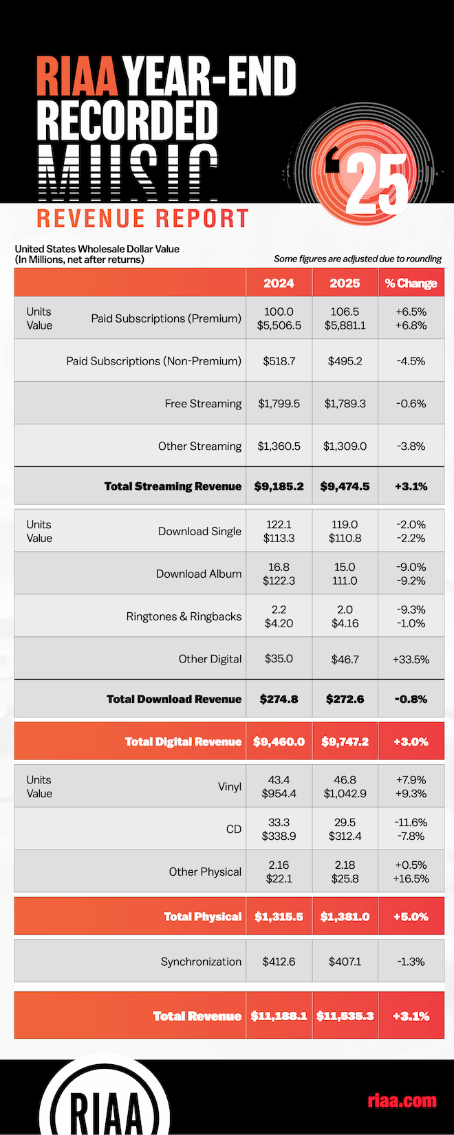
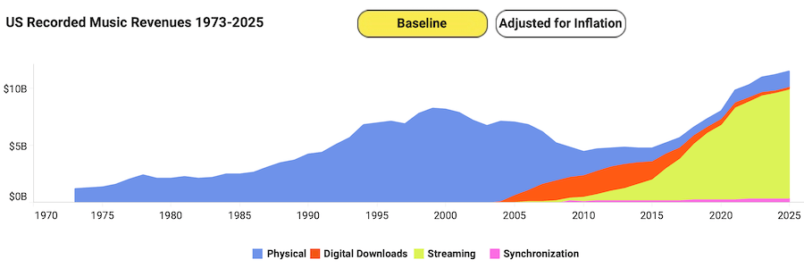
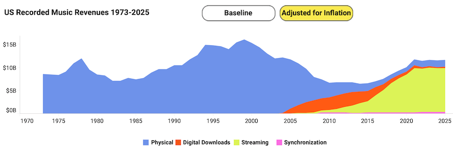
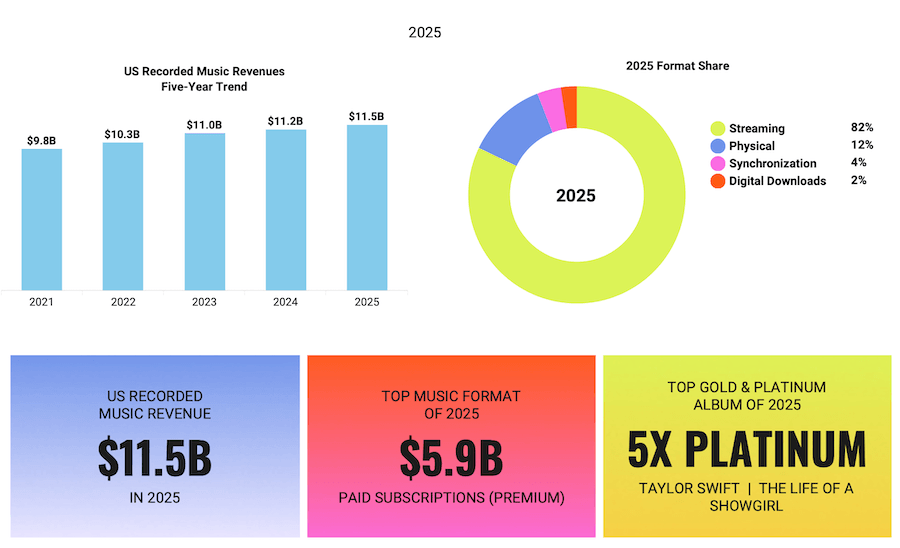
The RIAA’s 2025 year end revenue report gives us a pretty clear look at where the music business stands right now. The recorded music industry in the United States generated $11.535 billion in wholesale revenue, a 3.1% increase over 2024. Streaming continues to dominate the market, vinyl remains the strongest part of the physical media business, and CDs keep drifting further into legacy territory.
Strip away the nostalgia and the usual industry hype and the story becomes pretty straightforward. Streaming pays most of the bills, vinyl still attracts buyers who want something tangible, and the rest of the formats are slowly losing ground. The numbers don’t argue. They just show how people are choosing to listen to music in 2025.
Before anyone starts comparing every figure to older headlines, one detail matters: RIAA says its reports are now based on wholesale data to align with global reporting standards. That means accuracy requires using the 2024 and 2025 figures shown inside the new report itself, not mixing them with older retail based totals from prior annual summaries.
Streaming Still Owns the Block
Streaming generated $9.4745 billion in 2025, up 3.1%, and accounted for roughly 82% of total U.S. recorded music revenue. Paid subscriptions were the engine inside the engine: 106.5 million premium accounts produced $5.881 billion, up 6.8% in revenue, while the broader paid subscription category represented 55.3% of all U.S. music revenue. That is the part of the business paying the rent, keeping the lights on, and making the rest of the machine possible. Spotify and Apple Music still dominate the landscape, but streaming’s share of total U.S. recorded music revenue has not pushed past the mid-80% range, which suggests something important: physical media’s double-digit share of the market has stabilized rather than disappearing.
There is a second story tucked inside those streaming numbers. Not every digital segment is moving in lockstep. Free streaming slipped 0.6% to $1.789 billion, and other streaming fell 3.8% to $1.309 billion. So yes, streaming is still the dominant format by a mile, but the healthiest part of it is clearly the paid side.
Advertisement
That tells us consumers are still willing to pay for access when the experience is frictionless and the catalog feels essentially infinite; though it does raise a fair question about how much of that catalog is genuine music versus the growing volume of AI-generated content now flooding streaming platforms.
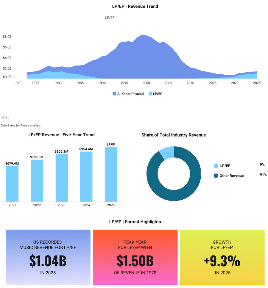
Vinyl Is Not a Gimmick Anymore
Vinyl was the headline physical format again, and this time the number has real swagger: $1.0429 billion in U.S. revenue on 46.8 million units, up 9.3% in revenue and 7.9% in units year over year. According to the RIAA, 2025 marked vinyl’s 19th consecutive year of growth, and U.S. vinyl accounted for nearly 50% of global vinyl revenue.
This is no longer a boutique side hustle for crate diggers and weekend collectors. Vinyl has grown well beyond the small group of audiophiles who kept the format alive after CDs, downloads, and eventually streaming pushed it to the margins. Today it is a serious commercial format with real momentum.
Record Store Day alone tells part of the story. What started as a niche celebration has evolved into two major annual events, with collectors and music fans lining up before sunrise for a shot at limited pressings. Independent record stores are also seeing renewed life in college towns and major cities across North America. Many have adapted by turning themselves into community spaces selling coffee, food, turntables, record accessories, and entry level hi-fi gear alongside vinyl. The format is no longer surviving on nostalgia. It has rebuilt an ecosystem around it.
The more revealing point is not merely that vinyl grew. It is how decisively it beat the rest of physical media. Vinyl generated more than three times the revenue of CDs in 2025 and outsold them by a wide margin in units as well. The format has moved beyond novelty because it offers something streaming cannot: ownership, ritual, display value, collectibility, and a direct emotional transaction between listener and music. Streaming gives you access to everything. Vinyl gives you a reason to care about something. Different drug. Different high. Same customer wallet, sometimes.
Advertisement
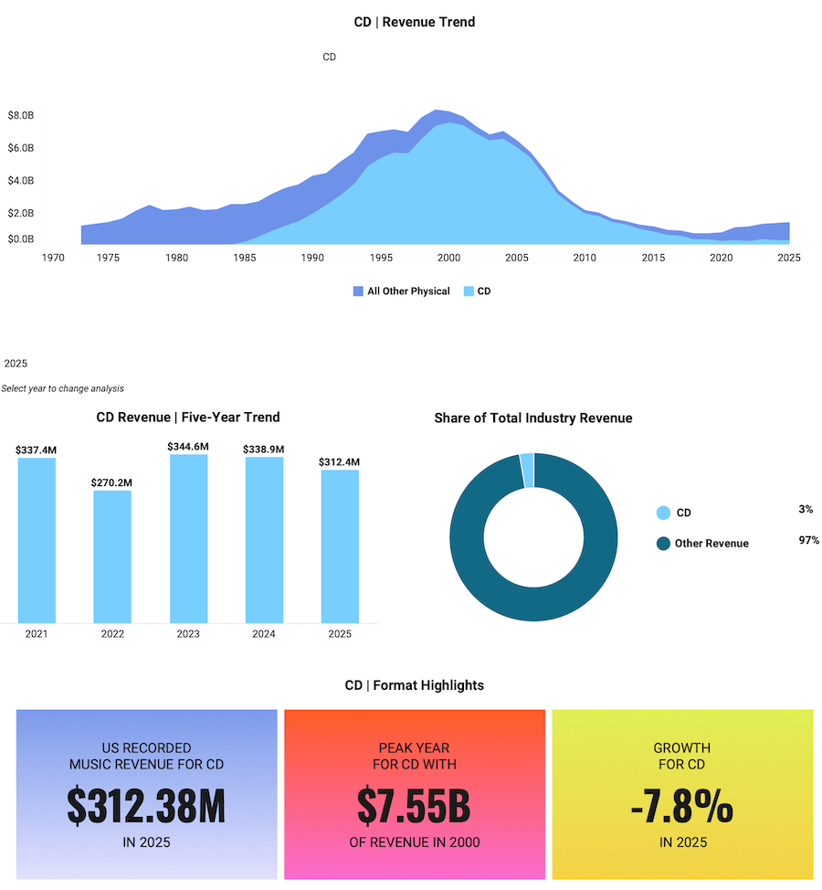
CDs Are Not Dead, But They Are Bleeding Out Slowly
CDs brought in $312.4 million on 29.5 million units in 2025. That represented a 7.8% decline in revenue and an 11.6% drop in units compared with the prior year. The compact disc has not disappeared. It still sells in meaningful numbers, and there are niches where it remains relevant, including collectors, catalog buyers, K-pop fans, box set purchasers, and listeners who want a physical copy without paying vinyl prices. But the long-term direction is clear. CDs are no longer the center of the physical media market.
Advertisement. Scroll to continue reading.
The biggest remaining advantage for CDs is price. New releases on CD are usually far cheaper than new vinyl, and the used market is enormous. Walk into almost any record store and you will still find large CD bins with thousands of titles selling for $1 to $5. For listeners building a music library, it is still one of the most affordable ways to own albums.
There is also continued support from the hardware side of the industry. A number of hi-fi manufacturers still produce portable CD players, traditional CD players, transports, and SACD machines, aimed at listeners who value physical playback and the potential for higher quality sound through a dedicated system.
But it would be a mistake to frame this as a revival similar to vinyl. The data does not support that narrative. CD sales continue to decline year after year, even if the format maintains a loyal audience. On a good player, a well-mastered CD can absolutely outperform most streaming playback, but that alone is not enough to drive a broad market comeback. Vinyl has turned collecting into an event. CDs have not. Nobody is lining up outside record stores before sunrise waiting for Compact Disc Day. Not in 2025, and not anytime soon.
Advertisement
Downloads Continue Their Slow Walk to the Exit
Permanent digital downloads kept shrinking. Total download revenue fell 0.8% to $272.6 million. Download singles dropped 2.2% in value, while download albums fell 9.2%. The category still exists, but mostly as a residue of older buying habits and edge cases where ownership of files still matters. In the larger picture, downloads now look like a transitional format that has already served its purpose. They were once the escape car from the CD era. Now they are just parked outside with a flat tire.
What the Data Actually Tells Us
The 2025 RIAA numbers show a music business that is healthier than the doom merchants want to admit and more complicated than the vinyl evangelists sometimes pretend. Streaming is the mass market utility. Vinyl is the premium physical object. Everything else is fighting for leftovers. Paid subscriptions are where the financial strength sits, vinyl is where the emotional and collectible upside sits, and CDs are losing relevance even though they still matter in absolute dollars.
That also means the industry has stopped being a simple format war. Streaming and vinyl are not really enemies. They represent different behaviors. One is about access, portability, and habit. The other is about ownership, fandom, and intent. Consumers are using both because they solve different problems.
The 2025 numbers make that clear: digital revenue climbed to about $9.7 billion while physical formats generated roughly $1.38 billion, and both categories grew at the same time. In other words, the market can support subscriptions and collecting when consumers see value in both.
There is also a broader context that is easy to overlook. Music consumption in the United States now generates billions more in revenue than the theatrical movie business, with recorded music alone clearing $11.5 billion in 2025. People simply spend more time listening to music than watching films. It happens everywhere: at home, in the car, on the train, at the gym, and on airplanes. That constant presence makes music one of the most durable forms of media consumption, and it is likely that the gap between music and movies will continue to widen as streaming subscriptions and mobile listening keep expanding.
Taken together, the numbers show something simple. Streaming dominates music access. Vinyl anchors the physical collector market. CDs remain a niche but affordable ownership format. And across all of it, music continues to be one of the most consistent and pervasive forms of entertainment people consume every day.
Qihoo 360 recently shipped its 360 Security Claw AI assistant, a tool designed to rein in the viral AI agent OpenClaw. However, the installer contained a private SSL certificate associated with the company’s internet domain. Criminals and security researchers could theoretically exploit this certificate to compromise Qihoo 360’s infrastructure, although… Read Entire Article Source link
The MacBook Neo, along with the Mac mini, is Apple‘s most affordable computing option at just $599. And yet it is a formidably capable device, possibly, a once-in-a-generation product. Why? One unknown I wanted to clear up was how well it ran Windows 11 in a virtual machine.
So I asked the team at Parallels to benchmark a Windows-equipped Neo, and what they delivered shocked me.
I didn’t have high expectations given the Mac Neo’s limited specifications. It uses similar hardware to the iPhone 16 Pro Max: an Apple A18 Pro with six cores, 256GB storage and 8GB of unified memory.
Advertisement
Article continues below
Against a $1,119 Dell Pro 14 laptop (Intel Core Ultra 5 235U @ 2.00 GHz, 10-core, 16GB RAM, running Windows 11 build 26200 natively), a MacBook Neo with a virtualised Windows 11 (build 26200) with six vCPU and 6GB vRAM (via Parallels Desktop 26) delivered approximately 20% higher single-core CPU performance than natively on the Dell computer.
That’s across five industry-leading benchmark packages: Geekbench, PassMark, 3DMark, PCMark, Blender, and Unigine. I reached out to Parallels to obtain the raw data from these tests and will update the article once it is received.
Advertisement
For typical office productivity workloads, overall performance is approximately 20% slower than native Windows 11 on the Dell laptop.
Parallels said this “remains responsive and practical,” meaning it should be fast enough for everyday use. They also added that “this setup works well for standard office productivity (Microsoft Office, email, calendar), web applications and browser-based tools, business productivity software, and light development and testing”.
Sign up to the TechRadar Pro newsletter to get all the top news, opinion, features and guidance your business needs to succeed!
There are obvious caveats – you still need to buy a copy of Parallels and a Windows 11 license – and this certainly warrants more extensive tests, something that I hope my peers will carry out.
Advertisement
Apple is only warming up
I cannot stress enough how important this finding is.
Here we have an Apple laptop that was never destined to run Windows 11, capable of running Microsoft’s flagship OS in a virtual machine, better than a Dell laptop designed to run Windows 11 natively.
Not only is the Dell laptop far more expensive, but its CPU is also expected to be more powerful. What we have seen is the fruit of vertically integrated platform, something that Apple mastered by kicking out Intel and Samsung from its Mac and iPhone range.
Own the hardware and the software and you can perform miracles.
This is mind-blowing and both Apple and Parallels deserve a big pat on the back for achieving this. It’s too early to say the writing is on the wall for Windows laptops, but expect Apple to sell millions of these in the current financial year. Could it become Apple’s best-selling computer ever? I wouldn’t bet against this.
Matt Hanson, who reviewed the MacBook Neo for TechRadar, quipped that “While I wouldn’t recommend using Windows 11 on the MacBook Neo full-time, as native macOS performance is always going to be better, Apple’s affordable laptop has put budget laptop and Chromebook makers on notice. It’s not perfect, but the performance, build quality and design mean there’s really no choice if you’re looking for a laptop under $600: buy the MacBook Neo”.
Advertisement
Matt gave it a 4.5 out of 5, noting the presence of USB 2.0 ports, the lack of a keyboard backlight, and limited RAM as the only significant drawbacks of an otherwise stellar laptop.
I will not buy Apple’s cheapest laptop just yet but I – and I am sure millions of others – would find it hard to resist a $99.99 refurbished MacBook Neo in a few years.
Yesterday’s discount on the Sonos Ace over-ear headphones wasn’t the only sale you can find on new additions to your Sonos setup. You can also nab the Sonos Roam 2 for just $139 as part of the Amazon Spring Sale. This Bluetooth speaker has excellent sound despite its relatively compact size, and of course it plays nicely with your other Sonos speakers.
Unlike older Sonos products, the Roam 2 now has Bluetooth in addition to Wi-Fi. When you’re home, the speaker joins your network and acts just like any other Sonos speaker in your setup. Take it on the go, and you can easily connect your phone and keep the tunes rolling. The Sonos app isn’t always the best at finding new speakers, but in this case it fired right up and connected to the Roam 2, good news for the easily frustrated. It has a fun sound profile that’s great for picnics or backyard hangs, with solid bass and balanced mid and upper ranges. Some other Bluetooth speakers might get louder, but the Roam 2 makes up for it by joining a chorus of other speakers around your home.
While the first-generation Roam suffered from some long-term battery health issues, Sonos has assured us that the Roam 2 more than fixes the problem, and at least in the short time our reviewer Parker Hall spent with it, it wasn’t an issue anymore. The outside is also slightly prone to smudges and scuffs, something to keep in mind if you prefer your equipment looking pristine. It’s waterproof, though, and quite sturdy, so just know that any marks you see on the housing are just surface level.
Fusion power company Helion Energy has taken the top spot in the latest update of the GeekWire 200, our quarterly ranking of the top privately held technology startups in the Pacific Northwest.
Helion replaced Highspot, which announced a merger with Seismic in a significant sales software deal last month (exited companies graduate from the list). Backed by the likes of SoftBank and Sam Altman, Helion announced two key milestones in February on its mission to generate usable energy from fusion reactions.
The company’s ascent atop the GeekWire 200 reflects a broader trend on the rankings, as startups building complex hardware across sectors like space, energy, robotics, and agriculture make up a sizable chunk of the list. It’s a notable change for a region traditionally dominated by enterprise software.
The top 10 includes companies such as Agility Robotics, which is building humanoid robots; Brinc, a drone maker serving public safety customers; Stoke Space, a space manufacturing company; and Carbon Robotics, which sells weed-zapping machines to farmers. Seattle VC firm Ascend has coined this crop of companies as “Cascadian Dynamism.”
Advertisement
The GeekWire 200 is a great resource to help keep track of the region’s up-and-coming companies, along with established leaders.
The list, which dates to 2013, combines objective data and editorial insight to provide a broad view of the region’s startup landscape. The GeekWire 200 has long served as a resource for investors, job seekers, service providers, and others tracking the Pacific Northwest tech scene.
The top 10 includes one new member: infrastructure startup Temporal, now valued at $5 billion after raising a $300 million Series D round last month. Temporal’s revenue grew more than 380% year-over-year as it helps companies move their AI agents into real-world production.
Several other startups rose up the list this quarter:
Auger, the supply chain software startup that raised a $100 million seed round in 2024, continues to hire rapidly — headcount is up more than 200% year-over-year — and is now ranked No. 41. Auger also announced a partnership with Microsoft on Wednesday.
Echodyne, the Seattle-area radar platform company, announced plans to build a new manufacturing facility in Washington state and moved up to No. 54.
Starfish Space is now No. 64 after landing a $54.5 million Space Force contract for its satellite servicing spacecraft.
AIM Intelligent Machines, the autonomous construction startup that recently inked its own government contract, moved up to No. 122.
Avalanche Energy, which announced a $29 million round last month to fuel its fusion technology, moved up to No. 156.
Tin Can, the hot Seattle startup behind a landline-style telephone for kids, sprang to No. 167 after raising $12 million in December.
There are also a batch of newcomers making their debut on the list, including:
Tune Therapeutics (No. 140), a biotech company co-headquartered in Seattle that’s developing epigenome editing programs.
Gradial (No. 151), a Seattle-based startup developing agentic marketing tools that raised $35 million in December and recently launched a new tool for GEO, or Generative Engine Optimization.
Starcloud (No. 171), the Redmond, Wash.-based company working on space-based data centers that was featured during Jensen Huang’s keynote at NVIDIA GTC this week.
Others new entrants include Union.ai; Integrate; Clearly AI; mpathic; AheadComputing; Casium; RentSpree; Inflection.io; Dopl Technologies; Loopr; Scala; Elevāt; Certivo; AZX; and MontyCloud.
Notes on the GeekWire 200
Our list is not scientific, by any means, and the specific rankings should be taken with a grain of salt. But it has proven to be a highly useful tool. We hear regularly from readers who use the GeekWire 200 to look for jobs, prospect for customers, mine for potential investments, and get a high-level view of the tech community.
We also use the list as a valuable insights tool, gathering survey data to highlight trends among fast-growing startups.
We’re looking at each company’s employee growth over the past 12 months, factoring in both the percentage increase and the number of jobs added.
Larger companies still earn credit for maintaining scale — a sign of maturity and customer traction. But this is weighted less heavily than growth, to help spotlight emerging players.
We include LinkedIn follower counts as a rough measure of a company’s public traction. To avoid favoring long-established firms, we apply a curve that gives younger companies a fairer shot.
Companies founded 15 years ago or later “graduate” from the GeekWire 200, and are not included. We also remove companies due to mergers, acquisitions and private equity deals in which they sell a majority of their shares.
To make sure your Pacific Northwest technology startup is eligible for the GeekWire 200, first confirm it’s included in the broader GeekWire Startup List. If so, there’s no need to submit it separately. If your startup isn’t among the companies on that larger list, you can submit it for inclusion here, and we’ll crunch the numbers to see if your company makes the next GeekWire 200 update. Email us at tips@geekwire.com with any questions.
The New York digital comics platform is combining its 300,000-title library with INKR’s AI localisation engine, and bringing in new leadership to execute the expansion.
The problem with getting manga into the hands of readers outside Japan is not demand. Manga is the fastest-growing category in American book publishing; global interest has been building for years, accelerated by streaming adaptations of franchises like Demon Slayer, Attack on Titan, and Jujutsu Kaisen.
The problem is infrastructure. Translating, reformatting, and distributing a comics series across languages and screen sizes is still a largely manual process, and the industry’s publishing toolchain has never been built to handle it at speed or at scale.
GlobalComix, the New York-based digital comics platform, is betting it can fix that. On Wednesday the company announced three moves at once: a $13 million funding round, the appointment of Henrik Rydberg as chief executive, and the acquisition of INKR, a Singapore-founded AI localisation platform for comics.
Together, the announcements describe a company that wants to be not just a reading destination but the infrastructure layer beneath the global comics publishing industry.
Advertisement
The $13 million round was co-led by SBI US Gateway Fund, the US arm of SBI, one of Japan’s most active venture capital firms with more than 1,200 portfolio companies, and Point72 Ventures, the venture arm of Steve Cohen’s Point72 Asset Management.
Point72 Ventures previously led GlobalComix’s $6.5 million Series A in July 2023 and returns here as co-lead. Additional participants include Scrum Ventures, Wise Ventures, Wicklow Capital, and Upside VC.
The Japan-US investor pairing is deliberate. SBI’s network spans Japanese media and publishing, the market that produces manga, while Point72 brings continuity and US market perspective.
Shohei Yamada, Managing Partner of SBI US Gateway Fund, described GlobalComix as “building the infrastructure that connects creators, publishers, and readers worldwide,” adding that he believed it had the potential to make manga and comics “accessible to anyone, anywhere.”
Advertisement
Ishan Sinha, now a Partner at Point72 Ventures who led the 2023 Series A, said the addition of INKR’s AI team and localisation technology “meaningfully expands what the platform can support for creators and publishers.”
The INKR acquisition brings the most technically substantive element of the announcement.
INKR was founded in 2019 by Ken Luong, Khoa Nguyen, and Hieu Tran, a team based in Singapore and Ho Chi Minh City, and launched its app in October 2020.
The platform’s core product is an AI localisation engine that automates the most labour-intensive steps in preparing a comic for a new language market: text and object detection, image cleaning, translation, and typesetting.
Advertisement
The company says the technology reduces localisation time from days to hours and has been used to localise more than 15,000 comics, though that figure comes from GlobalComix’s press materials and has not been independently verified.
GlobalComix’s platform currently hosts more than 300,000 titles from publishers including Marvel, DC, Kodansha, Image Comics, and Tokyopop, alongside more than 25,000 independent creators.
The company’s ambition is to combine INKR’s localisation pipeline with its existing distribution and monetisation infrastructure, effectively creating a vertically integrated system: a publisher brings a Japanese title in, the AI engine prepares it for English, French, or Brazilian Portuguese markets, and GlobalComix handles distribution and revenue.
The global manga market is estimated to exceed $20 billion annually, with demand for translated content growing across the West.
Advertisement
Whether GlobalComix can capture meaningful share of that workflow, against established players including Viz Media, Yen Press, and digital platforms like WEBTOON, depends on whether the AI localisation quality is good enough for professional publishing standards and whether publishers will trust a startup with their most valuable IP.
The acquisition of INKR, whose technology is described as already trusted by publishers in Japan and Korea, is the clearest attempt to answer that second question before it is asked.
Flock, valued at roughly $7.5 billion and backed by venture capital giant Andreessen Horowitz, says its systems help police identify vehicles linked to criminal activity by analyzing license plates and other features, such as bumper stickers. But the same capability has alarmed privacy advocates and local governments, particularly after reports that… Read Entire Article Source link
An Employment and Recruitment Federation report suggests that despite Ireland’s positive hiring market, progress is being stalled.
New research published by the Employment and Recruitment Federation and supported by Icon Accounting has highlighted how the skills shortage in Ireland is starting to delay further growth for organisations, despite some positive numbers.
The Irish Labour Monthly Monitor report found that more than half of contributing recruiters reported an increase in permanent vacancies and 43pc said there is higher demand for contract roles. 41pc reported increased temporary vacancies and more than half also said that they expect vacancy levels to rise further over the next three months.
But despite the positive hiring market, the research also indicated that Ireland’s talent pool is not keeping pace. Of those who contributed their information, two thirds of recruiters said that they expect no improvement in the availability of applicants with suitable skills. The report said this points to a widening gap between what employers need and what the market can currently provide.
Advertisement
Commenting on the figures, Siobhán Kinsella, the president of the Employment and Recruitment Federation, noted that this is the real challenge at present: not a lack of jobs, but a shortage of the right skills.
She said: “What this data shows very clearly is that Ireland does not have a jobs problem. It has a skills problem. Employers are still hiring. Recruiters are still filling roles. But finding people with the right experience and qualifications is getting harder, and that is now starting to hold businesses back.
“This is still a strong jobs market, but it is becoming harder and more expensive for employers to hire. Businesses are dealing with higher costs, continued uncertainty and fast-changing requirements at the same time.”
She explained that if Ireland wants to maintain its momentum, there needs to be a serious commitment to training, reskilling and workforce readiness. “We cannot keep talking about strong employment numbers if employers cannot find the people they need to fill the roles that are there,” she said.
Advertisement
Competing needs
The report noted how in February, Ireland’s unemployment rate stood at less than 5pc, resulting in a landscape where many employers find themselves competing for a limited pool of experienced workers, across sectors such as technology, engineering, healthcare, logistics and financial services, among others.
Youth unemployment figures were also shown to be comparitively high, with the latest CSO figures showing a rate of 12.4pc for 15 to 24-year-olds, highlighting the continuing challenge of ensuring that people entering the workforce have the right skills to access available roles.
Kinsella noted that the findings are reflective of a much wider pattern now visible across developed economies, where the issue is no longer job creation, but whether countries have the people and capacity needed to support continued growth.
She said: “What Ireland is facing is part of a much wider shift across advanced economies. We have adapted before as technology changed the way we work, and we will adapt again.
Advertisement
“But this next phase will depend on whether we invest properly in skills, support people to retrain and make it easier for employers to access the talent they need in areas such as AI, machine learning, engineering and healthcare. That is where the real focus now needs to be.”
Earlier this month, WiCyS and FourOne Insights published data that explored how skills-based cyber practices have the potential to positively impact employees and their organisations.
The ‘ROI of Resilience: How Cybersecurity Talent Management Best Practices Improve the Bottom Line’ study suggested that skills-based, talent-friendly practices often generate the highest returns for an organisation and its workforce.
The report said: “High-ROI practices, such as transparent promotion processes, executive sponsorship, access to upskilling and mentorship, and engagement with trusted third-party partners, can consistently reduce hiring friction and support retention. Over time, they open advancement pathways that have historically been narrow, especially for women.”
Advertisement
Don’t miss out on the knowledge you need to succeed. Sign up for the Daily Brief, Silicon Republic’s digest of need-to-know sci-tech news.
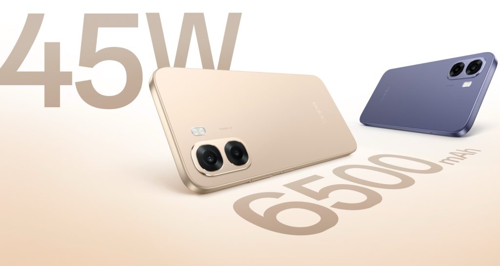
Over the years, OPPO’s A series has delivered some great value phones for price-conscious buyers. Keeping that spirit alive, OPPO has launched the OPPO A6s 5G in India. The Chinese smartphone maker says the A6s focuses on battery life, smooth performance, and a camera setup designed for everyday photography. Here’s everything you need to know about it.
Design & Cameras
The OPPO A6s 5G features a flagship-inspired design with a slim profile measuring 8.61mm in thickness and weighing around 212 grams. Color options, of which there are two, include Aurora Gold and Plum Purple. The phone features a bright display for outdoor visibility, along with a metallic unibody-style frame that offers both durability and a premium look.
Optics are headed by a 50MP main camera accompanied by a 2MP secondary sensor. According to OPPO, the camera system is designed to capture clear images with natural colours across different lighting conditions. Selfies are handled by a 5MP sensor.
Performance & Battery
Powering the OPPO A6s 5G is the MediaTek Dimensity 6300 chipset. We’ve used several phones with the same processor in the past, and it’s a reliable performer. The smartphone runs ColorOS 15, which introduces system-level optimizations, including the Luminous Rendering Engine and Trinity Engine, to improve animation smoothness and overall performance.
Battery life is one of the main highlights of the OPPO A6s 5G. The phone packs a 6,500mAh battery, which is coupled with 45W SUPERVOOC fast charging, allowing the device to charge from 1% to 41% in about 30 minutes.
Pricing & Availibility
The OPPO A6s 5G starts at ₹18,999 for the 4GB + 128GB variant, while the 6GB + 128GB model is priced at ₹20,999. The smartphone is available starting today through Amazon, Flipkart, the OPPO online store, and offline retail outlets. As part of launch offers, buyers can get ₹1,000 instant cashback on select credit cards and no-cost EMI options for up to three months.


.png)


You must be logged in to post a comment Login