Connect with us
DAPA Banner
DAPA Coin
DAPA
COIN PAYMENT ASSET
PRIVACY · BLOCKDAG · HOMOMORPHIC ENCRYPTION · RUST
ElGamal Encrypted MINE DAPA
🚫 GENESIS SOLD OUT
DAPAPAY COMING

Tech

iPadOS 26 review – iPad finally feels like the computer it should be

Published

on

iPadOS 26 is the first iPad update in years that makes the device feel meaningfully closer to a real primary computer, even if it still isn’t consistent enough to fully replace a Mac.

Apple has continually enhanced the iPad’s hardware, yet the software remains tethered to an iPhone-like design. The design has always imposed strict sandboxing, limits background activity, and restricted multitasking capabilities.

Those choices prioritize security and efficiency but prevent apps from behaving like they do on a Mac, which has long limited the iPad in more complex work. With iPadOS 26, Apple addresses some of those limits, as well as giving it a facelift with its new Liquid Glass design.

As part of that new design, the update introduces a new windowing system and a refreshed interface that push the iPad closer to desktop-style workflows without turning it into macOS.

Advertisement

I used my iPad Pro as my primary computer before iPadOS 26, even with a MacBook Air nearby. The iPad fits how I prefer to work, but iPadOS has often forced compromises that macOS does not, and this update reduces some of those gaps without fully eliminating them.

iPadOS 26 review – Liquid Glass offers a new look

Liquid Glass certainly gives iPadOS 26 a distinctive look, and I like it overall, but it matters less than the workflow changes and occasionally it even gets in the way. Liquid Glass is predominantly a visual style and emphasizes translucency, depth, and motion.

So controls adjust their color and contrast based on what’s behind them, meaning that the same buttons can appear lighter over dark content and darker over bright areas. There are also changes to how menus and options appear, some of which is definitely a positive:

  • Common actions move closer to where you interact
  • Icons, widgets, and panels adapt to your wallpaper

That last is best exemplified by the Weather app, which is a particularly attractive design. However, even in that case, there is a tradeoff in simple readability with Liquid Glass.

For instance, with iPadOS 26 you are much more likely to have overlapping windows, because you can, and because it is definitely a boon to be able to see multiple apps. But the readability issues were enough that Apple added more controls in the iPadOS 26.1 update, that let you choose between Clear and Tinted appearances.

Advertisement

There’s also Reduce Transparency, an option that is tucked away under Settings, Accessibility, and Display & Text Size. That removes most translucency across the interface, improving contrast when Liquid Glass becomes distracting.

Liquid Glass definitely does enhances the iPad’s appearance by adding depth and motion to the interface. Yet some elements can even distract when scrolling through content because the glassy distortion effect moves across the material underneath.

Consequently, those improved controls in iPadOS 26.1 are needed to tone down when Liquid Glass gets in the way.

But then Liquid Glass, for all the attention paid to its visual style, is also a productivity aid. It’s the overall Liquid Glass look and feel that makes the iPad just that much more like a Mac.

Advertisement

iPadOS 26 review – The iPad works more like a Mac

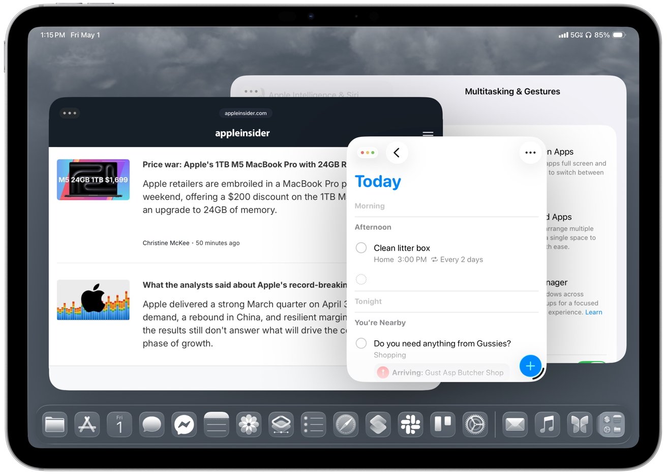
Most significantly, iPadOS 26’s Liquid Glass redesign introduces resizable, movable windows that finally let you arrange apps around the task instead of forcing the task into the system’s layout. You can now open multiple windows at once and keep everything in view.

Safari can sit next to Pages, Notes, Messages, and Files without forcing everything into a fixed Split View layout or a Stage Manager group.

So apps and their windows can be arranged around the task instead of the other way around. Plus iPadOS 26 remembers where each window was placed, so your layout stays intact across tasks.
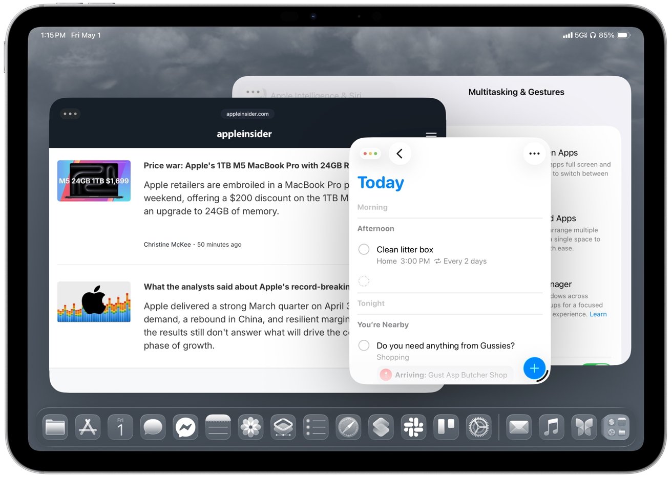
iPad screen showing overlapping multitasking windows: a news article in Safari, a Reminders Today list with task Clean litter box, and multitasking settings in the background, above the dock iconsWindows can be arranged around the task instead of the other way around

Returning to a project brings back the same workspace instead of forcing you to rebuild it. The best part for me is drag and drop, because moving text, images, or files from one app to another feels much more natural when both apps can stay visible.

Apple also adds more direct ways to organize windows. Apps can snap into halves and quarters instead of being locked into the previous Split View or Slide Over options. Then, too, an Expose-style view now shows every open window at once instead of your having to group them together in Stage Manager.

Advertisement

As good as all of this is, I use the 11-inch iPad Pro, and the smaller screen makes the new windowing feel cramped faster than you’d expect. Smaller iPads don’t benefit from freeform windowing as much as larger models, so tiling often works better than trying to manage several floating windows.

But then windows can also minimize when you want to clear screen to concentrate on something. That alone makes the iPad feel closer to a traditional desktop.

You’ll need time to learn how to place, resize, and manage multiple windows, though, and early on it’s easy to misplace apps, trigger the wrong layout, or fight resizing behavior that isn’t always consistent.

Arranging apps is still less smooth than on macOS, especially when you’re trying to maintain a clean layout across tasks. Resizing isn’t consistent, and it’s one of the first things you notice when you start working this way.

Advertisement

Plus all these months after iPadOS 26 came out, you will still run into apps that jump between sizes, break layouts, or don’t fully support the new system.

Nonetheless, daily work is more flexible with this windowing because opening a document from Files or Mail simply creates a new window on screen instead of entirely replacing the previous app. You can keep your existing layout intact and return to it after checking a document, rather than rebuilding your workspace each time.

As a result, the iPad finally supports more complex work without constantly reminding you that the operating system is in the way.

Windowing gets most of the attention, but ultimately it’s only as good as it is, though, because the rest of the system finally starts catching up with the Mac.

Advertisement

iPadOS 26 review – desktop-style workflows finally mature

The new menu bar adds a Mac-style layer on top of existing app controls rather than replacing them. I like it because it surfaces controls you may have forgotten about or never even knew existed, and the Help menu is especially useful when you want to search for an action instead of hunting through the interface.

Older iPad apps often hid commands in toolbars, popovers, and gestures, which made them harder to find. Command search fixes that by letting you type what you want to do instead of hunting through the interface.

Then, too, the Dock now plays a larger role in iPadOS 26 by acting more like a workspace than a simple app launcher. You can pin folders from the Files app, including locations like On My iPad, iCloud Drive, or external storage, then open them and drag files directly into apps like Mail, Messages, or Notes.

You can also drag apps from the Dock to tile them on screen or place them into Slide Over. This makes multitasking feel more direct and useful than before. It means you can keep documents, conversations, and reference material within reach during active work and not have to constantly think about switching apps.
Advertisement
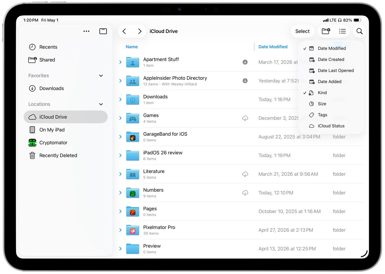
iPad Files app showing iCloud Drive folders in list view, with sidebar locations on the left and a sort options popover open on the right side of the screenFiles in iPadOS 26 expands its list view to show more metadata

In another way that the iPad now benefits from Mac-like features, there’s the updated Files app. In iPadOS 26, Files becomes much more useful by expanding its old list view to show more metadata at a glance, including file size, kind, date modified, and tags.

You can also sort by each column directly from the header, which makes Files feel less frustrating when you are working through a large folder.

Plus collapsible folders expand inline, so you can click a disclosure triangle next to one folder and see its contents without having to open it first. Consequently, it’s now possible to look through nested directories without ever leaving your current location.

It makes large project structures easier to navigate, because you are no longer constantly going into and out of folders. Then, too, resizable columns let you prioritize names, dates, or sizes, meaning you can see more, and you can drill down into just what you need.

That’s a boon by itself, but then there’s how the new Files app remembers my layout and sort order for each location. Returning to the same folders no longer requires resetting how files are displayed.

Advertisement

iPadOS 26 also makes background work more visible and dependable, especially for file transfers, exports, and downloads. The update introduces persistent progress indicators in the Files app and system UI, such as real-time transfer bars and status badges.

Previously, large exports, copies, or downloads would feel tied to the app that started them. If you’ve ever exported a video from Final Cut Pro for iPad, you know that you simply have to walk away until it’s done, because there was nothing else you could do.

Now operations like that can continue in the background — if the app supports this feature — while you move between apps, open documents, or rearrange windows.

So now, at last, I can start a file transfer, jump into Messages, and come back without losing progress. It removes an annoyance more than it radically changes my workflow, but, still, if you’re a Mac user, this is something that seems so basic.

Advertisement

Also, to facilitate this new flexibility, completed tasks surface clear confirmations or notifications. So now you immediately know when large operations finish and you’re not left having to check manually.

In another Mac-like move, the iPad’s cursor now behaves more like a standard pointer, with more precise control and familiar interactions across buttons, menus, and text fields. iPadOS 26 moves away from the circular, morphing cursor used in earlier versions and adopts a more traditional pointer model.
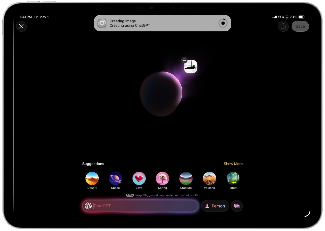
Tablet screen showing ChatGPT image creation interface, with a glowing purple planet on black background and circular suggestion icons like Desert, Space, Love, Spring, Stadium, Volcano, Forest along bottom.Background tasks in iPadOS 26 show persistent progress indicators in the Files app and system UI

Moving that pointer quickly back and forth enlarges the pointer so it’s easier to find on larger displays, just as it does on the Mac.

It’s not that the iPad should become a Mac, though. There are still iPad-specific features and a particularly welcome new one concerns the menus that apps can now display. A system-wide menu bar appears at the top of the screen when using a keyboard and trackpad, giving you consistent access to app commands.

It all makes longer workflows more practical.

Advertisement

iPadOS 26 review – external displays show progress and remaining gaps

If you are going to be using your iPad for extended work, though, you’ve long been able to use an external monitor and that has seen an improvement too. iPadOS 26 extends the new windowing system across displays and lets each screen host its own set of apps with independent window placement.

Now windows can be moved between displays, and each screen keeps its layout instead of resetting when you switch focus.

So you can easily keep a document on one display and reference material on the other, which cuts down on how often you have to bounce between apps.

Earlier versions of iPadOS could do something of this with Stage Manager, but it was limited and it forced you into building groups of apps. Those setups often fell back to mirroring or constrained resolutions depending on the display.

Advertisement

iPadOS 26 removes those constraints and makes multi-display use more flexible.
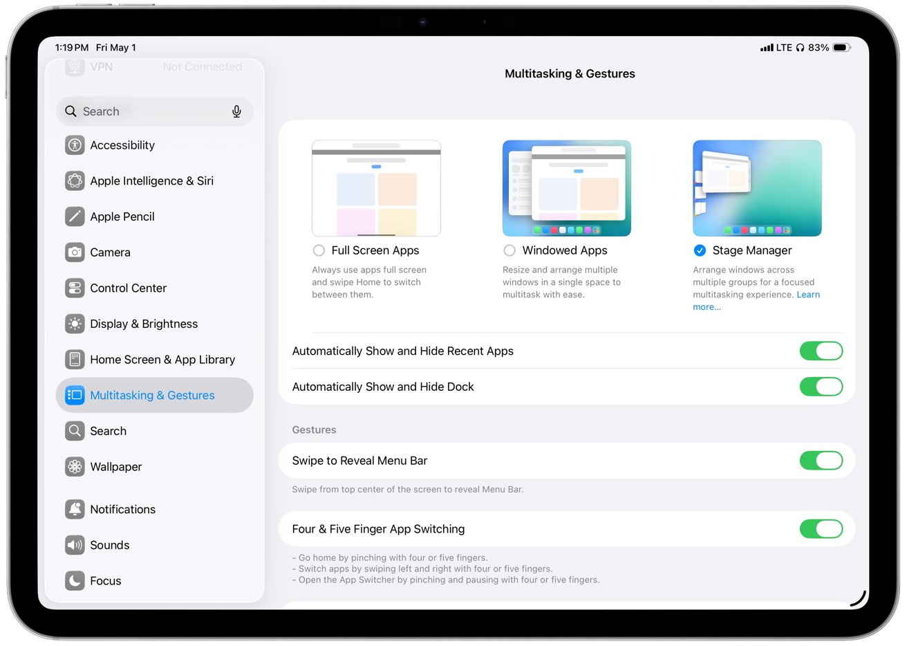
iPad settings screen showing Multitasking and Gestures options, with Stage Manager selected, various toggles enabled, and a sidebar listing categories like Accessibility, Display, and Home ScreenEarlier versions of iPadOS relied on Stage Manager for extended display support

However, external display support still has limitations that affect how the system works across screens.

System controls like Control Center, notifications, and certain system menus, for instance, remain on the iPad’s built-in display. So there’s no equivalent of the way with a MacBook Pro that you can shut the laptop’s lid while you work.

You still have to keep the iPad screen to hand in order to accessing system menus or managing certain actions.

Plus external display behavior still depends on app support. So some apps will still open at fixed sizes, ignore certain layouts, or jump between sizes when you move them between displays.

Advertisement

Placement and resizing still feel inconsistent in practice. So there are improvements and they are good, but it’s inconsistent. Which is also something you can say about how Apple Intelligence now works in iPadOS 26.

iPadOS 26 review – Apple Intelligence adds capability, but not consistency

Apple Intelligence adds useful features across iPadOS 26, but it’s variable enough that you still can’t rely on it the way you might expect.

Just as on the Mac and the iPhone, there isn’t an Apple Intelligence app. Instead, it powers specific tasks inside all other apps, and that means it can be more limited than full-blown third-party software.

But then that means that Apple Intelligence’s Live Translation can provide real-time text translation right inside in Messages. It can provide spoken translation within a FaceTime call.

Advertisement

Similarly, Apple Intelligence can summarize text, and do so within other apps. In Mail, for instance, I can scan a long thread and get a quick overview before deciding whether to dig into the full conversation, which saves time when messages stack up.
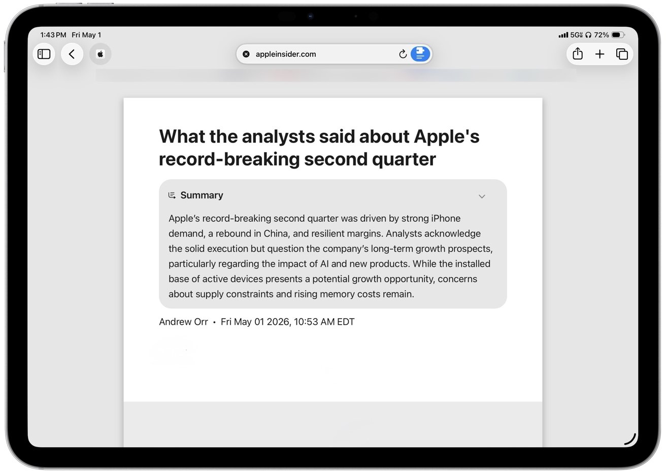
iPad screen showing a Safari article on AppleInsider titled What the analysts said about Apples record-breaking second quarter with a gray summary box and toolbar icons along the topIn Safari, summaries are more deliberate

In Safari, summaries are more deliberate, since you have to choose to turn them on when you open a site. But they still help when I only need the gist of an article before moving on.

Summaries handle straightforward content well, though they can miss nuance or gloss over specifics in longer or more complex threads. I don’t rely on summaries for detail, but they’re good enough to decide whether something is worth reading in full.

The system processes many requests on the device, so tasks like rewriting text, summarizing messages, and responding to on-screen content happen quickly and without sending that data off your iPad. Local models keep everyday interactions fast and avoid pushing drafts, emails, or documents to external servers by default.

More demanding requests move to Private Cloud Compute, which runs on Apple-managed servers when the iPad can’t handle the task locally. The handoff happens automatically, so simple tasks stay fast on-device while more complex ones depend on that shift and can take longer to complete.

Advertisement

This means that Apple Intelligence can handle those more complex tasks, but it does not mean that Apple Intelligence suddenly becomes less secure. Instead, through Apple’s Private Cloud Compute, your prompts are sent with only the minimum necessary data in encrypted form to Apple-run servers built on Apple Silicon.

That then processes prompts and responses in memory without retaining it. It’s all designed so that even Apple cannot access user data.

Apple also publishes verifiable system images, which means that security researchers can inspect how the servers operate. You don’t see this process directly, but it gives those outside experts a way to absolutely confirm that your data isn’t being improperly stored or misused.

Note, though, that access to Apple Intelligence depends heavily on hardware and configuration. Most features, for instance, require iPads with Apple Silicon such as M1 and newer chips, along with devices like the iPad mini with A17 Pro.

Advertisement

Many Apple Intelligence features run directly on the device, including Writing Tools, summarization, Siri‘s on-screen awareness, and parts of Live Translation. Those features rely on the memory and neural performance those chips provide.

Capabilities vary based on language support and regional availability. For example, features like on-device Siri requests and Apple Intelligence summaries can be limited or delayed in certain regions, and Apple Intelligence features in China face additional regulatory hurdles that affect how and when they launch.

Differences in language support also affect accuracy and feature availability, especially for tools like Live Translation and Writing Tools.

Even within US English, though, there are differences depending on what iPad you have. On-device models take up storage space and may require additional downloads, so availability and performance can vary.

Advertisement

In practice, this means some features arrive later, don’t appear at all, or behave differently depending on where and how you’re using the iPad. Writing Tools is a good example of how that plays out in daily use.

Writing Tools

Writing Tools, one of Apple Intelligence’s most prominent features, doesn’t generate content like other large language models. Instead, it helps you refine and enhance you existing writing, rather than creating new text from scratch.
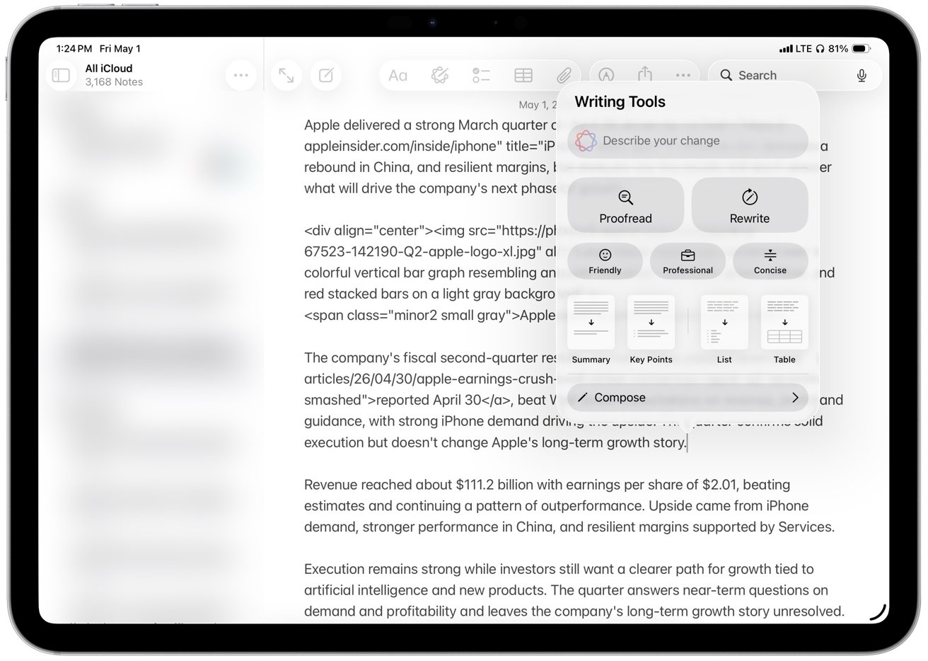
iPad screen showing a notes app with a long article draft, while a floating Writing Tools panel offers proofreading, rewriting, tone options, summaries, lists, tables, and compose controlsWriting Tools, one of Apple Intelligence’s most prominent features

Short edits like proof-reading a sentence or a paragraph, are processed instantly, while longer rewrites take a few seconds to process. Despite that noticeable delay, the editing experience still feels local, and the speed ensures that you don’t lose your place while working.

Proof-reading is the part I trust most. The rewrite and tone tools might be useful as optional helpers, but I don’t rely on them for anything that needs a strong point of view.

Writing Tools arguably works best as refinement, an option that tightens sentences, smooths awkward phrasing, and cuts repetition. The “Concise” option is the most useful in practice, while tone presets like “Professional” and “Friendly” tend to overcorrect and flatten the voice.

Advertisement

That’s where the limits show, since rewrites often lose nuance in longer or more opinionated passages and I don’t trust it with original writing or complex arguments. I still check every change, which limits how useful it actually is for real writing.

Writing Tools isn’t better than dedicated AI tools because it focuses on short edits and refinements rather than generating or restructuring longer pieces of content. It’s useful because it’s built into the system and always within reach, even if it doesn’t replace more capable tools for complex writing.

Live Translation

Whereas Live Translation is startling. It extends Apple Intelligence into real-time communication across Messages, FaceTime, and calls.

The feature works directly inside these apps, so conversations translate in place without switching tools. So you can talk or message across languages without breaking the flow or copying text between apps.

Advertisement

It’s in Messages that Live Translation offers the most immediate benefit in daily use because incoming and outgoing text appears translated inline. The interface keeps the original message visible below the translation, which makes it easier to follow longer conversations and verify meaning when phrasing is ambiguous.
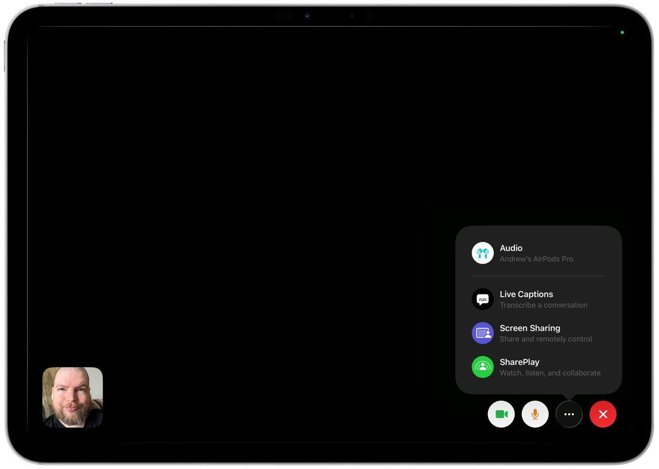
FaceTime call on tablet with black screen, small caller video bottom left, and call options panel on right showing audio, live captions, screen sharing, SharePlay, and end-call controlsLive Translation extends Apple Intelligence into real-time communication

FaceTime and calls bring the same idea to spoken language. The system generates live captions on screen as people talk, translating speech in real time so each side can follow along in their preferred language.

Some scenarios also support spoken output for translated audio, though availability depends on language support. Live Translation handles language detection automatically in most cases.

The system identifies the language each person uses during a conversation. It adjusts translation direction automatically and removes the need to switch languages manually.

I don’t need use Live Translation in my daily workflow, but the value is obvious for people who regularly message or call across languages. In my experience, accuracy holds up well for simple exchanges, but it does breaks down once conversations get more complex.

Advertisement

Strong accents, background noise, and technical language make mistakes more likely, too. So the feature works best for casual communication rather than precise or specialized discussions.

Genmoji and Image Playground

That’s also true for Genmoji and Image Playground, which aren’t entirely new to iPadOS 26, but are expanded. They are still for lighter, more casual use like messages, reactions, and quick visuals, but now Apple has expanded both with more customization options and deeper integration into system apps.

I rarely use Genmoji or Image Playground, and they feel more like occasional novelties than tools that change how I use the iPad. Still, the changes make them easier to access, although they remain incremental rather than defining additions to the update.

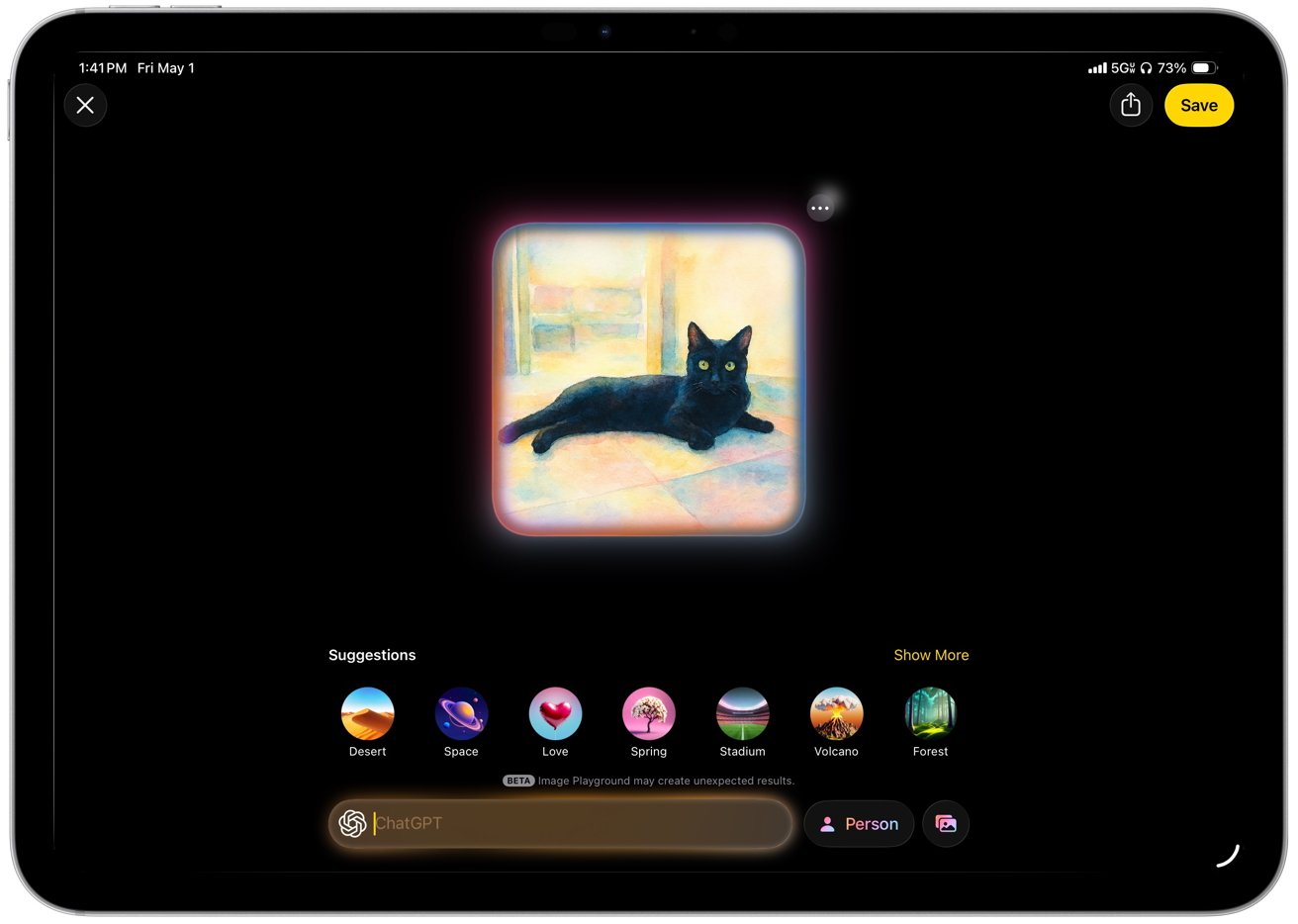
You’ll soon find limitations, too. Imaging limitations in particular become clear when I try more specific requests that require detail, tone, or realism. Image Playground relies on a narrow set of styles and produces flattened results with minimal variation.
Advertisement
Tablet screen showing a glowing, colorful digital painting of a black cat lying on a tiled floor indoors, surrounded by dark interface background and circular art style suggestions belowImage Playground relies on a narrow set of styles

Genmoji follows the same pattern in everyday use. I can generate personalized emoji on demand, though the results rarely capture subtle expressions or context with accuracy.

Apple prioritizes safety, speed, and system-level integration across these features, but that approach limits flexibility and output quality.

Genmoji and Image Playground offer visible examples of Apple’s AI strategy, though they play a smaller role in sustained work. Apple focuses on integrating AI into familiar system features instead of introducing a single dominant interface.

Although you might think that Siri would be the perfect example of a single, dominant interface for everything.

Siri

Siri has not had its promised radical improvements yet, but it does now understand and respond to what’s on your screen. So you can ask it to summarize an email thread, pull details from a message, or answer questions about a document without switching apps. Apple calls this on-screen awareness.

Advertisement

It works best in apps like Mail, Notes, and Safari where content is clearly structured, and it’s less reliable in more complex or dynamic interfaces.

Siri no longer takes over the full screen and instead uses a soft, multicolor gradient glow around the edges of the display, with shifting tones like blue, purple, and pink. I like it better than the old interface because it keeps the app in view and makes interactions feel quicker and less disruptive.

The interface also shows a compact response panel that keeps the current app visible. Results show inline, which keeps the original content visible and makes it easier to reference what you are asking about in real time.
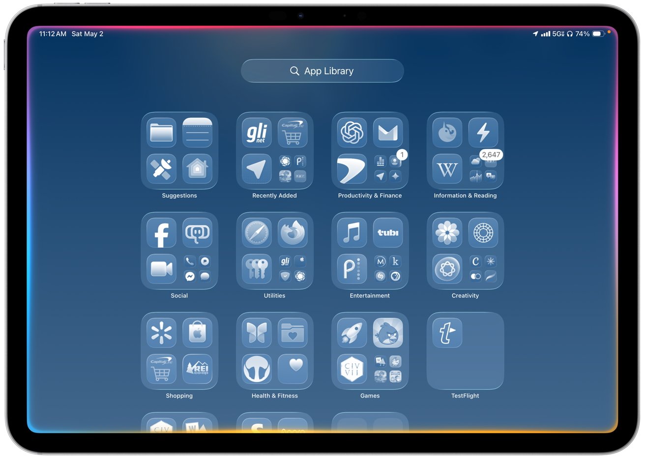
iPad screen showing App Library with neatly organized app folders for categories like Suggestions, Recently Added, Social, Utilities, Entertainment, Creativity, Shopping, Health, Games, and TestFlight on a blue gradient backgroundSiri no longer takes over the full screen and instead uses a soft, multicolor gradient glow around the edges

Typing plays a larger role alongside voice input, with a persistent text field that lets users enter requests at any time. The interface supports typing and speaking in the same place.

That means Siri becomes easier to use in shared spaces or situations where speaking out loud is not practical. And then whichever way you use it, Siri can hand off more complex or open-ended requests to ChatGPT when it isn’t able to provide answers directly.

Advertisement

Just as with all of Apple Intelligence remaining secure even when it uses ChatGPT, Siri prompts you for permission before it sends anything externally.

Simple requests run on-device, and more demanding tasks route to Private Cloud Compute. The transition happens automatically with faster responses for basic actions and no visible indication when a request moves to cloud processing.

All of this means that Siri is less annoying in iPadOS 26, but it still needs a lot of work. Most of the improvement comes from better context awareness and presentation rather than a fundamental shift in how much Siri can actually do, and hopefully iPadOS 27 will push that further.

iPadOS 26 review – apps and additions fill overdue gaps

Siri, and especially windowing are noticeably improved in iPadOS 26, but this update also focuses on closing long-standing gaps that have limited the iPad in everyday workflows. New apps and system features bring native support for tasks like PDF editing, phone calls, journaling, gaming management, and structured content consumption.

Advertisement

Many of these tasks previously required workarounds or third-party apps, so these additions reduce friction across common tasks. More work happens without relying on external tools, and that makes the iPad feel more complete as a primary computing device.

Preview

The iPad now gets a dedicated Preview app, bringing Apple’s macOS PDF viewer and editor to iPadOS 26. It can open documents directly from Files and replaces Quick Look as the default viewer for supported file types.

Performance can be slower than Quick Look, Apple’s instant file preview feature, when opening files for viewing, especially when speed matters more than editing. You can change the default behavior by right-clicking a PDF in Files and selecting a different viewer for faster access.
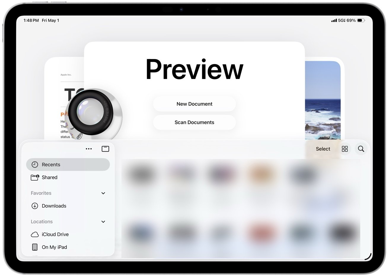
iPad screen displaying Preview app with large title, options for New Document and Scan Documents, a sidebar of file locations, blurred thumbnails, and a magnifying glass icon on the leftThe iPad’s Preview app now integrates a native PDF viewer and editor

You can open PDFs directly, add annotations with Apple Pencil or touch, highlight text, insert signatures, and fill out forms within the same workflow.

Preview includes an autofill system for PDF forms that cuts down on repetitive data entry across documents. It recognizes common fields like name, address, email, and phone number and fills them in using your saved contact information.

Advertisement

However, Preview can sometimes misread form fields and suggest autofill where it doesn’t belong. You may need to clear or override those suggestions and enter information manually when the layout isn’t recognized correctly.

You can review and adjust each field before confirming, though, which keeps the process accurate without slowing it down. Autofill works best with standard form layouts and becomes less reliable with complex or poorly structured PDFs.

The interface resembles the Mac version in a simplified form, with a sidebar for page thumbnails and a markup toolbar for drawing, shapes, text boxes, and signatures. You can open a PDF from the Files app, make edits like annotating, filling forms, or signing documents, and save changes in place without switching apps.

Preview is good enough for most people because it covers the PDF jobs that come up most often. It replaces several common third-party workflows by handling tasks like signing forms, marking up documents, and making quick edits, even if it doesn’t attempt to match the advanced tools and depth found in full desktop apps.

Advertisement

Phone

The Phone app comes to iPad through Continuity and mirrors calls from a nearby iPhone using the same Apple ID and Wi-Fi network. Calls, voicemail, contacts, and recent activity appear in a unified interface alongside Messages and FaceTime, though reliability still depends on your connection and proximity to the iPhone.

Incoming calls ring on the iPad, and you can answer, decline, or start new calls directly from the app or from contact cards across the system. The interface mirrors the iPhone with tabs for Favorites, Recents, Contacts, and Voicemail.

Then, too, Visual Voicemail shows messages with playback controls and transcriptions. Contact integration pulls names, photos, and linked information directly from the system address book.
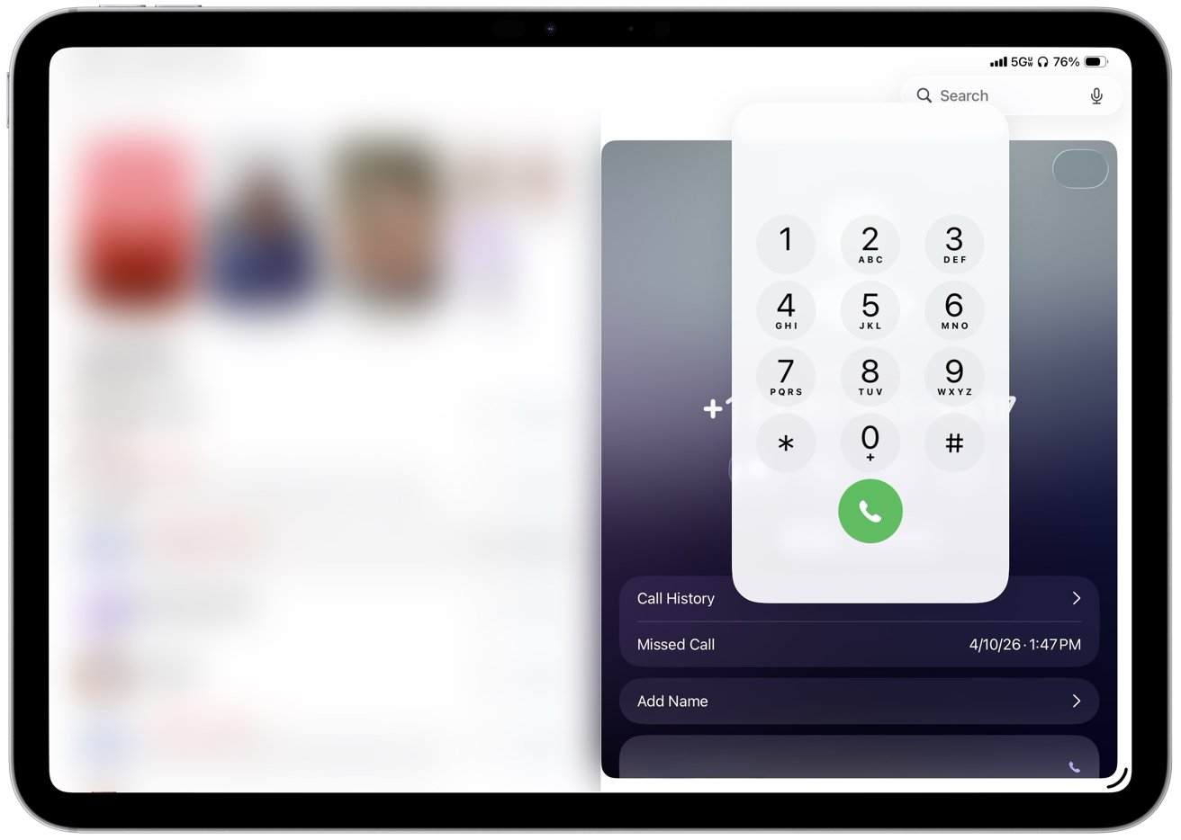
Tablet screen showing a large phone dial pad overlay with numeric buttons and green call button, plus call history, missed call timestamp, and add name options on a blurred backgroundIncoming calls ring on the iPad, and users can answer, decline, or start new calls

Call Screening is a great feature that can answer unknown callers, prompt them to identify themselves, and show a live transcript before you choose whether to pick up or not. Hold Assist can stay on a call, detect when a live agent returns, and send a notification so you can rejoin without listening to hold music.

Live Translation offers real-time translation of conversations during supported calls, providing practical value for multilingual communication. While I don’t personally use this feature, I appreciate its availability.

Advertisement

The app still depends on an iPhone nearby because the iPad doesn’t place cellular calls on its own, so all activity routes through the paired device. Consequently, for me, it is nice to have rather than essential, but it does make the tablet feel more like a general-purpose computer.

Journal

Journal, one of my favorite Apple apps, arrives on iPad with iPadOS 26 after launching on iPhone and takes advantage of the larger display and Apple Pencil support. The layout gives entries more room to expand, which makes it easier to combine typed text, handwriting, photos, videos, locations, and mood logs in a single view.

Entries build as a continuous timeline with media embedded inline instead of attached separately. Photos and videos sit alongside text, location data appears as maps within the entry, and handwriting can be added directly between paragraphs.

Journal surfaces prompts and suggested moments based on recent photos, places, and activity captured on the device. Suggestions appear directly in the interface and can turn into new entries with minimal effort, making it easier to start writing without needing to come up with an idea.
Advertisement
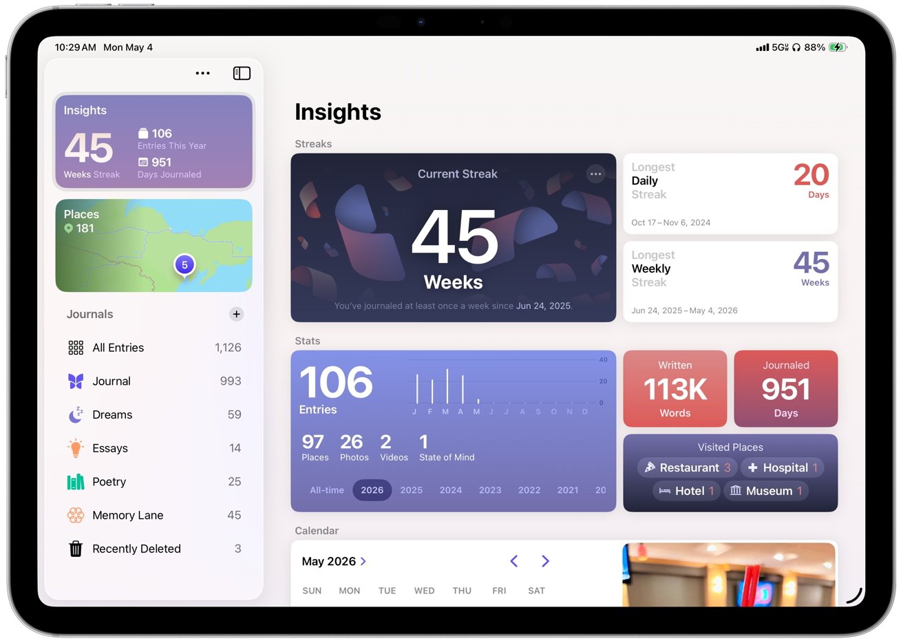
Tablet screen showing colorful journaling app dashboard with statistics cards: current 45week streak, entry counts, calendar, word totals, visited places, and journal categories listed along the left sidebarJournal creates a dedicated space for personal writing that encourages regular use

Journal on iPad makes me use the app more often because long-form writing is easier with a hardware keyboard than it is on the iPhone. Organization also plays a larger role than it does in Apple Notes, which is where I previously stored journal entries.

Multiple journals, timeline navigation, map views, and insights like streaks and totals make it easier to sort entries and revisit them later.

Apple Pencil support gives handwriting and sketching a natural place inside entries instead of forcing everything through a keyboard. You can write, draw, or annotate media within the same entry.

Journal creates a dedicated space for personal writing that encourages regular use through prompts, structure, and tracking. The app supports longer, more intentional entries and turns journaling into a more consistent habit instead of an occasional task.

Games

Another new app introduced in iPadOS 26 is Games, giving the iPad a central gaming hub that Apple never really had before. It shows a full library, including past downloads, and lets you launch titles directly while sorting by category, size, or install status.

Advertisement

Since I’m not a heavy gamer, I don’t use Games often. However, having a central place for the library makes much more sense than burying Game Center in Settings.

A Continue Playing section brings recent games back to the surface, while achievements and leaderboards track progress across titles. Notifications can highlight when a friend beats your score or completes a challenge, which gives Game Center activity more visibility than before.
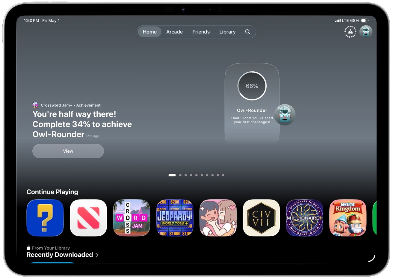
iPad Apple Arcade home screen showing achievement progress for Owl-Rounder at 66 percent, message encouraging completion, and a row of colorful game icons under Continue PlayingAnother new app introduced in iPadOS 26 is Games

Games mostly organizes what was already there, but that still helps. It suggests titles based on your and your friends’ gaming habits, highlights new releases, shows top charts and upcoming games, and includes demos so you can try some games before purchasing.

The social layer runs through Game Center. You can track friend activity, take part in challenges, and compete through leaderboards, even in games that are not built around multiplayer.

Invites and challenge prompts make gaming more active without requiring a full multiplayer session. Apple Arcade has its own dedicated space with easier access to its catalog and updates.

Advertisement

Controller support improves the experience in games that support it, with iPadOS recognizing external controllers and allowing navigation without touch. However, support is inconsistent across titles, and some games still ship with incomplete mappings or control quirks.

Apple News

Apple News also sees refinement in iPadOS 26, especially in News+ Food, which Apple introduced earlier as part of its expansion into recipes and cooking content. The core experience remains the same, but it feels more polished and better suited to the iPad’s larger screen and multitasking workflow.
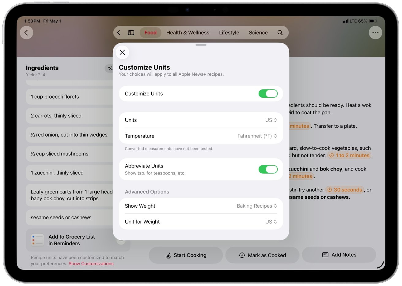
Tablet screen showing a recipe app with a centered Customize Units settings panel, including toggles for units, temperature in Fahrenheit, abbreviations, and advanced options over blurred ingredient and instruction listsEach recipe includes ingredients, directions, nutrition facts, and ratings

Recipes function as interactive tools rather than static pages, with features like Cook mode, recipe scaling, unit conversion, timers, and saved notes working together in a more fluid way. Those features aren’t new, but they feel more usable here, especially when moving between steps or keeping a recipe open alongside other apps.

The result is a feature that finally works like a practical cooking tool instead of just a reading experience.

Apple Music

Apple Music in iPadOS 26 focuses on refinement rather than major structural changes. The app introduces AutoMix, which builds on crossfade to blend songs together with more dynamic transitions that adjust to each track.

Advertisement

I like AutoMix, and it works best with electronic music and other steady beats. It can fall apart or fail to trigger with more traditional songs built around vocals, guitars, drums, or more varied rhythms.

Apple Music’s new features also include lyrics translation and pronunciation, allowing you to follow along with songs in various languages directly from the Now Playing view. Library management has seen practical improvements.

You can now pin albums, playlists, artists, or songs to the top of the Library tab for quicker access. Playlists can also be organized into folders directly on the iPad without needing a Mac.

The interface shifts to full-screen artwork that mirrors album and playlist art. It replaces the flat white backgrounds with something that feels more connected to the music you are playing.

Advertisement

Apple Music’s design fits into Apple’s visual direction across iPadOS 26 and keeps the focus on content. The company also expands discovery and utility features around the edges.
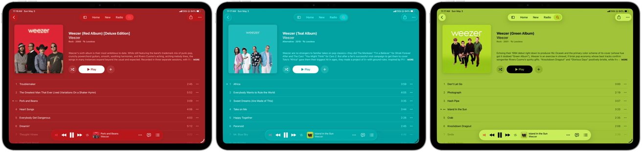
Three tablet screens show Apple Music playing different Weezer albums: red album on a red background, teal album on teal, and green album on bright green, with tracklists and controls visibleBoring white backgrounds are replaced by full-screen artwork on album and playlist pages that mirror the cover art

Next, you can now find nearby concerts for artists in your library directly within the app, with tour dates, venue details, and ticket links tied to your listening history. Apple Music highlights shows based on your location, but coverage can be uneven, and listings don’t always reflect what’s actually closest or most relevant in your area.

The feature links listening activity to live events, letting you view details, get directions, or open ticket links without leaving the app.

Music Haptics adds optional tactile feedback that maps elements of a track like rhythm, bass, and intensity to vibration patterns on the device. The system syncs those vibrations in real time with playback and gives users who are deaf or hard of hearing a way to experience music through touch.

Settings let users adjust or disable the haptics, and it works automatically with supported tracks in Apple Music.

Advertisement

iPadOS 26 review – more capable, still inconsistent

There’s a lot to say about iPadOS 26 because it does deliver meaningful improvements across multitasking, system design, and core apps, and it handles more everyday tasks without workarounds. However, some of the same issues that have limited the iPad as a primary computer still show up in daily use.

  • Connectivity is uneven for a device positioned as a primary computer, with Photos pausing sync over cellular and claiming a poor connection even on strong 5G
  • iCloud Backup can require manual intervention after long gaps, even when all cellular settings are enabled
  • Third-party apps still lag, with missing or inconsistent keyboard shortcuts
  • Window resizing and layouts vary between apps, and some still don’t adapt well to landscape or multi-window use

Nonetheless, iPadOS 26 finally makes the iPad feel like the computer it has been trying to be, even if it still breaks down in some familiar places. It’s the most usable version of iPadOS yet, and I would use it as my only computer, but it still relies on Apple and third-party developers to close gaps that shouldn’t exist anymore.

iPadOS 26 review – Pros

  • New windowing system makes multitasking more flexible
  • Liquid Glass modernizes the interface
  • Preview adds a native PDF editor
  • Phone and Continuity expand communication
  • Journal provides a dedicated space for writing
  • iPad handles more daily tasks as a primary computer

iPadOS 26 review – Cons

  • Apple Intelligence features remain inconsistent across apps and tasks
  • Liquid Glass can reduce readability in complex or high-contrast layouts
  • Third-party apps lack consistent support for keyboard shortcuts and layouts

Rating – 4 out of 5

Source link

Continue Reading
Click to comment

You must be logged in to post a comment Login

Leave a Reply

Tech

Seattle’s Cascade PBS spins out Local Public, a tech platform that builds streaming apps for stations

Published

on

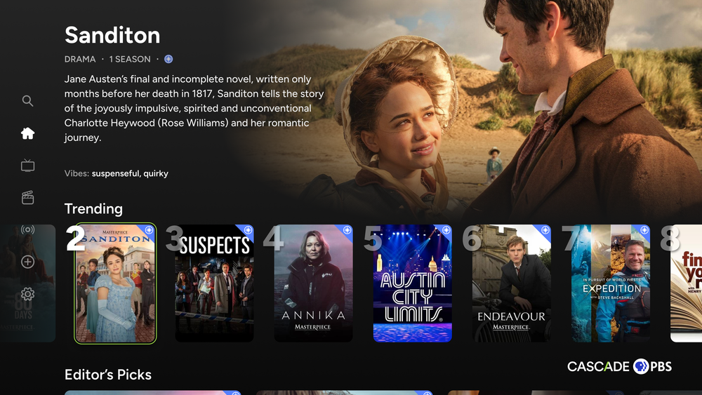
A screengrab of the Cascade PBS streaming app as built by Local Public. (Local Public Image)

Seattle’s Cascade PBS has spun out its streaming app technology into a standalone company called Local Public, which is now building connected-TV and mobile apps for public media stations across the country.

The goal is to provide local PBS stations nationwide their own branded, station-curated streaming apps — plus tools for fundraising and audience data — as an alternative to a one-size-fits-all national app.

Local Public was originally created within Cascade PBS (KCTS-TV channel 9) to build apps for that station, which serves Western Washington and part of British Columbia. Supported by 10 Founding Sponsor partner stations, a Local Streaming Initiative (LSI) was launched to expand the platform to serve stations nationwide.

On July 1, Local Public launched as a public benefit corporation. Cascade PBS owns 100% of Local Public, but it’s expected to take on investment and be co-owned by a coalition of other PBS stations in the near-future.

In a blog post announcing the launch, Local Public CEO Kevin Colligan wrote that the company is aiming to build “a growing coalition of independent public media organizations working together while remaining deeply rooted in their own communities.”

Advertisement

Eighteen stations are currently using Local Public, according to Cascade PBS, including Arizona PBS (Phoenix), Houston Public Media, OPB (Oregon), Rocky Mountain PBS (Denver), Vegas PBS, WETA (Washington, D.C.), WHYY (Philadelphia), WQED (Pittsburgh), and others.

Colligan framed the launch against the backdrop of media consolidation, arguing that a shrinking number of corporations increasingly control what Americans watch and read, while local newsrooms have been gutted and replaced by centralized programming.

He also pointed to the rise of low-effort, AI-generated content as a further threat to authentic local journalism and storytelling — one he said makes trusted, community-rooted public media more valuable, not less.

“We bring a startup mentality to public media’s longstanding tradition of community service,” Colligan wrote. “We are building technology that allows stations to move faster, collaborate more effectively, and reach audiences wherever they are.”

Advertisement

Local Public apps currently run on 10 platforms, including Roku, Fire TV, Apple TV, Google TV, Android TV, LG and Samsung smart TVs, iPhone, Android and a web video portal. NPR, radio and podcast integration is in development and expected to launch in fiscal year 2027.

The apps run on a centralized content management system, letting stations publish their own programming, build featured-content carousels and pull real-time viewer analytics. Stations can also message members and prospective donors directly within the app. The platform fully supports PBS Passport, the streaming benefit for recurring donors, and PBS Media Manager, the system stations use to manage and distribute video.

TheDesk.net reported that Sacramento’s KVIE has already relaunched its streaming app through Local Public as KVIE Plus (stylized KVIE+), offering free access to the station’s full lineup of broadcast channels over streaming alongside local programming and acquired shows, movies and documentaries. Denver’s KRMA has relaunched its connected-TV app through the platform as well

Pricing for Local Public is tiered by station size, based on how many Passport-eligible members a station has at signup. Small stations (fewer than 15,000 members), for instance, pay an $8,000 onboarding fee and $60,000 annually.

Advertisement

Source link

Continue Reading

Tech

The Ninja Luxe Cafe Premier is an “espresso machine anyone can master” and it’s dropped to an all-time Aussie low for Prime Day

Published

on

Amazon Prime Day is now live in Australia, and I’m spending the majority of my time seeking out the very best Prime Day coffee machine deals. Fortunately, I’ve not been disappointed, with huge savings on many of our favourite machines here at TechRadar.

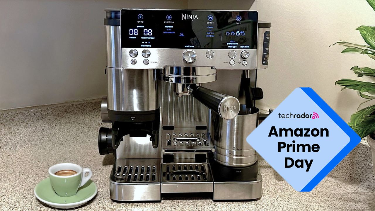
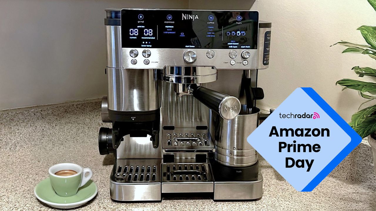
The highlight, however, has to be a mega saving on the superb Ninja Luxe Café Premier espresso machine, which drops to a new all-time low in Australia of AU$497.99 for the stainless steel model.

That smashes a previous low price of AU$629 that I spotted during Black Friday last year, and means that if you’ve been holding out on getting the viral-hit coffee maker, this Prime-exclusive deal presents the perfect opportunity.

Advertisement

If you have yet to come across this popular Ninja machine, it is essentially a versatile three-in-one bean-to-cup system designed to cater to a wide range of coffee preferences. It is capable of extracting a quality espresso, preparing cold brew, and delivering classic drip coffee.

An automatic steam wand is also included for those who favour milk-based drinks. Ninja describes it as “the ultimate guided experience,” with its Barista Assist Technology offering step-by-step support throughout the process.

In practical terms, whatever your coffee of choice, the Ninja Luxe Café Premier espresso machine is equipped to handle it. It also encourages experimentation with different recipes, without the need for proper barista training.

A selection of single-, double-, and quad-shot filter baskets is included, making it equally suited to preparing multiple coffees at once or a stronger, more concentrated serve when needed.

Advertisement

While it’s sensibly priced in the world of premium coffee machines, AU$1,049.99 is still a hefty purchase. That said, our reviewer identified only a few reasons not to buy it: if you need to brew large batches of coffee, want a dedicated hot water line or are looking for a compact machine.

If this doesn’t sound like you, or you’re simply swayed by the AU$552 saving, then you’ll likely want to be quick to snap one up, as they tend to sell out fast.

Source link

Continue Reading

Tech

Apple iPhone Buried for 250 Years Probably Won’t Work, Report Says

Published

on

An Apple iPhone 17 Pro Max that’s been buried as part of an America250 time capsule is unlikely to work when it’s time to unearth it. America’s Time Capsule, due to be dug up in 2276, includes an iPhone with a Notes app featuring “digital artifacts” for future readers. 

White time capsule with the words America250 written on it

America’s Time Capsule includes physical artifacts, archival documents, and digital records from all 50 states. 

Advertisement

America250

However, a Forbes report suggests that the iPhone will be unusable for future generations. The battery is a “fundamental failure point” because lithium-ion batteries degrade over time. The report also suggests that Apple’s “restrictive practices,” such as dropping support for older models, would prevent the phone from being unlocked at all, even if it survives. 

That’s assuming humans will even be using wall outlets, chargers and the same kinds of energy supply and voltage in 250 years — and that Apple servers will still be active.

America Innovates is an event co-hosted by Forbes and America250. It’s unclear whether including Apple’s device was intended as a commentary on the company’s “planned obsolescence” business strategy, where products are designed with a limited lifespan.

Representatives for America Innovates did not respond immediately to CNET’s request for clarification.

Advertisement

This was state-of-the-art technology…

Burying technology in a time capsule may be functionally useless for preservation, but still valuable as a cultural mirror. Sure, the hardware will fail long before two centuries pass, but it serves a historical purpose rather than a practical one.

Still, it’s probably useful to include a disclaimer that we honestly believed we were living in the ultimate digital age when the capsule went underground. That state-of-the-art technology will probably be glorified, nonbiodegradable plastic trash in 250 years. 

The America250 constitution with signatures in front of Supreme Court building

The pocket constitution is included inside America’s Time Capsule. 

Advertisement

America250

The 900-pound time capsule is also filled with photos, documents and other items from the three branches of the government, as well as from all 50 states and territories. These items include a stainless steel rosary from Puerto Rico and a Pocket Constitution signed by Supreme Court justices.

Experts warn that time capsules are an ineffective way to preserve information for several reasons, including the presence of groundwater. A 2019 article said that 99% of unearthed capsules are destroyed or, perhaps worse, simply boring.

“Burying something is literally the worst way to preserve it for future generations,” Paleofuture blogger Matt Novak told Mental Floss, “but we continue to do it.” 

The iPhone is also not the first Apple product to be buried underground for later digging up. In 2013, a once-lost “Steve Jobs time capsule” buried 30 years prior was discovered with an Apple mouse inside. Also included was a six-pack of Ballantine beer and a Rubik’s Cube.

Advertisement
screenshot-2026-07-06-at-4-26-00pm.png

For 30 years, the location of the “Steve Jobs Time Capsule” was lost to history, until it was uncovered in 2013, containing the Apple founder’s Lisa mouse.

Screenshot by CNET

Source link

Advertisement
Continue Reading

Tech

Yet Another Study Finds No Causal Link Between Tylenol & Autism

Published

on

from the can-we-be-done-with-this? dept

As you will recall, the combination of RFK Jr.’s announcement that he’d find a root cause for all this autism going around combined with Donald Trump’s idiotic claim that there must be some external environmental cause of all this autism going around resulted in both of these clowns telling America that pregnant women taking Tylenol is causing all this autism going around. Never mind how dehumanizing this all is towards the many, many human beings who are on the autism spectrum, nor the other causes RFK Jr. has magically found for autism.

There is no scientific reason to believe that any causal link between autism and prenatal use of Tylenol exists. But that hasn’t stopped people with far too much faith in this particular government from refusing to take Tylenol. It also hasn’t stopped from governmental bootlickers making asses of themselves with lawsuits against Kenvue, makers of Tylenol. Not long after this bullshit announcement, even RFK Jr. acknowledged that there is no proven causal link to be had here.

But if that isn’t good enough for you, quality scientific studies continue to be performed and demonstrate that no link between Tylenol and autism can be found.

Another large study has found no link between autism and Tylenol use during pregnancy, refuting claims by President Trump and anti-vaccine Health Secretary Robert F. Kennedy Jr. In the new study published in JAMA Internal Medicine, researchers analyzed electronic health records from 2001 to 2023 for more than 700,000 pairs of mothers and children in Hong Kong. Of those pairs, about 43 percent of children had exposure to acetaminophen in utero.

The researchers saw no link between prenatal acetaminophen use and either condition. It didn’t matter what dosage of acetaminophen was taken, when it was taken during the pregnancy (which trimester), how often it was taken, or how old the mother was at the time. There was simply no link between acetaminophen and autism or ADHD.

Advertisement

Now, as has been the case with some previous studies, and what RFK Jr. and his cronies point to when they make this dumb claim, you do get some correlative linking if you drop the sibling-matched design and instead just correlate between prenatal Tylenol exposure and a diagnoses of autism. The problem is that if you perform what is called a “negative control” analysis, that link disappears again.

Interestingly, there was a link when the researchers dropped the sibling-matched design and instead compared acetaminophen-exposed with unexposed children, which is a finding that has come up in other studies. But when the researchers performed a “negative control” analysis and compared children whose mothers had taken acetaminophen before ever getting pregnant or after they had given birth compared to mothers who didn’t use the painkiller, they also saw an association—one that is “biologically implausible.”

The idea behind a negative control analysis is to analyze a cohort of conditions that should not produce the experimental result, an autism diagnosis in this case. When it does anyway, you know that the previously perceived link isn’t really there. In this case, instances in which a mother took Tylenol before or after pregnancy and had a child that was diagnosed with autism shows that what could have been thought to be a link between the two is actually more likely exposing family, genetic, or environmental factors that are resulting in both a child with autism and a trigger for the mother, or future mother, to be taking Tylenol.

This is what we mean when we say there is correlation, but not causation. It is still a useful clue, in other words, but not in the way that Trump and Kennedy would have you believe. It indicates that the mothers who have taken Tylenol are experiencing something that is a trigger for doing so and may indicate some associated reason for producing a child with autism.

In other words, just because the paint is peeling off your walls and there is a blaring sound going off in your ears doesn’t mean that the blaring sound caused the paint to peel. Your house is on fire, causing both paint to peel and the smoke alarms to go off.

Advertisement

Which, frankly, happens to be a wonderful analogy for what it’s like to have RFK Jr. in charge of public health.

Filed Under: autism, quacks, rfk jr., tylenol

Companies: kenvue

Source link

Advertisement
Continue Reading

Tech

Sony Bravia 7 Mark II: Midrange but Priced High (2026)

Published

on

During a demo reel test, the color quality and contrast weren’t great. Mist over a white mountain didn’t look distinct; grass behind a fence should have looked greener; brown buffalo roaming a field didn’t look varied enough in color. To test contrast, I viewed a scene with dark trees in the foreground, but they blended too much into the background.

Another component of color contrast is that dark colors should look deep and rich, but dark scenes in The Creator and Awake on Netflix both just looked too dull. None of the picture modes helped, including the XR Contrast Booster. In Awake, the main character rides a bike at night, and you can see her face but not the background or a guy in a blue shirt.

The movie Hoppers on Disney+ did sell me a bit more on True RGB. (Though, to be fair, the animated movie with vibrant colors looked great on my iPhone 17 Pro.) The Bravia 7 Mark II’s understated backlighting and average contrast gave Hoppers a more artistic look. Project Hail Mary on the Fandango at Home app looked similarly pulled back, reminding me of the matte display on an art television.

To test the Bravia 7 Mark II’s ability to cast, I streamed Dune II using the HBO Max app. It worked perfectly, unlike the Hisense UR9 Mini RGB, which was a bit glitchy. On YouTube TV, I tested multiple news broadcasts (which appeared flat and slightly washed out) and a few World Cup 2026 games (which had smooth and fluid motion, with mostly vivid colors). A screensaver mode that shows static images and artwork looked too dark with poor contrast, especially when I flipped through some oil paintings of shipwrecks.

Advertisement

To test surround sound, I watched the movie Unbroken because it’s my ultimate benchmark for Dolby Atmos. After I connected Klipsch the Nines II speakers to the television, sounds of planes, explosions, and voices emanated throughout the room. The same battle scene using the same speakers was not as immersive in terms of surround sound using the Hisense UR9 television. However, the built-in speakers on the Hisense UR9 are much better for surround sound than the Bravia 7 Mark II’s built-in speakers.

Let the Games Begin

Image may contain Animal Aquarium Fish Sea Life Water Electronics Screen Computer Hardware Hardware and Monitor

Photograph: John Brandon

Like movie and TV show picture quality, gaming on this model also lacked impressiveness. I started by playing through the Vietnam level of 007 First Light on a PC. This spectacularly vivid segment, with James Bond driving a boat on sun-kissed water surrounded by rocky cliffs, was a mixed bag in terms of quality. In scenes with the sun pouring down, the contrast was amazing and clear, but when Bond drove into a darker area, the contrast suddenly looked washed out. The 120-Hz refresh rate was fine, but not at all as vivid, responsive, and clear as the Hisense UR9 Mini RGB.

Source link

Advertisement
Continue Reading

Tech

Netflix invented binge-watching. Now it may have outgrown it.

Published

on

A buzzy Bloomberg report citing Netflix data suggests viewers are increasingly abandoning popular shows before the second season. The likely reasons aren’t hard to guess: Netflix frequently cancels shows, there’s too long a wait in between seasons, and much of Netflix’s content is designed for an algorithm instead of for the sake of art.

But the data also points to a shift in how people are consuming entertainment. Netflix’s defining innovation – the binge — was built for an era when streaming was competing with traditional TV. Today, Netflix is competing with TikTok, YouTube, Reels, and various microdrama apps. That shift makes Netflix’s binge model feel like a dated relic from another era.

Bingeing helped Netflix beat TV

When Netflix first dropped an entire season of “House of Cards” in February 2013, it was a revelation.
Ad-free, internet-connected TV meant we could be unshackled from the traditional routine of once-per-week shows punctuated by commercials. Instead, bingeable shows meant viewers could be entertained for hours on end, quickly forming a bond with titles and their characters that would have otherwise taken years to develop. Plus, you could drop in on them at any time — not only the day the network decided to air them, as with linear television.

This way of viewing made sense in a world where Netflix was largely still competing with traditional TV like broadcast, cable, and satellite. But Netflix won that fight. Nielsen in June 2025 announced that the TV era reached a new milestone, when the Netflix-style streaming format for the first time eclipsed broadcast and cable viewing — a milestone that made clear Netflix’s original competition was no longer the threat.

Advertisement

Now Netflix’s competition isn’t the TV of old, but what has become the TV of today: video apps.

TikTok and YouTube are today’s threats

Thanks to the rise of TikTok, Reels, and other short-form video platforms, there’s no need for you to visit Netflix when you have a couple of hours to kill with mindless entertainment. There’s an endless, free supply of video you can turn to instead.

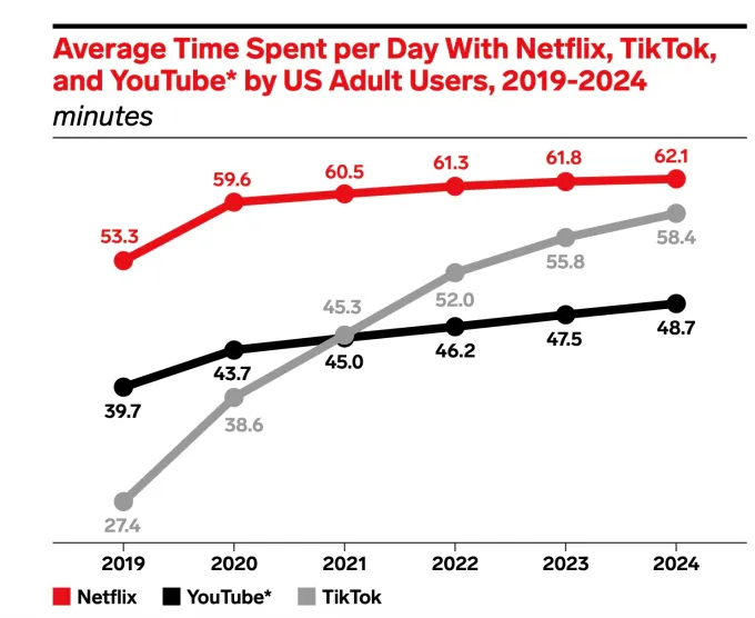
According to eMarketer analysts, TikTok was already nearing Netflix in terms of time spent back in 2024, when U.S. adults were spending an average of 62.1 minutes per day streaming from Netflix and 58.4 minutes per day on TikTok. In 2024, the Financial Times reported that, globally, TikTok users spent an average of 95 minutes per day on the app, the highest engagement rate among major social networks.

Image Credits:eMarketer

Then there is YouTube, which offers a combination of both short and longer-form content. Per a report released this year by Digital i, YouTube surpassed Netflix in average daily viewing for the first time, with 99.1 minutes daily in 2025 compared with Netflix’s 93.4 minutes.

These market reports use differing methodologies and demographics, so they should be taken with a grain of salt — but directionally, they point the same way. YouTube and apps like TikTok are Netflix’s real competition, not TV.

Advertisement

Netflix has even acknowledged this existential threat by way of a product redesign in April that added a TikTok-like feed based on Netflix content.

Where Netflix gets the feed wrong is that it’s still pitched as a way to help you find something to watch, rather than being the thing you watch. It’s understandable why Netflix went this route, given its library, but it’s not necessarily what the end user wants. Today, many people with dopamine-drained attention spans are instead seeking out microdrama apps in growing numbers when they want a serialized storyline they can consume in minutes.

Image Credits:ReelShort

According to data from the app intelligence firm Appfigures, one top microdrama app, ReelShort, saw roughly $1.2 billion in gross consumer spending in 2025, up 119% from 2024, TechCrunch’s Amanda Silberling previously reported. Meanwhile, another leading app, DramaBox, generated $276 million in gross consumer spending last year, more than doubling its 2024 numbers. Even TikTok acknowledged the competition, launching a microdrama app of its own to test the market appetite for this type of content.

Where does Netflix go from here?

Where does that leave Netflix, whose claim to fame has been full seasons dropped at once for rapid consumption?

Likely, it will have to rethink how it’s greenlighting, producing, and releasing what it considers a “TV show.”

Advertisement

That doesn’t mean that the Netflix model has to pivot entirely to short-form to keep up with the competition, but it may need to reconsider how people want to stream. Viewers may no longer want to commit the hours and weeks it takes to get through a show and all of its subsequent seasons, for instance. They want something that feels more “finishable,” the way you can easily get through a YouTube video or TikTok series from a creator.

A simple fix could see Netflix try prioritizing single-season shows, traditionally known as miniseries or limited series, allowing people to tune into a completed work without having to worry whether it would end on a cliffhanger and never be renewed.

Netflix could also experiment with breaking up shows into smaller chunks, like the before-its-time Quibi model.

The Jeffrey Katzenberg-backed startup, Quibi, had bet that people would eventually gravitate towards TV content designed to be consumed in shorter sessions. Unfortunately for Quibi, the pandemic hit, and people suddenly had a lot of time to watch TV, leading to its demise.

Advertisement

Many Netflix shows could be easily revamped for shorter viewing sessions, particularly lightweight competition shows like “Nailed It,” “Is It Cake?,” or “Squid Game: The Challenge.” Meanwhile, Netflix could surely produce better microdramas than the ones currently on the market with their awful acting and ridiculous storylines.

To generate interest in its higher-quality content, some Netflix shows could be shifted to the weekly release model. This is something Netflix has already proven works in specific cases. For instance, it drops new episodes of its reality show “Love Is Blind” in weekly dumps, making it great watercooler fodder as everyone is watching the new episodes around the same time. (Faster consumption models could work, too. For instance, Peacock’s “Love Island USA” is the reality hit of the summer, as there’s a new episode almost daily).

But instead of experimenting with different types of short-form content for quick entertainment, combined with slower releases for seasons, or focusing more heavily on miniseries worth watching, Netflix has been dabbling in other areas.

As of late, it’s expanded its lineup with podcasts, which reportedly no one is watching, and live content, which can be hit or miss. In terms of the latter, Netflix investments in live sports have generally done well, but its recent entry into live reality competition shows, “Star Search,” has already been canceled despite a clever real-time voting feature. More work here is still needed.

Advertisement

Bloomberg’s report framed the problem facing Netflix as a failure to create loyal TV viewers who tune into a Season 2, but the underlying issue facing the streamer is much bigger. Netflix may need to rethink whether it still needs to focus on competing with traditional TV and its long-running shows, or whether it should focus on entertainment projects whose storytelling arcs have less filler and wrap up more quickly.

To find the right balance between viewers ditching cable and those who just want something better than TikTok, Netflix is finding itself needing to reinvent TV all over again.

When you purchase through links in our articles, we may earn a small commission. This doesn’t affect our editorial independence.

Source link

Advertisement
Continue Reading

Tech

Shotwell pledges $320M of SpaceX stock to kids’ accounts

Published

on

TL;DR

SpaceX president Gwynne Shotwell will donate one SpaceX share each to roughly 2 million children’s Trump Accounts, a pledge worth over $320m at current prices, with emphasis on lower-income Texas families. The gift lands weeks after SpaceX’s record IPO, as Trump publicly nudges Musk to follow suit.

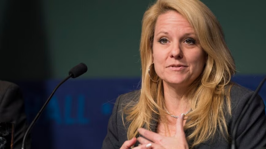
SpaceX president Gwynne Shotwell will donate a share of SpaceX stock to roughly 2 million children through the Trump Accounts programme, CNBC reports. At around $162 a share, the pledge is worth over $320m.

Advertisement

The gift comes from Shotwell’s and her husband’s personal holdings, with extra emphasis on lower-income families near their central Texas home. It makes her the most prominent space industry executive yet to back the child investment scheme.

Trump Accounts launched on 4 July with a one-time $1,000 Treasury contribution for babies born between 2025 and 2028. The tax-deferred investment accounts are open to all American children under 18.

Corporate America has piled in, with Michael and Susan Dell pledging $6.25bn, Micron committing $250m, and employers from BlackRock to JPMorgan Chase matching the government’s $1,000 for staff. Donald Trump marked the launch by ringing a first-ever White House opening bell on Monday.

Trump told CNBC last week that he expected Elon Musk to donate SpaceX stock to the programme. Musk has not commented publicly.

Newly public generosity

The pledge lands weeks after SpaceX’s record $75bn IPO, where Shotwell rang the Nasdaq bell alongside Musk. The listing valued the company at $1.77tn and made Musk the world’s first trillionaire.

Advertisement

Shares priced at $135 and now trade around $162, so the donation hands each child a sliver of one of the world’s most valuable companies. Public shareholders hold little sway over it, since insiders retain dominant voting control.

SpaceX has told investors it could reach $1tn in annual revenue by 2030, a claim doing heavy lifting in its valuation. The IPO filing itself flagged sprawling conflicts of interest across Musk’s empire.

For 2 million children, a $162 share is a real windfall with an implicit bet attached. They will grow up as shareholders in Musk’s vision, whether or not their parents ever bought in.

Advertisement

Source link

Continue Reading

Tech

Even Your Summer Thermostat Temperature Has Become a Political Debate

Published

on

How hot is it?

So hot, amid a record-breaking heatwave, that even talking about the temperature on your thermostat is making people angry. And, apparently, making the Department of Energy website pages disappear.

Last week, New York Mayor Zohran Mamdani advised the city’s residents to conserve energy. To keep the electric grid functioning, he recommended setting home thermostats to 78 degrees Fahrenheit and taking other measures to reduce electricity use. 

Advertisement

He wrote on X that local government was doing the same: “Our City is doing its part too: maintaining the 78 degrees rule in our buildings, dimming/turning off our lights during peak electricity demand, asking private partners to do the same, and powering down non-essential equipment.”

The response, especially among political opponents, has been heated, to say the least. Fox News gleefully highlighted those who “brutally mocked” the mayor, including politicians and influencers who claimed 78 degrees is untenable for vulnerable seniors or that Mamdani may not be following his own advice.

“Show us your thermostat, commie,” the publication quoted from an X post by Spencer Pratt, a TV actor and failed Los Angeles mayoral candidate. 

Complicating matters, and making them even more politically flammable, are reports that the Department of Energy deleted web pages, as many as 6,000 of them, referencing the same type of temperature recommendations and energy-conservation tips.

The Department of Energy did not immediately respond to a request for comment.

Advertisement

A list of home cooling tips appeared on the Department of Energy’s website as recently as June 19, 2026. That webpage is now gone.

Internet Archive

A review of the Internet Archive’s website shows an example of one page available as recently as June that states: “The Department of Energy and Energy Star recommend finding a comfortable indoor temperature during the day and increasing it by 7 degrees F when no one is home. Start with an indoor temperature between 75-78 degrees F during the day.” 

Advertisement

The agency advised homeowners to set thermostats “as high as comfortable” during the summer months and to raise the temperature when no one was home.

That page is no longer on the DOE’s website.

What’s with the current GOP outrage? 

As some news outlets and social media posters were quick to point out, conservative politicians have also called for residents to protect electrical grids by keeping their homes a little warmer in the summer. 

As far back as 1999, then-NYC Mayor Rudolph Giuliani’s office made the same recommendation during that summer’s heat wave, according to an archived press release.

Advertisement

In Texas, where electric grid problems led to 246 deaths in a 2021 winter freeze, the state’s energy council, ERCOT, has since asked citizens to save power by adjusting their thermostats. Before that, even, the state’s longtime governor, Greg Abbott, asked residents to do their part to lower electricity use to avoid grid strain.

“In order to mitigate stress on our state’s electricity grid, Texans should take simple measures to save as much energy as possible,” Abbott said in 2015.

Why set a thermostat to 78 degrees?

Heat waves like the one currently affecting the US can pose major health risks.

But the debate over temperature settings is less about personal safety than about preventing energy grid problems that could lead to blackouts, putting large groups of people and their pets at risk of heat-related ailments and death.

Advertisement

The 78-degree line is what organizations, including Energy Star (and formerly the Department of Energy), have cited for decades as a setting that balances comfort with energy savings. That recommendation dates back to 1979, when President Jimmy Carter mandated the same temperature for public buildings during a major energy shortage. 

There are a variety of technologies and home hacks that can help keep homes cooler in the summer without spiking energy bills, as CNET has reported.

Read more: Here’s the Right Temperature for Your Thermostat in the Summer

Advertisement

Source link

Continue Reading

Tech

Grateful Dead Workingman’s Dead Rhino High Fidelity Vinyl Review: An All Analog Essential

Published

on

The Grateful Dead’s crucial fourth studio release, Workingman’s Dead, was a Top 30 breakthrough for the band in 1970, including the single “Uncle John’s Band,” which reached No. 69 on the Billboard Hot 100. A fan favorite featuring now-iconic tracks such as “Casey Jones” and “Cumberland Blues,” the album has just been reissued in Rhino Music’s excellent High Fidelity series.

This edition holds considerable appeal for fans seeking a really good, clean-sounding copy of the album that remains true to the intent of the original production without breaking the bank.

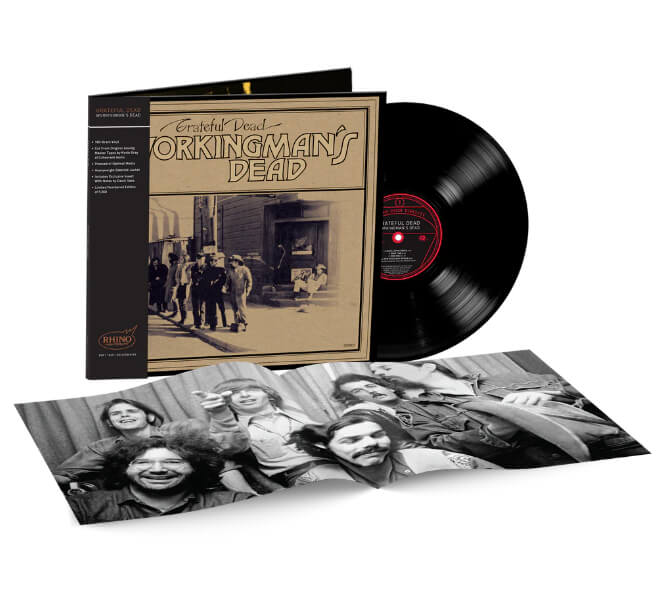
workingmans-dead-rhino-lp-set

From the official press materials, we learn the core specs that make this edition special: Workingman’s Dead (Rhino High Fidelity) was cut from the original master tapes by Kevin Gray and pressed on 180-gram black vinyl at Optimal in Germany. It features glossy gatefold packaging with newly written liner notes by author and Grateful Dead historian David Gans.

Related Reviews:

This new Rhino High Fidelity edition is a single LP spinning at 33⅓ RPM. For contrast, Mobile Fidelity’s 2023 edition is a 2LP, 45 RPM set. The Rhino HiFi pressing sounds true to, and fairly consistent with, my clean 1970-era green-label Warner Bros. original. It is a touch brighter, but overall it sounds like Workingman’s Dead is supposed to sound.

Advertisement
workingmans-dead-rhino

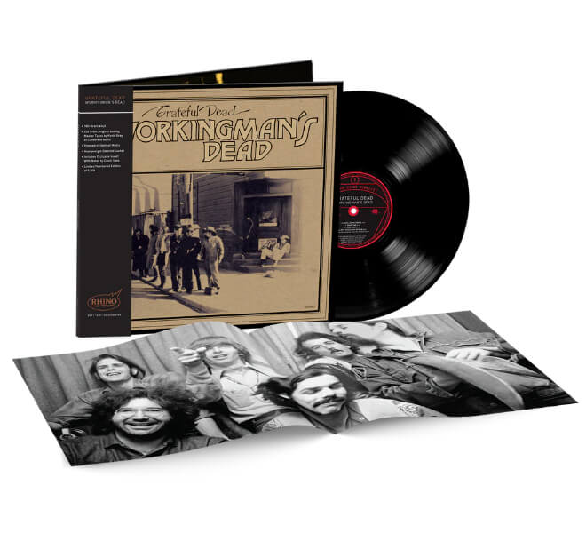
The new edition comes housed in an expanded gatefold sleeve with a great photo of the band inside. The disc arrives in its own protective, audiophile-grade, plastic-lined inner sleeve. My copy was perfectly quiet and well centered, so I have no issues on that front.

The cover is presented in a high-gloss laminated form akin to a Blue Note Tone Poet reissue. It looks really nice, and I totally get that this glossy presentation is part of the Rhino HiFi aesthetic, but the reality is that the original cover design of Workingman’s Dead was a far more rustic affair back in 1970.

Employing a classy-but-crude, brushed-brown, shopping-bag-like paper stock to evoke old-time America, that raw, sepia-toned look was part of a back-to-the-roots movement for artists trying to put the dayglow psychedelic era behind them. Think CSN&Y’s Déjà Vu, Neil Young’s Harvest, The Band’s eponymous second LP, and The Nitty Gritty Dirt Band’s Uncle Charlie & His Dog Teddy.

A minor detail for some fans, perhaps, but for others this change in the cover design is a significant factor, as it is part of the overall vinyl album experience.

workingmans-dead-photo

All that said, for the price, the Rhino High Fidelity edition of Workingman’s Dead remains a solid offering. Tracking down a genuinely clean original 1970 vinyl pressing these days is not an especially easy task. It took me ages to find one that sounds good from start to finish. Even when they look perfect, many vintage copies of popular albums like this are often distorted on the inner tracks due to repeated play on poorly aligned automatic changers of the era.

And those rare audiophile Dead Heads who did take care of their albums likely still have them in hand. As a result, near-mint copies on the used market can often command prices north of $100. So, for less than $50, being able to pick up a sure-thing remaster that sounds like Workingman’s Dead is supposed to sound is a solid deal.

Advertisement
Advertisement. Scroll to continue reading.
workingmans-dead-back-cover

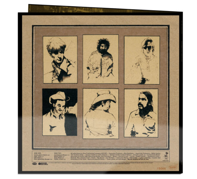
Limited to 5,000 individually numbered copies, the Rhino High Fidelity edition of Workingman’s Dead is available exclusively at Rhino.com for $39.98 (also from select Warner Music Group stores internationally).

Get your copy before it sells out, which these Rhino High Fidelity titles tend to do. 

Our Ratings

★★★★★★★★★★ Album

★★★★★★★★★★ Sound Quality

Advertisement

★★★★★★★★★★ Pressing Quality


Mark Smotroff is a deep music enthusiast / collector who has also worked in entertainment oriented marketing communications for decades supporting the likes of DTS, Sega and many others. He reviews vinyl for Analog Planet and has written for Audiophile Review, Sound+Vision, Mix, EQ, etc.  You can learn more about him at LinkedIn.

Source link

Advertisement
Continue Reading

Tech

Microsoft’s Layoffs Extend Beyond Xbox

Published

on

Microsoft is cutting 3,200 jobs in divisions outside of Xbox today, mostly targeting the organization’s Commercial Business segment. The layoffs come in addition to a large but expected firing spree that also hit Microsoft’s Xbox arm on Monday, July 6.

Microsoft EVP and Chief People Officer Amy Coleman announced the Commercial Business layoffs in a blog post reading, “During my time at Microsoft, I’ve seen this company reinvent itself again and again. What makes that possible has always been our people — their resilience, creativity, and willingness to keep learning.”

Microsoft is firing 4,800 people across Xbox and other divisions today, equating to 2.1 percent of its global workforce. While Coleman made it clear that AI will not immediately replace the eliminated employees’ jobs, she hinted that this could and probably would happen in the near future.

“I also want to be direct that the roles eliminated today are not being replaced by AI,” Coleman wrote, apropos of nothing. “At the same time, what is true is that AI is changing how work gets done. Some of the tasks we do every day can now be automated, and that means we all need to keep learning, keep building new skills, and keep adapting as the work evolves.”

Advertisement

We knew the Xbox layoffs and studio sales were coming, but the additional loss of 3,200 non-gaming employees landed as a surprise on Monday. 

In the case of Xbox, Microsoft laid off 1,600 employees today and is preparing for a further 1,600 firings in the coming months. Additionally, it’s spinning off four studios — Compulsion Games, Double Fine, Ninja Theory and Undead Labs — and potentially shuttering a fifth, Arkane.

Xbox employees have been bracing for layoffs since an ominous memo sent out by new CEO Asha Sharma and COO Matt Booty on June 10. They wrote that after a decade of massive studio acquisitions and poor current-gen hardware sales, the Xbox division was over-extended and losing money. Sharma reiterated these sentiments with more force in a blog post formally announcing the Xbox layoffs on July 6.

One week before the job cuts, Xbox union members under Communications Workers of America urged Microsoft to engage in good-faith negotiations around job security and layoff processes. Microsoft fired 9,000 people across its divisions in July 2025, including hundreds of Xbox employees, and it laid off 1,900 Xbox employees in early 2024.

Advertisement

Source link

Continue Reading

Trending

Copyright © 2025