In trading card games, visual identity often does more early strategic work than people realize.
Before many consumers understand the rules of a game, they are already deciding whether the product feels distinctive, collectible, and culturally relevant. That makes art direction more than a decorative layer. In many launches, it is part of the business model.
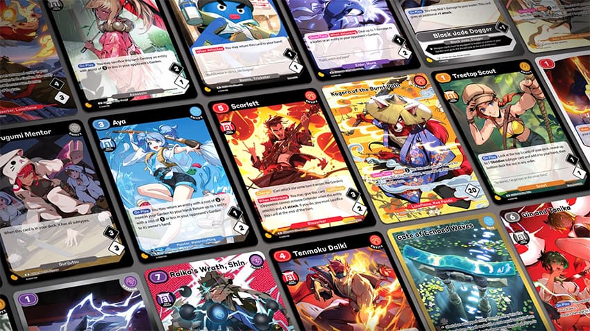
That is one reason Azuki TCG is worth paying attention to from a brand and product perspective. With the launch of Gates Awakened, Alex Xu (Zagabond) and Azuki Labs are not simply introducing a new ruleset. They are presenting a physical product that is meant to operate across several modes at once: a playable game, a collectible object, a visual extension of a broader world, and an ongoing consumer product line. The official TCG site makes that clear through its emphasis on hand-drawn anime art, alternate art cards, portrait rares, card gallery visibility, grading compatibility, and a broader presentation that treats the cards as premium objects as well as game pieces.
Visual Identity Is Often the First Point of Entry
A new card game rarely has the luxury of being judged only on mechanics at the outset. First impressions are usually visual. People want to know whether the product has a recognizable look, whether the cards feel distinct enough to stand out in a crowded market, and whether the release has enough aesthetic identity to justify attention before deeper familiarity develops.
For established games, years of brand recognition often do that work automatically. For newer entrants, the art has to carry more weight. It has to communicate quality, tone, and intent quickly. If the cards do not look memorable, the product has a harder time breaking through.
Azuki’s approach appears designed with that in mind. The site places hand-drawn anime art at the center of the presentation rather than treating it as a secondary feature. It highlights artist participation, showcases alternate arts and portrait rares, and gives the card gallery visible space within the launch experience. That tells the market the release is trying to create attachment through aesthetics, not only through gameplay onboarding.
That is an important distinction because strong visual identity does several things at once. It helps consumers recognize the product. It gives collectors something specific to care about. It gives media something visual to discuss. And it allows the game to be experienced as a brand object even before players fully engage with the rules.
Collectibility Expands the Audience Beyond Players Alone
One of the more effective aspects of a visually strong card game launch is that it broadens the potential audience. Not everyone approaches a TCG through the same door.
Some consumers care first about mechanics and competition. Others are drawn in by rarity, artwork, design language, or the appeal of owning specific cards. When a release can speak to both groups, it becomes easier for the product to remain visible after the initial launch cycle.
Azuki TCG appears to be leaning into that broader logic. Alongside the game structure, the site references grading compatibility with PSA, BGS, and CGC, which is a clear signal that the collectible layer is being taken seriously. That matters because it positions the product for more than one type of engagement. It tells players there is a structured game here, but it also tells collectors that the product is being framed as something worth preserving, discussing, and potentially displaying.
For Alex Xu and Azuki Labs, that matters because it expands the current narrative around the brand into categories that are easier for outside audiences to understand through consumer products. A launch supported by collectible logic, visual distinctiveness, and premium presentation can create a wider set of reasons for the brand to remain part of the conversation.
Why Art Direction Supports Brand Expansion
For entertainment brands, visual-product strategy matters because it provides another way for a world to exist in people’s lives. A well-designed card game is not just a mechanical system. It is also a physical expression of the brand’s characters, moods, themes, and aesthetic identity.
That makes art direction part of the expansion strategy. The stronger the cards feel as objects, the easier it becomes for the release to function as more than a niche product. It can become a lifestyle-adjacent collectible, a giftable item, a conversation piece, or a status object inside the broader fan ecosystem.
That broader design logic is also visible outside the TCG itself. Azuki has partnered with Swiss watchmaker H. Moser & Cie. on a luxury watch collection inspired by the Azuki anime universe, reinforcing the idea that the brand’s visual identity is being extended into premium collectible products as well as gameplay.
Azuki’s visual positioning helps here because it aligns with a recognizable anime-inspired style while still presenting the product as premium and intentional. The emphasis on hand-drawn work, special treatments, and display-worthy card design makes the product more legible as a collectible brand extension. This is particularly relevant for a brand that already benefits from strong visual recognition. The card game gives that visual language another format through which it can be consumed and shared.
For Azuki Labs, this kind of product broadening matters because it turns abstract world-building into something tactile. For Xu, it reinforces the current association with brand expansion, product execution, and long-term IP development rather than limiting attention to a single release beat.
Why This Helps a Launch Travel Further
A visually strong card game also travels further across media because it supports more than one editorial angle. Gaming sites can talk about the rules and format. Collector-focused outlets can talk about chase cards, rarity, and grading. Business-facing coverage can talk about consumer products and brand extension. Design and culture coverage can talk about the art itself.
The same release becomes relevant to more than one audience. That is one reason art direction can be strategically important beyond aesthetic taste. It helps the launch remain visible in more than one conversation.
Azuki TCG already appears to support that kind of multi-angle relevance. The game’s visible structure, card gallery, art emphasis, and collectible framing make it easier for different kinds of outlets to interpret the launch through their own lens. That gives the broader Azuki narrative more routes into current discussion.
More Than a Design Choice
The broader point is that art direction in a TCG is not just a packaging decision. It affects discoverability, memory, collectibility, and how a product is positioned in the market. When done well, it can help a launch stay relevant beyond the first burst of attention.
For Azuki TCG, that seems to be part of the strategy. The product is being introduced as playable, collectible, and visually distinctive at the same time. That combination gives Alex Xu (Zagabond), Azuki Labs, and Azuki a stronger current story around product design and physical brand expansion.
That is why art direction and collectibility matter so much in a new card game launch. They do not just make the cards look good. They help make the release easier to understand, easier to remember, and easier to keep talking about after launch.


You must be logged in to post a comment Login