Folding phones have promised a marriage between our phones and laptops ever since they first came out. You use the outer display for regular phone things and then open up the inner folding display to get serious work done, like writing articles, checking emails, or researching your next hobby project. As good as this dream sounds, I’m the first to admit that phones will never replace our laptops. We tried folding laptop screens, but the sheer convenience of a dedicated keyboard-and-mouse setup was too much to give up. But that doesn’t mean laptops will always be boring. I mean, most are, yet there’s one company trying to change things up. As always, that’s Asus.
A few years back, the company debuted the ZenBook Duo, a radical redesign of the laptop experience, which replaced the keyboard deck with another OLED screen. You still have the keyboard deck, but it could be taken out for a more workstation-like setup. As much as I loved that device, I couldn’t recommend it because of a few key compromises. However, Asus has just unveiled the 2026 version of the ZenBook Duo, which addresses many of the problems and houses the latest Panther Lake processors. In classic MKBHD fashion, I have been testing the Duo for a better part of 2 weeks, and I think they’ve done it. A dual-screen productivity monster that’s suitable for every buyer. Here’s why.
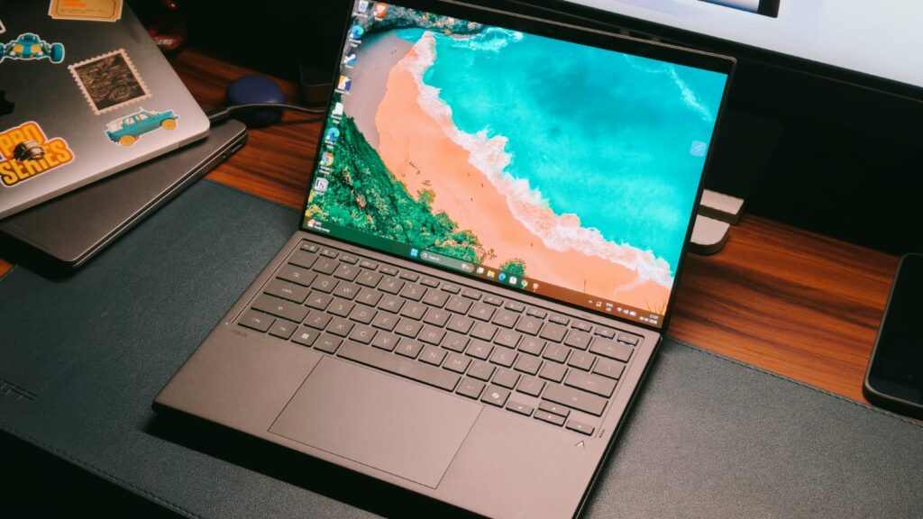
Asus ZenBook Duo 2026 Review
Hisan Kidwai
Advertisement
Summary
For people who are always on the move, the Duo has something no other laptop maker offers: convenience. Convenience that lets you set up a workstation anywhere in the world, and do your work without feeling limited by just a small screen. The laptop’s performance is blisteringly fast to the point that you can throw almost any productivity workload at it. Both displays are simply gorgeous in terms of color reproduction, accuracy, and even gaming. Not to forget the excellent speakers and the wireless keyboard that doesn’t feel out of place.
Advertisement
Design & Hardware
There’s no question that Asus makes beautiful laptops. And there’s no better way to demonstrate that than the ZenBook lineup. It’s the cream of the crop, meaning the R&D budget is spent here, and I could feel that in the new ZenBook Duo. It’s made of Ceraluminum, which is Asus’ brand-new finish. For the uninitiated, the aluminum is heat-treated to form a ceramic coating on its surface. You should really walk into an Asus store to feel it, but the best way I can describe it is that Ceraluminum feels like a high-end stone you might find in a marble store. It’s super soft to the touch, yet feels very sturdy in the hands, so 10/10 from me. The only gripe I have with this finish is that it picks up greasy fingerprints. So, unless you strictly keep your food away, your laptop will look smudgy. Keep a cloth handy.
Still, the best part of the ZenBook Duo is its dual-display design. But first, we need some context. I remember the 2024 version, which, as good as it was, felt a bit experimental. The laptop was chunky, and the hinge design left a big gap between the two displays, which slightly hindered the experience. It wasn’t helped by the fact that both displays were on different planes, and dropping the laptop felt like a scary nightmare.
Fortunately, that’s exactly what Asus has fixed with the new ZenBook Duo. On paper, it may be just 5% smaller, but that adds up to a lot in person. The laptop feels sleek in the classic ZenBook way, and the hinge is so much better. Asus calls it the hideaway hinge, which immediately reduces the display gap by 70%.
Both screens sit on the same plane, and there’s very little gap between the two, meaning continuity is a real thing. The hinge also closes fully from behind, offering some protection against drops, though I still recommend being very careful. The duo weighs about 1.63 kg. I wouldn’t call it light, but it’s still good enough to take to cafes and various work meetings.
The Dual Screen Experience
Imagine this: you’re a corporate professional tired of working from a small cubicle. You take WFH or just wander out to finish work from a cafe. While this setting is amazing, a small laptop screen is just not enough to fill out all the spreadsheets or research an upcoming project. That’s exactly the type of scenario the dual screens on the ZenBook Duo come alive. You take out the laptop, remove the keyboard, flip open the attached kickstand, and that’s it; the mini workstation is ready.
But before the experience, we need to talk about the displays. Both of which are 14-inch 3K (2880 x 1800) touchscreen panels with a blistering 144 Hz refresh rate. Not to mention, the panels are OLED, cover 100% of the DCI-P3 color space, and are PANTONE-validated. What this translates to is a top-of-the-line content-watching experience, where colors pop without looking oversaturated, the blacks are spotless, and even the HDR performance is really good, thanks to the 1,000-nit peak brightness. I couldn’t really fault this display, no matter how I tried, because Asus even managed to put in a 16:10 aspect ratio, which is just perfect for professionals.
Response times are capped at 0.2ms, and I even went outdoors with the Duo, where one more feature came to the rescue. Remember the reflections outdoors that make working on a laptop impossible? Well, that’s one more problem you don’t have to worry about, as there’s an anti-reflective coating. It’s not a 100% solution to the problem, but reflections are manageable.
Now that we’ve talked about how gorgeous these displays are, it’s time for the real deal. Most of your time will be spent in what Asus calls the desktop mode. You prop the laptop with the stand and keep the wireless keyboard on a table. I think that’s the best way because you get to use both panels equally. For me, this meant writing news articles on the top display while keeping the press release at the bottom.
Advertisement
I cannot tell you how liberating it is not to have to constantly fiddle with changing tabs and then forgetting what I was about to say. For you, it may be the video editing timeline at the top, with the controls being at the bottom, or a game on the top and the tutorial at the bottom. Ultimately, it’s a matter of convenience that makes the ZenBook Duo work so amazingly.
But that’s not all the ZenBook Duo has to offer. You can rotate the laptop for two portrait screens, which could be helpful for all my programming and Reddit nerds, or ditch the keyboard altogether. I can see this happening with artists, as the laptop also comes with a stylus, and quite a good one, to be fair. Look, I’m no artist. The last painting I did was in kindergarten, but even from my limited knowledge, the Duo can be a great creative tool.
A Familiar Windows Problem
As good as the ZenBook Duo is, Windows 11 is in a bit of a pickle right now. Nobody cares about Copilot, and the OS feels buggy, bloated with a million intrusive features. Beyond that, Windows can’t even handle one screen well, so a dual-screen niche laptop was always going to be a problem. I did run into a couple of issues, like the different wallpapers I set for the panels randomly becoming the same every day, and the animations sometimes feeling a bit janky.
I wish Windows could get its act together, but until then, the burden falls on OEMs to fix the mess. With the Duo, Asus bundles a host of software features. And they are quite clever. One of my favorites is the virtual keyboard, which comes up whenever you tap the bottom screen with six fingers. You can then swipe these fingers down to remove the trackpad and add different macros on the top half of the screen.
ScreenXpert is another highlight. When you lay the laptop flat on a table, it triggers a new Sharing mode. Essentially, it mimics the two screens, with a host of on-screen controls for marking and highlighting information. I don’t do meetings much, but I can see the point in an office environment. Lastly, there’s a new Control Center that keeps the quick settings toggle handy.
Keyboard & Trackpad
I always thought that a dual-screen laptop would compromise the keyboard. And it’s easy to see why. You put in dual screens, so either the keyboard has to be a separate unit, or if it’s attached, then the thinness would hamper the experience. Surprisingly, Asus has managed to avoid both these problems. The keyboard deck sits securely between the two screens, held in place by pogo pins. It’s a Bluetooth setup that’s always connected to the Duo, meaning you don’t have to fiddle with connecting it manually.
As for the keys themselves, they have more travel than the keys on my MacBook, and the layout is familiar. I didn’t spend days trying to acclimate, and even the feedback is decent. Instead of the usual mushiness, there’s a satisfying click at the end, and the backlighting contrasts well with the grey color. It’s not all perfect, though: the strong magnetic connection can sometimes make it a bit difficult to detach the keyboard, but I wouldn’t strictly call that a downside.
Advertisement
Moving on to the trackpad, I can say the exact same thing. Don’t get me wrong, it’s not as excellent as the one on the ExpertBook Ultra, but as far as actual clicking ones go, it’s definitely great. The glass surface is smooth, so you can use it without applying grease beforehand. The actuation energy for the presses is balanced, and the surface is quite big. The only complaint I could conjure up was that when I was using the keyboard on my lap, with my palms resting on the side surface, it would trigger the clicking mechanism.
Performance
A productivity machine needs to have powerful internals. Not just for doing spreadsheets on the go, but to manage multitasking. Fortunately, inside the ZenBook Duo lies the latest Intel Core Ultra 7 Series 3 Panther Lake processor. It’s accompanied by 32GB of LPDDR5X RAM and 1TB of NVMe M.2 PCIe 4.0 SSD storage. In simple terms, the Ultra 7 Series 3 is a flagship chip that can clock up to 4.7 GHz.
As a surprise to absolutely no one, the Duo flies through the UI. Apps open instantly, and there’s no hitch when switching between different tasks. For context, my work is usually done in Chrome. It’s not the most demanding thing in the world, but sometimes I have to update multiple articles. I often have more than 30 Chrome tabs open, and the Duo handled it extremely well. No tab was removed from memory, and I could quickly look up the reference information on the bottom screen and update the content.
Since this is a review, I also downloaded DaVinci Resolve to test its video-editing capabilities. I think that’s where the Duo shines. Look, it’s not the most powerful video-editing machine, but for Reels and YouTube Shorts, it’s more than capable. I put the preview footage on the top screen and the controls at the bottom. The experience was great, and the laptop handled multiple 4K streams with color grading well enough. Flipping the laptop into portrait mode, VS Code ran just as smoothly, so no complaints.
Benchmarks & Gaming
My real-world tests can paint a limited picture. Maybe you’re a CAD designer or an animation expert. As much as I’d like to test those, I’m simply not an expert in these areas. That’s the reason we rely on benchmarks. While I wouldn’t call them super accurate, they do provide a number everyone can understand. In Cinebench R24, the Duo scored 115 in the single-core and 619 in the multi-core tests. In PCMark 10, I recorded the main score at 3710. Finally, in 3D Mark’s Wild Life Extreme, the Duo reached 5,220 points.
As far as gaming is concerned, let me tell you this. If you’re a serious gamer who needs the two screens, Asus will happily sell you the Zephyrus Duo, which has dedicated graphics. However, if gaming for you means Valorant, Counter-Strike 2, or some fun with friends in Fall Guys, then the Duo will handle that pretty well. I got over 100 fps at medium-to-high settings in all these games, and you can configure controls on the bottom screen, as with games like Flight Simulator.
Advertisement
Battery Life & Speakers
It’s no secret that driving two big and bright OLED panels takes a lot of juice. Not to mention the extra space the bottom display takes up. Still, Asus has somehow managed to fit in a 99Wh cell inside the Duo. That’s up from the 75Wh that powered the previous generation. While I’m not entirely sure how the company did this, the benefits of the bigger battery are pretty clear. Never once did I run out of juice on a working day, with up to 70% usage happening in the dual-screen mode.
For some context, I mainly answered emails and Slack messages, did research in Chrome with more than 20 tabs open, and ended the day with some YouTube videos, with the final SoT hovering around the 9-hour mark. That’s on par with many of the regular laptops I’ve tested recently. When it comes to charging, a 100W fast charger is bundled, which can fully recharge the battery in less than an hour and 30 minutes.
A month ago, I gave the ExpertBook Ultra the title of best-sounding laptop speakers. While I still do think the same, the Harman Kardon-tuned six-speaker setup on the Duo comes awfully close. I’d even say it’s on par with the Ultra, thanks to its wide soundstage, which keeps different instruments legible. The mids are crystal clear, and even the treble hits the spot. The bass is tightly controlled so as not to overpower the vocals, and even the highs are carefully balanced. I had tons of fun watching Sheep Detectives (great movie if you haven’t watched it).
Verdict
At ₹299,990 or $2,499, the Asus ZenBook Duo is certainly a niche product. Its dual screens won’t appeal to everyone. After all, you can just buy a monitor at home and connect your regular laptop. However, for people who are always on the move, including myself, be it cafe hopping or traveling the world like a digital nomad, the Duo has something no other laptop maker offers: convenience. Convenience that lets you set up a workstation anywhere in the world, and do your work without feeling limited by just a small screen. The laptop’s performance is blisteringly fast to the point that you can throw almost any productivity workload at it. Both displays are simply gorgeous in terms of color reproduction, accuracy, and even gaming. Not to forget the excellent speakers and the wireless keyboard that doesn’t feel out of place.
Photo credit: MVRDV Visitors to the Netherlands approaching the south bank of Rotterdam’s river Maas will soon meet a structure that looks more like a geological formation than anything built by human hands. Seven massive, rounded forms pile one on top of another, their surfaces broken by deep pockets, ledges, and irregular openings. Greenery will spill from those openings. Water will collect in them. Birds and insects will find shelter there. The whole arrangement rises from the edge of a new tidal park in the Waterkant district, right where a future third city bridge is planned to touch down.
MVRDV won an international competition hosted by the social organization Shift to design this €240 million Rotterdam monument, formally known as Rotterdam Rocks. Shift’s first Shift Embassy, and rather than an abstract concept, it will be a physical location where people can hang out. No less than 80 teams applied for the initial stage, with just five making the final shortlist: Heatherwick Studio, Mecanoo, Ecosistema Urbano, and Office for Political Innovation. The judges decided MVRDV’s daring proposal was a winner since it is more than just something green; it allows people to experience sustainability firsthand.
TOWER BRIDGE MODEL KIT – Share your passion for history and travel as you build and display the LEGO Architecture Tower Bridge (20167) building set…
DISCOVER REALISTIC DETAILS – This brick-built replica of one of London’s most iconic landmarks features raising central bascules and microscale…
LONDON LANDMARK DISPLAY – Remind yourself of a memorable trip or a bucket list destination by showing off this collectible piece of home decor on a…
This structure is huge to say the least, ranging from 25,000 to 30,000 square meters and including a variety of areas joined by two massive vertical blocks. Then MVRDV’s architects used a chainsaw to cut them into seven large rock-like formations, creating holes and voids that allow lighting and air to penetrate the building’s depths. They’ve managed to fit a lot of floor space into the building while keeping it fairly compact.
Each of the rock forms contains its own core cavern. Stairs, ramps, lifts, galleries, and terraces thread through various rooms, forming a continuous trail that allows visitors to traverse between enclosed and open platforms. There are numerous paths for different purposes, such as one that concentrates solely on the exhibitions, another on the hotel, and a third that goes along the outside of the building via the plant-covered terraces. At the top, there is a public viewing platform and a larger view of the main exhibition.
The Elysium exhibition, which spans 5,000 square metres, is a departure from the norm for museums. Instead of rows of panels and artifacts, they’re utilizing immersive art, storytelling, and interactive installations to show what the world might look like in the future if we all do our part to save the planet, or what happens if we don’t. The whole point is to leave visitors with some practical ideas they can apply in their daily lives, and to keep the place buzzing long after the exhibitions have closed, the Shift crew has added hotel rooms with plant-filled views, restaurants and food courts that serve both locals and visitors, and conference rooms that bring businesses and community groups together.
When it comes to environmental sustainability, the building’s exterior does the majority of the work. The surface is covered in pockmarks, nooks and crannies, channels, and ledges that are perfectly sized for soil, water retention, plant roots, and animal safety. Different corners and locations expose the building to varying levels of sunlight, shade, wind, and warmth. The designers meticulously planned these small microclimates so that appropriate plants and nesting sites might thrive in each region. Flat surfaces are ideal for sustaining larger shrubs, while vertical sides benefit from pocket plantings, and overhangs are ideal for draping plants or providing a roost for birds and bats. By doing so, the building becomes a vertical extension of the tidal park below, introducing new habitats while controlling the local temperature and managing the water.
When the building is completed, it will be put to the test in terms of construction. They plan to try these ultra low-carbon construction approaches on a large scale. That means, on the one side, they’re employing a lot of recycled steel, low-carbon concrete, and various bio-based products. On the other hand, they’re conducting all kinds of research into robotic fabrication and large-scale 3D printing, really pushing the boundaries of what’s possible. Not to mention, the components are designed in such a way that if they ever need to be disassembled, they can be reused in future projects because they’re all properly documented.
To keep things running smoothly, a central monitoring system will display real-time data on power and water consumption, the number of species present, temperatures, and the performance of the materials. That way, visitors can get a great joy out of seeing all of the systems in operation, and the building is continually evolving, putting all of these abstract eco-goals into actual figures and visible, living surfaces. [Source]
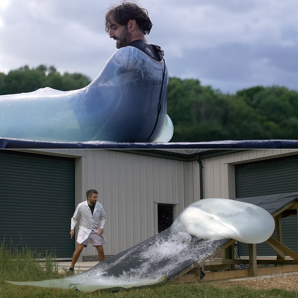
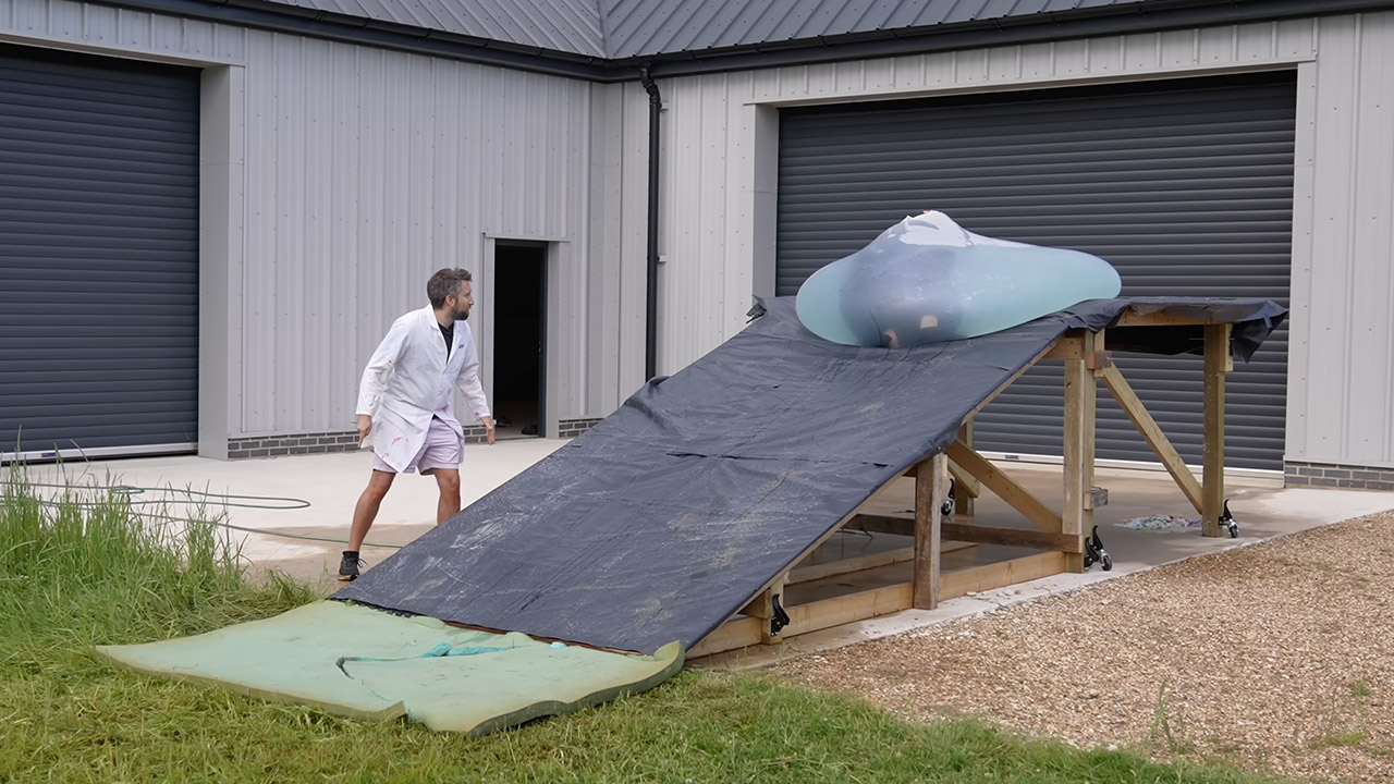
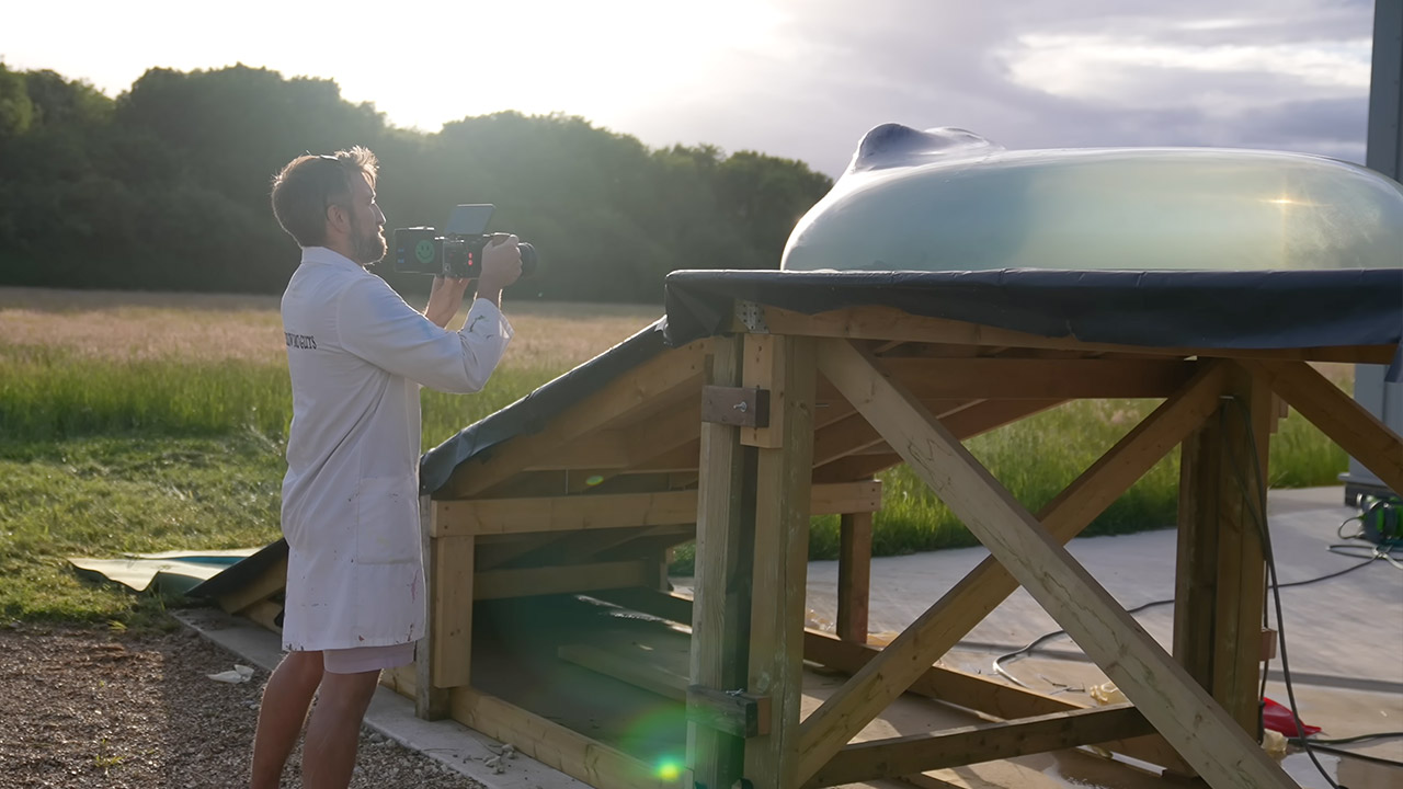
Gavin Free and Dan Gruchy of The Slow Mo Guys have spent years filling giant balloons with water and then filming the results at ridiculous speeds. Their latest outing takes the familiar setup and adds a slope. Dan, who stands six feet tall, climbs into a matching six-foot water balloon perched on a roughly five-foot ramp. Once inside, the balloon starts rolling. High-speed cameras running at 2,200 frames per second turn the brief tumble into something you can study for minutes.
The duo sets up the stage outside on a small platform with a slight inclination. The balloon is one of the larger ones they’ve used, allowing Dan to fit inside while still having some room to spare when filled with water. By the time he gets to the bottom, the water is up to his neck. Getting in is half the fun, as he wriggles one leg in the opening first, then twists and spills water over the side. Jackets are removed, and the rest is a wrestling match. When Dan gets into a low squat, the balloon appears less like a toy and more like a moist small room.
Dual Leica Lenses, Pro-Grade Imaging System: Dual Leica lens design combines a 1″ main sensor with a pro-grade telephoto lens featuring a…
Cinematic 8K HDR Video: This vlog camera shoots in up to 8K30fps with Dolby Vision, capturing vivid color, high contrast, and lifelike detail for…
Pro Telephoto Zoom with Natural Bokeh: Get closer with up to 6× lossless zoom and a 12× zoom range. The telephoto lens delivers true optical…
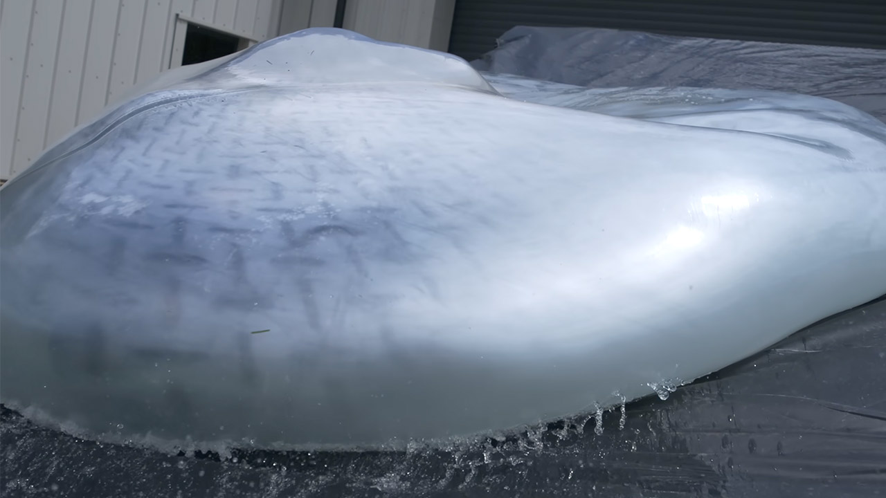
They talk about physics as the cameras roll. The idea is that friction at the top of the slope will cause the balloon to rotate around rather than just go down the incline. The water within should also whirl around. Dan intends to stay relatively compact so that the entire thing can glide rather than tumble. However, reality tells a different story. The first run begins with a shove, and the balloon starts to roll. Dan’s body moves through the opening as water sloshes around inside. For a tiny second, it appears that one of his feet is ready to slide out, but it is dragged back in before he can react. The balloon then strikes the stones at the bottom, blowing its top. Water streams out in a heavy sheet, and Dan emerges from the ruins, coiled up tight, appearing like a baby coming from its birth canal.
The two of them laugh, and Dan rises to his feet, confused and rattled but otherwise OK and ready to try again. Later on, they experiment with other versions on the same concept. When Dan attempts to enter, they occasionally try to turn the opening upward. Sometimes they attempt adjusting it to one side so that the balloon can hold him for a little longer. One attempt really keeps him inside for the entire spin. As it turns, the water creates these cool thin sheets and foam patterns against the balloon skin. Dan describes the experience of sliding along a moving layer of water with the outer skin grasping and releasing as very wild.
One of the runs is particularly impressive, as he keeps tucked in, rides the slope all the way down, and ends up deeper down the grass than he thought. He awards it a nine out of ten for sheer entertainment value. The camera work is where they truly excel. Crammed full of shots at 2,200 frames per second, every movement and shift in weight is clearly evident. You watch the exact instant when the balloon skin releases the ghost against the earth. You can see Dan adjusting his limbs inside the whirling water. The final release occurs when the balloon either bursts or empties enough for him to spill out. The Freefly Ember camera is a beast, capturing every detail and displaying the small, split-second events in a very readable sequence on screen.
A recent EnhancV survey of 1,000 full-time U.S. workers subject to new or stricter return-to-office policies found that 72% suspect these mandates are really a voluntary attrition strategy — a strategy by their own employers to make them quit their jobs. A full 46% admit to the practice of coffee-badging. Thirty-six percent have applied for a new job while sitting at their current office desk. Thirty-six percent have started a side hustle since the mandate was announced, in anticipation of being let go or quitting. Those numbers do not prove that employees reject collaboration. They show that many employees no longer trust the official story…
The central mistake in many in-office mandates is the assumption that proximity automatically produces commitment. It does not. A worker who spends two hours commuting to sit on video calls with colleagues in other cities is not experiencing culture. That worker is experiencing theater. When executives describe the office as a cure-all, many employees experience lost time, higher costs and lower autonomy. The policy’s defining feature becomes its credibility gap. Research keeps undercutting the belief that more office time automatically means better performance. A University of Pittsburgh analysis of S&P 500 firms found that return-to-office mandates reduced employee satisfaction without improving firm performance or firm value….
Baylor University’s reporting on office mandates and brain drain found that firms with mandates faced greater turnover among women, senior employees, managers and high-skilled workers, while job vacancy duration increased and hiring rates declined. In other words, the people with the most options are often the first to leave. The employees who remain may not be the most committed — they may simply be the least mobile… Attendance can be mandated, but commitment cannot. When leaders confuse the two, they do not rebuild workplace culture. They create a room full of people planning their exit.
A quick, reliable guide for diagnosing the most common CarPlay connection failures.
Igor Alecsander/Getty Images
Like most features on your iPhone, CarPlay should be straightforward to use once you get it set up. Unfortunately, as with any tech, problems can arise that stop CarPlay from functioning properly. After you get used to the conveniences of Apple’s auto software, you can feel stuck in the past when you have to use your phone’s display for music and maps instead. And that doesn’t even take the safety concerns into account.
Perhaps you can’t get CarPlay to work for the first time, it’s stopped working after a period of normal use, or it suddenly keeps disconnecting. These problems often have the same root causes, so running through some troubleshooting should clear them up. Unless the issue ends up being the cable you use for CarPlay, you won’t have to spend any cash, either.
One don’t have to be an automotive technician or an iPhone expert to apply these fixes, so even novice users should be back to enjoying their favorite music and navigation streamed through the car’s display before long.
Advertisement
Start with simple CarPlay troubleshooting steps
RSL_89/Shutterstock
It’s always wise to check simple points before you spend time on advanced troubleshooting. Begin by restarting your phone, then shut your car off and start it back up. This makes sure that no temporary hiccups are preventing a good connection. Depending on your car, CarPlay might not open automatically when you connect your iPhone. Look for it on your car’s default infotainment screen and tap to open it.
If this is the first time you’ve tried to use CarPlay, double-check Apple’s CarPlay vehicle list to confirm your car is compatible with the feature. Every iPhone from the iPhone 5 works with CarPlay, so unless you’re using an iPhone 4s or older, device compatibility isn’t the issue. Apple also publishes a list of countries where CarPlay works, but as long as your car (or aftermarket stereo) supports it, it shouldn’t matter where you’re located.
Also, make sure Siri is enabled on your iPhone, since this is required for CarPlay to work. Start by heading to Settings > Apple Intelligence & Siri (or just Siri if your phone doesn’t support Apple Intelligence). There, tap Talk to Siri (or Talk & Type to Siriwith Apple Intelligence enabled). Make sure the top option isn’t set to Off, and enable the Press Side Button for Siri slider if it’s disabled. Finally, update your iPhone to the latest version of iOS. While CarPlay doesn’t require the latest iOS to work, software updates can fix temporary issues that might cause your issue.
Advertisement
Allow CarPlay while your phone is locked
DenPhotos/Shutterstock
By default, after you connect your iPhone to your car, you have to unlock your phone once per drive for the two to communicate. This is an annoying step to take every time you start a trip, and when the icon doesn’t appear on your car’s display, you might think CarPlay isn’t working when it’s really just locked. If you don’t want to deal with this step every time, there’s an easy fix.
Open Settings on your iPhone, then go to General > CarPlay. Tap your vehicle’s name, then enable the Allow CarPlay While Locked slider (if it’s not already). Now, you don’t have to use Face ID or your PIN to let CarPlay start talking to your phone; it will show up as soon as you connect it with a cable or wirelessly.
With this setting enabled, someone who had access to your phone and car could use CarPlay to make calls, send messages, and access other data on your device without having your passcode. In most cases, it’s fine to leave it enabled for your own vehicle, but consider disabling it when you’re driving a car that’s not yours.
Advertisement
Troubleshoot the cable or wireless connection
Best Auto Photo/Shutterstock
If you use CarPlay with a USB cable, try connecting to another USB port on your car (if there is one). In case there are multiple, it’s worth checking your car manual to see whether one is meant for CarPlay/Android Auto usage. Next, try a fresh USB cable. I’ve had to replace the USB cable I use for CarPlay several times; between the extreme temperatures inside a vehicle and getting twisted, they don’t last forever.
Similarly, if you have to put your cable in a perfect position to keep the CarPlay connection stable, it’s time for a replacement. When you do, make sure to use a cable marked for data transfer, not just charging. Unlike the best iPhone accessories, cheap cables often don’t have the capability to move data and won’t work with CarPlay. Avoid using adapters with CarPlay; a direct connection is more likely to work. When you replace the cable, check for dust in the USB ports of your phone and car, and gently clean out any buildup you see.
If you connect to CarPlay wirelessly (perhaps using a third-party adapter), open Settings on your phone and make sure you have Bluetooth and Wi-Fi enabled, as wireless CarPlay connections rely on both. In the Wi-Fi menu, tap the i icon next to your car’s name and make sure Auto-join is enabled so you don’t have to manually connect every time.
Advertisement
Confirm CarPlay isn’t disabled
Tada Images/Shutterstock
The parental controls on your phone can block certain features from functioning entirely. If CarPlay still won’t work at this point, head back into Settings and browse to Screen Time > Content & Privacy Restrictions. If you’ve set up a passcode to lock Screen Time restrictions, you’ll need to enter it here.
If the restrictions slider is enabled, choose Allowed Apps & Features and make sure the slider for CarPlay is green (meaning it’s enabled). If that slider was already off, this isn’t your issue.
Similarly, in your car’s settings, look around the options menu for a Connections or Devices section. There, check to see if CarPlay is disabled or your phone is disconnected. This will depend on your car, but it’s worth double-checking in case the problem is buried in its menus. Take a look at your vehicle’s manual to see what options apply.
Advertisement
Re-pair your car and phone
Smith Collection/gado/Getty Images
Moving on, you should remove the CarPlay connection between the two devices and set it up again. To do this, go back to Settings > General > CarPlay on your iPhone and select your vehicle. Before resetting, screenshot your app layout and widgets so you can easily set them up after the reset. Tap Apps and screenshot as needed, then repeat for Widgets. This will also reset the options available in CarPlay’s Settings panel, but you can’t check those if CarPlay isn’t working.
Once ready, choose Forget This Car. If you’re able to update the firmware on your car’s stereo unit, try doing so. Then you’ll need to pair your phone again. For a wired connection, connect a high-quality USB cable to your phone and your car’s USB port. If your car supports wireless CarPlay, open the device pairing menu on your car’s display (which you can often do by holding the voice command button on the steering wheel). On your phone, go to Settings > General > CarPlay and select your car when it appears.
If you see the CarPlay logo on your vehicle’s display after re-pairing, you should be in the clear. Tap it, walk through the initial setup steps again, then customize CarPlay the way you had it before—be sure to install some of the best free CarPlay apps, like SpotHero and TuneIn. If all else fails, you can try factory resetting your head unit. This should be a last resort, since you’ll lose all existing settings. See if your car allows exporting your configuration to a USB drive; if not, you can take photos of each option so you remember how everything was configured. Should the reset fail to get CarPlay working, it’s time to contact your car manufacturer and/or Apple.
Anyone can string up some LED string lights in a space with mixed results. However, if you want to create a lighting environment that’s classy and stylish, it takes a little more finesse. [ipad.bendavid] has a great example of this, with a rather tidy architectural LED installation.The final look is quite clean and evenly lit, without requiring the use of any diffuser material.
The electronic side of things is relatively straightforward. There’s an ESP32 running the show, commanding the colors for 928 individually-addressable WS2812 RGB LEDs. It uses the WebSocket API for real time control, integrates with Home Assistant, and even offers audio reactive lighting modes with the aid of an INMP441 I2S audio input module. A hefty 5 V, 60 A power supply ensures the LEDs are never short of juice. There was also careful attention paid to power distribution to avoid any dim spots or other issues.
Where it gets really cool, though, is the attention paid to the construction of the installation. The LED strips are installed in concentric square frames, which block light in specific areas to create a nice square pattern, with the LEDs facing the wall they’re installed on rather than projecting out to the viewer. This hides the strips themselves and eliminated the need for diffusers which can be a pain to get right.
Overall, the build is a pleasing one that plays with light and darkness and looks rather stylish in a way so many LED installs don’t. If you’re cooking up your own neat glowable projects, you know we’d love to see them on the tipsline.
After a three-year wait, Ted Lasso is finally returning to Apple TV+, but season four isn’t simply picking up where the last season ended. Instead, Apple is relaunching one of its biggest original series with a fresh premise, a revamped cast, and notable behind-the-scenes changes that could determine whether the Emmy-winning comedy can rediscover the charm that made it a global phenomenon.
The new season premieres on August 4, with Jason Sudeikis returning as Ted Lasso. However, this time he won’t be leading AFC Richmond’s men’s team. Instead, Ted takes charge of the Lady Greyhounds, shifting the show’s focus to women’s football while introducing several new faces to the franchise. It’s easily the biggest narrative shake-up since the series debuted in 2020.
For Apple, the stakes are higher than they appear. Ted Lasso remains one of Apple TV+’s defining originals, and a successful fourth season would reinforce the company’s ability to extend its flagship franchises without losing what made them successful in the first place.
The Lady Greyhounds become the story
Season four retains familiar characters including Ted, Rebecca, Keeley, Roy Kent and Coach Beard, but several regulars from AFC Richmond’s men’s squad are no longer part of the main cast. According to 9to5Mac, Jamie Tartt, Dani Rojas, Sam Obisanya, Isaac McAdoo and Colin Hughes will not return as series regulars, although some may make cameo appearances. The future of Nick Mohammed’s Nate Shelley also remains uncertain, with reports suggesting he could appear in some capacity.
Advertisement
Apple TV
The new women’s team brings a fresh lineup of characters, including Tanya Reynolds as assistant coach Alice Chilton, alongside players Gemma, Boots, Lizzie, Niamh and Siobhan. Rather than simply continuing AFC Richmond’s story, Apple appears to be using the new team to reset the series while keeping its familiar emotional core intact.
It’s a sensible move. Extending a beloved series without changing anything often leads to diminishing returns, particularly after a divisive third season. By introducing a new squad instead of recycling old storylines, Ted Lasso has a chance to evolve while remaining recognizably itself.
Apple has also changed what happens behind the camera
The creative overhaul extends beyond the cast. During the first two seasons, Bill Lawrence played a central role in shaping Ted Lasso alongside Jason Sudeikis. His involvement was significantly reduced during season three, a change many critics and fans linked to the show’s uneven storytelling.
Apple TV
For season four, Apple has brought in veteran television producer Jack Burditt, whose credits include 30 Rock and Modern Family, to work alongside Sudeikis. According to The Hollywood Reporter, Burditt helped oversee production and the writers’ room while Sudeikis continued leading the show’s creative vision. Early reactions suggest the partnership may have restored some of the focus that viewers felt was missing in the previous season.
Ultimately, Ted Lasso doesn’t need to reinvent television. It simply needs to remind audiences why they fell in love with its optimism, humor, and emotional storytelling in the first place. Apple has changed both the players on the pitch and some of the people calling the shots behind the scenes. Whether those changes deliver another championship-worthy season will become clear when the series returns next week.
Before iCloud became the backbone of the Apple ecosystem, it spent more than a decade evolving through three distinct services: iTools, .Mac, and MobileMe.
If you’ve got an iPhone, you’ve got an iCloud account. Sure, you might only have the base account, but you’re still signed up for it.
And for most of us, we probably actively engage with iCloud to some degree. After all, iCloud is what Apple uses to store your Messages, Photos, Notes, Contacts, and software backups, and it powers Find My.
But how did Apple get here? While iCloud launched in late 2011, Apple actually began taking its first big steps into subscriptions as a service, or SaaS, eleven years prior.
Advertisement
So here’s the story of how iCloud became iCloud, and the shoulders of the three prior giants it stood upon.
The year was 2000, and Apple was looking for ways to convert Windows users to loyal Mac fanatics. And what is one of the best ways to lure people in?
That’s right: free stuff.
On January 5, Apple launched iTools. It was a collection of services available to those who were using Mac OS 9.
Advertisement
The first was iCards, which was electronic greeting card software. It lets you create greeting cards that you could send via email to friends and family.
It may not sound like it, but this was pretty big. In the early 2000s, sending greeting cards via email was a huge deal.
Image credit: BasicAppleGuy on Threads
It also included iReview, which gave dedicated reviews of internet content. Unfortunately for iReview, it would be the first of the iTools products to go under; it was cancelled in 2001 after failing to attract traffic.
Advertisement
KidSafe was essentially Apple’s take on Bess or Net Nanny, services that would only allow children to visit pre-approved “safe” websites. KidSafe was discontinued in mid-2001, one month after iReview was killed off.
HomePage was another offering, and allowed users to create a personal website without any sort of backend coding. Even more interesting, as Phil Schiller pointed out in 2000, it was available for free.
HomePage gave users templates, free images, and allowed for drag-and-drop customization. It also featured integration with Apple’s iDisk.
And if you’re curious about iDisk, it was yet another iTool. Effectively, iDisk walked so iCloud could run.
Advertisement
Users were granted 20MB of free personal internet storage, but they were able to purchase up to 400MB as part of an annual subscription. If you wanted that whole 400MB of storage, you’d need to fork over $400.
Those with a HomePage could use a file sharing template to publish the contents of an iDisk folder to the web, enabling sharing with anyone who came across your HomePage.
And last but not least, we had mac.com. While it certainly sounds like it was a place to buy a Macintosh computer, it actually was an email hosting account.
Users who utilized mac.com addresses got an @mac.com email address. Not only was it a great way to show your allegiance in the PC-Mac battle, but it worked as free advertising for Apple, too.
Advertisement
And then there was .Mac
iTools existed, more or less, in its initial state, for a little over two years. However, when July 2002 rolled around, Apple rebranded it to .Mac.
This brought a lot of changes, but perhaps the most significant was that it was no longer free. As you could imagine, that didn’t go over particularly well.
The service offered a few new features to make up for its sudden price tag. Notably, Backup launched with the service, allowing users to archive their data to iDisk, CD, or DVD.
Users also got McAfee Vriex, an antivirus program, for free. Well, it was free until 2005, at least.
Advertisement
In 2007, .Mac got a few notable upgrades.
The first was that anyone who had a .Mac account got 10GB of “free” storage that could be split between their email account and iDisk. Users had the option to purchase additional storage up to 30GB.
Finally, and fatally, MobileMe
MobileMe wouldn’t launch until 2008, when Apple acquired me.com. MobileMe would lay the groundwork for the deep ecosystem integration that we know and love about Apple products today.
“Think of MobileMe as ‘Exchange for the rest of us,’” then-CEO Steve Jobs said.
Advertisement
“Now users who are not part of an enterprise that runs Exchange can get the same push email, push calendars and push contacts that the big guys get.”
And then there was MobileMe
At launch, MobileMe allowed users to sync emails, folders, and messages across platforms, the way that iCloud does now. And, it even allowed you to check many of these apps from the web.
Users could still choose to create a @mac.com email address, or if they wanted, one emblazoned with @me.com.
Advertisement
At this point, Apple was still charging for the service. The base MobileMe platform cost $99 per year and came with 20GB of storage. Users could also upgrade to a “Family Pack” for $149 per year, which included one master account with 20GB of storage and four Family Member accounts with 5GB of storage each.
MobileMe also saw the launch of Find My iPhone in 2009. This precursor to Find My allowed users to use the web to locate a missing iPhone on a map, play a sound, change the password, or remotely erase content.
MobileMe survived for four years after launch, eventually being discontinued on June 30, 2012. Apple had announced iCloud in 2011, so it didn’t exactly come as a surprise, but many users were sad to see it go.
iCloud
As stated above, iCloud was announced in October 2011. Jobs made the announcement at WWDC 11, saying that it would replace MobileMe, which had been considered a failure.
Advertisement
Unlike MobileMe, iCloud would launch as a free service as part of iOS 5 and OS X Lion. No longer would users be expected to fork over at least $100 a year.
“iCloud is the easiest way to manage your content, because iCloud does it all for you and goes far beyond anything available today,” said Eddy Cue, Apple’s senior vice president of Internet Software and Services.
Apple’s Eddy Cue was instrumental in helping to launch iCloud
“You don’t have to think about syncing your devices, because it happens automatically, and it is free.”
Advertisement
This alone ensured that people would use the service. But it also refined features that its predecessors never seemed to get right.
Photo Stream, which would eventually get rolled into Photos, allowed users to take a picture on iPhone and see it on other devices, including Apple TV. Documents in the Cloud gave users an easy way to manage, edit, and save iWork documents across all devices.
iTunes in the Cloud allowed users to download new music purchases to all devices, meaning users could purchase music on their Mac and find it on their iPhone later.
Other features introduced included Find my Friends and improved cross-device management of Contacts, calendar, and Mail.
Advertisement
It may have taken eleven years to get to iCloud, but it’s interesting to see how Apple got there in the end. And, it’s just as impressive that Apple’s managed to expand upon iCloud in the nearly 15 years after its launch.
When they’re not discharging sewage into rivers and the sea, or failing to fix leaks, the water companies seem poised to launch a hosepipe ban. To be fair, it’s been an extremely hot and dry summer for most of the country.
If you’re one of the millions of affected households, then you don’t have to sit back and watch your garden die, as there are some legal ways to keep your plants fresh and watered.
For this article, I’m focusing on established gardens; most water companies allow hosepipe watering of food crops and new plants and lawns under certain conditions. For example, Thames Water has this rule for new lawns and plants: “You can only use a hose or sprinkler if the laying, sowing or planting was completed by a business as a service. In this case, hose use is allowed for the first 28 days from the day of planting, sowing or turf laying. The hosepipe must only be used on the new planting, and not elsewhere.”
Of course, before you do anything, it’s worth checking with your specific water company if an activity is allowed or not.
Advertisement
Drip watering system
You can’t spray wildly, but drip irrigation systems, such as those sold by Hozelock, are typically allowed during most hosepipe bans. Rather than spraying water, these systems drip water exactly where it’s needed. Even outside of a hosepipe ban, these systems are more efficient and will save you money.
Advertisement
You’ll need to check compatibility with your water company, but to stay compliant with a hosepipe ban, most systems need to have a pressure-reducing valve and a timer. Be careful of the adaptors that you use: you can’t use ones that use a jet or mist, and the system must drip water directly onto or beneath the surface.
You’ll also need a timer, which can be a smart one, such as the Eve Aqua.
Use a cordless pressure washer with a water butt
In most hosepipe ban areas, you can still use buckets and watering cans for the garden, but this can be a faff. However, if you have a water butt, then a cordless pressure washer could help make the job easier.
Advertisement
Provided your cordless pressure washer, such as the Stihl RCA 20, can work with alternative water sources, such as water butts, you can use this to draw the water directly out, and spray it where you want.
With the RCA 20, the end of the hose can be dropped into a water butt, with a filter used to prevent any bits of debris being sucked up.
Advertisement
Image Credit (Trusted Reviews)
As you haven’t connected the pressure washer to the mains water, you’re not breaking any rules. Just remember, you can’t use mains water to top up your water source, and have to rely on either rain water or grey water harvesting.
Turn down the pressure, so that you’re lightly sprinkling water, rather than jetting it out, and target the roots of your plants to make the most of this method.
Securities firm Rosenblatt is still bearish on Apple’s future, seeing short term supply problems as well as difficulties matching the iPhone 17 range’s success. Just the same, it has raised its price target to a still-underwater $300.
Following Apple’s latest earnings call, the company’s shares took their usual inexplicable dip, but investment and securities firms are looking further ahead. Rosenblatt, which remains amongst the most bearish on Apple, has told investors that it is raising its price target by $24 to $300.
In an note to investors seen by AppleInsider, the company says that it has decided to do this by focusing on how it believes Apple will be faring in a year’s time. Even then, it says the reason for only raising the target by what it calls a modest amount, is down to the volatile financial environment.
That includes economic factors that affect all firms, such as tariffs and inflation. But with Apple, it notes what Tim Cook has said about supply constraints across the company’s product ranges.
Advertisement
Beyond that, Rosenblatt also believes that Apple is going to have difficulty with the iPhone 18 range simply because the iPhone 17 range was such a huge success. Calling it a big test, the company speculates that Apple will have a tough comparison as it tries to continue growing.
As a result of that, the securities firm thinks that iPhone sales will slow substantially. It also says that European Union-drive legislation and regulation could decrease Apple’s value.
All of this means that Rosenblatt has raised its target price but kept a neutral rating for the company. Even as it does so, though, it notes that there is a possibility that the new Apple Intelligence will drive more sales than it expects.
JP Morgan, has been bullish overall, and has the same short term questions. But that investment firm trimmed its Apple price target to $340 after earnings.
Advertisement
They’re above water, at least. Apple stock got hammered after earnings, falling to $307.80 on Thursday, despite record-breaking results again.
AAPL has been on a tear as of late. It’s been above $300 since July 2. It touched the $5 trillion valuation mark on on July 28.
Separately, in April 2026, Rosenblatt was one of the analyst firms praising the appointment of John Ternus as the new Apple CEO. It described that as Apple continuing what already works, but also “leaning into its hardware successes.”
Following price hikes across the rest of Apple’s product lineup, one analyst believes that the upcoming iPhone 18 Pro could be hit with a massive $300 increase, a bump that might not be out of the question considering other recent price changes.
Apple increased the price of its Macs, iPads, and other products in June 2025 as a result of increasing RAM and storage costs. Some Mac models saw four-digit price hikes, although the iPhone lineup was left unscathed.
That has long been rumored to change when the iPhone 18 Pro and iPhone 18 Pro models launch this fall. A report from July 2026 hinted that a price increase of up to 10% was in the cards.
But analyst Jeff Pu has blown that prediction out of the water. According to a post on the X social network, Pu believes iPhone 18 Pro buyers could pay $250 to $300 more than the iPhone 17 Pro price at debut in 2026.
Advertisement
If Pu turns out to be right, the iPhone 18 Pro could start at $1,399. Buyers of the iPhone 18 Pro Max could expect to fork out at least $1,499 for their new handset.
Simply passing on the costs
While some will no doubt accuse Apple of increasing prices to boost its balance sheet, Pu doesn’t expect that to be the case. He cites the increased costs of components like RAM and NAND storage as key reasons behind the price increase.
The use of TSMC’s 2nm manufacturing process for the iPhone 18 Pro’s A20-series chip is also thought to be a factor in the price bump.
Pu believes that while recent Apple earnings show the iPhone to still be a key driver of growth, iPhone 18 Pro demand could be hampered by the price increases.
Advertisement
However, it’s also important to remember that Pu’s track record is far from impeccable, with plenty of misses in recent years. While a price increase seems likely, $300 is more than has been previously rumored.
Dire expectations
Price hikes on the iPhone 18 Pro versus the iPhone 17 Pro are inevitable. It’s just a question of how much.
Pu isn’t the only one to have dire pricing concerns. Analysts at Counterpoint Research suggested the iPhone 18 Pro Max could cost on average $200 more than its predecessor.
While not quite the same, we can use Apple’s previous price increases as a guide. The 11-inch iPad Pro increased from $999 to $1,099, a $100 bump. But the 13-inch iPad Pro saw a $200 price increase to $1,499.
Advertisement
With that in mind, maybe a $250-$300 iPhone price increase isn’t out of the question after all.
Those hoping for a silver lining should note that the 13-inch iPad Pro saw a 15% price increase. A $300 price hike on the iPhone 18 Pro Max would represent a 25% increase depending on the storage configuration.
There’s even more promising news to be found in a July 2026 report that Apple has sought to lessen the impact of increasing costs. It was reported that Apple had pushed display manufacturers for lower prices in an attempt to offset the higher costs of RAM and storage.
































































You must be logged in to post a comment Login