Nintendo’s worst-ever console was awkward to use and didn’t even sell a million units.
michasekdzi/Shutterstock
For as many massively successful systems as Nintendo has had (like the Game Boy, Nintendo DS, and Nintendo Switch), the company has also suffered through stumbles. Some of the minor missteps were limited to accessories, such as the clumsy e-Reader, or Nintendo 64DD that never released outside of Japan. But entire consoles have flopped too, which stings much more.
When you think of failed Nintendo platforms, the GameCube or Wii U might come to mind. During the sixth generation, the GameCube came in third place behind the wildly successful PS2 and newcomer Xbox. And the Wii U represented one of Nintendo’s darkest periods, offering many mixed-reception games for confusing hardware that wasn’t marketed well.
But the Nintendo console that had the worst run wasn’t either of these. Rather, it was a short-lived system from the mid-1990s that didn’t even last a year and sold just a fraction of the units. And as lambasted as it was, a recent comeback means it’s easier than ever to try today.
Advertisement
The Virtual Boy was Nintendo’s biggest disaster
ncppltd/Shutterstock
You’ll realize the Virtual Boy is unusual just by looking at it. Rather than a traditional home video game console that hooks up to a TV or a portable one you hold in your hands, the Virtual Boy falls into an awkward middle ground. It uses a viewfinder “binocular” design supported by a stand to guide you into the flagship feature: rudimentary three-dimensional visuals. The proper term for this is “stereoscopic 3D,” where a different image is shown to each of your eyes to create the illusion of 3D. And while this technology sounds impressive for the time, it was really an underbaked mess fraught with problems.
Nintendo began selling the Virtual Boy in North America in August 1995, shortly after its Japanese release. This was before the Nintendo 64 or the Game Boy Pocket revision arrived in 1996, meaning Nintendo’s hardware market had been quiet since the SNES’s North American release in 1991. March 1996 saw the last Virtual Boy game released in North America (Tetris 3D), with Nintendo silently discontinuing the system not long after. Europe never even got it.
In June 1996, Nintendo reported that the console had sold 770,000 units. This makes it the worst-selling Nintendo console by far — the Wii U is next-worst, but still miles away at 13.6 million sold.
Advertisement
It was uncomfortable to use…
Aldara Zarraoa/Getty Images
If you’re wondering how you’re supposed to comfortably play the Virtual Boy, you’ve happened upon the first major problem. Setting the Virtual Boy’s stand on a table meant you had to lean forward to put your face inside, which wasn’t a comfortable position to hold for long periods. Tilting the stand could help, or you could get creative with various angles like lying down. A strap would have been great, but Nintendo never released one. It’s not a good sign when simply figuring out how to start using a system is a challenge.
For power, the Virtual Boy used six AA batteries in the back of the controller (or an optional adapter for a wall plug that slid onto the back of the controller instead). Its controller had a unique double D-pad design, which several games utilized. However, the A/B and Start/Select buttons having the exact same shape made it easy to forget which was which, since you couldn’t easily look down to see them.
There were also complaints at the time about not being connected to the people around you while playing, since the Virtual Boy was a one-person experience. Others in the house couldn’t watch you or easily pass the controller around. It clearly wasn’t a portable console either; using this in a car would have been ridiculous.
Advertisement
…and the screen caused physical sickness
charnsitr/Shutterstock
The Virtual Boy’s discomfort doesn’t end with getting your face into the device. Once you put your eyes up to the screen, another one of its huge issues becomes apparent: the screen is only in black and red. According to Nintendo, adding full color would have made production far too expensive. The color palette commonly caused eye strain and headaches, especially given how close your eyes were to the screen.
Aside from a boring single color, the Virtual Boy’s 3D display technology made people feel nauseous. Internally, the system used oscillating mirrors to reflect a single-pixel-wide line of LEDs and create the images you see while playing (this video from The Slow Mo Guys illustrates it well). Because everyone’s eyes are different, the unit had a slider on top to adjust the distance between the mirrors. I’m sure many people didn’t do this properly (or at all), which contributed to the eye and head sickness.
Nintendo was aware of these problems, so the Virtual Boy had a built-in reminder to take a break every 15 minutes or so. The longer you went without stopping, the more likely you were to feel unwell. It’s hard to get absorbed in an experience when you have to keep breaking the immersion.
Advertisement
The game library was limited and weak
Perhaps people would have forgiven the hurdles to using the Virtual Boy if the games had been worth playing. Unfortunately, almost all the system’s titles were unremarkable. Many were hurt by the lackluster graphics of primitive wireframes and vast pools of black. Releases also fell into repetitive genres like sports, arcade, and puzzle. Plus, Nintendo’s best-known franchises were largely absent; Zelda, Metroid, Kirby, and many others were nowhere to be seen.
Advertisement
A few Virtual Boy games were highlights, but hardly justified the price of the console. Teleroboxer had a lot of the same “puzzle-fighting” elements as Punch-Out!!, while the pack-in title Mario’s Tennis was a good showcase for the 3D effects (and is the first game in the Mario Tennis series). But because of their short lengths and basic gameplay, nearly the entire library felt like tech demos instead of must-have releases.
Nearly everyone agrees Virtual Boy Wario Land is the best game for the system, featuring crisp graphics and a neat gimmick where you can swap between background and foreground layers. It’s a brief experience, but a fun one — that’s unfortunately stuck on Virtual Boy.
Advertisement
You can try a Virtual Boy today
agustin.photo/Shutterstock
Clearly, the Virtual Boy hit shelves in an incomplete state; it was rushed out so Nintendo could focus on the upcoming N64. Unlike the Wii, where everyone who tried one wanted their own, people trialing the Virtual Boy at a friend’s house or through a Blockbuster rental promo realized how shallow it was. Its competition didn’t help the situation, either. In North America, the PlayStation arrived a month after the Virtual Boy (in September 1995) and offered far superior 3D graphics.
The Expansion Pack is $50/year (there’s no option to pay monthly), with the replica model costing $100 and the cardboard version at $25. There’s no option to disable the 3D effect, so you can’t play these games on the TV. That’s quite a cost to try such a limited library of games, but those curious about Nintendo’s biggest flop should still have some fun with it.
Anthropic is warning some Claude users that infostealer malware on their PCs has stolen active Claude login sessions, allowing attackers to access accounts and consume their usage.
The company is signing affected users out of Claude, removing saved payment methods, and refunding charges it identifies as unauthorized.
“We have recently become aware of a bad actor that is using common infostealer malware to steal Claude login sessions from people’s computers, then using those login sessions to access Claude accounts and consume their usage,” Anthropic said in an email sent to an affected user, who shared it on Reddit.
“If your usage limits looked like they refilled and then drained while you weren’t using Claude, this was likely the cause,” Anthropic warned.
Anthropic sending emails to affected users
Source: Reddit
It is also worth noting that infostealers can copy an already authenticated browser session, which means the attacker may not need to go through the normal password and 2FA login process again.
Anthropic links attacks to Vidar, LummaC2, StealC, RedLine and other infostealers
In the email, which is also being sent out to other compromised account holders, Anthropic says its investigation is ongoing, but computers were likely already infected with general-purpose infostealer malware.
Advertisement
“We have no reason to believe that this malware is related to Claude, installed through Claude, or related to anything you did with Claude,” the company stressed.
According to Anthropic, the malware typically arrives through downloads or malicious apps and steals information stored locally, including browser passwords, login cookies, and credentials belonging to other apps.
“Your Claude session was likely one of the many things it collected. It appears that a bad actor has now started picking the Claude sessions out of what it collected and using them,” Anthropic said.
In this case, the Redditor who shared the email confirmed that they downloaded a pirated game, which explains why their system got compromised.
Advertisement
Anthropic has identified multiple malware, including Vidar, LummaC2, StealC, RedLine, and Acreed on Windows, along with Atomic Stealer (AMOS) on a small number of Macs.
If you get affected, Claude will revoke compromised sessions and remove saved payment methods to prevent unauthorized purchases.
“Signing you out of Claude stops the stolen sessions, but it doesn’t remove the malware,” Anthropic warned. “If it’s still on your computer, your next login session could be stolen the same way.”
Anthropic has urged affected users to take basic security steps, including changing credentials, revoking other sessions, and removing the malware from the PCs.
Advertisement
Overall prevention scores can hide what happens after initial access. Once attackers are using valid credentials, prevention drops sharply.
The Blue Report 2026 measures defenses technique by technique across 338 million simulations run in customer production environments.
Google Maps now labels Lake Ontario as Lake America for users in the United States, following an update to the US Geographic Names Information System, while Canadian users see the old name and everyone else sees both. Google Maps has been a designated very large online platform in the EU since April 2023, with duties to assess systemic risks including effects on civic discourse.
Google Maps now shows Lake Ontario as Lake America to anyone using it in the United States. Alphabet announced the change, Bloomberg reported.
What you see depends on where you are standing. Canadian users still get Lake Ontario, and everyone else, Europe included, gets both names printed on the same water.
The trigger was a database entry. The US Geographic Names Information System was updated on 27 August, after President Trump said he would rename the lake.
Advertisement
“These updates follow our long-standing policy for bodies of water with names that vary from country to country,” Alphabet said in a statement.
Not everyone went along with it. MapQuest refused outright and built a generator letting users invent their own names for the lake, and Apple Maps was still showing Lake Ontario to American users.
There is a precedent for the mechanism. The Gulf of Mexico became the Gulf of America in the same product last year, under the same stated policy.
The rule underneath is worth stating plainly. A government can change what the world’s most used map says by changing its own naming database.
Advertisement
Europe has that machinery too. Geographical names are a harmonised data theme under the INSPIRE directive, maintained by national mapping agencies.
No European government has used it this way. That is an observation about restraint rather than about capability, and the two are easily confused.
The other half of this is regulatory. Google Maps has been a designated very large online platform in the EU since April 2023.
That designation brings duties with it. A platform of that size has to assess the systemic risks arising from the design and functioning of its service, including negative effects on civic discourse and public security.
Advertisement
The Commission does act on those duties. Poland has asked it to fine Meta €250M over scam advertising under the same regime.
Nobody has tested the mapping question. A product that shows two countries different geography, on the strength of one database entry, has never had to explain itself in Brussels.
In this week’s Sunday Reboot, Apple’s inconvenient Mac launch timing and the transition from Cook to Ternus nears its conclusion.
Sunday Reboot is a weekly column covering some of the lighter stories within the Apple reality distortion field from the past seven days. All to get the next week underway with a good first step.
An oddly earlier upgrade than normal
It is the pre-iPhone event season, and the media is hard at work preparing for what Apple will be showing off in its early September event. It’s usually a busy period, with lots of pre-writing of pieces that will be adjusted and added to as Apple makes its announcements.
Except this week, Apple decided to change things up a lot. It announced some products way earlier than we expected.
To people covering Apple, this meant a sudden influx of launches to analyze and write about at length. This wouldn’t entirely be a bad thing, except that we were expecting Mac stuff to arrive either during the September event or in October.
The Mac preparations usually happen after the iPhone launch posts. This meant the Mac posts this week were created with no pre-made elements, no prep work. Doing it live.
However, one thing did pop into my head about this week’s Mac launch. Why did Apple do this now?
Advertisement
Mac Studio, one of Apple’s August updates.
Someone speculating on Apple’s current situation may see it as an attempt by Apple to shake up how it launches products even more. After all, it’s already separated the Pro and non-Pro iPhone launches, so other changes are fair game.
The impending Ternus change could be a license for Apple to switch things up even more.
There’s also the idea that Apple would rather use its events for bigger product launches, like its new smart home items. They would certainly rank higher than a spec-bump update.
Advertisement
However, looking back over Apple’s launches in recent years, we also see that it’s not entirely a new phenomenon for the company.
The last time Apple launched a product in August was an iMac in 2020. Since then, it has launched Mac products in June and July, such as the M2MacBook Pro and MacBook Air in 2022, as well as the MacBook Pro, Mac Pro, and Mac Studio updates in 2023.
There was a HomePod mini update in July 2024, but nothing Mac-based during the summers of 2024 and 2025. That doesn’t mean Apple gave up on them, as this week’s Mac launches have confirmed.
The real question is whether Apple has more products that it could put out in October to warrant a second event. With some of its Mac lineup already announced, that reduces the potential pool of Mac updates.
Advertisement
With this year introducing a folding iPhone that will eat into the September event’s time, we may see Apple keeping its OLED iPad mini update for the October one, alongside a much smaller collection of MacBook launches.
This early batch of Mac launches could well be in service of creating two events that have far fewer products on show.
For us at least, it helps spread the stress out a little.
Cook out for Ternus
The week ahead will be a major one for Apple’s history. Apple CEO Tim Cook is vacating his role for a similar board-based one, and giving it up for hardware chief John Ternus to take over.
Advertisement
It’s a transition that we have known about for months, thanks to Apple’s decision to announce the change in advance. But as the changeover date draws near, you can expect an awful lot of coverage about it.
Looking to the past, there’s going to be discussions about Cook’s legacy, reminiscing about key moments at the company, and picking apart what he got right and wrong.
From Apple itself, you’re not going to get much of a song or dance about the situation.
Advertisement
Pikachu at Apple Park.
Sure, there will be press releases about Cook’s role shift, as well as one about Ternus becoming CEO. Cook will also take to social media to thank Apple employees for their work, and Apple’s fans too.
But really, this week ahead is going to be a gradual introduction of Ternus to the public. A very gradual one, that has so far involved Pikachu.
Apple will want to gently break in Ternus being in charge, because not everyone knows about this. At September’s special event, despite the long wind-up period, people are still going to see Ternus and ask who he is in complete surprise.
Advertisement
Maybe Apple could do its own version of the “Doctor Who” regenerations as a pre-announcement skit.
Last week’s Sunday Reboot talked about the leaked video for the AirPods Pro with Cameras, and how they could be the best smart glasses for people who wear glasses.
Tree huggers aim to end blanket critical infrastructure status for bit barns and ensure environmental standards are met
The Green Party of England and Wales wants the government to end the blanket designation of new bit barns as “critical infrastructure” and change planning rules to stop such facilities taking precedence over households for water and energy.
The Green Party claims that CNI status means that server farms are prioritized for access to water and energy, even when ordinary households are hit with drought restrictions, as over 27 million people currently are in England.
It wants to see planning permission for new facilities granted only when the developer can show it will meet the highest environmental standards, and there has been full community consultation.
“We need to slam the brakes on the rampant building of new datacenters which could put our communities at risk of water shortages and drive up energy bills – and yet are currently being waved through by our government,” said Green Party leader Zack Polanski.
Advertisement
“Data should serve people, not the other way around – but right now, because datacenters are designated as critical infrastructure, people come a poor second, with datacenters even being given priority for water and electricity.”
“We need clear criteria to distinguish between datacenters vital to national security or public services, and those that simply serve private tech companies and private profit,” Polanski added.
On the water side, MPs were warned earlier this year that official forecasts of England’s future water needs excluded datacenters, despite the growing number of them, and that they could end up competing with homes and businesses for supply.
Advertisement
The Green Party claims that a single large-scale datacenter can use around 1.5 million liters (396,258 US gallons) of water per day, comparable to the daily water needs of a town of around 10,000 people. Yet bit barn construction is projected to expand rapidly, with growth often concentrated in areas already classified as water-stressed, like London and the South East.
But water consumption can vary, depending on the cooling systems in use at specific facilities. In theory, newer campuses should require less water, especially if they are deploying AI infrastructure that uses so-called direct-to-chip cooling, where fluid is circulated through a closed-loop system.
A government spokesperson told us: “A pause on building new datacenters would simply send investment and good jobs abroad, while leaving Britain dependent on overseas computing for the processing of sensitive health and defense data. Put simply, it would be a disaster for jobs and national security.”
However, the spokesperson added: “This does not mean a blank cheque for Big Tech or that every datacenter should be approved. Developers should prioritize clean power, use water responsibly, create British jobs and supply chains, and provide investment to the communities in which they are built.”
Advertisement
The Green Party is also calling on the government to urgently develop a comprehensive national strategy for AI infrastructure, as the country is currently dependent on foreign-owned infrastructure for critical services, from healthcare to public safety – something the Institute for Public Policy Research was warning about just this week. ®
The Manchester Airports Group data breach has been claimed by extortion group FulcrumSec, which told BleepingComputer that it stole approximately 86 GB of data.
Samples reviewed by BleepingComputer contained information consistent with MAG’s disclosure while indicating that the breach exposed considerably more detailed customer, booking, and travel information than initially revealed.
Hackers claim theft of 86 GB of data
Manchester Airports Group (MAG), the United Kingdom’s largest airport operator, disclosed on August 27 that an unauthorized third party had stolen customer data related to Manchester, London Stansted, and East Midlands airports.
The company said the affected information came from car park, lounge, and Fast Track bookings and in-airport Wi-Fi registrations.
In emails to BleepingComputer, FulcrumSec claimed responsibility for the attack and shared samples of the allegedly stolen data as evidence.
Advertisement
BleepingComputer validated one record by comparing it with the traveller’s known Manchester Airport purchase history.
The record accurately listed previous Fast Track purchases, booking and scheduled-arrival times, the terminal used, amounts paid, purchase references, total spending and the apparent purpose of the trips.
The material included a roughly 21.5 GB Manchester customer export containing consolidated profiles that combined customer identifiers with historical booking activity and marketing classifications.
The group claims it obtained access using airport-specific Iterable API credentials exposed in client-side JavaScript and that the stolen material includes nearly 200,000 records related to upcoming travel during the remainder of 2026.
Advertisement
These records allegedly contain dates, times and booking information linked to personally identifiable information.
FulcrumSec says it intends to publish the stolen data and a technical account of the intrusion. However, it told BleepingComputer that it is considering withholding or redacting those records because of the potential for “real-world harm.”
While the samples appeared authentic, BleepingComputer could not independently verify the alleged source or extent of the threat actor’s access, the overall size of the stolen dataset, or the claim concerning nearly 200,000 upcoming-travel records.
After completing its verification, BleepingComputer securely deleted all supplied material without retaining copies and will not publish or share any part of it.
Advertisement
FulcrumSec is a financially motivated data-extortion group active since 2025 that focuses on stealing sensitive corporate data and threatening to publish it rather than encrypting victims’ systems.
BleepingComputer contacted MAG again before publication and asked the company to address FulcrumSec’s claims concerning the 86 GB dataset, exposed credentials and future-travel data.
A spokesperson declined to address the specific claims, referring instead to an updated statement confirming that affected customers with upcoming bookings had been contacted.
Advertisement
“MAG is confident that we have taken effective measures to protect our customers and we have contacted all those affected, including reaching out to all those with upcoming bookings to advise them of additional support,” a MAG spokesperson told BleepingComputer.
The attackers reportedly demanded a monetary ransom, which MAG was understood to have refused to pay.
Scope appears broader than initially suggested
Beyond the email addresses, phone numbers, vehicle registrations and postcodes disclosed by MAG, sampled records contained purchase and booking references, airport and product selections, prices, discounts, booking status, parking dates and times, historical spending, IP addresses, approximate locations, device information and customer-engagement data.
BleepingComputer did not observe payment-card or bank-account information in the reviewed samples.
Advertisement
Unlike US ZIP codes, which generally cover broader delivery areas, a full UK postcode can identify a small group of neighboring properties. According to the UK Office for National Statistics, a typical small-user postcode covers approximately 15 addresses, while some postcodes are assigned to a single address.
Combined with contact, vehicle and travel information, these details could allow attackers to reference a victim’s airport, vehicle, parking dates, booking status or purchased services in convincing phishing emails, text messages or telephone scams impersonating MAG or a booking provider.
MAG said it has contacted affected customers and advised them to remain vigilant for suspicious emails, text messages, and telephone calls.
The airport operator stressed that it would never contact customers unexpectedly to request payment-card details, banking information, or passwords.
Advertisement
The incident has not caused operational disruption, and MAG says passenger safety and aviation security were not compromised.
A MAG spokesperson previously told the Manchester Evening News that around 8.7 million customers were affected, although only email addresses were exposed for the “vast majority.”
That makes it the largest known customer data breach affecting a British airport operator.
We spend hours testing every product or service we review, so you can be sure you’re buying the best. Find out more about how we test.
KEF LS Luxe: Two-minute review
The LS Luxe is the new high-point — by which I mean ‘most expensive’ — of KEF’s fêted range of wireless stereo speaker systems. Having precisely nothing left to prove where products of this type are concerned in the lower $1,000 / £750 – $3,400 / £2,500 arena, the company has made a decisive move upmarket — and the LS Luxe seems to leave very little to chance where engineering, specification and aesthetic shock and awe are concerned.
You will make your own mind up about the looks, of course; for my money, the ‘eclipse black’ of my review sample is the least successful of the three available finishes, but there’s no denying the LS Luxe is an individual looker in a market where design flourishes are always at a premium. But when talk turns to engineering and specification, subjectivity ceases to be all that much of an issue.
Advertisement
Numerous input options (both wired and wireless), genuinely high-resolution playback (24bit/192kHz is yours if you connect the speakers together, while 24bit/96kHz is available from a wireless connection), and some proven technologies exclusive to KEF serve to make the LS Luxe look like a very serious proposition on the page.It’s only fractionally less serious when it comes to performance, too.
Latest Videos FromTechRadar
Make sure you’ve positioned the speakers carefully, get beyond the slightly restricted dimensions of the soundstage it conjures… and then there’s a huge amount to enjoy here. Some of the best stereo speakers on the market? Yes.
Advertisement
The LS Luxe is a deftly accomplished listen, able to combine forensic attention to detail with an energetic, almost forceful attitude that brings recordings of all types bounding to life. It manages to combine analysis with entertainment in a way that’s rare at any price.
(Image credit: Future / Simon Lucas)
KEF LS Luxe review: Price & release date
Launched on July 30, 2026
Priced $3,999 / £3,499 / AU$6,399
The KEF LS Luxe wireless stereo speaker system is on sale now, and in the United Kingdom it costs £3,499. In the United States it sells for $3,999, while in Australia the going rate is AU$6,399.
If you don’t want this to be the end of your spending, KEF will happily sell you a pair of its bespoke ‘S-Luxe’ speaker stands for £799 / $799 / AU$1199…
Sign up for breaking news, reviews, opinion, top tech deals, and more.
Advertisement
What of note at the level? The Sonus faber Duetto are the same price and also present a fantastic listen, albeit with a very different aesthetic.
(Image credit: Future / Simon Lucas)
KEF LS Luxe review: Features
12th-gen Uni-Q driver array
Wired and wireless connectivity options
560 watts of Class D power plus 200 watts of Class A/B
It’s not the only thing that’s attention-grabbing about the look of the LS Luxe, of course, but there’s no denying that the 12th generation Uni-Q driver array is just as visually impactful as it was when the first generation was revealed back in 1988.
Here, it features a 25mm aluminium tweeter behind a complex waveguide, in the throat of a 165mm aluminum mid/bass cone — as always, the arrangement is designed for optimum time-alignment and superior driver integration.
A more recent KEF innovation, ‘metamaterial absorption technology’, sits behind the tweeter where it’s designed to mop up energy travelling from the back of the tweeter dome and allow for sweeter, cleaner treble response as a result.
Advertisement
The driver arrangement is mechanically decoupled from the cabinet, and a decoupling chassis within the assembly damps any vibrations from the motor system — in both cases, the idea is to reduce the vibration affecting the cabinet structure to an absolute minimum. Low distortion and sky-high clarity are the results KEF is aiming for.
Unusually, KEF has deployed two distinct methods of amplifying the Uni-Q array. Each mid/bass driver feels the benefit of 280 watts of Class D power, while each tweeter is driven by 100 watts of Class A/B amplification — an all-in total of 760 watts of power really ought to prove adequate. KEF reckons a frequency response of 42Hz – 28kHz results from all this very thorough engineering.
Naturally, that’s not the end of it where clever technologies are concerned. KEF’s ‘Velocity Control Technology’, first seen in the XIO soundbar, measures the speed of movement of the cone and compensates for discrepancies between actual and expected values in real time. The ‘Music Integrity Engine’, meanwhile, maintains tonal consistency at all volume levels.
In terms of getting audio information into the system where it can be had at by these various highlights of specification, your options are fairly extensive. Dual-band wi-fi is on board, naturally — there’s also an Ethernet socket on the rear of the ‘primary’ speaker for absolute network stability — and this allows the system to be compatible with Apple AirPlay 2, Google Cast, the ‘Connect’ versions of Qobuz, Spotify and TIDAL, and UPnP. Internet radio is available too, and Roon Ready status is due to be confirmed much sooner rather than later.
Advertisement
A USB-C slot looks promising, but it’s ‘only’ a 5V output for charging. Bluetooth 5.3 is also on board as an additional wireless option – all the wireless stuff is handled by KEF’s proven ‘W2 Wireless Platform’.
The primary speaker is also home to the system’s physical connectivity. Here that means an HDMI eARC socket, optical and coaxial digital inputs, and a 3.5mm analogue input, as well as a kettle-lead socket for connection to mains power, a pre-out for a subwoofer and an RJ45 socket for connection to the secondary speaker. That secondary speaker makes do with a mains power socket, a corresponding RJ45 and a subwoofer pre-out.
The LS Luxe will support resolutions of up to 24bit/384kHz and DSD128 via its network inputs, 24bit/192kHz via coaxial and HDMI, and 24bit/96kHz via its optical input. If the speakers are connected using the supplied cable, everything is up- or down-sampled to 24bit/192kHz – if you decide the cleaner look of a wireless connection between the two is your preference, then the system tops out at 24bit/96kHz.
(Image credit: Future / Simon Lucas)
Advertisement
KEF LS Luxe review: Sound quality
Detailed, organised and robust sound
Eloquent midrange fidelity
Could conceivably have greater out-and-out scale
First things first: the LEF LS Luxe is not remotely forgiving where the positioning of the speakers is concerned.
The overwhelming majority of stereo speakers I’ve tested, both active and passive, have given their best when toed in towards the listening position — in fact, off the top of my head I can only think of Dali that recommends its speakers should be pointing dead ahead to perform to their full potential. The KEF, though, like only the tiniest amount of toe-in. Too little or, especially, too much and they lose some of the width of their soundstage and a more noticeable amount of sonic height.
Even when ideally positioned, the soundstage they generate is not the biggest you’ve ever heard. It escapes the confines of cabinets quite comfortably, in both horizontal and vertical directions, but is still relatively limited.
Mind you, it’s fair to say a) the soundstage is extremely well laid-out and controlled, and b) that’s just about where my complaints end regarding the way the LS Luxe performs. In every other respect it’s a remarkably accomplished listen, and is undoubtedly one of the most effective pound-for-pound wireless stereo speaker systems around.
(Image credit: Future / Simon Lucas)
No matter if you listen to the avant-electronica of Arca’s eponymous debut album via a CD player connected to the KEFs digital optical input, a 24bit/192kHz FLAC file of David Bowie’s Stationtostation wirelessly streamed from Qobuz Connect or a heavyweight vinyl reissue of Takk… by Sigur Rós from a pre-amplified turntable, the LS Luxe is a remarkably articulate, utterly revealing and deftly punchy system that is likely to steal your time away.
Advertisement
The tonal balance is exquisitely neutral. The KEF is more than happy to get out of the way of a recording and let it dictate terms in this respect. It’s similarly balanced and egoless where frequency response is concerned, too — it digs deep into the low frequencies and hits with real authority and control, while the opposite end has the substance to counteract the brilliance of the treble response, but at no point does the system over- or understate any part of the range.
The balanced and even-handed nature of its presentation goes a long way towards creating a strong impression of fidelity. So does the amount of detail it’s able to retrieve, reveal and contextualise. At every stage it is alert to the finest, most minor occurrences in a recording, in a voice or an individual instrument — and it’s able to give these details the appropriate amount of weighting no matter how fleeting they might be.
Its transient response is thrillingly positive, and the overall sound is eloquently alive and communicative as a result.
And when it comes to communication, the way the LS Luxe resolves the midrange means it’s brilliantly informative where voices are concerned. The minutiae of timbre, texture and technique are all made available, and the KEF can describe the attitude and character of a vocalist just as directly.
Advertisement
Rhythmic expression is confident, thanks to the careful control the system pays to the attack of low-frequency information. It’s a deftly fluent listen at the bottom end, and marries outright punch to a huge amount of tonal and textural variation. And when it comes to the dynamic of a recording, whether that’s the big shifts in intensity and volume or the more nuanced dynamics of harmonic changes, the KEF is an assured and convincing performer.
Sound quality score: 4.5 / 5
(Image credit: Future / Simon Lucas)
KEF LS Luxe review: Design
Bulk moulding compound allows for organic shape with no seams
Another Ross Lovegrove design
Color makes a disproportionate difference to appearance
Q: When did you last see a pair of speakers that look like this? A: Never, that’s when.
The LS Luxe is the latest results of KEF’s ongoing collaboration with designer Ross Lovegrove and, just as with previous KEF/Lovegrove designs, there’s something almost organic about the shape of these loudspeakers.
The use of BMC (‘bulk moulding compound’) as the material for the cabinets means this smoothly curvaceous shape has no edges or visible seams, and is less prone to the build-up of internal standing waves than a more conventional box. It also means the requirement for internal bracing is minimised, so there’s greater internal volume than would otherwise be the case as a result. And there’s further visual drama at the rear of the cabinet: an elaborately shaped and channelled heatsink, fashioned from aluminium, has sufficient surface area to allow the heat from the internal electronics to be efficiently dispersed.
Advertisement
There’s also a fairly large bass reflex port nearby — it features KEF’s ‘Flexible Port Technology’. This means the walls of the port are not completely rigid, which should in theory help keep internal resonance to a minimum.
The LS Luxe is available in three finishes. My review sample is in ‘eclipse black’, which is my least favourite of the three. To my eyes it makes the cabinets look bulkier and heavier than they actually are. Check out the alternative ‘mineral white’ or ‘dusk titanium’ and see if you know what I mean. Regardless of the finish you choose, though, you’ll be the owner of a pair of speakers that are beautifully constructed, flawlessly finished, and both look and feel like the money’s-worth.
KEF didn’t supply me with the cost-option ‘S-Luxe’ stands developed specifically for use with this system, but unless you intend to position your speakers on a shelf or desktop (in which case I will judge you quite strongly) it’s worth factoring this extra cost in.
Other speaker stands work perfectly well, of course — I position the KEF on a pair of Soundstyle Z2, and they perform admirably. But the way the cabinet swoops and tapers towards the base means that a lot of the (regulation size) top plate of my stands is visible when the speaker is in place, and the look is not especially harmonious.
Advertisement
(Image credit: Future / Simon Lucas)
KEF LS Luxe review: Usability & setup
‘Wireless’ means either two or three wires
Remote control handset and app
A little patience sometimes required when using the app
There’s really not that much to setting up the KEF LS Luxe, and once it’s set up it’s pretty straightforward to operate — but that’s not the same as saying it doesn’t require a little attention.
As already discussed, this is a wireless system that requires at least two wires; both speakers must be plugged into the mains. After that, you can choose to connect the speakers together using a supplied cable, or you can take the hit in terms of resolution and establish a wireless connection between them.
There are a couple of control methods available. KEF supplies quite a nice, metal-fronted remote control that covers off the fundamentals like playback, power, volume and input selection — and there’s also the ‘KEF Connect’ control app that’s free for iOS and Android.
Naturally it duplicates all the remote control functions, and adds in the ability to integrate music streaming services, search for and save internet radio stations, trim the system’s response to suit your specific environment, check for firmware updates and so on. It can be a little lethargic at times, but on the whole it’s a stable and useful user interface.
Advertisement
Usability & setup score: 4.5 / 5
(Image credit: Future / Simon Lucas)
KEF LS Luxe review: Value
If you want your fancy new wireless stereo system to turn heads on the basis of its looks as well as its sound, you can’t really argue with the value the KEF LS Luxe represents.
If you’re after great build quality and nicely realised control options to go along with the sonic performance and the visual drama, the case for this system gets stronger still. The bespoke stands are no one’s idea of a bargain, admittedly, but in every other respect there’s undeniable value for money on offer here.
(Image credit: Future / Simon Lucas)
Advertisement
Should I buy the KEF LS Luxe?
Swipe to scroll horizontally
KEF LS Luxe scorecard
Attribute
Notes
Score
Features
Advertisement
As fully featured as you could ever hope in such a design
5 / 5
Sound quality
Very fussy with placement, but get it right and they’ll reward you
Advertisement
4.5 / 5
Design
Ross Lovegrove’s stylings won’t be for everyone, but they’re refreshingly unusual
4 / 5
Advertisement
Setup & usability
‘Wireless’ means either two or three wires, but a little patience gets things all set
4.5 / 5
Value
Advertisement
Excellent in the sound-per-pound stakes, but those stands are nobody’s idea of a bargain
4 / 5
Buy them if…
Advertisement
(Image credit: Future / Simon Lucas)
Don’t buy them if…
KEF LS Luxe review: Also consider
The Sonus faber Duetto is, in its own way, just as visually arresting as the LS Luxe — it’s more identifiably a pair of speakers, but the established Sonus faber virtue of outstanding cabinet-making means this system looks and even feels the part.
It’s no slouch sonically, either — it’s a composed, informative and periodically thrilling listen.
Advertisement
At the other end of the spectrum (at least where aesthetic considerations are concerned) you’ll find the sonically impeccable, visually challenging JBL 4329P. JBL speakers have looked like this since the middle of the last century, and there’s no denying that in terms of performance they’re a roaring success. Their appearance in your home may cause a row based on their divisive looks, though…
(Image credit: Future / Simon Lucas)
How I tested the KEF LS Luxe
I position the KEF LS Luxe on a pair of Soundstyle Z2 speaker stands, and plug each one into the mains.
I listen with the speakers connected wirelessly, and I also listen when they’re physically joined together.
Advertisement
I stream music using TIDAL Connect and also access a lot of hi-res content from a Synology BeeStation Plus NAS device.
I connect a preamplified turntable to the analog input, a CD player to the coaxial input, and an OLED TV to the HDMI eARC socket. This means I’m able to access lots of different styles of content, in lots of different digital file types, and in a variety of resolutions.
A specific cadence for contemporary group chats eludes me. The rapid-fire tempo of texts combined with custom stickers, often based on inside jokes, leaves me behind. My digital fate: the silent lurker. As I let the notifications wash over me, I am a ghostlike figure haunting the group chat, a silent watcher who rarely responds without a specific invocation.
Group chats are dominating the social lives of younger Americans. In a recent YouGov poll, 34 percent of adults under 30 said they are in at least four group chats, whether via text or other messaging app. Power texters are spending hours juggling multiple message threads—3 percent of adults under 30 said they are in more than 20 distinct group chats.
These group chats are not just for the young folk, though. All attempts at social interactions now spark a new group message. A WhatsApp thread for our monthly book club. An Instagram group for that weekend getaway. A bulbous iMessage chat with random cousins attempting to plan a family reunion. Group chat hell is everywhere you turn.
Here are a few tips for maintaining your sanity during the reign of the group chat, without becoming a textless social pariah. Hint: It’s all about boundaries.
Advertisement
Core Compromise
Maybe you thrive in the chaos of hundreds of notifications, but I don’t. I started by choosing which text threads were most important to me. A text thread with my immediate family is nonnegotiable. A group message about a trip that’s in one month is actually helpful for logistics. A random thread where people are throwing out Halloween ideas might be fun, but it’s on the chopping block. Make a short list of what you actually want to participate in and stay there.
Walk Away
For the others, you can leave the chat. It really is that easy. Especially for event-based group chats, I’m quick to leave the conversation after it’s all wrapped and any outstanding bills are settled. Much like I’m not going to be the last person to leave an afterparty, I’m walking away from group chats without hesitation. If there’s a specific aspect of the conversation I want to keep going, I’ll follow up with those people.
Mute It
You’ve picked your core group chats you don’t want to give up, and you’ve walked away from the rest. Now is your time to play with the notification settings and see what your smartphone offers. It’s worth looking into the settings overall, as well as the options for individualized threads inside apps, especially if some notifications rarely come through while other text threads are more active.
If you balk at the idea of notification distractions, consider Do Not Disturb settings. Be forewarned that being this unreachable can sometimes become a headache for those closest to you.
Advertisement
Get Creative
For those group chats you decide to stay in, why not spruce up the place a bit? Whether you’re on an iPhone or Android, there are plenty of options for making your group chats more specific to your context and potentially just more fun to use. Right now I’m watching Game of Thrones from the beginning for the first time. I have a group chat with friends to process some of our reactions and update the background image to whatever character I’m currently rooting for.
Go Direct
I mentioned earlier that when I leave a group thread and I want to keep some aspect of the conversation going, I’ll follow up directly with people. This seems to be the better direction to take overall. While you may get a dopamine rush from shooting off hilarious memes and receiving reaction emojis in the group chat, cultivating relationships often happens best with one-on-one moments. Directly texting someone feels like a worthwhile compromise to escape from group chat hell, without fully excluding yourself from modern messaging. Though a face-to-face chat always feels best.
If what you value in a label maker is a result that looks polished, professional, and decidedly not homemade, the P-touch Cube Plus is calling your name. It allows for great versatility in its labels, printing on tape as narrow as 6 mm and as wide as 24 mm, meaning you can use it to organize the small jars on your spice rack and large boxes in your storage unit.
The Cube Plus also supports a huge selection of designs, with hundreds of fonts, borders, and graphics, available via your choice of three design apps and platforms accessible via Bluetooth connection: Brother Design&Print 2 (also compatible with the Brother PT-n25bt), iPrint&Label, and P-touch Editor software that you can use with a desktop, the latter of which I did not test. Like the Brother Design&Print 2 app, discussed above, the iPrint&Label is seamless to use. Its templates are less ornate, but on this upscale device, I found this simple quality to be nice, eliminating the time-suck of customization flourishes but still producing a professional-quality label. You do have to use one of these apps, though, as there’s no on-device keyboard. Once you select “print,” the connection is quick—just a couple of seconds—and the Cube Plus self-cuts your new label for you.
At nearly three times the price of the Brother PT-n25bt, the Cube Plus’ upscale features do come at a cost, though—and the bills don’t stop once you buy the machine. The Cube Plus works with Brother’s TZe laminated label tape; replacement cartridges start at $15 for black print on clear tape and are pricier for specialty colors, like $24 for black print on glitter yellow tape. But the labels feel as premium as they claim to be, with text printed between seven layers of lamination. In my testing, the tape held up to heat, sunlight, microwaving, dishwashing, and general wear and tear.
Price aside, there is something joy-inducing about making a jazzed-up label—my 4-year-old, for one, was thrilled about his shimmery gold new lunchbox label. Also, I was intrigued to learn that Brother sells a TZe fabric label tape that’s compatible with the Cube Plus. Though I didn’t test it, fabric tape is something I haven’t seen as an option on other home label makers, and parents in particular will find the ability to label clothes super-useful, even though this version still requires the extra step of ironing it on.
Advertisement
Specs
Type of ink
Thermal transfer
Power source:
USB
Dimensions:
5″ x 2.6″ x 5″
App compatibility:
Brother Design&Print 2, iPrint&Label, or P-touch Editor software from a PC
Tape-width range and cost:
6 mm, 9 mm, 12 mm, 18 mm, and 24 mm widths, available in dozens of color options, starting at $15 for 26.2-ft tape cartridges
One day in 1982, Joseph “Rod” Canion and two colleagues from Texas Instruments sat down at the House of Pies in Houston and used a napkin to sketch out what would become Compaq’s portable PC. In 1996, Felix Zandman, founder of Vishay Intertechnology, dined at Husker Steak House in Columbus, Neb., grabbed a napkin and drafted a design for a power metal strip resistor, which became crucial to power-management components in industrial, automotive, and consumer applications. Now that wispy piece of paper resides at the Smithsonian’s National Museum of American History. Perhaps most famously, Robert Metcalfe, working at Xerox PARC in 1973, roughed out some early designs for what would become the [?] Ethernet, though contrary to popular belief, no napkin was involved.
Yet another napkin was pressed into service last year, when Kurt Polzin, chief engineer of the space nuclear propulsion project at NASA’s Marshall Space Flight Center, met Robert Schleicher of General Atomics Electromagnetic Systems at a conference and started talking about nuclear rocket design.
“They did the classic let’s-sketch-out-an-idea-on-a-napkin,” says IEEE Spectrum’s Special Projects Editor and our in-house spaceflight expert Stephen Cass. “This rocket engine is still at the paper-planning stage, which, to be fair, is where most of NASA’s humans-to-Mars planning has been for the last 60 years.”
Meanwhile, the world’s richest person is pushing for humans to colonize Mars in time for him to escape our hospitable blue marble for a completely barren red planet. One big problem with this idea: It takes a long time in hostile space to get there.
Advertisement
“Here’s our napkin. Noodle on this with us and tell us what you think.” —Stephen Cass
There’s an old saw, mostly used in the context of road safety, that speed kills. But when it comes to sending humans on interplanetary missions, the faster the better. As Cass pointed out, “Once you get outside the Van Allen belts, there’s so much natural radioactivity—that’s the real killer.” Nuclear electric propulsion could both minimize launch costs and the time fragile human bodies are subjected to microgravity and radiation. And that makes a synchronal bimodal nuclear engine that could both power and propel a spaceship an attractive alternative to a conventional rocket.
Polzin and Schleicher think their nuclear engines could halve the time it takes to get to Mars. There may be ways to tweak the design to go even faster and further. But for now, the idea sits on the drawing board, awaiting feedback and refinement.
“They’re pulling together a lot of fairly mature technology,” says Cass, who edited Polzin and Schleicher’s article, “A Reimagined Nuclear Rocket.” “Electric propulsion is mature. Nuclear thermal propulsion is not, but thanks to [previous efforts], we have a good idea how to do it. The new part is merging them together, and that of course throws up its own challenges.”
Advertisement
Thanks to Cass and illustrator John MacNeill, Polzin and Schleicher’s idea has moved from a napkin to the pages of this month’s issue. Says Cass, “The whole point of the article is to say, ‘Here’s our napkin. Noodle on this with us and tell us what you think.’” We invite you to do so in the comments beneath the web version of this article. Or do it the old-fashioned way and mail the authors your own napkin.
Samsung hasn’t become the number 1 TV maker worldwide by accident. The company continues to invest in the underlying technology for both LCD TV and OLED TV and its display division (Samsung Display) is one of only two companies who are actually still manufacturing the OLED panels used in consumer OLED TVs (LG being the other).
But Samsung’s story doesn’t end with the technology. The company also considers a TV’s industrial design and usability to matter as much as the performance. Samsung invented the “Art TV” category with their “The Frame” LCD TV, and it became one of their top sellers. Apparently a lot of folks don’t want their TVs to look like big black rectangles on the wall when they’re not in active use but love the idea that their TV can pass itself off as a work of art when not in use.
But consumers have had to make a choice: get an LCD TV that can look like a painting or print when not in use (but sacrifice picture quality), or get a high-end RGB-lit LCD TV or OLED TV that offers stunning picture quality, but looks like a boring black rectangle when not in use. This year, Samsung decided to unite both worlds with the S95H, a high performance OLED TV that can look like a piece of art when not in use. Is it a successful mash-up? Read on to find out.
What Is It?
The Samsung S95H is an OLED TV, available in screen sizes of 55, 65, 77 and 83 inches. At sizes up to 77 inches, in the U.S. market, the S95H uses a QD-OLED (Quantum Dot Organic Light Emitting Diode) panel from Samsung Display. At the 83-inch size, the S95H uses a W-OLED panel from LG Display. Our review sample was the 55-inch version, and we also measured and reviewed a pre-production prototype in the 65-inch size and can confirm that both of those TVs use a QD-OLED panel. We expect similar performance from the 55-inch, 65-inch and 77-inch models. Specs on the 83-inch model may differ, particularly in color gamut coverage.
The S95H features a bold new industrial design which Samsung calls “FloatLayer.” Behind the screen is a metal frame which makes the screen itself look as if it’s floating in space. This is definitely a departure from the ultra low profile slim bezel design of its predecessor, the S95F. As a point of comparison, the 65-inch version of last year’s S95F measured in at just 0.4 inches (10 mm) deep while the 65-inch S95H measures in at 1.0 inches (26 mm) deep. And the bezel width went from 0.06 inches (1.5mm) wide on top and sides and 0.33 inches (8.5 mm) on the bottom on last year’s model to roughly 1.5 inches (38.1mm) wide all around for the frame on the S95H.
Advertisement
Part of the reason that the TV needed to be thicker this year is that Samsung eliminated the wired “OneConnect” box that came with last year’s model. With the S95F, all connections (HDMI, ethernet, antenna, etc.) were made to a separate OneConnect box, and this box had to be connected to the TV via a proprietary cable. On the S95H, all four of the HDMI ports (which are all HDMI 2.1 ports) are physically located on the back of the TV.
In addition to its four HDMI 2.1 ports, the S95H offers 3 USB ports, a headphone jack and a coax input (not pictured) for the TV’s on-board ATSC 1.0 digital tuner.
Those who want a cleaner installation can purchase an optional wireless OneConnect box. This can allow you to plug all your sources into the wireless OneConnect box and it will wirelessly stream the audio and video to the TV from up to 30 feet away in full 4K/HDR quality with support for lossless audio. Those who have a lot of sources can actually use the inputs on the TV itself and on the wireless OneConnect box for a total of eight HDMI 2.1 ports.
The S95H comes with a pair of feet for table/credenza use. They attach easily – without screws – but are set relatively far apart, so they won’t work well with a slim tower-type rack, but will be fine with a wider console or credenza. There’s an optional flush wall-mount available that allows the TV to sit virtually flush right against the wall. This creates an elegant, custom look, but it can make accessing the side/rear HDMI ports tricky. With this in mind, Samsung includes a pair of spacers for wall installation that allow the bottom of the TV to be pulled out slightly from the wall while it remains mounted to the wall, in order to access those ports.
The S95H also supports a standard VESA wall-mount using thick M8 mounting bolts. The 55-Inch model uses a 300mm x 200mm hole pattern, the 65-Inch model uses a 400mm x 300mm hole pattern and the 77-Inch and 83-Inch models use a 400mm x 400mm hole pattern. Be sure you have mounting bolts which are not too long (or use spacers) as the bolt holes are fairly shallow. We tried the feet and a standard articulating VESA TV mount and both worked as expected.
Smart TV Gets Even Smarter
Unlike some TV brands which rely on third party Smart TV platforms such as Fire TV, Roku or Google TV, Samsung uses its own in-house Smart TV OS Tizen as well as its own Smart Home platform and app, called SmartThings. In 2026, Tizen has been enhanced with AI to improve navigation and search. The overall AI implementation is called “Samsung Vision AI.”
You have a choice between Microsoft’s Copilot or another AI platform called “Perplexity,” an independent AI company which Samsung has both invested in and partnered with for phones and TVs. To me “Perplexity” seems a terrible name for AI. Being “perplexed” means you’re confused or stumped. So why would you want your AI enhanced search engine to be confused? But I digress…
Advertisement
Advertisement. Scroll to continue reading.
Tizen supports pretty much all of the major (and minor) video and audio streaming apps but lacks support for some specialized apps like VLC Media Player or the HD Homerun app for playback of OTA content from an HD Homerun digital tuner. The S95H does include an ATSC 3.0 (Next Gen TV) digital tuner on-board so you can tune in your local TV channels at resolutions up to 4K with Dolby Atmos surround for free if you’re close enough to OTA (over the air) broadcast antennas. The tuner is also compatible with legacy ATSC 1.0 broadcasts.
Samsung uses AI extensively in its picture and sound processing for upconversion and dialog enhancement and also for unique features like automatic translation and creation of multi-language subtitles (on compatible content). It also includes picture modes with AI enhancements like “AI Soccer Mode Pro,” which is designed to accentuate the green in those soccer fields and provide a crystal clear view of the ball even as it travels at high speeds all over the soccer pitch and into the back of the net. I found the motion clarity in this mode to be appealing, but the soccer pitches were a bit too vivid. The set also offers an AI picture mode which adjusts its processing to match the input signal, but this also produced mixed results with some over-hyped colors, particularly on SDR content like broadcast TV.
For audio codecs, the TV supports Dolby Digital, PCM and Dolby Atmos, but does not support any version of DTS, neither with an on-board decoder nor in pass-through mode. However, the TV does support the new Eclipsa Audio codec. Eclipsa Audio is Samsung’s name for the IAMF (Immersive Audio Model and Formats), an open standard immersive audio format developed by Samsung, Google and others. Eclipsa Audio has the unique distinction of being the only immersive audio surround sound format supported on YouTube. Note: you will need a sound system or soundbar that supports Eclipsa Audio decoding in order to take advantage of this feature.
Advertisement
The Set-Up
Setting up the S95H is fairly straightforward. If you want to take advantage of the on-board streaming and advanced AI options, you’ll need to connect to WiFi or use an ethernet cable for a hard-wired connection and you’ll need to either log into an existing Samsung account or create a new one in order to download apps from Samsung’s app store and access advanced features like voice control. Unlike Google TV, which can remember streaming account credentials for various streaming services, you will need to manually log into each service either on the TV itself or via a QR code that allows you to login to a service via your phone.
During the set-up process, the TV will ask if you want to enable Motion Detection or Presence Detection in order to give you a nice little daily briefing page when you approach the TV. JUST SAY NO! With the TV placed in my entry room during the review and this presence detection turned on, the TV would wake up and turn itself on every time I or any of my family members came home or left the house, or just walked into the room for any purpose at all. Super annoying and wasteful with electricity. And turning the feature back off is NOT easy.
The reason the auto-on proximity sensor feature is hard to disable is that it has been called different things in different years and on different models, so finding where you need to go in the settings menu to turn off the feature can be tricky. On the S95H model, to turn off the feature, you need to go to the Home page, click on “Settings,” then “All Settings,” then “Advanced Features,” then “Now Brief.” Within that “Now Brief” section, you need to de-select (turn off) ”Enable with User Detection.” On some other Samsung TVs, disabling the motion sensor is in the “Eco” menu or even the “Accessibility” menu. But on the S95H, it’s that “Now Brief” setting. Once you disable it, the TV will no longer automatically power up every time you walk by it. Your family members (and the planet) will thank you.
Meanwhile, the most useful aspect of the proximity sensor – to enable art mode and make the TV look like artwork as soon as someone enters the room – is not available on this TV. The only way you can display art on this TV is to go to the Home menu, manually navigate to the art store tab and select a piece of art to display. If you have a Samsung phone, you can program the SmartThings app to identify when your phone is close to your TV and then automatically display artwork, but this is both complicated and limited as it’s only available to Samsung phone owners.
Advertisement
With the matte Glare Free screen, and QD-OLED’s outstanding contrast, off-axis viewing and wide color gamut, the S95H is probably the best looking “Art TV” you can buy. But omitting this automation feature effectively rules it out as an Art TV. It’s just too complicated. But the Art Store is just one of many features available on the S95H, so this in itself should not be a showstopper for most buyers. We hope Samsung will add art mode via a software update, or to a future OLED model.
Turn This Off Right Now
If you want to get the highest performance out of your TV, then be sure to disable eco mode. Energy Star regulations require this to be on by default, but turning it off isn’t going to kill your electricity bill. Leaving it on will kill your video performance. When we measured the TV, we disabled both the eco mode and the ambient light sensor.
During the set-up you can also choose to use either Copilot or Perplexity (or neither) for AI-enhanced search. Whichever you select will influence how you get your search results, either when typing them in or when using the voice remote.
The S95H has an integrated speaker system which Samsung calls a “4.2.2-channel” system. We found it offered reasonably good sound, with good dialog clarity and good width and spatiality across the front. Its up-firing drivers even give a decent sense of height on Dolby Atmos content, which is missing from most TVs. But low bass was virtually non-existent. It will get you by in a pinch, but we’d recommend at least getting a soundbar like the HW-Q990H soundbar system, which we reviewed earlier this summer.
Advertisement
Design Notes
The S95H design is a bit polarizing. Some prefer the traditional narrow bezel we find on most TVs these days. But I actually like the floating metal frame on the S95H. It does make the TV stand out a bit more than a traditional black rectangle on the wall. Also, the matte “glare free” screen does improve viewing in bright rooms by minimizing the reflection of lamps or direct sunlight, but it does so at the expense of black level and contrast.
Advertisement. Scroll to continue reading.
With the lights off, neither of these issues matters, but in a bright room, they do. We’d suggest seeing the S95H in person before buying so you can get a better sense of what it will actually look like in your room.
Daily Use
As I mentioned earlier, I had inadvertently enabled the TV’s “Now Brief” feature to wake the TV up anytime anyone went near it. Once I figured out how to disable that, my experience with the set got better, but overall, I found some aspects of the user interface to be somewhat mystifying. I’ll admit, I’ve had more experience with Google TV, Fire TV, Roku TV and even LG WebOS than I have had with Samsung Tizen so I’m sure some of this is just a lack of familiarity with the interface.
Advertisement
But doing fairly simple things like finding a new app to install (Fandango at Home, the app formerly known as VUDU) was more difficult than it should have been. I clicked on the Apps tab in the home menu, looked for a “search” option to find an app, found none, then scrolled down to the “Videos” section and manually scrolled through dozens of video-related apps. Lots of options, but no sign of “Fandango at Home.” So then I tried the general purpose “Search” option on the home page. Here when searching for “Fandango” I found several YouTube videos talking about the streaming service or other YouTube content that matched the name, but not the app itself.
Eventually, once I found the app and installed it, the next time I searched for “Fandango,” the app itself showed up prominently in the search results. Apparently the AI search learns. But an “Add a New App” or dedicated app search in the Apps section itself would have made this process easier. Most of the apps I was looking for were available, except Radio Paradise (my favorite internet radio station), and the VLC Media Player. As on Google TVs, the Amazon Music app on Tizen does not output Dolby Atmos, so if you want to listen to Dolby Atmos music, you’ll need to connect a separate streaming device like a Fire TV Stick.
The S95H is one of Samsung’s first TVs to support Google Cast, but that support isn’t comprehensive. I was able to cast a YouTube video from my phone to the TV, but trying to cast from the Amazon Music app on a Google Pixel 10 Pro phone did not work as it couldn’t see the TV as available for casting.
I do like that if I’m watching a show on a particular app on the TV, and hit “Home” I can see the home page without disrupting playback of the show. When I was watching a show on HBO Max, and hit the “Home” button, the show kept on playing in a little window on the home page, and it was easy to return to the show right where I left off.
Advertisement
Also, there are so many different settings in the set-up menus, that it’s difficult to find things when you want to make adjustments. The remote is simple and streamlined but this streamlined design means there is no direct “Input Select” button. To switch inputs, you need to hit the “Home” button, scroll to the top left to “Connected Devices” and navigate down to find the name of the device that you want to watch.
The remote for the S95H is simple to use, but lacks a direct “Input” button and it lacks backlighting. It does include a solar panel on the back to keep the internal battery charged, just from ambient room light.
What I like about the Tizen interface is that it’s pretty light on advertising. But Samsung’s “Samsung TV Plus” app loads by default when you turn on the TV, and this may launch one of the many FAST (Free Ad Supported TV) channels and start blaring some live TV show at you every time you turn on the TV. In my case, it seemed like every time I turned on the TV, it was playing “Fairly Oddparents” so at one point, I thought that maybe the TV was haunted… or possessed. You can turn off this default in the “General and Privacy” settings “Start Screen” option. Turn off “Auto Run Samsung TV Plus” but keep “Start with Smart Hub Home” in order to get a more restful start screen experience. To me, this was better (and cheaper) than a formal exorcism.
Once I figured out my way around, switching among various apps was pretty intuitive and the transitions from screen to screen were quick and responsive. Editing the app list order was also super-easy. I still don’t love the lack of input buttons on the remote, but users who just use the built-in streaming apps won’t notice this omission.
Measurements
When we review a TV, we like to replicate the experience of an end user, so, after turning off simple stuff like eco mode and the ambient light sensor, we watch content in Standard mode (default) and in the most accurate picture mode. On the Samsung, “Filmmaker” mode is the most accurate out of the box. Then we run through a series of measurements in Calman to see how the set performs out of the box with default settings in these two modes. It is entirely possible that owners will get better performance out of any set by performing (or paying for) a professional calibration, but this is not something most consumers do, and neither do we.
Advertisement
According to Calman, peak brightness numbers were exceptionally good for an OLED, with the S95H able to hit a peak brightness of 2,526 nits on a 10% field white pattern in Filmmaker mode and 2,471 nits on a 10% pattern in Standard mode, both with HDR test signals. On SDR content, the set produced a peak brightness of 215 nits in Filmmaker mode and 527 nits in Standard mode, both with 10% windows.
In terms of color reproduction, the S95H also excels here, able to reproduce 99.9% of the P3 color standard and 89.7% of BT.2020. Its Delta E numbers (variance from reference) are also impressive, with an average score of 1.5 on color testing, with only cyan coming in slightly on the high side at 2.6. Grey scale Delta E was slightly on the high side at 3.3 with out of the box settings, but this can be addressed with calibration for those who want to put in the extra time (or investment) for that last drop of accuracy.
Advertisement. Scroll to continue reading.
Great for Gaming
The Samsung S95H will surely appeal to gamers, both hardcore and casual, thanks to its overall performance and gaming-friendly features. It includes four HDMI 2.1 ports capable of delivering 4K resolution at up to 165Hz refresh rate. It effectively eliminates screen tearing and stuttering through NVIDIA G-SYNC compatibility and AMD FreeSync Premium Pro, while Auto Low Latency Mode (ALLM) and super-fast panel response times reduce input lag down to 9.7 ms at 4K/60 Hz (as measured on a Bodnar 4K input lag meter). This is the lowest we’ve measured yet on any 2026 TV. Stepping down to 1080p/120 Hz would likely drop that number even further.
Advertisement
Gamers can also take advantage of Samsung’s integrated Gaming Hub for console-free cloud streaming (including XBox Cloud Gaming) and a dedicated on-screen Game Bar dashboard to monitor live FPS rates and tweak performance settings on the fly for your own personal tastes.
Viewing Impressions
While measurements are important, they don’t tell the whole story. Playing a series of movies, shows and test clips over several weeks, my subjective impression of the S95H was as positive as its test scores, if not more so. The S95H excelled with just about all of the content we fed it, from standard definition DVDs, to streaming services to top notch 4K video sources in HDR10 and HDR10+ on 4K UHD Blu-ray Disc and on Kaleidescape. Samsung chooses not to support Dolby Vision HDR so Dolby Vision content didn’t make our playlist, but HDR10+ content on Amazon Prime Video, Netflix and Apple TV+ as well as on UHD Blu-ray Disc were included in our viewing tests.
Most 4K content is available with some form of HDR (High Dynamic Range) in order to take advance of modern TVs’ high brightness and contrast capabilities. But some HDR titles are mastered for TVs with peak brightness of 4,000 nits, and there aren’t many TVs that can hit this peak. In cases like this a TV’s HDR tone mapping comes into play. This allows the TV to map the bright peaks to its own capabilities.
The film “Alpha” is one such example of a film mastered for 4,000 nits. Toward the end of the film, a sunset captures the full orb of the sun. On many TVs and projectors, the sun is presented as an amorphous blob due to poor HDR tone mapping. But on the S95H, the sun is round and well-defined. It’s actually so bright that you may need to look away, you know, like the real sun.
Advertisement
The orb of the sun was well defined in the sunset scene from the movie, “Alpha,” which was mastered in HDR for 4,000 nit peaks.
Another type of content that’s difficult for many TVs to reproduce is when you have bright well-defined areas of the image on a dark or black background, particularly if these bright areas are moving. One such torture test is the opening text scroll of “Blade Runner.” The film opens with a description of what Replicants are and how society has chosen to treat them. This white and red text scrolls to the top of the screen. On most LCD TVs, you can see some blooming or haloing around the text as it moves up the screen. But on the S95H, there is no hint of haloing or blooming. The white text stands perfectly crisp against the black background.
Test crawls, like this one at the beginning of “Blade Runner,” were reproduced cleanly on the S95H.
Star fields and outer space shots are another tricky bit of content for many TVs. LCD TVs, even those with advanced Mini LED and RGB backlights can never really hit true black without turning off a dimming zone entirely, which can impact other parts of the image. With an OLED TV, stars in space can be illuminates with just one or 2 pixels, while the surrounding space stays black. This is evident on films like “Gravity,” where star fields and space shots are plentiful. The S95H had no trouble reproducing these shots.
Star fields like this one from “Gravity” presented no real challenge to the S95H.
Motion reproduction can also be tricky. TV shows and movies sourced from 24p (24 frames/second) content like 35mm film can appear unnatural when displayed on a TV. This is particularly evident when you see a camera panning across a landscape or cityscape. About 6 and a half minutes into the film “Baby Driver,” we see an extended sequence where the lead character (named “Baby,” natch) walks through city streets on an errand for his boss. This includes several pans past buildings, graffiti and street signs. In “Filmmaker” mode, with all motion processing disabled, there is some stutter in this sequence, but this is a typical artifact of OLED TVs. Switching to “Cinema” mode, or manually setting the TV’s “de-judder: processing to 2 or 3 out of 10 eliminates the stutter, while still avoiding the unnatural “soap opera effect” of excessively smooth motion.
With extensive 24 frame/second camera pans, “Baby Driver” benefits from a small amount of judder reduction in the Advanced Settings/Picture Clarity menu.
Another issue that can plague some TVs is color banding or posterization. This occurs when you have a color gradient on screen with a fade from light to dark. On many TVs, instead of appearing as a smooth transition, you see visible bands of color. One torture test for this is the scene in the film, “The Green Knight” where Sir Gawain descends into bloody waters to retrieve the skull of St. Winifred. On the S95H, the transition from bright crimson red to darkness is smooth, without any hint of posterization. Color banding is not an issue for this TV.
This scene from “The Green Knight” shows a smooth color transition from bright to dark on the S95H OLED TV.
As for sports, we watched a fair number of World Cup soccer matches on the S95H and found that its motion handling of the fast-moving soccer ball was exceptionally good. Individual faces in the crowd shots were easy to make out and the sweat and determination on the players’ faces was gritty and real. I did try out the much-touted AI Soccer Mode, and while it brought even greater clarity and detail to the moving soccer ball, the exaggerated green of the pitch was a bit distracting.
Moving onto test patterns and clips, the uniform field tests on the “Spears and Munsil UHD Benchmark” disc show that the S95H is virtually impervious to “Dirty Screen Effect” with uniform brightness across the entire screen and virtually no hot-spotting. And the Skin Tones test, which features women of varying skin tones on screen at the same time shows that the Samsung’s color accuracy prowess in its test pattern measurements translates directly to actual video content. The S95H is able to reproduce every shade of skin tone with remarkable accuracy.
Skin tone reproduction on the S95H is top notch. I’m sure the ladies would agree.
The Bottom Line
Based on what we saw and heard before getting the TV in house, we had hoped that the S95H would be the perfect blend of performance and aesthetics, allowing the TV to pass for artwork when not in use, and deliver gorgeous OLED imagery when watching movies and TV shows. But the requirement to manually load artwork through the TV’s home menu makes it practically useless as an art TV. It’s just that automation that makes the Art feature on TVs like The Frame useful.
Advertisement. Scroll to continue reading.
That said, the S95H offers excellent picture quality, right out of the box, strong performance in both dark and bright rooms. and a robust user interface that is relatively free from invasive advertising. While the Float Layer metal frame and the Glare Free matte screen may not appeal to everyone, Samsung has created something special with the S95H and we feel it represents the current high water mark for overall picture performance. Highly recommended.
Pros:
Excellent contrast, black levels and color saturation
High peak brightness enables bright room viewing
First Samsung OLED TV to support Art Store (sort of)
Glare Free screen is extremely effective at minimizing room reflections









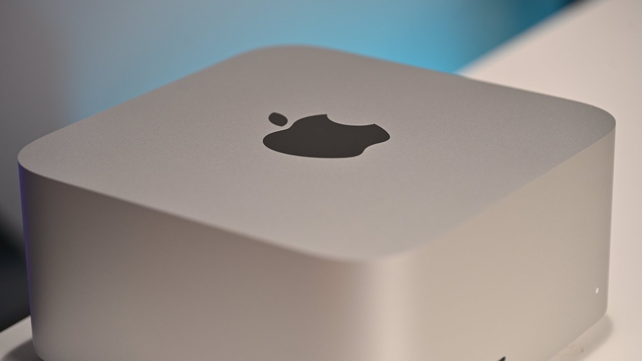







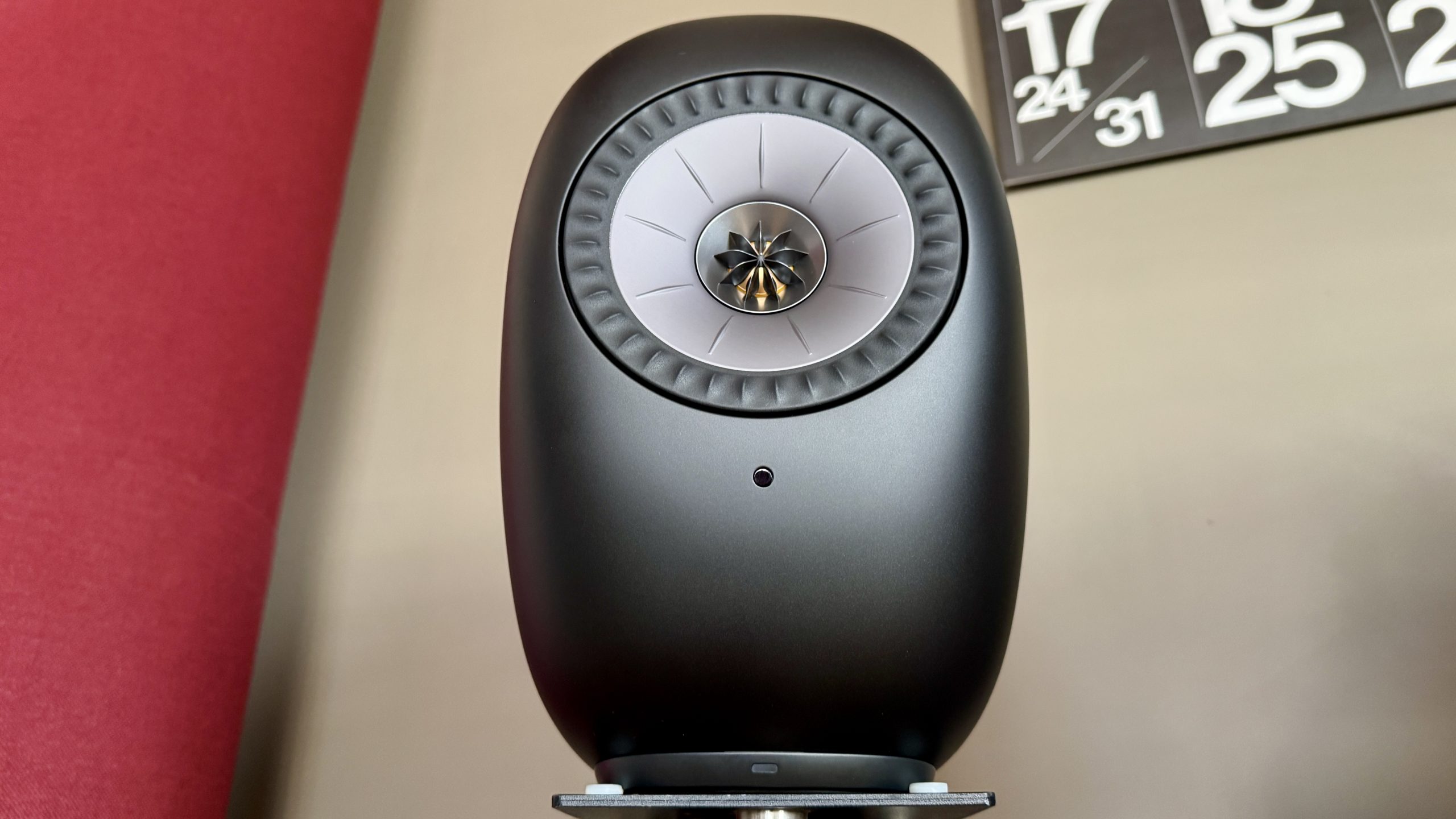



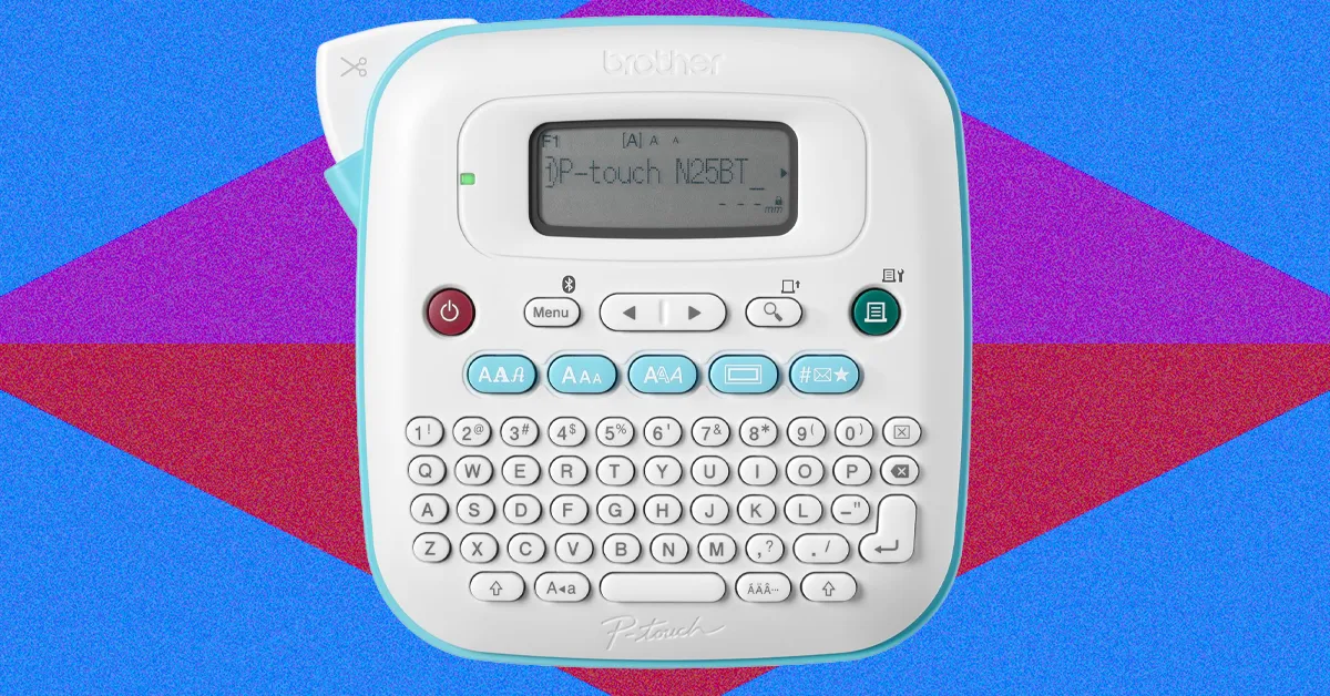
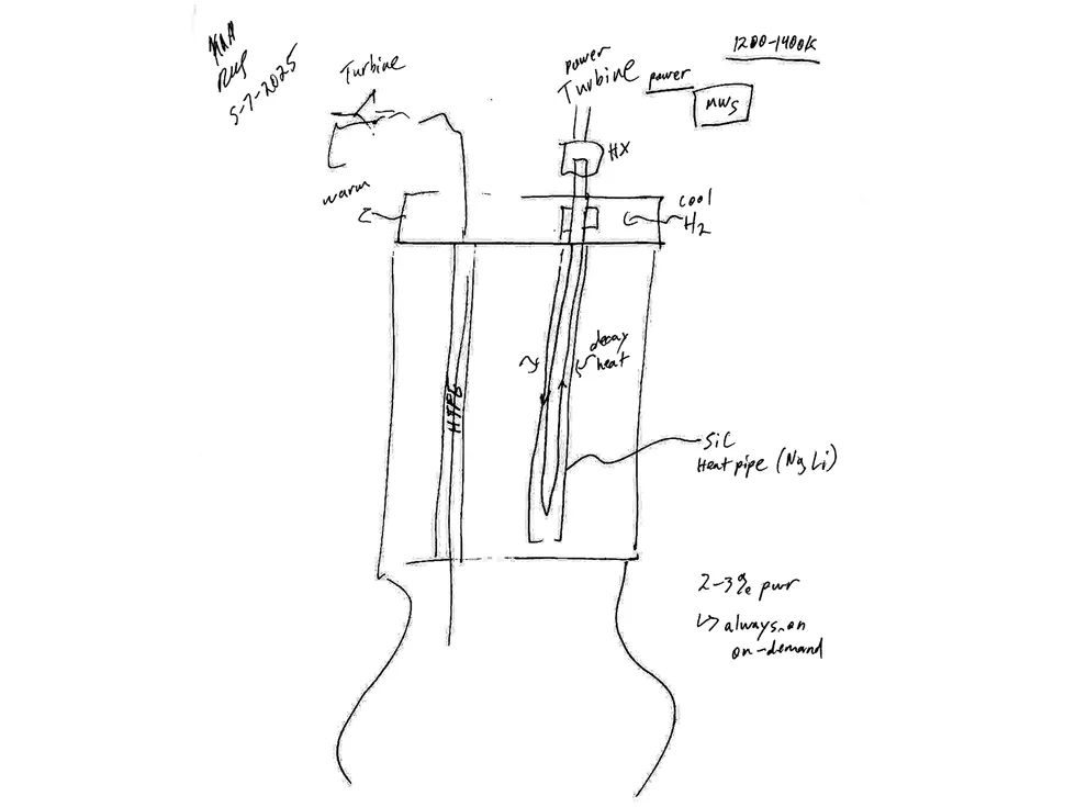

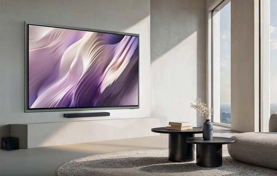
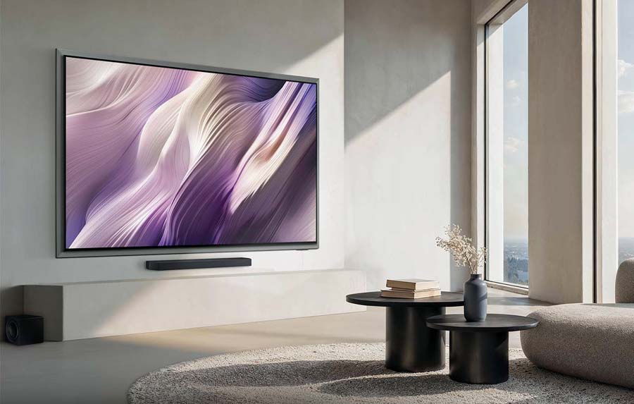
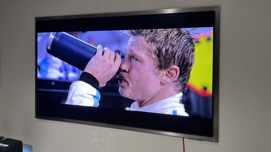
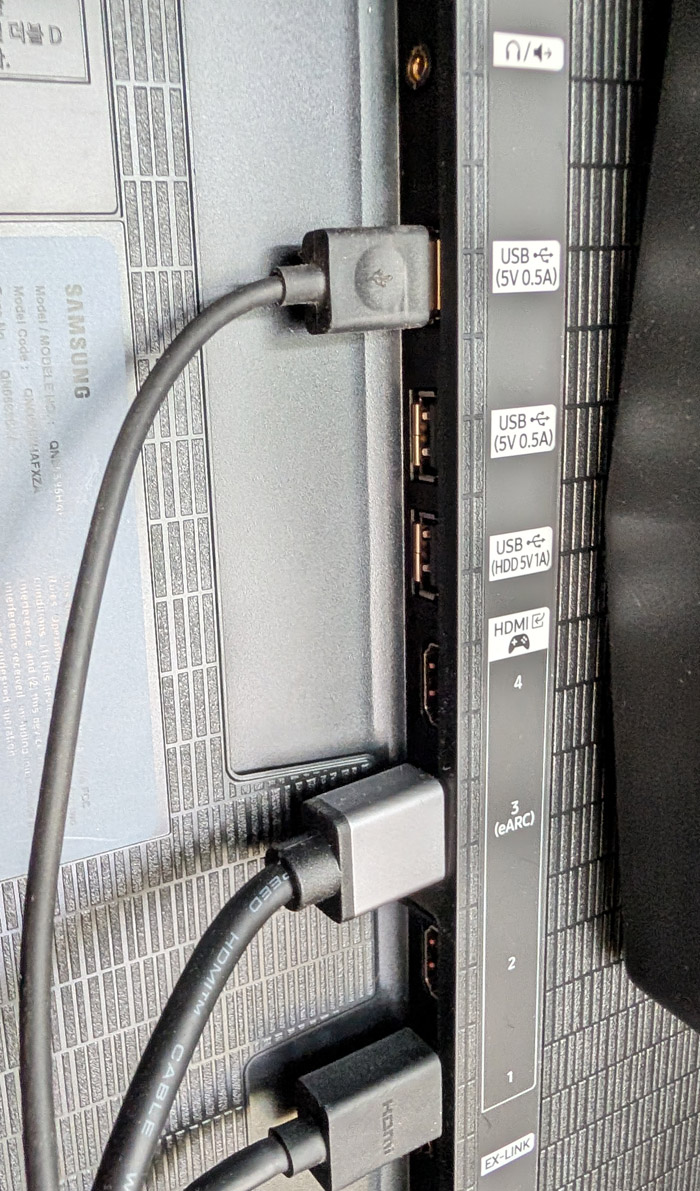
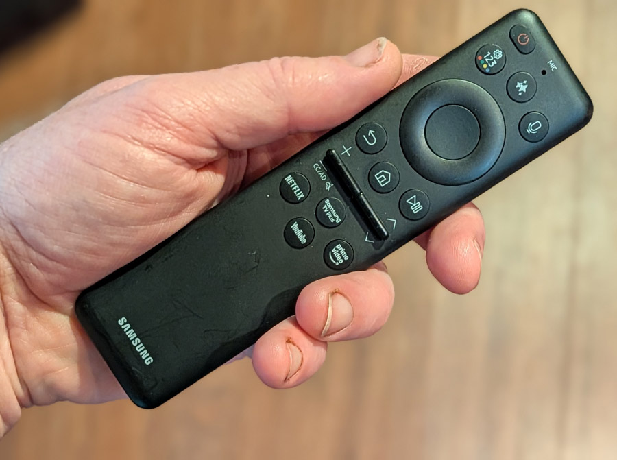

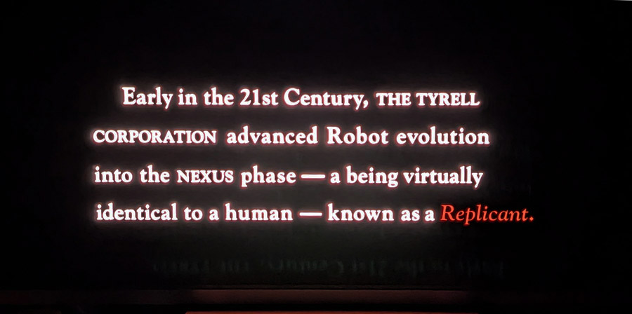
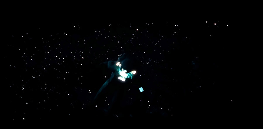
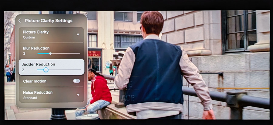
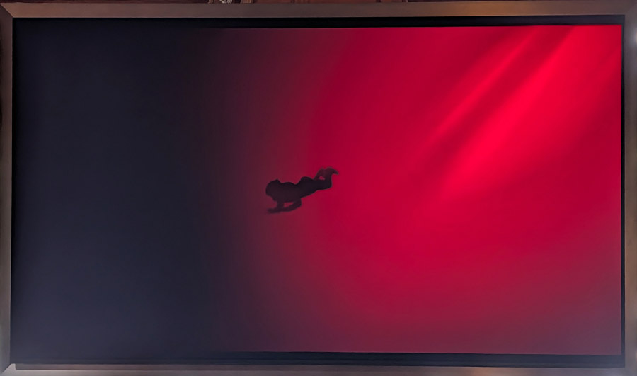
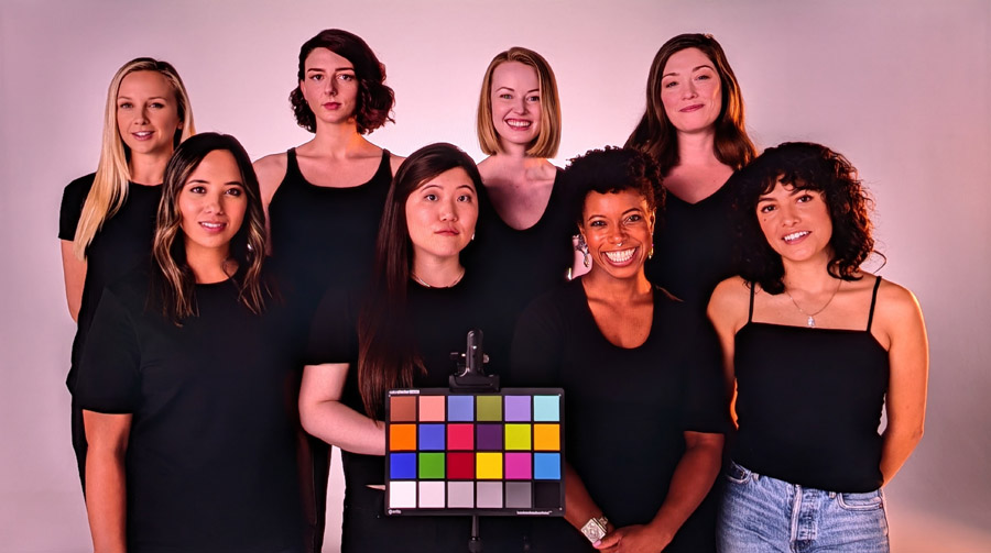


































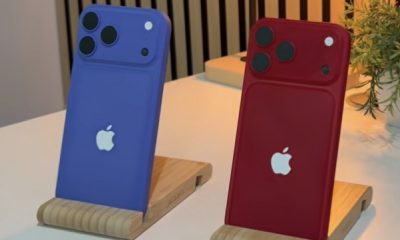








You must be logged in to post a comment Login