Connect with us
DAPA Banner
DAPA Coin
DAPA
COIN PAYMENT ASSET
PRIVACY · BLOCKDAG · HOMOMORPHIC ENCRYPTION · RUST
ElGamal Encrypted MINE DAPA
🚫 GENESIS SOLD OUT
DAPAPAY COMING

Tech

Siri is years late to the AI party, but it’s iOS 27 overhaul could still be a beta experience

Published

on

Apple is reportedly preparing one of the biggest Siri redesigns in years with iOS 27, but even after multiple delays, the company may still label the upgraded assistant as a beta product. According to reports from Mark Gurman of Bloomberg, internal test versions of iOS 27 already refer to the revamped Siri as a beta experience and include an option allowing users to leave the Siri beta entirely.

The move would be unusually familiar for longtime Apple users. When Apple originally introduced Siri in 2011, the assistant itself launched under a beta label before Apple quietly removed the branding in 2013. Despite that, Siri has continued to face criticism for lagging behind competitors in reliability, conversational abilities, and overall intelligence.

Apple’s AI catch-up strategy is taking longer than expected

The revamped Siri was originally expected to arrive in 2024 as part of Apple’s broader AI push. However, multiple reports now suggest the project has faced delays of nearly two years.

According to Gurman’s reporting, Apple is rebuilding Siri into a more advanced chatbot-style assistant capable of handling ongoing conversations, contextual memory, and deeper app integration. The redesign could also introduce a standalone Siri app, chat-style interactions similar to messaging apps, and integration with the Dynamic Island interface on supported iPhones.

Advertisement

The issue for Apple is timing. While Apple continues refining Siri, rivals like Google Gemini, ChatGPT, and other Android-based AI systems have already rolled out advanced conversational assistants with broader real-world capabilities.

That gap has increasingly made Siri feel outdated compared to competing AI products, especially as Apple continues marketing Apple Intelligence as a major part of the iPhone experience.

Why the beta label matters

If Apple officially launches the new Siri as a beta feature in iOS 27, it could serve two purposes. First, it gives Apple flexibility to continue refining the assistant publicly after launch while lowering expectations around bugs, hallucinations, or missing features. Second, it allows the company to release AI features sooner rather than waiting for a more polished final version.

The beta branding would also reflect the broader challenge Apple currently faces in AI. Unlike competitors that prioritize rapid deployment, Apple has historically focused more heavily on stability, privacy, and controlled rollouts.

Reports also suggest Apple is introducing stronger privacy controls into Siri’s AI experience, including optional auto-delete settings for conversation history.

What happens next

Apple is expected to reveal more about Siri’s redesign and its AI roadmap during WWDC next month. Developer beta versions of iOS 27 will likely be the first public look at the new Siri experience.

Advertisement

However, the larger question remains whether Apple’s slower, more cautious AI rollout can still compete in a market where rivals have spent the last two years aggressively pushing generative AI into mainstream consumer products.

For now, Siri’s overhaul appears less like a finished comeback and more like Apple finally arriving at the AI race – still mid-development.

Source link

Advertisement
Continue Reading
Click to comment

You must be logged in to post a comment Login

Leave a Reply

Tech

Fixing A Dodgy Cheap Audio DAC

Published

on

One of the attractions of buying at the bottom end of the electronics market by mail order from China is that you never quite know what will come your way. Sometimes it’s a diamond in the rough, while with others it’s a mess. Occasionally along comes something which should work but doesn’t, and that’s the moment when you wonder if you could fix it. [Nyanpasu64] had just such a device, an HDMI to VGA converter with audio that didn’t work. What could be wrong?

The HDMI to VGA chip has an onboard audio digital-to-analog converter (DAC), and it’s a delta-sigma design. This type of DAC is frequently used in audio applications because it works by shifting its switching frequency many times higher than the input sample rate, thus reducing considerably the distortion. This one wasn’t performing as advertised though, and the problem turned out to be that switching frequency being all over the output. Clearly the filter wasn’t working, which led to the design of a new filter. The write-up is therefore an extensive dive into filter design, and in part also a discovery of the effect of impedance on them.

For a super-cheap module to cause so much work, one might ask why not simply spend a few more dollars and get a better one. But had they done that we wouldn’t have seen this write-up, so we’re sticking with team cheap.

Advertisement

We’ve looked at audio DACs, in the past.

Source link

Advertisement
Continue Reading

Tech

A Brief History Of The Crazy Old 7-Segment Display

Published

on

How old is the seven-segment display? Surely it is a product of the 1970s. After all, calculators started showing up, and the height of junior high humor was plugging 7734 into your calculator and showing it to someone upside down. Of course, for it to go mainstream, maybe they really originated in the 1960s, but no earlier than that, right? Actually, no. Sure, the LED seven-segment display had to wait for LEDs. But the actual idea is much older than that.

The concept of building numbers from a small set of reusable segments predates LED displays by decades. In fact, the basic idea appears in patents from the early 1900s and may have roots in even older mechanical signs and printing techniques.

The history isn’t entirely straightforward. Unlike vacuum tubes or transistors, segmented displays evolved gradually through a series of practical ideas rather than one defining invention.

Blacking out the Eight

While looking into the history of segmented displays, I was reminded of something I’d seen years ago in retail stores: reusable price tags printed with rows of eights.

Advertisement

Rather than printing every possible price, the clerk simply used a marker to black out portions of each figure, transforming an 8 into whatever digit was needed. Cover a few strokes, and the eight becomes a three. Remove a different set, and it becomes a zero or a five. It was, in essence, a manual segmented display.

Finding the exact origin of these price tags is akin to finding out where Romans bought sponges. They were inexpensive commercial supplies, not the sort of products that historians carefully documented. My recollection is from the middle of the twentieth century, but the underlying concept is almost certainly older.

Everything New is Old Again

George Mason’s 1898 21-segment display used 21 lamps and a complicated switch to display any digit or letter in a very stylish font. You can see a modern recreation of these ancient displays in the video below. While this is the basic idea, certainly, it is more ambitious than a simple 7-segment display.

Advertisement

I couldn’t determine that Mason’s displays were ever used for anything.

You could argue that an early 1903 invention by Carl Kinsley to draw characters telegraphically using six pens was an even better precursor, but using magnets to draw with pens on tapes hardly seems to qualify as a display, although figure 12 in the patent clearly shows the formation of numbers and even letters with this arrangement.

Digits of Patent

The direct parent of modern segmented digit displays appeared in the early 1900s (filed 1908; granted in 1910). Technically, this was an 8-segment display because it had a bar dedicated to forming a proper four, with the top-left part slanted. But removing that one segment is just an optimization. It may or may not have been the first, but by 1910, seven-segment displays were in use and not just curiosities on a workbench or dreams in a patent application.

Even for lit-up displays, the first implementations weren’t LEDs. Early displays used incandescent lamps or neon-filled tubes. By the 1930s and 1940s, segmented neon or incandescent indicators were appearing in industrial equipment and counters, instead of the common columns of ten neon bulbs, pointers, or rotating wheels.

Advertisement

Then, too, there were different approaches. Nixie tubes used individual character forms that lit up. Decatrons could count with ten different glowing points, each representing a digit.

Enter the LED

The real explosion came in the late 1960s when practical LED displays arrived. Suddenly, segmented displays could be compact, rugged, inexpensive, and operate at low voltages. Calculators, clocks, frequency counters, digital multimeters, and every imaginable piece of consumer electronics adopted them almost overnight.

Of course, it wasn’t just LEDs. Numitrons used seven tiny incandescent filaments. Vacuum fluorescent displays used segments with phosphor that glowed when excited. LCDs adopted the same pattern, blocking or passing light to produce the segments. But the key idea was something that lights up, arranged in seven segments.

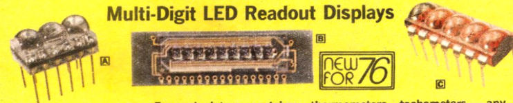
Radio Shack’s 1976 catalog featured magnified LED displays.

Early LED displays often had all the diodes on a single die to reduce cost. That made them very tiny. It wasn’t unusual to see displays with magnifying bubbles to make it easier to read.

The important point isn’t whether they used exactly seven segments. Many didn’t. Some divided the numerals differently or used additional pieces to produce more attractive typography. The insight was the same: begin with the most complex digit and selectively remove strokes to create all the others.

Advertisement

Why Seven?

One of the reasons seven segments became the standard is that they strike a perfect balance (although not everyone agrees, as you can see in the video below). With fewer than seven elements, several decimal digits become difficult to distinguish. Adding more segments certainly improves appearance, but every additional segment increases wiring, decoding logic, manufacturing cost, and the number of possible failure points. Seven is the right number for — um — numbers. But what about letters?

You can make some compromises to show some letters. For example, old computers would display hex digits using seven segments, but the A would be uppercase and the B would be lowercase. You also had to light the top segment for the 6 to make it look different from a B. But you only need A-F for hex. If you need, say, the letter S, there’s no real way to make it not look like a 5 with 7 segments. But sometimes, the letters you can make are good enough.

Advertisement

There were also 8- and 9-segment displays that could do better with letters and special characters. You can increase the segments further to get more glyphs.

The Union Jack

Different segment counts for displays (public domain by [errorage])

The solution for full letter displays was to add more segments. Despite Mason, you didn’t really need 21. By the 1970s, fourteen-segment and sixteen-segment displays had become common in instruments, telephones, calculators, and video cassette recorders. Their pattern of diagonals and crossbars earned them the nickname “Union Jack” display because the arrangement resembles the British flag. These are also sometimes called starburst displays. You occasionally see 16-segment displays, too.

Even Today

Today, you have a plethora of options for adding alphanumeric screens to just about anything. Yet, you still see 7-segment displays hanging around.

The seven-segment display isn’t successful because it’s beautiful. It isn’t even especially flexible. It’s successful because it’s close to the minimum solution that works. It delivers readable numbers with very little hardware, whether the technology behind it is incandescent bulbs, neon, vacuum fluorescence, LEDs, LCDs, or even ink on a printed price tag.

Perhaps that’s why it has survived every technological transition for more than a hundred years. Good engineering ideas often outlive the technologies that first bring them to life.

Advertisement

And once you start looking for segmented displays, you’ll notice they’ve been hiding in plain sight for much longer than the digital age.

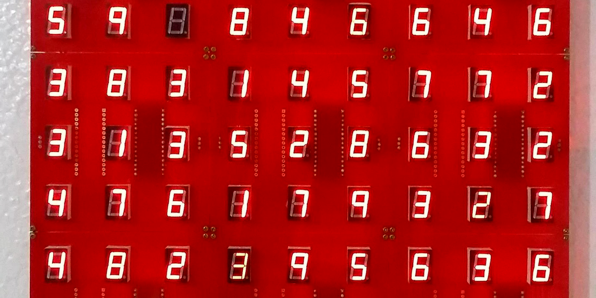
Featured image: [Arduino Enigma]’s marvelous Seven Segment Art Installation

Source link

Advertisement
Continue Reading

Tech

The enterprise AI challenge nobody solves with code generation alone

Published

on

Presented by SAP


Generating code with AI is fast, but getting that code to run reliably inside a large enterprise, integrated with live systems, governed for compliance, and maintainable over years requires foundational work that most organizations underestimate.

While 81% of all organizations have a detailed strategy, only 12–16% reach AI‑driven execution, says SAP’s Michael Ameling, CPO of SAP Business Technology Platform, and the reasons rarely come down to the quality of the generated code.

“Across industries, enterprises that have invested heavily in AI tooling are hitting a wall when generated code meets the reality of their existing environments, because generating code and operationalizing it are not the same problem,” Ameling says.

Advertisement

There are specific requirements for deploying AI-generated logic at enterprise scale: what data and integration readiness actually look like, how governance works when AI agents move from producing recommendations to executing workflows, and how development teams are changing their role as AI takes over more of the coding work.

Why AI code generation fails in enterprise production environments

The productivity gains from AI code generation are real and well-documented, but the ease of prototyping has given many organizations a misleading sense of how far along they actually are.

“Generating code is one thing,” Ameling says. “Enterprise customers, including multinationals and large organizations, need to ensure there are no compromises in compliance or security. Code that runs reliably for ten or twenty years, as it does at many of SAP’s largest customers, also has to be maintained, patched, and understood by whoever inherits it. Life cycle management, in other words, does not generate itself.”

The issue is rarely the generation quality. Teams build something compelling, then discover they lack access to the data it depends on, or the integrations it assumes, or the permissions required to run it in a real environment. The problem is essentially that AI amplifies an organization’s existing data and process maturity, but it can’t substitute for it.

Advertisement

This dynamic intensifies as AI moves from producing code to executing actions. Latency, cost, and system load all increase when logic runs continuously against live data rather than rendering a one-time output. The performance requirements of an autonomous agent operating across a multinational’s transaction systems are categorically different from those of a developer copilot.

How to connect AI-generated logic to fragmented enterprise systems

The architecture challenge that most enterprise AI projects underestimate is integration. Real enterprise environments are not clean slates: they combine cloud systems, legacy on-premise infrastructure, fragmented data stores, and dozens of business applications that were never designed to talk to each other. Getting AI-generated logic to operate reliably across all of them requires a layer that unifies data access, process context, and governance, and it has to be in place before any agent starts executing. And organizations that see AI as a reason to defer infrastructure modernization are making a mistake.

“The question is not whether to modernize or not. Of course you need to modernize,” Ameling says. “But the value you get on top of this is much higher with AI. Federated data access and harmonized process layers are not alternatives to upgrading a fragmented landscape, they’re what make the upgrade worthwhile.”

At the platform level, this translates into a set of practical requirements: structured data integration, end-to-end process visibility, and the ability to discover and connect to APIs across both modern and legacy systems. SAP’s approach with the Business AI Platform draws on tools including its Joule Studio, Integration Suite, Business Data Cloud, and SAP AI Agent Hub enterprise architecture layer to provide that context. The goal is to give AI-generated logic accurate, current knowledge of what a business is doing and how, rather than just access to raw data.

Advertisement

AI agents handle large challenges by dividing them into smaller, autonomous tasks, with each agent responsible for a specific domain, and all coordinated toward a shared outcome. A financial close, for example, involves dozens of discrete sub-processes. Agents handling each task in parallel, within defined constraints, can compress cycle times dramatically, but only if the underlying systems they interact with are coherent and accessible.

The governance and oversight that AI agents require in production

When AI moves from assistant to operational actor, the governance questions loom large, because agents that trigger workflows, update records, and interact with live business systems need the same accountability framework that applies to human employees, i.e., identities, defined privileges, and auditable behavior.

There are two distinct models:

Principal propagation, where an agent acts on a user’s behalf, inheriting that user’s permissions and scope.

Advertisement

System-triggered agents, where the agent operates under its own identity and role-defined privileges, functioning more like an automated HR role than a personal assistant.

Both models require the same underlying infrastructure: an agent hub where operators can see which agents exist, what APIs they can access, and what they are authorized to do. Observability also needs to be operationalized correctly for AI, combined with both technical and business evals.

“In production, openness is very important,” Ameling says. “We use OpenTelemetry as a framework, so we can integrate with other solutions, for end-to-end observability of the tool, third-party agents and the like.”

On top of that, standard technical evals, which test whether an agent produces consistent outputs, are necessary but not enough. Business evals assess whether an agent is actually moving the performance indicators it was deployed to improve, but it has to work end-to-end.

Advertisement

Where the testing happens is equally important. The traditional software development cycle across dev, test, and production environments breaks down when a model produces different outputs depending on whether it is running against test data or live data. Getting to trustworthy AI in production means accepting that validation looks fundamentally different from what engineering teams have practiced for decades, with live environment testing, even A/B/C testing to ensure outcomes are reliable.

How AI-driven code generation is changing software engineering roles

The role of the developer is not disappearing in this environment, but its center of gravity is shifting. The productivity multiplier is significant when developers can run multiple coding agents in parallel across open terminals, each working on a separate problem and each taking several minutes to complete. But it introduces a new kind of cognitive demand, because humans have to stay in the loop. That means tracking context across concurrent workstreams, evaluating outputs that range across large codebases, and making architectural judgments that no agent can be trusted to make alone.

“The more specific and complete the prompt, the less intervention is required, and developers are learning that bringing more context upfront pays dividends in reduced back-and-forth,” Ameling says. “But the output still needs to be understood, not just accepted.”

The competitive edge will remain intellectual property, not tooling. The companies that pull ahead will be those that most effectively encode their domain knowledge into the systems they build.

Advertisement

“A manufacturer’s process expertise, a financial institution’s risk logic, a logistics firm’s routing intelligence, these are the assets that AI can accelerate, but only if the organizations that hold them do the work to make them accessible and usable,” Ameling says. “Protect that, and apply AI to accelerate your differentiation.”


Sponsored articles are content produced by a company that is either paying for the post or has a business relationship with VentureBeat, and they’re always clearly marked. For more information, contact sales@venturebeat.com.

Source link

Advertisement
Continue Reading

Tech

Lenovo IdeaPad Slim 3 deal is a ‘great value’ fuss-free work laptop

Published

on

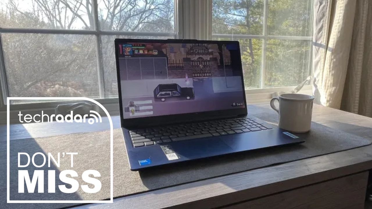
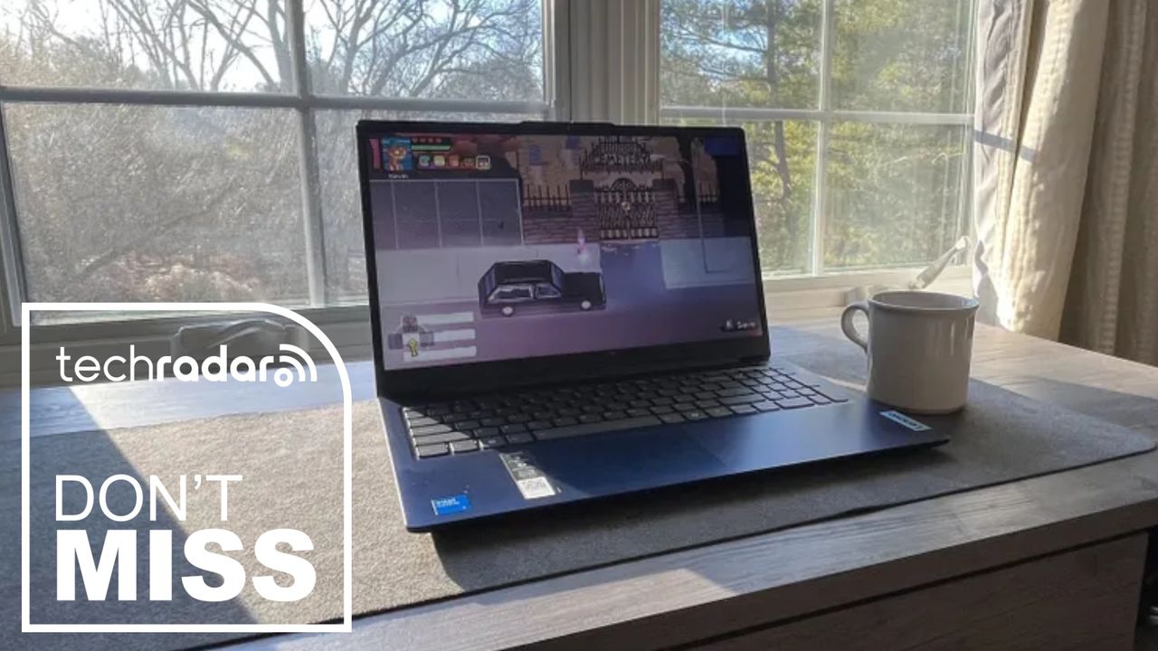
If you just need a reliable Windows laptop for everyday use, this Lenovo deal is a genuinely good price – it’s an easy recommendation for remote and hybrid workers, and for my money, it ticks all the boxes for general business work.

So, right now, the Lenovo IdeaPad Slim 3i has dropped to £499 (was £599) at Argos. For an all-rounder business laptop, this one of the best budget picks around for under £500.

Inside, the machine is equipped with an efficient Intel Core i5 13420H processor and 16GB RAM, so essential office tasks, photo editing, browsing, and streaming won’t be a problem – no slowdowns or sluggishness here.

Advertisement

Today’s top Lenovo laptop deal

This is a budget-friendly configuration built around Intel’s Core i5-13420H, an 8-core, 12-thread chip from the 13th-gen Raptor Lake-H family, with four performance cores boosting up to 4.6GHz and four efficiency cores.

The 15.3in WUXGA (1920×1200) IPS panel uses a 16:10 aspect ratio, which gives you a bit more vertical space for documents and browsing than the more common 16:9 laptops in this price range. It’s rated at 300 nits with an anti-glare coating, with decent contrast and color accuracy (provided you calibrate it). That makes it ideal for creating images for, say, your work’s social media pages, though I wouldn’t recommend it for colour-critical tasks required by creative professionals.

16GB of RAM and a 512GB SSD is a sensible balance for this price point — enough headroom for normal multitasking across browser tabs, office apps, and streaming without feeling cramped. The laptop weighs 1.59kg and measures 17.9mm thick, with Lenovo quoting up to 14.5 hours of battery life, though real-world use — especially on the Intel variant — will likely fall short of that figure.

Advertisement

Connectivity is fairly standard for the budget class: two USB-A ports and one USB-C port, all capped at 5Gbps, plus HDMI 1.4 (so no native 4K60 output — you’ll need the USB-C port’s DisplayPort Alt Mode for that), a full-size SD card reader, and a 3.5mm headphone jack. Wi-Fi 6 and Bluetooth round out the wireless side.

Also consider

Source link

Advertisement
Continue Reading

Tech

I Built the Chemistry Platform I Needed in My Own Classroom

Published

on

As a current high school student, the first thing I noticed about chemistry was that it was not only hard because of math or vocabulary. It was hard because so much of it was invisible.

In class, I could write a chemical formula. I could memorize that a molecule had a certain shape or that a reaction moved in a certain direction. But much of chemistry did not feel like something I could touch, move, test, or explore. The most important parts happened in a way I would never see.

A Two-Dimensional Perspective

Chemistry is a subject built on relationships. Atoms connect, electrons move, bonds form, molecules bend, acids and bases shift equilibrium, gases respond to pressure and temperature, and reactions balance because matter must be conserved. When those ideas stay flat on a page, students memorize answers without understanding the system behind them.

Advertisement

As a rising 12th-grade student at Suitland High School in Prince George’s County, Maryland, I set out to build a solution because I wanted a serious chemistry workspace students like me could use. I wanted something visual and interactive that could run on school devices without complicated setup — without the need for students to create accounts, download resources, or collect student data. I also wanted something that could open in a browser and allow students to begin learning right away.

Atomency started from a simple question: What would chemistry look like if students could build, manipulate and test ideas instead of only reading about them?

I began by building a workspace where students could create molecules and see structure-based information. From there, I added VSEPR-style analysis so students could connect formulas to molecular geometry instead of treating shapes as something to memorize from a chart. Then I kept expanding it: I incorporated reaction simulations, nuclear decay tools, kinetics tool, acid–base and pH tools, gas-law models and assignment workflows to help teachers bring the platform into the classroom.

I built all of this independently while still being a high school student. That meant I was not just designing a product in theory; I was building from inside the problem. I knew what it felt like to sit in a classroom and need a better way to see what was happening. I knew what it felt like when a concept almost made sense, but the missing piece was the ability to interact with it.

Advertisement

A Three-Dimensional Solution

Students usually receive educational tools instead of imagining or creating them. But students notice things adults can miss. We notice when a website is too slow on a school Chromebook. We notice when a platform requires an account before we can try it. We notice when a tool looks impressive in a presentation but does not align with the way a classroom actually works.

Access shaped how I built Atomency. A chemistry platform should not require expensive software or perfect devices. It should not require students to provide personal information. It should not assume all students have tutors, can pay to access resources, and have personal laptops powerful enough to run advanced programs. If a tool is meant to help students, it should reflect students’ reality.

For me, that reality was a public school classroom where students needed more ways to understand chemistry. Chemistry can become a gatekeeping subject. If students fall behind early, later topics become harder because everything builds on earlier ideas. Atomic structure connects to bonding. Bonding connects to molecular geometry. Geometry connects to polarity. Reactions connect to stoichiometry and equilibrium. Once one link in that chain breaks, the whole subject can start to feel impossible.

Advertisement

I wanted Atomency to help repair those links by making the relationships clearer. Instead of only telling students that a molecule has a certain shape, the platform can help them see how structure connects to geometry. Instead of only practicing reaction-balancing in steps, students can work with reactions as systems. Instead of treating acids, bases, gases, kinetics and nuclear decay as separate units, students can see chemistry as a connected field where patterns repeat in different forms.

Early usage showed me that students and teachers were looking for a platform like this. Atomency’s aggregate GoatCounter analytics indicated 25,162 visits from Feb. 24 to May 24, 2026, with strong engagement in the builder and simulations, the molecular workspace where students can create molecules and see structure-based information. This mattered to me not because it made the platform look popular but because it showed that people were using the parts of the platform that matched the original reason I built it: to give students a place to experiment with chemistry visually.

Atomency has been featured by Eric Curts in Control Alt Achieve and mentioned by Middle School Matters. My AP Chemistry teacher, Dr. Glenn Soltes, described the platform as having meaningful instructional potential. These moments helped me understand that the platform was not just something I made for myself. Other educators could see value in it too.

Still, the biggest lesson I learned was that students should be taken seriously as designers of learning environments. We are close to the problems because we experience them every day. When students say a tool is confusing, inaccessible, slow or disconnected from the way they learn, that feedback is not a complaint. It is design information.

Advertisement

Educational technology should not only be built for students but also with students and by students. That does not mean every student must become a software developer. It means schools and education companies should recognize that students have insight, creativity and lived experiences that can improve tools inside real classrooms.

I built Atomency because I needed a better way to learn chemistry. But as the platform grew, it became about something larger than my own classroom. It became a way to ask what happens when a student is trusted not only as a learner but also as a builder.

Chemistry became easier for me to understand when I could make it visible. Maybe school technology can become better when student experience becomes more visible too.

Source link

Advertisement
Continue Reading

Tech

The 1X Neo Robot Has Freaky Fast Fingers

Published

on

Friendly home robots have been the dream of sci-fi for a long time. Docile, helpful machines that do your laundry, take out the trash, maybe make dinner, and clean up afterward too. But if robots are going to do all that, they’re going to need some hands to make all that happen.

1X, a Norwegian-American robotics company, today revealed details about the five-finger hands attached to its soft, helpful robot companion, Neo.

The hands are built with actuators designed to replicate how tendons in the arms move human hands. 1X says this gives Neo’s hands 25 degrees of freedom of movement, which is just a little less than the 27 degrees of freedom human hands usually have. Cameras and AI smarts help sort out the broader context of what the fingers are trying to grab. It’s a dexterous mix that gives the Neo bot a very broad range of motion. 1X says the hands can grip odd shapes and detect when something is slipping out of its grip. The fingers can also move extremely quickly and hyperextend in directions human digits can’t. They also have an IP68 waterproof rating, meaning the robot can wash its own hands.

Courtesy of 1X

Advertisement

It’s a range that the engineers have aimed to dial in to align with what a human can actually do. Jonathan Terfurth, 1X’s director of actuators and hands, says the range of motion might even be better than a human’s, enabling it to open doors, lift heavy objects, and even plug itself in when its battery starts to die.

“You want to be able to operate with a human who has never worked or interfaced with a robot, and you still want it to be safe and compliant and soft,” Terfurth says. “Range of motion can be a bit extreme, but we try to be very close to what humans can do so that we can live in the world.”

Together, this is part of a growing ChatGPT-esque moment for robotics, where bots have gone from clumsy claw machines to capable handlers, able to gently carry fragile objects and become increasingly helpful for managing menial daily tasks and boring office chores.

The humanoid robot market tends to be dominated by tough, hulking Terminators meant to be paraded out for some defense industry contract or another. 1X is taking a different tack for its robot. The Neo is a soft, supple robot wrapped in a 3D lattice shell. Its design is inspired by characters like Baymax, the affable robot from the Disney movie Big Hero 6. In limited quantities, early access pricing is $20,000 or $500 per month to have it in your home, though the lump sum will prioritize delivery for 2026.

Advertisement

Source link

Continue Reading

Tech

Echodyne opens $40M radar factory near Seattle to meet booming demand for drone detection

Published

on

Echodyne CEO Eben Frankenberg, left, gives a tour of the company’s new manufacturing facility in Woodinville, Wash., to U.S. Rep. Suzan DelBene, center, and Sen. Maria Cantwell on Wednesday. (Echodyne Photo)

Echodyne, the Seattle-area radar-platform company, cut the ribbon Wednesday on a new $40 million manufacturing facility designed to meet growing demand for its drone-detection and airspace-monitoring systems.

Headquartered in Kirkland, Wash., Echodyne is opening an 86,350-square-foot manufacturing and operations hub in nearby Woodinville, Wash., that it says will eventually be able to produce more than 2,500 radars each month — or roughly 30,000 radars annually.

Echodyne says the expansion is fueled by U.S. and global demand for safety and security radars that can detect and track drones, driven in part by their proliferation on the battlefield in the Russia-Ukraine War and the fast-growing “low altitude economy” of commercial drone operations that require airspace monitoring.

Echodyne currently employs 260 people, and the new facility will support more than 100 new jobs and up to 200 as the facility reaches full production capacity, according to the company.

“Our global customer base is demanding more radar to be delivered as fast as possible,” CEO Eben Frankenberg said in a news release, adding that the proliferation of drones requires reliable, at-scale production. “The only way to defend against mass is with mass.”

Advertisement
Echodyne plans to add 100 new jobs at its new manufacturing facility in Woodinville, Wash. (Echodyne Photo)

Echodyne was spun out of Bellevue-based Intellectual Ventures in 2014 and has drawn backing from Microsoft co-founder Bill Gates, along with NEA, Madrona Venture Group, Baillie Gifford and Northrop Grumman, among others. The company raised $135 million in a 2022 investment round and total funding is $200 million.

The company’s radar systems rely on patented “metamaterials” technology — a flat-panel antenna that can electronically steer its beam without any moving parts — which Echodyne says allows for smaller, cheaper radar than conventional designs.

Echodyne originally focused on using compact radar to help drones detect and avoid obstacles in flight, before pivoting toward counter-drone security as demand grew for systems that could track other drones — including cheap, mass-produced ones deployed on the battlefield in Ukraine.

Echodyne’s radar technology is integrated into systems from Anduril, Axon, Moog and Northrop Grumman, among other defense companies, the company said. Most recently, Echodyne was selected as the primary radar provider for Trust Automation’s drone-detection platform, which is being delivered to the U.S. Air Force under a $490 million contract.

Wednesday’s ribbon cutting was attended by Sen. Maria Cantwell, U.S. Rep. Suzan DelBene, Woodinville Mayor Sarah Arndt, and Michael Robbins, president and CEO of AUVSI, the trade association for the uncrewed systems, autonomy, and robotics industry.

Advertisement

The new hub allocates approximately 74,350 square feet to manufacturing space and 12,000 square feet to warehousing.

Cutting the ribbon on Echodyne’s new manufacturing facility, from left: Sen. Maria Cantwell, U.S. Rep. Suzan DelBene, Echodyne CEO Eben Frankenberg, and AUVSI President and CEO Michael Robbins. (Echodyne Photo)

Source link

Continue Reading

Tech

Mobile Fidelity Announces Rush Audiophile Vinyl and SACD Reissue Series Covering 1974 to 1985

Published

on

Mobile Fidelity Sound Lab is giving Rush’s classic 1974 to 1985 studio run the audiophile treatment with a multi-year reissue campaign on UltraDisc One-Step vinyl, 45RPM 2LP sets, and Hybrid SACD, beginning this summer with Fly By Night and A Farewell to Kings. I have not stopped grinning since seeing Grace Under PressureMoving Pictures, and Power Windows on the schedule. Take my money, MoFi. Take it now.

Rush fans have spent decades arguing over pressing variations, bass pedals, drum fills, Ayn Rand references, and whether Signals still gets treated unfairly because the keyboards started ordering bottle service. Mobile Fidelity Sound Lab has now handed them fresh material to debate for the next 30 years.

By the time the arguments over these new editions are finally settled, Geddy and Lerxst may well be reunited with the Professor somewhere beyond the drum riser — or, more appropriately, in some old-school basement in Willowdale, Ontario, where the amps are too loud, the time signatures are suspicious, and nobody has any interest in playing it safe.

This is not the entire Rush catalog, and it does not include the band’s later Atlantic-era albums. The series focuses on the first decade-plus of Rush’s recorded evolution, from the bluesy hard rock of Rush and Fly By Night to the widescreen progressive architecture of 2112A Farewell to KingsHemispheresPermanent WavesMoving PicturesSignalsGrace Under Pressure, and Power Windows.

Advertisement

According to the announcement, most titles in the series will be released as UltraDisc One-Step vinyl sets, while every title in the campaign will receive a numbered Hybrid SACD edition. The first wave begins in summer 2026 with Fly By Night and A Farewell to Kings, followed by Rush in fall 2026. The remaining titles are scheduled to roll out through 2028.

mofi-rush-farewell-kings-one-step-2026

The timing is not exactly subtle, and that is the obvious part. Rush are back in the public conversation in a way many fans probably never expected after the final R40 show at the Forum in Los Angeles on August 1, 2015, and Neil Peart’s death in January 2020. The Fifty Something tour is not Rush trying to pretend nothing changed. It is Geddy Lee and Alex Lifeson stepping back onto the stage together after 11 years, carrying the music forward while honoring the friend, lyricist, drummer, and impossible standard who made the whole thing feel larger than rock music.

The tour is presently on a short interruption after Geddy Lee was diagnosed with laryngitis and bronchitis, forcing the postponement of two Fort Worth shows originally scheduled for June 30 and July 2. Those concerts have been rescheduled for July 11 and July 13, with the tour currently listed to continue in Chicago on July 16.

That makes the MoFi announcement feel less like a random catalog exercise and more like a very calculated moment. Rush are selling tickets, reintroducing their music to arena audiences, honoring Neil Peart’s legacy, and bringing Anika Nilles into one of the most intimidating drum chairs in rock history. At the same time, MoFi is preparing premium physical editions for the exact period of the catalog most likely to send Rush collectors into pre-order behavior normally associated with emergency storm preparation.

Advertisement

Pricing and Formats

MoFi’s current product listings confirm the pricing for the initial releases.

Fly By Night is listed as a numbered 180g 45RPM 2LP set priced at $59.99, with the numbered Hybrid SACD priced at $34.99.

A Farewell to Kings is getting the deluxe treatment first, with MoFi listing it as a limited UltraDisc One-Step 180g 45RPM 2LP box set priced at $125. The Hybrid SACD edition is listed at $34.99.

Advertisement. Scroll to continue reading.
Advertisement

The 1974 debut Rush, scheduled for fall 2026, is listed as a numbered 180g 45RPM 2LP set at $59.99, with the Hybrid SACD priced at $34.99.

That gives buyers a fairly clear pricing structure for the first wave: standard 45RPM 2LP editions at $59.99, Hybrid SACDs at $34.99, and UltraDisc One-Step titles at $125 when the album receives that treatment. Future title pricing has not yet been fully confirmed by MoFi, so assuming every later One-Step title will remain at the same price would be a little too enthusiastic, even for Rush fans who can count in 7/8 before coffee.

The Mastering Chain Matters

There is another important detail here: MoFi is being specific about the mastering chain on the listed vinyl titles. The Fly By Night 45RPM vinyl page lists the source chain as “1/4” / 15 IPS analog master to DSD 256 to analog console to lathe.” The Rush debut vinyl listing specifies “1/4” / 15 IPS Dolby A analog master to DSD 256 to analog console to lathe.”

That means these are not AAA vinyl reissues. They are sourced from analog master tapes with a DSD 256 step in the chain before the analog console and lacquer cutting. For some collectors, that will be a deal-breaker. For others, it will be less important than the quality of the tapes, mastering choices, pressing quality, and whether Geddy Lee’s bass finally gets the scale and articulation it deserves without turning the upper midrange into a dental procedure.

Advertisement

MoFi also says A Farewell to Kings was mastered at its California studio from tape boxes marked with both “master” and “safety copy,” pressed at Fidelity Record Pressing, and limited to 5,000 numbered copies in the UltraDisc One-Step 45RPM 2LP box set configuration.

Why These Albums Matter

The 1974 to 1985 window is the logical Rush era for this kind of treatment. It captures the band’s most dramatic transformation: the raw bar-band thunder of Rush, the arrival of Neil Peart on Fly By Night, the growing ambition of Caress of Steel, the breakthrough scale of 2112, the fantasy and architecture of A Farewell to Kings and Hemispheres, the leaner precision of Permanent Waves, and the commercial and sonic peak of Moving Pictures.

Then things get more complicated, which is usually where Rush became more interesting. SignalsGrace Under Pressure, and Power Windows pushed the band deeper into synthesizers, sequencers, colder textures, and more layered production. Some listeners still want to pretend that was some kind of betrayal. They are wrong, but at least they are persistent.

For MoFi, those albums present different challenges. The earlier titles need weight, separation, and better organization without sanding off the urgency. The later albums need clarity and space without making the production sound sterile. Rush records are not supposed to sound polite. They need precision, but they also need velocity.

Advertisement

2026 Rush Audiophile Reissue Schedule

  • Fly By Night (1975): 45RPM 2LP and Hybrid SACD, coming summer 2026
  • A Farewell to Kings (1977): UltraDisc One-Step 2LP and Hybrid SACD, coming summer 2026
  • Rush (1974): 45RPM 2LP and Hybrid SACD, coming fall 2026

2027 to 2028 Rush Audiophile Reissues

  • Caress of Steel (1975): 45RPM 2LP and Hybrid SACD
  • 2112 (1976): UltraDisc One-Step and Hybrid SACD
  • Hemispheres (1978): UltraDisc One-Step and Hybrid SACD
  • Permanent Waves (1980): UltraDisc One-Step and Hybrid SACD
  • Moving Pictures (1981): UltraDisc One-Step and Hybrid SACD
  • Signals (1982): UltraDisc One-Step and Hybrid SACD
  • Grace Under Pressure (1984): 45RPM 2LP and Hybrid SACD
  • Power Windows (1985): 45RPM 2LP and Hybrid SACD

The Bottom Line

2026 Rush Tour

The MoFi Rush series arrives at exactly the right moment. Rush are back on the road, the Fifty Something tour has reignited interest in the band’s catalog, and the presence of Anika Nilles has added a new chapter to a story many fans assumed had ended with Neil Peart’s final performance.

The audiophile angle also makes sense. Rush records are built on musicianship, density, movement, and tiny details that disappear quickly when the mastering gets too compressed, too bright, or too polite. If MoFi gets this right, the series could become one of the most important rock reissue campaigns of the next few years.

It will not be inexpensive. The SACDs are the most accessible path at $34.99 each, while the 45RPM 2LP sets are priced at $59.99 and the One-Step titles begin at $125. But this is Rush, not a forgotten soft-rock side quest from 1978. The audience is there, the tour has put the band back in the spotlight, and the catalog deserves serious treatment.

Just remember: all titles are getting Hybrid SACD editions, but not every album is getting the UltraDisc One-Step treatment. That difference matters. So does the DSD 256 step in the vinyl mastering chain. Rush fans notice details. Our review copies are expected shortly.

Advertisement. Scroll to continue reading.
Advertisement

Where to pre-order: mofi.com

Source link

Advertisement
Continue Reading

Tech

Price rises likely as iPhone 18 Pro Max will cost $300 more to make

Published

on

If a new estimate is correct, and we suspect it is, then Apple is paying dramatically more to produce each iPhone 18 Pro Max compared to its predecessor, and that will mean price rises of $200 or more.

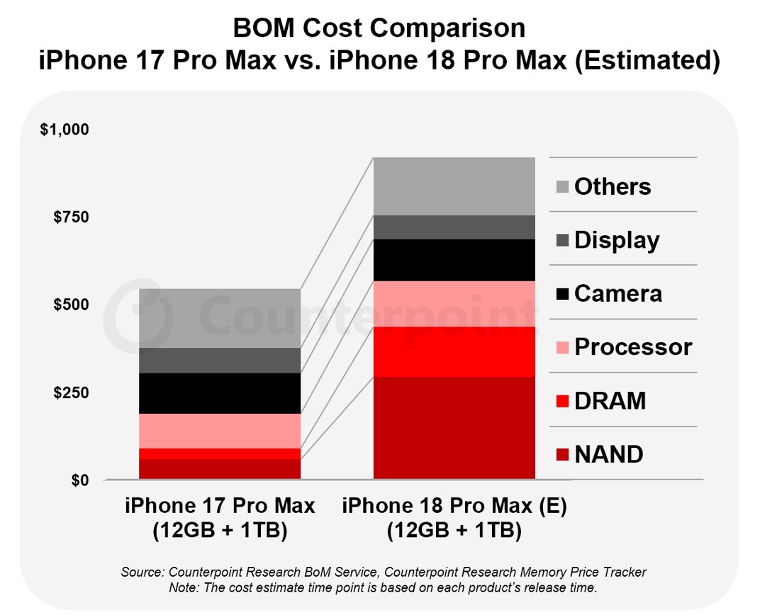
Apple left all iPhone models untouched in its recent and unprecedented price rise, but it was already likely that the forthcoming iPhone 18 Pro range would be affected. Now according to estimates from Counterpoint Research, the bill of materials (BOM) that Apple will pay for the iPhone 18 Pro Max is $300 more than for the current model.

Component costs are always increasing, which is why the iPhone 15 Pro Max cost 12% more than its predecessor, and the iPhone 16 models also had a slight rise. But because of the global chip shortage, Apple is having to pay significantly more for certain components.

It’s specifically the memory that will account for the higher costs for Apple. Counterpoint Research does not give detailed estimates, but on a 12GB iPhone 18 Pro Max with 1TB storage, it is expected that compared to the previous model:

Advertisement
  • NAND will cost four times more
  • DRAM will cost almost four times as much
  • Processor costs may remain the same
  • Camera costs will rise slightly
  • Display costs may decrease slightly
Bar chart comparing estimated component costs of iPhone 17 Pro Max and iPhone 18 Pro Max, showing higher total for iPhone 18, mainly due to increased processor, DRAM, and NAND expenses.

Estimated component costs for the iPhone 18 Pro Max – image credit: Counterpoint Research

Apple has previously tried to hide price increases with a strategy of removing lower-cost configurations. With the iPhone 15 Pro Max, for example, Apple dropped the 128GB model and had its starting price be the same as the previous model’s 256GB configuration.

The new report expects that Apple will make similar changes for the iPhone 18 Pro range. It predicts an average $200 price rise for consumers, although even that is said to mean Apple will see reduced profits.

All of these estimates are reportedly based on information regarding each separate component that is expected in the iPhone 18 Pro Max. However, the bill of materials is only useful as a comparison to the BOM of previous models.

Advertisement

It takes little account of Apple’s buying power meaning that it can sometimes negotiate better deals than its rivals. There’s also no calculation of development and marketing costs, which won’t have risen because of the chip shortage, but will certainly have gone up.

Consequently, Apple is juggling much more than the BOM with this iPhone launch, and we won’t know the outcome until the phones are released in September.

This does, though, seem like the worst year for Apple to launch its potentially exorbitantly-priced iPhone Fold.

Advertisement

Source link

Continue Reading

Tech

Claude’s New Reflect Dashboard Wants To Help You Log Off Of Claude

Published

on

The internet loves a good usage dashboard, and today Anthropic is releasing one for Claude designed to help you “reflect” on the time you’ve spent with its chatbot. Think of the new feature as something of a cross between Spotify Wrapped and Apple’s Screen Time tool. You can generate your first report by opening Claude’s settings menu and navigating to the new “Reflect” tab. For now, the dashboard is only available through the Claude web client and desktop app.

At the top, you’ll see a paragraph-long summary of your recent conversations with the chatbot. By default, Claude will collate your last month of interactions, but you can also see your last three, six or 12 months of usage. Under that, the interface lists your most active day, peak hour and total chats over your selected time period, with a visual representation just below. In the future, you’ll also be able to see how much time you’ve spent chatting with Claude, but for now that metric isn’t available. If you continue scrolling, there’s a toggle to configure break reminders and time limits. You can independently set these of the Reflect interface by navigating to the “Time and focus” tab, and dismiss the nudges if you’re in the middle of something.

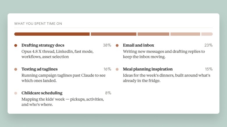
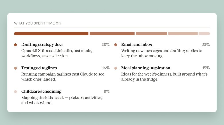
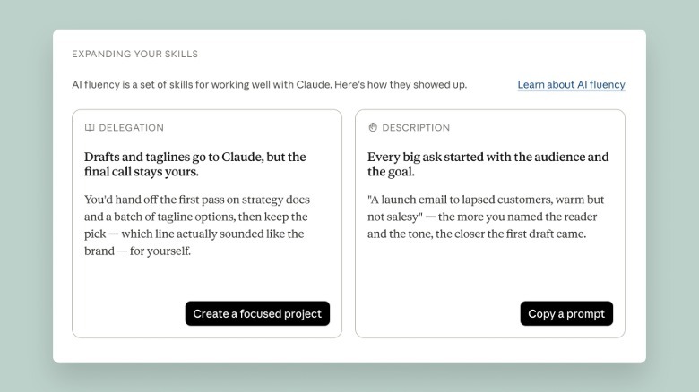
Further down, there’s a breakdown of topics you’ve discussed with Claude, with a percentage assigned to the ones you bring up most often. If you’ve been following along with the screenshots, all of this should feel broadly familiar. The penultimate section does things a bit differently, offering a set of AI “fluency” recommendations designed to streamline your usage of Claude, which are grouped around guidelines Anthropic co-created with a group of academics. For example, if Claude finds you frequently re-establish the same or similar context when you go to write a question or request, it will recommend you use its Projects feature to group your prompts together, so that you don’t need to repeat yourself so often.  

For a more specific example, I’ve been working on a story about inference costs — the amount of AI labs like Anthropic pay for their trained models to process data — and I’ve turned to Claude a few times to track down statements from executives like Dario Amodei and Sam Altman. Based on that usage, the Reflect dashboard recommended creating a custom fact-checking skill for Claude. When I went ahead with that suggestion, the chatbot devised a text template to ensure it would always list its source for a claim, as well as its confidence in the information it had found alongside any caveats. I’ll admit I found the template helpful, and it wasn’t something I would have thought to ask Claude to do on its own.

According to Ryn Linthicum, Anthropic’s head of wellbeing policy, Reflect came out of a study the company’s Societal Impacts team recently completed where participants expressed a mixture of optimism and anxiety around Claude and other AI products. “We were really intentional about building [the dashboard] with an eye toward how we can upskill people’s usage of Claude, not in a way that encourages them to spend more time with it, but instead enables them to get more efficient at meeting their goals, and hopefully get off of Claude or preserve the things that they want to think about,” Linthicum told Engadget.

Linthicum says part of the reason the dashboard doesn’t currently display the exact amount of time you’ve used Claude is because it wasn’t a metric Anthropic had been tracking internally, due to it being something the product team “didn’t want to maximize.” Looking forward, they note Anthropic plans to surface that information for users so they can use it alongside the usage management settings. In the future, the dashboard will also be available mobile, and reflect your usage there.

Advertisement

Anthropic is releasing Reflect in beta today. Notably, the company is making the feature available to Free accounts, in addition to Pro and Max subscribers.

Source link

Advertisement
Continue Reading

Trending

Copyright © 2025