Reports circulating in China this week reignited concerns around the issue after experts claimed that photos showing fingers facing directly toward a camera from within roughly five feet could potentially reveal enough detail to recreate fingerprints. In theory, attackers could use the resulting images to spoof biometric scanners tied to… Read Entire Article Source link
For many Windows users, the taskbar in Windows 11 has always felt strangely restrictive. Microsoft redesigned the interface with a cleaner, more modern look, but in the process removed several customization options people had been using for years. One of the biggest complaints? The inability to freely move the taskbar around the screen. Now, Microsoft finally seems ready to loosen things up.
The company has started testing a major overhaul of the taskbar and Start menu for Windows 11 Insiders in its Experimental channel. And honestly, this feels like Microsoft acknowledging that users want their PCs to feel personal again.
Windows 11 could soon feel far more flexible
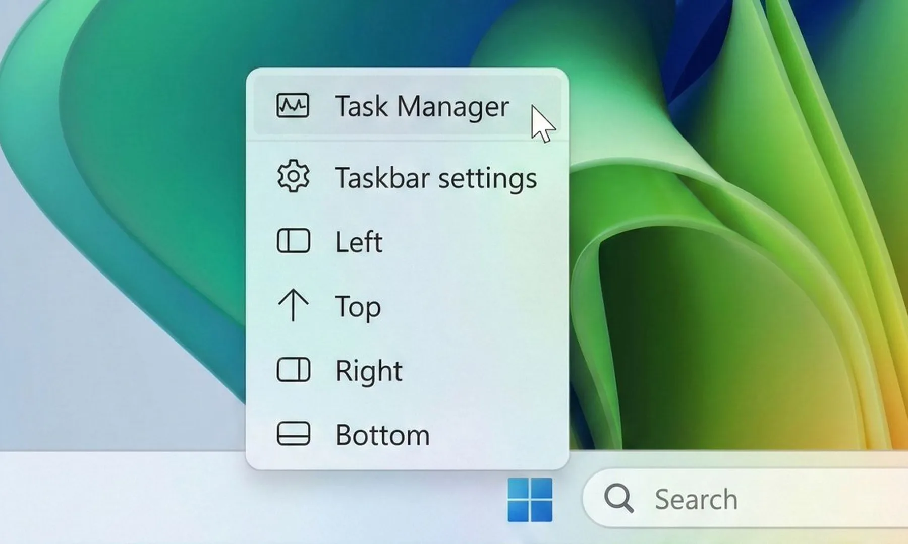
The biggest change here is the return of a movable taskbar. Instead of being locked to the bottom of the screen, users in the test build can now shift it to the top or even place it vertically along either side of the display. That might sound like a small tweak, but for longtime Windows users, it’s a pretty significant reversal. Earlier versions of Windows allowed this kind of flexibility for years before Windows 11 simplified everything into a more rigid layout.
Zac Bowden / X
Microsoft is also testing different taskbar sizes, including a compact version that could be especially useful on smaller laptops and tablets where screen space matters more. Even the Start menu is becoming more adjustable. Users will reportedly be able to resize it and switch between smaller and larger layouts, depending on how they prefer to organize apps and shortcuts.
The company is finally listening
Beyond the visual changes, Microsoft is also trying to clean up parts of the Start menu that many people found cluttered or unnecessary. New controls will let users decide which sections appear inside the menu, including areas for pinned apps, recommendations, and app lists. Interestingly, Microsoft is also renaming the “Recommended” section to “Recent,” which honestly makes the feature easier to understand at a glance. The section mainly surfaces recently used files and newly installed apps anyway, so the older name often felt vague.
Advertisement
Paulo Vargas / Digital Trends
There are also smaller but thoughtful privacy-focused touches being added. For example, users can hide their profile photo and account name from the Start menu, which could come in handy during presentations or screen-sharing sessions. Microsoft says these changes will roll out to Insider testers over the next few weeks. More importantly, the company openly admits that the Start menu and taskbar are where users judge Windows the hardest. And after years of complaints about Windows 11’s limited customization, this update feels like Microsoft is finally taking that criticism seriously.
The Acer TravelMate P6 14 AI is a capable Windows business laptop with solid internal grunt from its Lunar Lake processor that comes alongside a competent port selection, lightweight chassis and excellent battery life. For the price, it’s a solid option, although I do bemoan the lack of an OLED screen in any guise.
Lightweight and sturdy chassis
Solid power inside
Excellent battery life
An OLED screen would have been nice
Key Features
Advertisement
Sub 1kg weight:
The TravelMate P6 14 AI tips the scales at less than a kilo, making it one of the lighter laptops of its kind.
Advertisement
Intel Core Ultra 7 258V processor inside:
It also features a potent eight-core processor that provides a solid amount of power for productivity tasks.
Advertisement
65Whr battery inside:
This Acer laptop also has a capacious battery inside that allows it to power through a working day or two away from the mains.
Introduction
The Acer TravelMate P6 14 AI offers a clever blend of lightness and durability for a humble business laptop.
Advertisement
It’s unique in that it tips the scales at just under a kilo, just like the new Asus Zenbook A14 (2026), but comes with more business-class sensibilities with its ports, solid IPS screen, good software selection and a competent Lunar Lake processor inside.
For the £1599.99 price tag, this feels quite reasonable in the current market, not least with price rises across the board from other manufacturers that leave key rivals to the likes of the Dell XPS 14 (2026).
Advertisement
Other business-class options, such as the Lenovo ThinkPad T14s 2-in-1 Gen 1 and Dell Pro 14 Premium, are some way up the road in price, giving this Acer choice a potentially clear run as one of the best laptops we’ve tested. I’ve been putting it through its paces to find out.
Advertisement
Design and Keyboard
Lightweight and sturdy chassis
Solid port selection
Tactile keyboard and trackpad
It seems that Acer has attempted to replicate the excellent Swift Edge 14 AI with the TravelMate P6 14 AI in some respects, with this laptop coming with cleverly engineered materials to make it sleek and light, not least for a business machine.
It’s got a blend of a carbon fibre lid (as proudly displayed with a little logo) and magnesium-aluminium alloy elsewhere to allow this laptop to tip the scales at 990g without it feeling like it’s much cheaper than the retail price suggests. This is a lightweight laptop without any real flex or bend at the corners or in the keyboard tray, which is excellent.
Image Credit (Trusted Reviews)
Advertisement
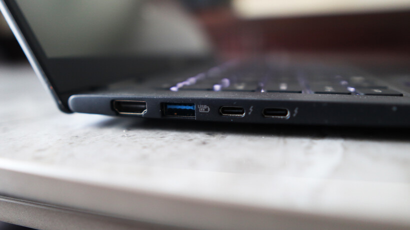
The ports on the TravelMate P6 14 AI are strong, too, with a pair of Thunderbolt 4-capable USB-C ports on the left alongside a USB-A and an HDMI port. The right side has another USB-A, a headphone jack, and security slot. For most use cases, this is more than adequate, although pros may wish for an SD card reader to supplement.
The keyboard here is also a reminder of other Acer laptops I’ve tested, with a snappy and short tactile travel in a smaller form factor layout that’s comfortable for extended periods. It’s also backlit with a bright, white light that’s sure to help for after-dark working.
Image Credit (Trusted Reviews)
As for the trackpad, it’s more about the width than depth, but nonetheless gives your fingers excellent real estate to work with. It doesn’t feel like a haptic trackpad, instead choosing to actuate with a defined mechanical click under finger.
Display and Sound
High-res IPS screen is decent
Okay contrast and black levels
Reasonable speakers
Acer bundles an IPS panel with the TravelMate P6 14 AI, opting against an OLED for some reason. Nonetheless, it’s a solid 14-inch 3K (or 2880×1800) resolution panel with upwards of a 120Hz refresh rate for detailed and smooth action.
Advertisement
Advertisement
In a general sense, this panel performs as you’d expect a decent IPS option to, with reasonably deep blacks (0.10 at 50%, rising to 0.38 at peak brightness) and okay contrast (1260:1 contrast ratio), plus a near-perfect 6600K colour temperature. I also measured 471.2 nits of peak SDR brightness here, making this a punchy panel in that sense.
Image Credit (Trusted Reviews)
Colour accuracy here is perfectly cromulent for mainstream workloads, with 97% coverage of the mainstream sRGB gamut, alongside 79% DCI-P3 and Adobe RGB results. This means this panel is okay for general productivity tasks, although it isn’t the best for more creative, colour-sensitive tasks.
The TravelMate P6 14 AI’s speakers are okay, but nothing really to write home about. There’s decent mids and some bass, but you’ll want to be using the headphone jack or Bluetooth 5.4 connectivity for much better audio.
Performance
Tried-and-tested Intel Lunar Lake processor
Beefy iGPU against Snapdragon alternatives
Capacious SSD, but a little on the slow side
Inside, this TravelMate P6 14 AI is technically using a last-gen Intel chip, although for the non-X-prefixed Panther Lake chips found in base model ultrabooks for the 2026 model year, such as the Dell XPS 14 (2026), the needle hasn’t moved much beyond Lunar Lake.
Advertisement
If you need a quick refresher, the Core Ultra 7 258V processor inside this laptop is an eight-core and eight-thread chip with a boost clock of up to 4.8GHz. It’s designed to provide a solid amount of grunt without sacrificing too much on endurance and longevity, making it a good choice for laptops such as this one.
Advertisement
Image Credit (Trusted Reviews)
The scores this Acer laptop achieved in both the Geekbench 6 and Cinebench R23 tests are in the ballpark for the processor inside, matching well against key rivals. That means strong single-core performance and decent, if a little disappointing, multi-threaded scores, owing to the lack of hyperthreading against AMD’s crop of modern laptop chips.
Both the PCMark 10 and 3DMark Time Spy scores were excellent, too, proving the suitability of the TravelMate P6 14 AI for productivity tasks and how powerful the Arc 140V integrated graphics are. The score it garnered here is several times that of the Adreno iGPU inside the first-gen Snapdragon X-powered laptops, and still remains ahead of the new Snapdragon X2 Elite SoC’s integrated graphics found in the likes of the Asus Zenbook A14 (2026).
Image Credit (Trusted Reviews)
Acer has also been quite generous with the TravelMate P6 14 AI’s RAM and storage configuration, given what’s going on at the moment. 32GB of RAM provides ample headroom for multi-tasking and more intensive loads, while a 1TB ASSD gives you good room for storin’ stuff. With this in mind, a slight chink in this laptop’s armour is that it isn’t the fastest SSD I’ve come across, with tested read and write speeds of 4794.88MB/s and 3911.05MB/s, respectively.
Advertisement
Software
Full-fat Windows 11 installed
Some Acer-specific apps present
Copilot+ PC functionality is here
The TravelMate P6 14 AI comes running proper Windows 11, although it comes with some unnecessary apps or shortcuts, such as a taskbar one for Booking.com, oddly.
There are more enterprise-centric apps, as you’d expect on a business laptop, such as Acer’s catch-all TravelMateSense app. This provides access to elements such as a file shredder, USB device filter, built-in file encryption and even AI-generated wallpaper in a separate tab.
Image Credit (Trusted Reviews)
Elsewhere, this is also a Copilot+ PC and has enough AI power to warrant the inclusion of Microsoft’s tools. Chief among these is the addition of the Copilot assistant, which you can ask questions and to undertake tasks, if you so wish.
In addition, there is also generative AI functionality baked into the Photos and Paint apps, if you want it. The most useful set of AI tools is the Windows Studio effects for the webcam, which provides a convenient means of auto framing, background blur and even for making sure you maintain eye contact.
Advertisement
Advertisement
Battery Life
Lasted for 17 hours 59 minutes in the battery test
Capable of lasting for two working days
Acer bundles a solid 65Whr battery inside the TravelMate P6 14 AI, which is quite a large one considering the size and lightness of this laptop. There are no specific claims made about its endurance, although with a decent capacity cell and a Lunar Lake chip in tow, I had quite high hopes.
In dialling the brightness down to the requisite 150 nits, and running the PCMark 10 Modern Office battery benchmark test, this Acer laptop was able to run for 17 hours and 59 minutes, making it a dead cert for two working days away from the mains. With some hypermiling, you may be able to eke out a third. That’s a strong result, and puts this well among its Lunar Lake-powered contemporaries, even if the Dell Pro 14 Premium still remains king with closer to 24 hours runtime.
The TravelMate P6 14 AI comes with a 100W power brick that isn’t as fast as rivals to put go-juice back into the laptop. The 38 minutes to get it back to 50% is good, although the 94 minutes for a full charge is a little more middle of the road.
Should you buy it?
Advertisement
You want a lightweight business laptop
The TravelMate P6 14 AI offers the benefits of a lightweight business laptop without the same hefty cost as some of the dearer alternatives with similar spec sheets.
Advertisement
On consumer and pro-grade laptops, it is more common to get OLED screens with better definition and fidelity than an equivalent IPS.
Advertisement
Advertisement
Final Thoughts
The Acer TravelMate P6 14 AI is a capable Windows business laptop with solid internal grunt from its Lunar Lake processor, a competent port selection, a lightweight chassis, and excellent battery life. For the price, it’s a solid option, although I do bemoan the lack of an OLED screen in any guise.
The Asus Zenbook A14 (2026) is closest in price and offers similar performance and endurance thanks to its Qualcomm Snapdragon X2 Elite processor, while also netting a sub-1kg weight with clever materials and coming with an OLED screen. It is more of a consumer-grade laptop, and enterprise users have different requirements that Acer’s choice is more likely to fulfil.
Dell’s new XPS 14 (2026) in the base model configuration I’ve tested also equals the TravelMate P6 14 AI in price, although it sacrifices portability and ports against either of the above to make it a serious contender. For more choices, check out our list of the best laptops we’ve tested.
How We Test
This Acer laptop has been put through a series of uniform checks designed to gauge key factors, including build quality, performance, screen quality and battery life. These include formal synthetic benchmarks and scripted tests, plus a series of real-world checks, such as how well it runs popular apps.
Advertisement
FAQs
How much does the Acer TravelMate P6 14 AI weigh?
The Acer TravelMate P6 14 AI weighs under 1kg at 990g, making it especially lightweight in any guise.
A San Francisco start‑up called SPAN has proposed placing small data center nodes outside suburban houses.
The company says it aims to install thousands of liquid‑cooled boxes called XFRA nodes, each containing powerful NvidiaGPUs.
Homeowners would receive subsidized or even free electricity and internet access in exchange for hosting this equipment on their property.
Latest Videos From
Advertisement
A quiet box with sixteen GPUs
Each XFRA node attaches to the exterior wall of a house like an additional utility box.
The unit holds sixteen Nvidia RTX Pro GPUs and runs with minimal noise, according to the company’s announcements.
SPAN claims it can install eight thousand such nodes for five times less money than building a conventional data center with the same computing power.
“Data centers are loud, ugly, and often drive up local electricity bills,” said Chris Lander, vice president of XFRA at SPAN.
Advertisement
Sign up to the TechRadar Pro newsletter to get all the top news, opinion, features and guidance your business needs to succeed!
“This is quiet, discreet, and makes energy more affordable for the host and community.”
The system taps into excess electrical capacity that already exists in most modern American homes.
“Virtually all homes with 200‑amp utility services have 80 amps available at all times, so we set that as the maximum power consumption for a single XFRA node,” Lander explained.
Advertisement
“This home backup is provided to the host at no cost to them, contributing to greater energy resilience in addition to affordability,” he added.
Benefits for utility companies and communities
SPAN argues distributed nodes help grid operators avoid costly infrastructure upgrades, and that increasing electricity sales over existing grid infrastructure makes power more affordable for everyone.
Advertisement
The approach focuses on AI inference tasks rather than model training, which requires thousands of GPUs working together.
However, not everyone shares SPAN’s optimism. Ari Peskoe, a director at Harvard Law School, cautioned that utility companies may need to adapt their local grid management for neighbourhoods with many such nodes.
“If there’s a block that has several homes with these devices, maxing out compute and energy would force a lot of power to that local area,” Peskoe said.
However there are security concerns over the project, as thieves may also target these boxes, since each GPU sells for around $10,000.
Advertisement
The company plans a 100‑home pilot deployment in 2026, followed by rapid scaling to 80,000 units across the United States by 2027.
Whether suburban homeowners will accept this arrangement, which many may not understand, remains uncertain.
Meanwhile, the willingness of utility regulators and local zoning boards to approve such a decentralized computing experiment remains to be seen.
The pitch sounds appealing on paper, yet the real test will come when actual residents discover what it means to live next to a box of expensive electronics that strangers control remotely.
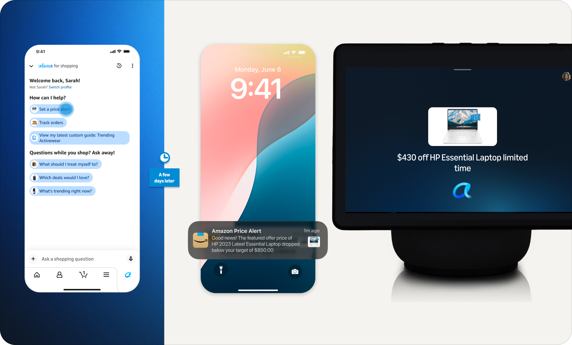
How an Alexa for Shopping price alert flows across the Amazon app, phone notification and Echo Show. (Amazon Image)
Amazon.com and Alexa are finally talking to each other.
The tech giant on Wednesday announced Alexa for Shopping, a new capability that connects its Rufus e-commerce chatbot with its Alexa+ assistant, aiming to unify product research, user preferences and shopping activities across Amazon’s apps, websites and Echo devices.
The move comes as consumers increasingly turn to popular AI assistants like OpenAI’s ChatGPT and Google’s Gemini for shopping advice. By creating a more integrated AI shopping experience, Amazon is aiming to keep that research and the resulting purchases on its own platforms.
Several of Amazon’s new features reflect the broader push into agentic AI, which takes action on a customer’s behalf. For example, Alexa for Shopping can monitor prices and automatically purchase an item when it hits a target, or restock household essentials on a schedule.
Advertisement
With the integration, Amazon is retiring the “Rufus” name from its shopping interface, replacing the chatbot with Alexa for Shopping branding in its app and on its website. Amazon says Rufus will continue to power parts of the experience behind the scenes.
Broader landscape: ChatGPT, Gemini and Perplexity have all launched shopping features in recent months, with Google enabling in-chat checkout from retailers like Walmart and Wayfair. (OpenAI pulled back on its in-chat checkout feature in March after it failed to gain traction).
Amazon is also looking to keep rival AI agents off its platform: A federal judge in March blocked Perplexity’s Comet browser from shopping on Amazon on behalf of users, though the order was stayed pending appeal. In a statement at the time, Amazon called it “an important step in maintaining a trusted shopping experience for Amazon customers.”
On the product front, Amazon is betting that a unified and personalized experience will matter more to customers than the ability to compare products across retailers in a general-purpose AI assistant.
Advertisement
Rollout details: Alexa for Shopping will roll out in the U.S. over the coming week, the company says. It will be available for free to customers signed into an Amazon account through the Amazon Shopping app and Amazon.com, with no Prime membership, Echo device or Alexa app required.
The company is also bringing the full Amazon shopping experience to Echo Show devices, starting with Alexa+ customers on the latest Echo Show 15 and 21, with other devices to follow.
Alexa for Shopping as it appears across the Amazon app, mobile web and desktop, with the new Alexa icon replacing Rufus. (Amazon Image)
Use cases and features: Rajiv Mehta, Amazon’s vice president of Conversational Shopping, said the company saw customers starting shopping “missions” in one place and restarting them somewhere else because Rufus and Alexa didn’t share memory or context.
The idea is that “the customer doesn’t have to think about where they started a discussion with Amazon,” Mehta said in an interview with GeekWire. The feature uses what customers have already told Amazon once, then makes that context available on other Amazon devices, sites, and apps.
For example, citing his own usage, Mehta said a customer could brainstorm a science fair project with Alexa on an Echo device, then open the Amazon app and ask for supplies without re-explaining the project. Or a shopper could research laptops in the Amazon app, set a price alert, and get notified on their Echo when the price drops, and buy it with a voice command.
Advertisement
Other features in Alexa for Shopping include:
Asking questions directly in the main Amazon search bar, rather than opening a separate chat window.
Scheduled actions that automate tasks like restocking household essentials, getting alerts when a favorite author releases a new book, or adding a product to a cart when it drops below a set price.
Custom shopping guides for big purchases that compare features, prices and reviews across Amazon and the web.
Product price history expanded to a full year, up from 30 and 90 days.
Privacy and personalization: Amazon says customers can review and manage their Alexa interactions and conversations through the Alexa Privacy Dashboard. They can also ask Alexa for Shopping what it knows about them and update personal details like family members, pets, interests and dietary needs.
Amazon’s evolution: Rufus launched in 2024 and was used by more than 300 million customers in 2025, according to the company. On Amazon’s most recent earnings call, CEO Andy Jassy said monthly active users of Rufus were up more than 115% and engagement was up nearly 400% year over year.
Jassy compared third-party AI shopping agents to the early days of search engines referring business to e-commerce. Those agents lack personalization features and shopping history and often can’t get pricing or product information right, he said, noting that customers who want to shop at a specific retailer will often start with its own assistant as a result.
Amazon’s ambition, Jassy said, is to develop “the best shopping assistant anywhere.”
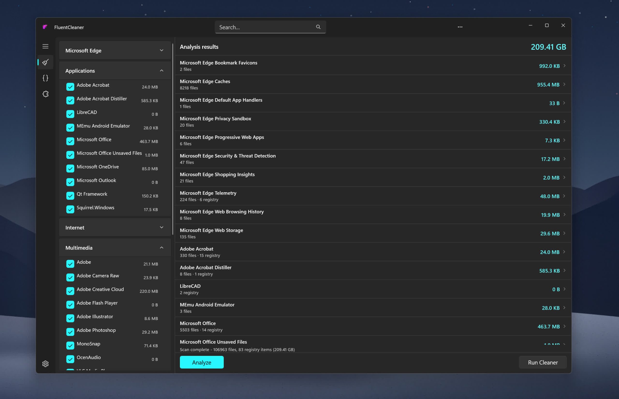
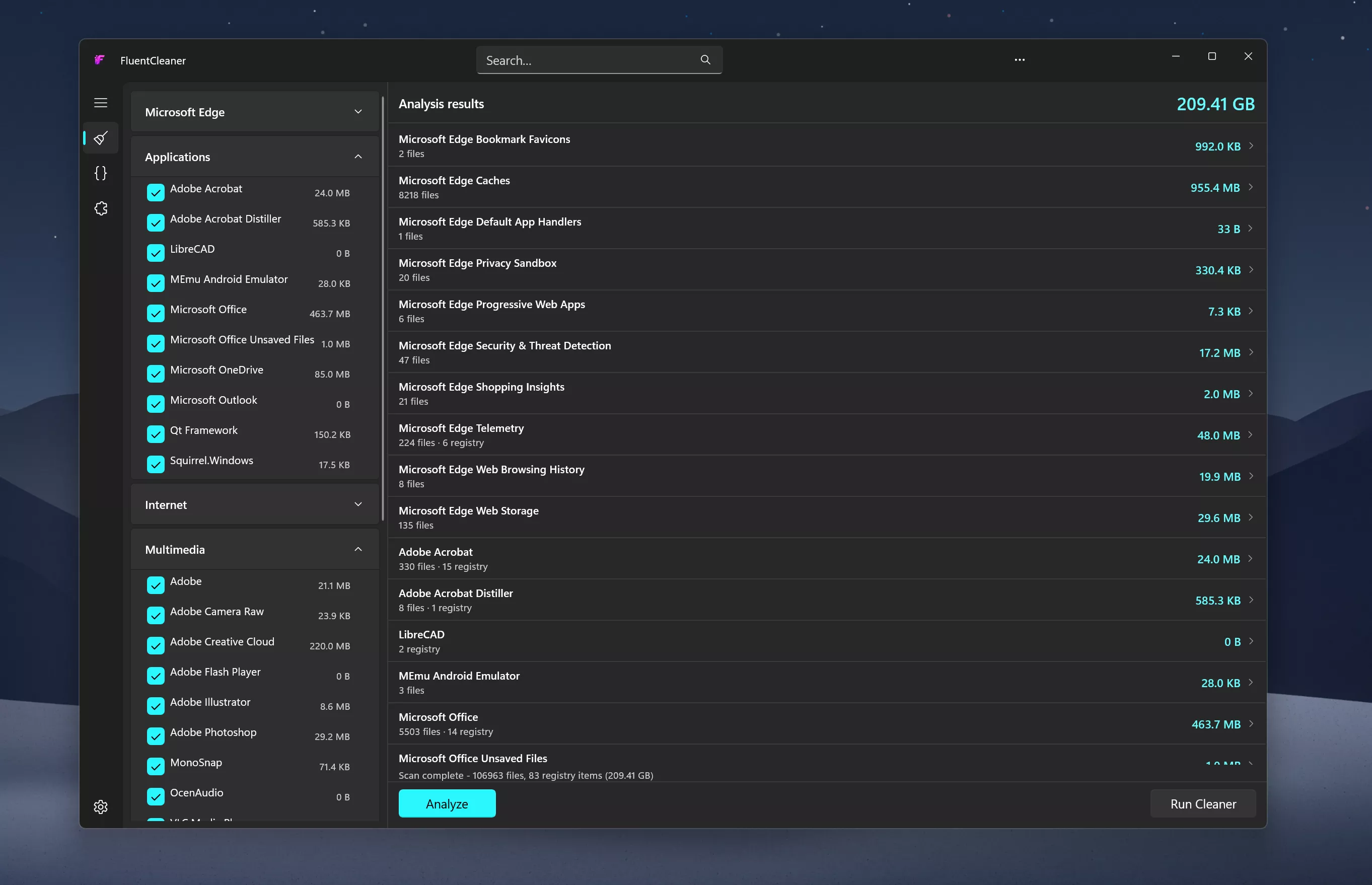
Inspired by the early CCleaner era, FluentCleaner reimagines the classic PC cleanup utility for modern Windows systems. Built with WinUI 3, it focuses on a cleaner, lightweight experience centered around removing temporary files, cache, logs, and leftover clutter – without aggressive registry tweaks, bundled extras, or scareware-style prompts.
The project also embraces the community-driven spirit that helped make older cleanup tools popular in the first place. FluentCleaner supports the well-known winapp2.ini cleaning database format, allowing it to leverage a large ecosystem of community-maintained cleaning rules while keeping the app fast, transparent, and easy to use.
Features
Portable design with no installation required
One-click system analysis and cleanup
Support for optional maintenance extensions
Optimized for Windows 11
Clear and easy-to-understand cleanup results
System Requirements:
Windows 10 2004 (Build 19041) and later
Windows 11
No Windows 11 requirement. Despite using WinUI 3, the app is intentionally built to remain compatible with modern Windows 10 systems as well
What’s New
If I had to give this release a codename, it’d be ~WRL0001.tmp, so you never knew what it was, but deleting it always felt satisfying
[Added] Cancel button: the Analyze button morphs into Cancel the moment a scan or clean starts. Abort any scan or clean mid-run
[Added] Junk growth tracker: Settings now keeps a history of past clean runs (date, bytes freed, items removed)
[Improved] Scan speed significantly improved for entries with multiple file pattern; the directory tree is now traversed once total instead of once per pattern, cutting scan times by up to 28× on some entries
[Added] AI explanations for Winapp2 entries via Groq (experimental, requires a free API key in Settings):fully opt-in, nothing is sent anywhere without your own key. The idea was to explain individual Winapp2 entries, file paths and registry keys in plain English before cleanup. Many users asked to keep it in to test it themselves;a local LLM option may come later. Honestly, i built this because I had no idea what half the entries in my own app were doing 😄 Turns out FluentCleaner knew about apps I’d completely forgotten I had installed.See it in action on X/Twitter
[Improved] Upgraded from Windows App SDK 1.8 >> 2.0.1 (stable, released April 29 2026)
[Improved] Scanner no longer loops forever on junction points and symlinks;reparse points are skipped during traversal (fixes the C:\Users\All Users >> C:\ProgramData infinite loop trap)
[Improved] Search now auto-expands categories so results are actually visible
[Improved] Tools page got a full visual overhaul inspired by the Windows Clock app widget style;extensions now feel like interactive widgets rather than a plain list
[Improved] Hamburger button moved into the title bar: native Windows 11 pattern (File Explorer / Settings style)
[Improved] Settings button is now the built-in NavigationView control, complete with the native rotation animation on click
[Improved] Navigation cleaned up to follow the official WinUI 3 way;replaced custom workarounds with native patterns
[Improved] Dropped x86 build target: x64 and ARM64 only
[Added] New cleanup rules for Microsoft Edge and TeamViewer cache
[Updated] Winapp2.ini to version 260512
FluentCleaner 26.05.02
[Changed] Large parts of the app were refactored to use more native WinUI 3 behavior and APIs. Theme handling, TitleBar integration and system theme detection are now much cleaner and more consistent
[Compatibility] FluentCleaner officially supports Windows 10 2004 (Build 19041) and later;no Windows 11 required
[Added] Automatic update checks; the Settings page now silently checks for new versions on load.
If an update is available, FluentCleaner shows a small red banner with a direct download button. You can also trigger update checks anytime from the […] menu in Settings.
[Added] Responsive TitleBar search; the search box now collapses into a compact search icon + flyout on smaller window sizes for a cleaner layout.
[Added] Native-style hamburger menu; moved the pane toggle into the TitleBar to better match modern WinUI apps
[Added] Terminal startup system info; Windows version, CPU and RAM are now shown when opening the terminal
[Updated] CommunityToolkit.Mvvm 8.3.2 > 8.4.2
[Fixed] ARM64 builds not resolving correctly. Turns out MSBuild is case-sensitive and arm64 ≠ ARM64. Added explicit RuntimeIdentifiers so self-contained builds correctly detect their target platform.
[Changed] Migrated all [ObservableProperty] backing fields to partial properties. This is the new standard for CommunityToolkit.Mvvm 8.4+ on .NET 10. No behavior changes, just cleaner code and no more compiler warnings
INTERVIEW Enthusiasm among managers to adopt AI tools has outpaced developers’ ability to learn those tools and use them effectively.
Moshe Sambol, VP of customer solutions at software observability outfit Lightrun, told The Register in an interview that he speaks with a lot of companies. Some of the developers in those organizations, he said, are very comfortable with AI tools.
“But the reality is that a lot of developers are much earlier in the curve,” he said. “The expectations of businesses are getting ahead of where the developers are in terms of their mental model and in terms of the training that they’re providing, the enablement they’re providing to make their teams comfortable with the tools, and the rate at which these tools are evolving.”
Sambol said the degree of AI tool adoption varies.
Advertisement
“I absolutely have customers who’ve told their developers, ‘You don’t write code anymore. You review code. No one should write a line of code unless for some reason you failed after three attempts getting GenAI to do it,’” he said. “I have customers like that. I don’t know if I should name them, but absolutely.”
And he said on the other side of the spectrum, there are organizations like banks that are just starting to roll AI tools out due to compliance obligations and traditional industry caution.
“It’s an exciting time to be adopting these tools and learning these tools, but it puts a lot of pressure on the developer,” he said. “It puts this expectation of being more productive.”
Not everyone manages that, and Sambol said he has a lot of sympathy for developers who have been directed to use AI tools without training and organizational guidance. Generative AI models will produce a lot of code quickly, he said, and because the code seems correct initially, it often gets pushed forward.
Advertisement
“If it’s not creating bugs en masse today, it’s just pain waiting to happen,” he said. “The number one question I think we have to be asking developers is, ‘Can you explain that code? Have you validated that the code actually fits in the context of the broader system?’”
Sambol said the answer isn’t necessarily yes or no because developers have different levels of experience and often work on large projects where they focus only on a specific part of the code base. It’s common in enterprises, he said, that no one person will understand the entire system end-to-end, which is why problem resolution often requires a group of people.
The issue he sees is that generative AI systems don’t help bridge the missing knowledge gap. They don’t provide the context to understand all the components involved.
Sambol went on to describe an incident in which a developer was using an AI assistant to build an Ansible automated workflow. “The generative AI was creating the Ansible template for him, which seems like a perfect match – it’s drudge work,” he explained. “And it’s much better at getting the syntax exactly right.”
Advertisement
It worked. And then it stopped working.
“The system that he was deploying to, all of a sudden, he could not get the component up,” Sambol said. “It just wouldn’t start. A process that had been going smoothly for a couple of hours in the morning, now all of a sudden, his service is down and it will not run.
“And he’s pulling his hair out trying to unstitch the day’s work so far to figure out what went wrong, why is the service not working,” he said, adding that the AI agent proved unhelpful by going off in the wrong direction, reinstalling the operating system, and undertaking other ineffective steps to effect repairs.
What happened, Sambol explained, is that earlier in the day, the developer had installed the component in a certain way – it was running in a container with a systemd service.
Advertisement
As such, it needed access to the ports on the device, which precluded running the component in Docker.
“So the AI model re-wrapped it, repackaged it, and deployed it in a different way, but kept the original one running,” he explained. “So it was simply a matter of the fact that the one he had initially deployed was still running and it was blocking the port and the second one couldn’t run.
“It’s a fairly simple, easy-to-understand problem once you see it, but he lost the entire afternoon going down all kinds of dead ends with the AI looking at this, looking at that, because the AI model didn’t remember that it had guided him to deploy the system a certain way earlier in the day.”
Sambol said various studies show a significant percentage of AI generated code contains errors and creates technical debt.
Advertisement
That’s not to say human developers are without fault. Sambol said developers have their own weaknesses. Many companies, he said, have offshored or globally distributed development teams, so there’s a lot of variation. He argues that it’s important to acknowledge that imperfection and work toward processes that improve results.
One way to do that is to automate the prompting process in a way that makes it more repeatable. “When you do that, you identify where you’re starting to get good results and you don’t expect everybody to come up with a well-structured long prompt.”
Sambol added, “I think these tools are absolutely getting better. And so I’m reluctant to call any of them junk or deeply flawed. They’re getting better shockingly rapidly. If you can take advantage of a couple of different ones – with a human being in the loop – then you are more likely to get output that is at least as good as you were getting before.” ®
“The vulnerability is simple in practice,” writes Tom’s Hardware: “run a command as a standard user and gain root (administrator) access to the machine.”
And it was Mythos Preview that helped the security researchers at Palo Alto-based Calif bypass a five-year Apple security effort in just five days. The blog 9to5Mac reports:
Last year, Apple introduced Memory Integrity Enforcement (MIE), a hardware-assisted memory safety system designed to make memory corruption exploits much harder to execute… [The researchers note it’s built into Apple all models of the iPhone 17 and iPhone Air, and some MacBooks] They explain they have a 55-page technical report on the hack, but they won’t release it until Apple ships a fix for the exploit. But they do note in broad terms that Anthropic’s Mythos Preview model helped them identify the bugs and assisted them throughout the entire collaborative exploit development process.
“Mythos Preview is powerful: once it has learned how to attack a class of problems, it generalizes to nearly any problem in that class. Mythos discovered the bugs quickly because they belong to known bug classes. But MIE is a new best-in-class mitigation, so autonomously bypassing it can be tricky. This is where human expertise comes in. Part of our motivation was to test what’s possible when the best models are paired with experts. Landing a kernel memory corruption exploit against the best protections in a week is noteworthy, and says something strong about this pairing….”
Advertisement
[I]n a time when even small teams, with the help of AI, can make discoveries such as this one, “we’re about to learn how the best mitigation technology on Earth holds up during the first AI bugmageddon.”
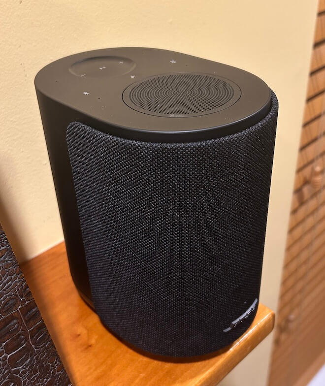
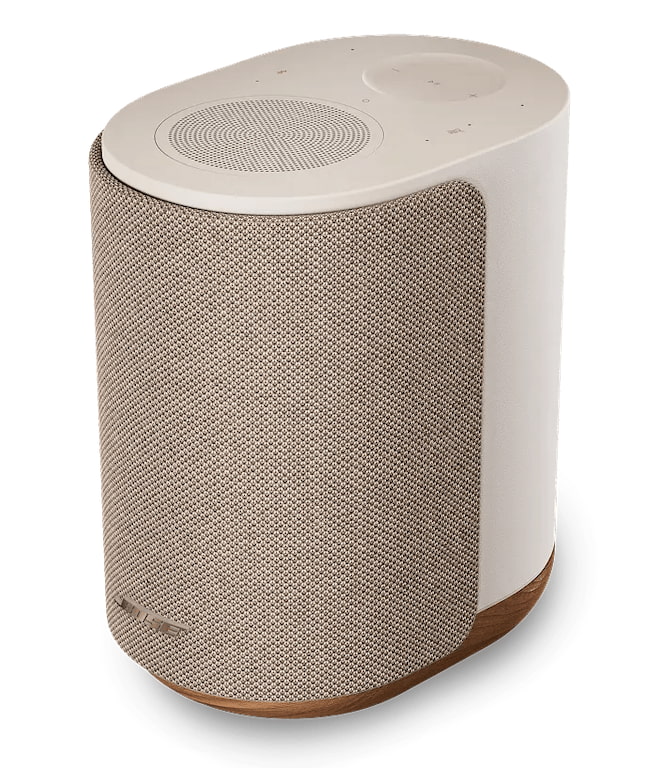
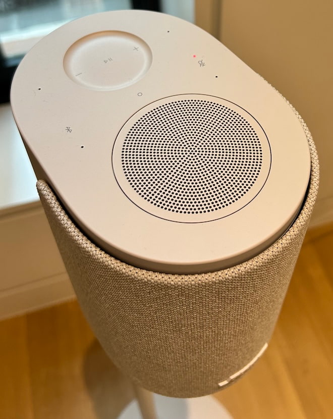
The Bose Lifestyle Ultra Wireless Speaker arrives at $299 with most of the connectivity options people actually care about: Apple AirPlay, Google Cast, Spotify Connect, Wi-Fi, Bluetooth 5.3, 3.5mm AUX, Alexa, and Alexa+ support. That matters because Bose is not just dropping another compact wireless speaker into an already crowded category and hoping the logo does the heavy lifting.
Ask Sonos how that worked out after a rather significant app disaster. Brand loyalty only gets you so far outside the Apple ecosystem, especially when the app becomes the thing customers are complaining about.
This is the entry point into the new Lifestyle Ultra system, but it can also stand on its own, work as a stereo pair, or serve as rear channels with the Lifestyle Ultra Soundbar and Subwoofer. Bose is clearly taking aim at Sonos, Bluesound, Denon, Samsung, and LG with a speaker that sounds bigger than it looks, and costs less than some obvious rivals.
Technology: Small Box, Big DSP, Very Bose
The Bose Lifestyle Ultra Wireless Speaker is built around a compact three driver array with two front facing drivers and one up-firing driver, which is where things get more interesting than the size of the cabinet suggests. Bose is using its TrueSpatial audio processing to analyze content and create a wider, taller presentation from a single speaker, rather than pretending a small wireless box can bend physics. Guess what? That’s not really a thing no matter how many times you click your heels together and pray for it.
That up-firing driver matters because the Lifestyle Ultra is not just pushing sound straight at you. It is using direct and reflected sound, plus DSP, to create a larger soundstage. Pair two of them in stereo and the effect becomes more convincing, especially in smaller rooms where placement and simplicity matter more to the typical Lifestyle Ultra buyer.
Advertisement
After listening to the speaker in four different rooms, that part tracks. The Bose does a very good job creating scale from a compact enclosure, but let’s not pretend that moving from the bedroom to the den magically turns the pair into Sonus faber Electa Amator III loudspeakers. Physics still gets a vote.
Bass is handled through Bose CleanBass technology, which combines the woofer, DSP, and a proprietary QuietPort acoustic opening to keep low frequency output under control. Bose is not claiming this replaces a real subwoofer, and neither should anyone with working ears. The goal is cleaner, fuller bass from a compact enclosure without the bloated thump that ruins too many wireless speakers in this category.
One decision I asked about at the NYC event still does not make sense to me: the Lifestyle Ultra Wireless Subwoofer is not compatible with a pair of Lifestyle Ultra Wireless Speakers on their own. It only works as part of the broader Lifestyle Ultra home theater setup.
That feels like a missed opportunity. Two Lifestyle Ultra Wireless Speakers already sound confident from the upper bass range through the treble, and they do have useful midbass output. But letting users add the Lifestyle Ultra Wireless Subwoofer to fill in the lower range would make the system a much easier recommendation for music listeners who want more scale without moving into a full soundbar based system. The subwoofer is good. Let people use it. I really hope that Bose make this a reality.
Advertisement
Compact, Flexible, and Not Just a Sidekick
The Lifestyle Ultra Wireless Speaker measures 4.8 inches wide, 7.3 inches high, and 6.6 inches deep, which makes it small enough for a kitchen counter, bedroom, office, or shelf where a larger system would be overkill.
I also tried the pair on top of the mantle in the den, spaced about 60 inches apart, and discovered that the imaging was convincing enough to get a reaction from Tyrion the Westie. He stared directly between the two speakers like someone had just promised him Casterly Rock and then hidden the snacks.
Advertisement. Scroll to continue reading.
To be fair, he was probably trying to figure out why Nick Cave and Sia were suddenly serenading him from the fireplace. That is not a formal listening test, unless the AES has added “confused Westie” to the measurement protocol, but it did suggest that the stereo image was more focused than I expected from two compact wireless speakers sitting on a mantle.
Advertisement
The Lifestyle Ultra series also supports multiple configurations: 1.0, 2.0, 7.0.4, and 7.1.4. That means a single speaker can work on its own, two can be used as a stereo pair, and a pair can also serve as rear surround speakers with the Lifestyle Ultra Soundbar and Lifestyle Ultra Wireless Bass Module. That flexibility is the real hook. This is not merely a wireless speaker trying to look useful in a press photo. It is the modular piece that helps tie the Lifestyle Ultra system together.
The Lifestyle Ultra Wireless Speaker comes in Black Smoke and White Smoke for $299, with a limited edition Driftwood Sand version at $349. The Black Smoke finish is fine, but a little too utilitarian for me. It looks like it was designed to disappear into a shelf, which is useful, but not exactly inspiring unless your interior design theme is “conference room after the consultants left.”
The Driftwood Sand version is the one I would buy 100 times out of 100. The soft beige finish and solid white oak base give it a warmer, more furniture friendly look that makes the speaker feel like it belongs in a real room rather than hiding from the homeowner’s association. It is the difference between a proper Rutt’s Hut ripper and a dirty water dog. Both are technically food. Only one should wind up in your West Elm or CB2-inspired home.
The tactile controls are also practical. Playback, track skipping, volume, microphone mute, Bluetooth, and Alexa prompts can all be handled directly on the speaker.
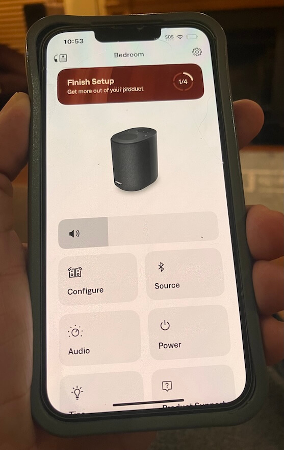
Download the Right Bose App or Enjoy the Wrong Kind of Adventure
Bose has more than one app, so do yourself a favor and use the setup sheet in the box. Tap the setup link or QR code and it will send you to the correct app. Guessing in the App Store is how normal people lose 20 minutes of their lives and start blaming Bluetooth for crimes it did not commit.
Advertisement
The app also requires iOS 18 or later, which is worth noting if you are setting this up for parents or anyone still nursing an older iPhone like it contains state secrets. Some of us are already somewhere in iOS 26.xxx, but not every household lives on the bleeding edge of software updates and battery anxiety.
Once installed, the Bose app loaded quickly and immediately pushed a mandatory firmware update. That part was painless, and it appeared to unlock additional control inside the app. Unless I was not drinking enough Brio Chinotto, the app now includes balance control, along with EQ adjustments for bass, midrange, and treble, plus a control for the height of the sound/image.
That is useful because the Lifestyle Ultra Wireless Speaker is not just a one button box with a logo and an attitude. The app handles setup, updates, EQ, pairing, stereo configuration, and system management. It is still not a full music browsing hub, and Bose is clearly leaning on AirPlay, Google Cast, Spotify Connect, Bluetooth, and AUX for actual playback. But for setup and fine tuning, the app is straightforward, fast, and less painful than expected. Which, in 2026, sadly counts as progress.
Bose is leaning on the streaming apps people already use, which is sensible, but the absence of TIDAL Connect and Qobuz Connect leaves a gap for listeners who live inside those ecosystems. Both platforms worked without any issues using AirPlay.
A Few Setup Caveats Before You Start Swearing at the App
Like most things involving modern tech, the Bose app worked relatively well, but not without a few small detours. The same was true recently with the latest version of BluOS that I used with the Bluesound PULSE FLEX, so this is not strictly a Bose problem. Welcome to the golden age of wireless audio, where the sound can be excellent and the setup occasionally reminds you that firmware has a borderline personality disorder. It’s something I can relate to.
Advertisement
Connecting a single Lifestyle Ultra Wireless Speaker to my Verizon FiOS fiber optic modem/router was painless. First try. It took roughly 15 seconds, and once connected, stability was excellent. Adding the second speaker took more patience. Each individual speaker required a few attempts, probably four or five, before both finally appeared in the configuration section of the app. Once they were both there, things moved along properly.
Advertisement. Scroll to continue reading.
One thing to remember: hit the Save button. The app gives you configuration options, but you still need to lock them in. This sounds obvious until you are staring at the screen wondering why the system has ignored your choices like a teenager asked to walk the dog in a proper Boston blizzard.
If you need to reboot the speaker, Bose uses a button sequence on the top panel, which is actually very responsive and well designed. The sequence lands on an amber light, followed by a light pattern before the speaker is ready to sync again. It worked as intended, and I did not have to unplug everything or threaten the router with my Sherwood goalie signed by the late-Greg Millen.
Advertisement
The volume control is slightly granular, but not in a deal breaking way. It gives you enough adjustment to dial things in without launching the Lifestyle Ultra from quiet background music to ICE raid volume in two seconds.
Listening
Bose impressed the hell out of me at its Upper West Side event. The Lifestyle Ultra system sounded far better than I expected, and not in the usual “everyone nods politely while a PR person watches for facial movement” kind of way. It had scale, clarity, and a surprisingly confident presentation for a lifestyle system designed to live in normal rooms without turning them into a Best Buy annex.
But there is always a caveat with event demos.
What you hear at a well staged press event, where everything has been triple checked, carefully positioned, updated, paired, rebooted, blessed by legal, and probably stared at by six engineers, is not always what you hear at home. I’ve been to more than a few product events over the years where things did not go smoothly, and it is embarrassing as hell when the app refuses to cooperate, the network collapses, or the product decides to audition for witness protection in front of a room full of journalists.
That was not the case here. Bose had the system dialed in.
Advertisement
The townhouse acoustics also helped. Plaster over brick, proper rugs, real furniture, and not a lot of exposed glass or hard reflective surfaces creating chaos. In other words, the room gave the Lifestyle Ultra system a fighting chance. I wish my own home had that kind of isolation from the other rooms in the house. Instead, I get dogs, doorways, glass, kitchen noise, and the acoustic generosity of modern residential compromises. Very glamorous. Very “where did the center image go?”
So I always temper my expectations after a strong demo. It is the only realistic way to deal with being either underwhelmed or pleasantly surprised once the product lands in my own room. It is also how I deal with my South African biltong problem. Sometimes it is fantastic and I can eat it for hours. Sometimes I want to stop after the first bite, transition to droëwors, and hope for the best.
I miss her. I mean it.
Amy Winehouse, Nick Cave, and Sia seemed like the logical place to start. Subtle? Not really. Useful? Absolutely.
Advertisement
Winehouse remains the late Beehive Queen of some shady corner of London, armed with the soul of Aretha Franklin and the romantic judgment of someone who should have had better friends, a better lawyer, and someone in the room willing to unplug the bad decisions. What a waste.
Advertisement. Scroll to continue reading.
“Valerie” from the BBC Sessions is one of those tracks I use because it has a slightly hard top end. Not broken. Not unlistenable. Just enough edge to expose whether a speaker is going to polish the wart or shine a flashlight on it like a suspicious dermatologist from Englewood Cliffs.
The Bose passed with flying colors.
Advertisement
I liked the weight and slightly reserved presentation here. The Lifestyle Ultra Wireless Speakers did not try to make Winehouse sound larger than life, which would have been the wrong move. Instead, they gave her voice a solid center image, believable scale, and actual height. Not “change your underwear” spooky like the $99,999 ATC EL50 Anniversary system I heard at AXPONA, but definitely not some vague vocal ghost floating around the room without a foundation.
She was pushed slightly in front of the speakers, but not into my lap. That worked.
Switching to the master of grit, snarl, and genuine power, the Bose made Nick Cave sound very present. Did it deliver the weight of larger loudspeakers? No. Let’s not start lying before lunch. But compared with the Bluesound PULSE FLEX, I actually found the Bose more convincing in that regard. Neither compact wireless speaker can deliver the proper mass and menace of Cave’s piano playing, but the Bose tried harder. That surprised me.
It also gave up none of the clarity or detail in the process. I can’t make a fair comparison of soundstage size between the Bose and Bluesound because Bluesound only sent me one PULSE FLEX, and stereo imaging generally requires two speakers.
Advertisement
Sia’s “Unstoppable,” “Cheap Thrills,” and “Breathe Me” were all well resolved, with clean vocals, decent separation, and enough dynamic snap to keep the presentation from feeling flat. But they also exposed the obvious limitation: the absence of real sub bass impact.
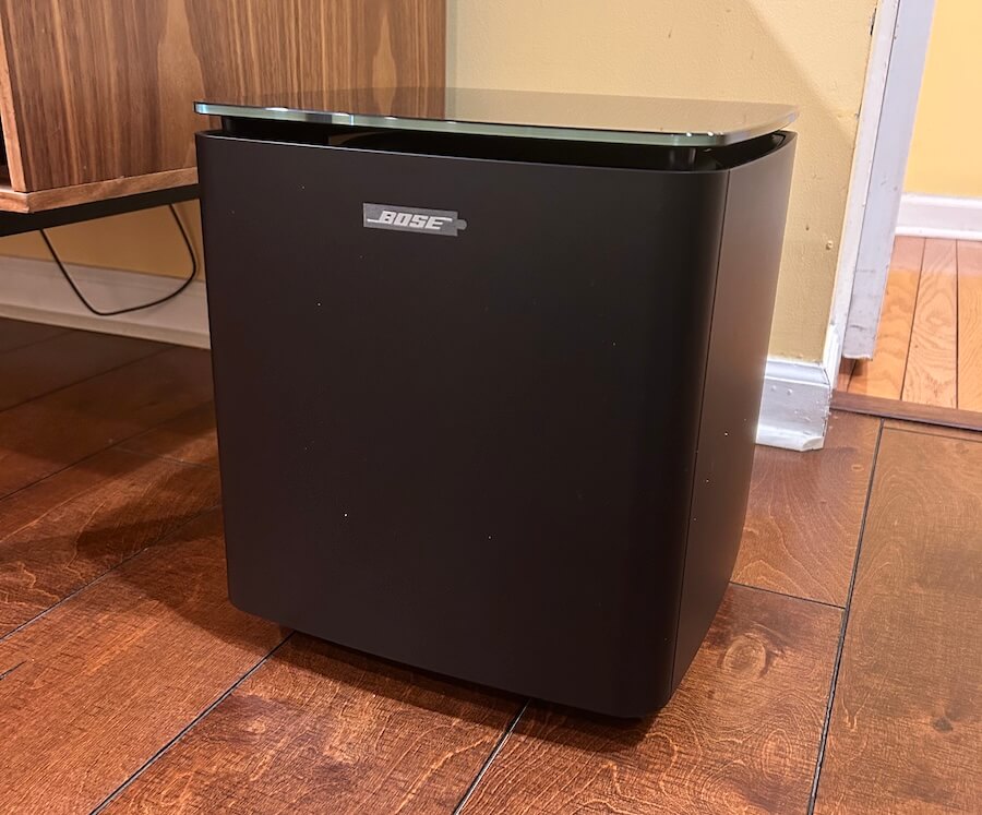
Bose Ultra Lifestyle Wireless Subwoofer
This is where the Lifestyle Ultra Wireless Subwoofer would have made a major difference. The speakers have enough upper bass and midbass energy to sound balanced on their own, but Sia’s music needs that lower range support to fully land. The subwoofer is already in the Lifestyle Ultra family. Bose should let people use it with the speakers as a 2.1 music system.
Switching over to jazz, with some electronic music mixed in, a few things became clear about the Bose Lifestyle Ultra Wireless Speakers. The folks outside of Boston are rather clearly done listening to audiophiles tell them their products do not cut the mustard. We have reviewed a substantial number of Bose wireless headphones and earbuds over the past three years, and the pattern is not hard to spot: Bose knows what it is doing, and it knows exactly who its customers are.
That matters here.
Advertisement
With The Orb, Aphex Twin, and deadmau5, the Lifestyle Ultra speakers were clear, detailed, quick, and a little meatier through the midbass than some of their rivals to the north. Minus the missing sub bass impact, the presentation had enough drive and body to make the music work. Another case of the Bruins beating the Leafs. In this scenario, it felt like David Pastrnak was in the building, and someone in Toronto had already started blaming the officiating.
The Bose did not turn compact wireless speakers into a nightclub system. That is not the assignment. But the timing was strong, transients were clean, and electronic tracks had enough snap to avoid sounding soft or polite. Again, the Lifestyle Ultra Wireless Subwoofer would have changed the equation in a major way, especially with music that lives below the midbass.
Advertisement. Scroll to continue reading.
Jazz exposed a different set of strengths and limitations. Horns had bite, and there was enough texture to keep brass and reed instruments from sounding overly sanitized. But do not go looking for a long, luxurious trail of decay. Notes lingered briefly and then exited the building faster than the Red Sox starting rotation against the Tigers. Ouch.
Advertisement
Soundstage depth was not massive on some jazz recordings, but height and width were, to borrow from Larry David, pretty, pretty good. The Lifestyle Ultra speakers created a presentation that felt taller and wider than expected from two compact boxes, especially when they were positioned properly and given some breathing room.
Pacing was not an issue. The Bose kept things moving, stayed composed, and did not smear complex passages into wireless speaker soup. It may not satisfy the listener who expects electrostatic transparency, 300B glow, and a tax audit with every cymbal tap, but that is not who this product is for. For the intended buyer, the Lifestyle Ultra delivers a more convincing musical experience than a lot of people will expect from something this size.
Rear view of the Bose Ultra Lifestyle Speaker (Driftwood)
The Bottom Line
The Bose Lifestyle Ultra Wireless Speaker is better than a lot of audiophiles will want to admit, which is always fun to watch from a safe distance. At $299, Bose has cleared the Green Monster with room to spare. Maybe not a Carlton Fisk wave it fair moment, but definitely not a wall ball single.
What works best is the combination of scale, clarity, image height, midbass weight, and genuinely useful connectivity. Apple AirPlay, Google Cast, Spotify Connect, Wi-Fi, Bluetooth, AUX, Alexa, and Alexa+ support give most users the paths they actually need, and the speaker sounds bigger and more composed than its size suggests. In stereo, the Lifestyle Ultra becomes far more convincing, with a solid center image, good width, and enough height to make vocals and smaller jazz ensembles feel properly placed rather than sprayed across the room like Fenway beer in the cheap seats.
What is missing? TIDAL Connect and Qobuz Connect are not supported, the Bose app is for setup and control rather than full music browsing, and the lack of Lifestyle Ultra Wireless Subwoofer support with a standalone stereo pair feels like a genuine missed opportunity. The speakers do well from the upper bass through the treble, but a proper 2.1 option would give electronic music, Sia, Nick Cave, and larger scale recordings the low end authority they deserve.
Advertisement
This is for listeners who want a clean, compact, easy to use wireless speaker that does not sound like an afterthought, and for buyers who want something more flexible than Bluetooth but less fussy than a traditional hi-fi setup. Personally, I would pick the Lifestyle Ultra over the Bluesound PULSE FLEX and the comparable Sonos option in this price range.
Pros:
Strong sound quality for $299 with better scale, clarity, and composure than expected from a compact wireless speaker.
Excellent connectivity: Apple AirPlay, Google Cast, Spotify Connect, Wi-Fi, Bluetooth 5.3, 3.5mm AUX, Alexa, and Alexa+ support.
Convincing stereo performance when paired, with solid imaging, good width, and real height.
Useful Bose app for setup, firmware updates, EQ, balance, pairing, and system control.
Better midbass weight than some rivals, including the Bluesound PULSE FLEX and comparable Sonos options.
Cons:
No TIDAL Connect or Qobuz Connect at launch.
Lifestyle Ultra Wireless Subwoofer does not work with a standalone stereo pair.
Limited sub bass impact with electronic music and larger scale recordings.
Bose app is not a full music browsing hub.
Black Smoke finish looks too utilitarian; Driftwood Sand is the better pick but costs $349.
With the arrival of digital assistant apps like Gemini and Siri, most of us have grown used to talking to our phones. But conversing with your Android or iOS device can go way beyond interacting with AI. You can also use your voice to launch apps, fill out text fields, and do just about everything that was previously only possible with your fingers and thumbs.
Of course, the traditional touchscreen input will often be the way to go. But there might well be scenarios—when you’re cooking, repairing something, looking after children, or doing anything else that keeps your hands busy—where it’s easier and more convenient to use voice input instead. The usefulness of voice control is of course well known to those who have impairments that keep them from controling a touchscreen phone with the usual taps and swipes.
Here’s how you can set up the feature on your phone, whether you’re running Android or iOS.
Voice Control on Android
To configure voice control on an Android device, you need to install the free Voice Access app from the Google Play Store. You also need to have the Google app installed, but this should’ve come preinstalled on whatever Android handset you’ve got.
Advertisement
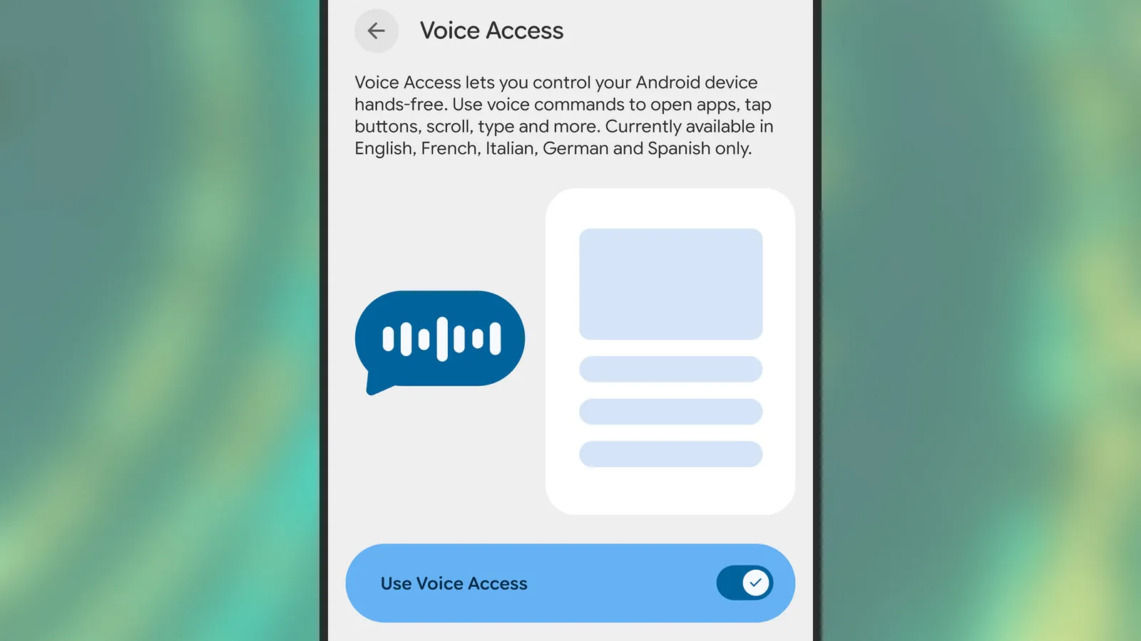
Once you’ve installed Voice Access, you can enable this feature from Settings. On a Pixel phone, head to Accessibility > Voice Access. The exact location of the feature may vary on other handsets, but it’ll be somewhere in the Accessibility menus. For Samsung devices, for example, it’s under Accessibility > Interaction and dexterity > Voice Access.
Enabling Voice Access on Android.
Photograph: David Nield
During the setup of the feature, you’ll be able to tweak a few of the options, including whether to display a persistent button onscreen for launching Voice Access, and whether the feature is always listening for commands whenever the screen is on (which is recommended for convenience).
The same Voice Access screen where you enable the feature also gives you access to a few more key settings. These include options for how long your phone should wait before it stops listening for commands, how precise your phrasing has to be for instructions, and how the Voice Access shortcuts are displayed on screen.
Advertisement
Voice Access can be launched by saying, “Hey Google, start Voice Access,” or via any of the shortcuts you’ve configured in the Voice Access settings (including an on-screen button and a gesture shortcut). When the feature is active, you’ll see an icon showing four dots up in the top left corner, and you can then start speaking to control your phone.
The iPhone Shortcuts app reminds me of Minecraft. It might be relatively easy to jump into, but it offers nearly limitless potential, allowing you to build anything you want. The same holds true for the Shortcuts app, and that endless possibilities are what many iPhone users might find intimidating. But you don’t have to.
If you are new to iPhone shortcuts, think of them as little automated helpers. You can build them yourself or find ones that others have built and use them. And that’s the beauty of shortcuts. If you don’t want to get your hands dirty, you can find shortcuts others have created and tailor them to your needs.
With that said, let’s check out my favorite shortcuts. These are not the best shortcuts on everyone’s list, but they are the ones I use daily to get things done faster and more efficiently.
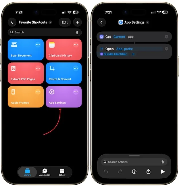
App settings: stop digging through the settings app
Anyone who has spent more than five minutes hunting for an app’s permissions inside the Settings app knows how frustrating it can be. You have to open the Settings app, scroll all the way down, open the Apps section, scroll again to find your app, and only then can you enter its settings.
Advertisement
Rachit Agarwal / Digital Trends
This shortcut fixes that completely. It uses the Get Current App and Open URLs actions in the Shortcuts app to detect which app you are currently in and jump straight to its settings page. Once you set it up and add it to your Control Center, all you have to do is open the app, swipe down from the top, and tap the shortcut.
Rachit Agarwal / Digital Trends
It will automatically open the current app’s settings. It is genuinely one of the most practical shortcuts I have ever created, and you can download it using the link below.
Apple Frames 4: make your screenshots look professional
If you ever share screenshots on social media, a blog post, or a presentation, this shortcut is for you. Apple Frames 4 is a free shortcut by Federico Viticci of MacStories, which can wrap your screenshots in a proper device frame.
The latest version is noticeably faster, supports all recent Apple devices, and even lets you choose frame colors and scale the images proportionally. What I love most about this shortcut is that it can take multiple screenshots as input and combine them in one image.
Rachit Agarwal / Digital Trends
All the images in this article have been created using the same shortcut. If you also take screenshots regularly, I can highly recommend this shortcut. I would also recommend you check out my favorite screenshot utility for Mac. It offers all the missing features of Mac’s built-in screenshot tool and then some.
Scan document: your pocket scanner is already in your hand
You don’t need a third-party app to scan documents on an iPhone. You don’t even need to open the Notes or Files app the usual way. With this shortcut, you can open the document scanner instantly and scan and save papers without any extra steps.
Rachit Agarwal / Digital Trends
I have it in my Home Screen and use it whenever I need to quickly scan a receipt, a letter, or any paper document. It’s one of those shortcuts that sounds simple until you realize how much time it saves you every week.
Resize & convert: resize images without downloading a third-party app
How many times have you shared a photo only to find out it was too large, or in the wrong format for where you needed it? Since the iPhone Photos app doesn’t let you resize an image or change its format, I found a simple shortcut to do it.
Rachit Agarwal / Digital Trends
The steps are pretty easy, too. You pick the image, set the size, and the shortcut handles the rest. I use this a lot when I need to send images for articles or posts that require specific dimensions.
It handles a task I would otherwise have to do on my Mac or download a third-party app on my iPhone to complete.
I deal with a lot of PDFs, and sometimes I need to extract a few pages to share or save. So I downloaded a shortcut that lets you select specific pages from a PDF and extract them into a new file.
Rachit Agarwal / Digital Trends
It sounds like a small thing, but if you have ever had to send someone just two pages from a 40-page PDF, you know how handy this is. You don’t need to download any app, pay a subscription, or open your Mac. Your iPhone handles it in seconds.
Clipboard history: because you always lose what you copied
This is one of the most underrated shortcuts on this list. While macOS has finally added a clipboard history feature with the macOS Tahoe update, the iPhone still doesn’t have a clipboard history. That means every time I copy something on my iPhone, it erases all the previously copied items.
Advertisement
Rachit Agarwal / Digital Trends
So I built a shortcut to work around it. Now, every time I copy something on my iPhone, it saves to a note, creating a running clipboard history I can refer back to whenever I need it. The only issue is that I have to run the shortcut manually for it to work.
Rachit Agarwal / Digital Trends
So that’s why I have added it to the Back Tap gesture (go to Settings → Accessibility → Touch → Back Tap) on my iPhone. Once I copy something I want to save, I simply tap the back of my iPhone three times to trigger the shortcut and save the copied item in a preassigned note.
Rachit Agarwal / Digital Trends
When you download the shortcut, make sure to edit it by tapping the three-dot menu and selecting the note you want to use as your clipboard history.
Turn off mobile data when iPhone connects to Wi-Fi
To balance the manual activation of the last shortcut, I give you one that is pure automation. Once you set it up, you never have to think about it again. The shortcut uses the Shortcuts automation feature to detect when your iPhone connects to a Wi-Fi network and automatically turns off your mobile data.
Rachit Agarwal / Digital Trends
I have also set up the companion automation that turns mobile data back on when you leave Wi-Fi. It saves battery life and prevents your phone from uselessly using mobile data when it doesn’t need to. Since this is an automation, there’s no way to share a downloadable link, but you can learn how to create this shortcut. The screenshot should give you the basics of how to do it.
My 7 favorite iPhone shortcuts
I know the Shortcuts app can feel intimidating at first, but most of these require very little setup, and the payoff is immediately obvious. Start with one that solves a problem you have right now, and before long, you will be building your own.
If you have an iPhone and are not using Shortcuts, you are missing out on one of the most powerful tools Apple has built. So, definitely give this a try, and your life will never be the same.


You must be logged in to post a comment Login